-
Posts
5,014 -
Joined
-
Last visited
-
Days Won
7
Posts posted by BigBubba
-
-
the internet is easy to order from and people don't want to pay triple digits for something as trivial as a sports jersey
You can order authentics from the Internet, too.
-
So what happened to seeing who likes your posts? It was interesting.
And ego-boosting.
If you have email notifications, you can still see, or you can check under "Liked Content" (or whatever it says) on your profile.
It got screwed up at the same time as the quotes, so I'm guessing that neither are coming back any time soon.
-
Maybe you're missing a black script jersey from your life?The Islanders black alternate is growing on me. Lol. No idea why. At all.

I got a chuckle out of that.
-
Antarctica is a desert. Let's move the team there! I bet their attendance would skyrocket compared to being in Glendale.They proved hockey belonged in the desert...
...Just don't ask them how or when.
I wouldn't put it out of the question. Penguins have been known to bandwagon.
-
 1
1
-
-
Is mayonnaise an instrument?
No.
Horseraddish is not an instrument either.
-
 1
1
-
-
I like patterned trim... sadly, it seems to have fallen out of favor since the '90s.
Surprised you didn't mention this:

I love patterned trim. Of course, if it made a comeback in the NHL, half the league would be wearing it in five years and the novelty would wear off, but it can be a great touch to a uniform.

Pacers best look was their previous pinstripe set

I wouldn't say best, but those were nice. I usually abhor double-outlines, but I don't know why, these just look good. But the way one end of the collar "folds over" the other is ugly.
Now an unpopular opinion of my own. This is probably the worst primary logo in all of the Big Four:

There is nothing remotely redeeming about it, except for maybe the colours, which are OK (but aren't even unique in the NBA).
-
Does this count?

-
Since we're doing Manny...

-BigBubba
-
Really? You think their 1990s logo is more "cartoony" than their post-2007 one?
If Nickelodeon ever made a show with anthropomorphic sharks, I'd envision them looking like the amateurish pre-2007 logo, so yes.
-BigBubba
-
I hate the term "dated".
OK, how about this: the Sharks' original logo was reflective of the 1990's style of "cartoony" logos and really started to look out-of-place as it reached 15 years old. The thin stroke lines, the overly-detailed teeth and stick, and the "mild" look of it just didn't work by the time 2007 came around. The new one is more "fierce" and doesn't look as "dead" (i.e. there's a lot more implied motion).


-
Never had a good look? That first sweater was a modern classic, and the second one had an appropriately progressive feel for a Silicon Valley team at the turn of the millennium. Even with the little flaws in the 2007-2013 set (the concavity in the shark triangle, the redundant secondary, the two-layer nameplates, the orange), the Sharks still had a unique color and a solid design. This is just a chipaway of a good-if-not-great look with none of the flaws resolved and more flaws added, to say nothing of a justification that insulted everyone's intelligence.
They were nice, to be sure, but I wouldn't use the "C" word. That logo was awfully cartoony and got dated quickly; the Edge update did wonders to help them out in that respect.
-
-
I tried sending him a message as a test, and this popped up:
The following errors were foundThe member bboy_555 can not use the messaging system
This personal message has not been sent
-
-
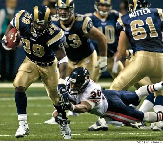
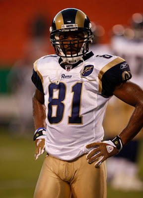
I love the Rams' current identity. I think it's the best in franchise history. Just go with the navy jerseys/gold pants and white jersey/gold pants from 2007*.


Just add a thick navy stripe on the pants (surrounded by thin white stripes so that it's W-N-W), wear navy pants on the road as an alternate, and get rid of the white pants - there's no need for them.
*Admittedly, I didn't watch the NFL at all in 2007, so I'm relying on the motherboard for this. If the year is wrong, forgive me.
-
 2
2
-
-
Quotes are not showing up with the person who said them.
I haven't tried quoting yet, but just from what I've seen it doesn't have the username and date when it's being quoted. It gets hard to tell who said it, gotta keep scrolling back up.
When I quote someone (like right now), it appears as "Legend, on 14 Aug 2013 - 14:26, said:" and then their post. But when my post come up, it doesn't say who said it.
But when you edit it, it turns back to normal.
-
In a similar vein (and yes, I know hat they're photoshops)...

José Bautista as a Steeler and Heat..
-
1. I like Pinstripes on road uniforms and wish the Twins and Rockies would bring them back

I like the Twins' current road uni better because I was never really a fan of that script, but I really liked road pinstripes. However, I just don't see them making a comeback anytime soon.
-
I agree, but really, it's the difference between crap and s--t.
-
Neither does Tim's.
-
Not gonna lie, I actually took slight offence to that comment (edited for accuracy).
Tim's has fries?I have an old "Free Coffee" rim from Roll up the Rim.
-
Nah, act like you've been there before and you might get back there.
That's the thing - you may very well never get back there. I say if you win, make the most of it and don't take it for granted. If I worked my whole life to win something, I'd want my ring as flashy as possible.
-
Baseball is more of a tradition based sport, I was meaning in football, and basketball. Alabama has a classic set, but its just boring. Arkansas "lightning bolt" uniforms are much much much better then in the McFadden days. And the '76ers throwbacks are ugly, but the Iverson days were great uniforms. That's what I mean.
I know what you meant; I was just saying that most people don't have a concrete preference of one over the other - it's usually a case-by-case basis.
-
 1
1
-
-
OK, what's up with quotes? Anybody noticing how the username/date/time don't appear when you quote a post?


Ask A Moderator
in Forum Policies and Announcements
Posted
Pretty sure we can.