


BigBubba
-
Posts
5,014 -
Joined
-
Last visited
-
Days Won
7
Posts posted by BigBubba
-
-
This:
 is >
is >this:
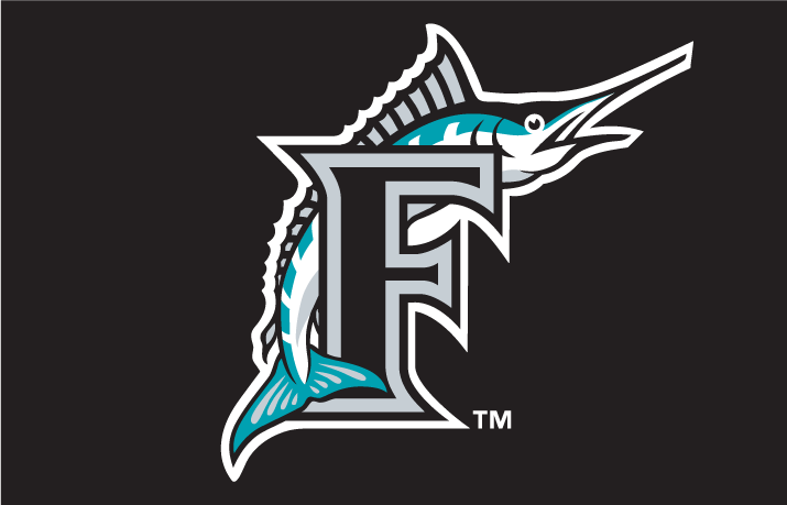
Sure the teal needs to return, but their current logo looks better than the generic, personality-less fish of their first 18 years.
A swooshing blob has personality?
-
Only in the G-ddamn NHL
Aw, there was fun to be had here!

-
A major flaw I have with the Braves' set that most people don't seem to care about...


Sorry, but that triple placket piping looks atrocious. Along with the outlined, cursive script and the tomahawk, it clutters the front of the jersey way too much.
-
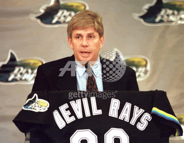
This is the original prototype of the Devil Rays. The only difference in the rainbow stripe and the numbering in the back is white instead of black
Good Lord, check out that NOB. Who the hell thought that two outlines - with the second, thicker one being the same as the base colour - was a good idea?
-
Just on a side note it would make things easier if the pictures at least would have the name.
If you can't recognize the player, you likely don't know who they are. And if you don't know who they are, how would being told their name make a difference?
-
It's just as annoying to scroll past these "MOD EDIT" posts as it was to see all those Cardinals rings.
Question, mods: Would it be possible to instead just delete bad posts instead of simply editing out all the text?
-
There's already the Majestic XII.
Don't ask about the Majestic XII.
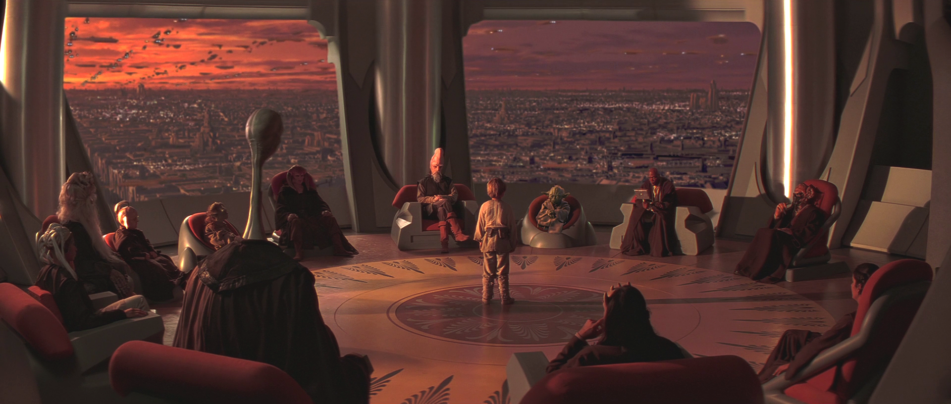
Basically this.
Fake Edit: I totally didn't even notice there are 12 guys in the council. Illuminati and stuff man..
More like this:

-
-
How long until someone cites the First Ammendment?
-
Cardinals should bring back that red piping on their pants.
Ehh, to me, pants piping looks weird when there's none on the jersey.
-
Bettman and the B.O.G. will probably steer the Yotes towards Vegas instead of Portland, Quebec or Seattle. Yeah Vegas is building a new arena but there is no predicting how an NHL team would do in Vegas but the odds are not good. But you never know.

-
 1
1
-
-
I love the Athletics new alt cap. Sorry.
Not forgiven.
-
1
-
-
I actually agree. The maroon and athletic gold is a great look.I think LeBron will be looking A LOT better this time around in Cleveland.
Is that unpopular? The Cavs have a top-three look in the NBA in my opinion.
-
New warning points system is interesting. Is there a maximum number that one can get before being banned, or will the mods still get to a point where a member's bad enough to warrant suspending or banning anyway, regardless of how close to zero they are?
Also: Do warnings have an "expiry date"? For example, if somebody got off to a rough start and racked up a good amount, would they stick with him indefinitely? It might be an issue if he cleaned up his act and was trouble-free for say, six months, yet still had those warnings looming over him, which wouldn't be very reflective of his current standing as a member.
-
Completely agree. What a wasted opportunity to get some beautiful colours in there.Love the details on the sides of the ring but why no color color on the head of the hawk? To me the top just blends together
And I'll echo what JQK said. I like big and flashy rings, but there comes a point where they get so big that you can hardly even call them "rings" anymore. Have some fun, but keep the size at least moderate.
-
I'm fine too with the Sharks moving to San Francisco and keeping their identity intact. Though they should start working with the Warriors soon to get the arena to fit a hockey rink, so we don't have another Islanders-Barclays Center fiasco.
I'm attached to the Sharks' name and general logo/colour scheme. San Francisco Sharks works.Sharks aren't going anywhere; the Bay Area is way too valuable and too demographically picture-perfect (young, affluent, tech-savvy). I wouldn't be surprised if they wound up in the Warriors' new arena, though. The Shark Tank won't age gracefully.
That's pretty much what I thought when the Warriors announced their intentions to build a new arena, way back in 2012. We might even see a rebrand (no way that they keep the San Jose name if they permanently move to SF, unlike their temporary stay in the Cow Palace), which would be welcome in my book.
Why? They're far from even being considered for relocation.
-
Take the orange out of that Padres set and you have the start of something workable.
Yeah, choose yellow and brown or orange and brown. Not all three.
-
1
-
-
Road pinstripes are one of the few baseball fads (if you can call them that) that I wish had staying power.
-
The Blue Jays sell them at their team shop for less than the price of a brand-new authentic.
-
Why not get some coffee and an order ofDo I want that venti white mocha from Starbucks? Or do I want to see an NHL hockey game tonight? Decisions, decisions...
TimBitsTimbits which comes with two free tickets?
-
A person can have more than one right uniform, and that is the case here. He led that team to back to back championships and that is what a lot of people remember him in.
When the majority of people think of John Elway, they picture him in the old uniforms. Ergo, those are the "right" uniforms. Now, follow along with me: another uniform, since it wouldn't be "right", would be "wrong". Sure, it may not have the "Holy crap!" factor of, say, Bobby Orr as a Black Hawk (was that before it after the name change?) because he had some hilight moments in them, but it's not his primary uniform. Comprondez-vous?
This argument just shows how badly this thread has degenerated from its original point.
But it does.
Still doesn't make it his wrong uniform
A Hall-of-Famer who played his entire career with one team, led them to back-to-back championships, and is the greatest player in team history? Yes, it absolutely counts.Does this count? Because it always looked strange to me.

The point isn't the team, obviously. The point is that his correct uniform is this one:

I don't follow the NFL too closely, so you know what, if many people actually do associate Elway with those uniforms, then I rescind my comment. That said, my point still stands about how the "right team/wrong uniform" scenario can still exist (which one poster seemed to refute).
-
When the majority of people think of John Elway, they picture him in the old uniforms. Ergo, those are the "right" uniforms. Now, follow along with me: another uniform, since it wouldn't be "right", would be "wrong". Sure, it may not have the "Holy crap!" factor of, say, Bobby Orr as a Black Hawk (was that before it after the name change?) because he had some hilight moments in them, but it's not his primary uniform. Comprondez-vous?
This argument just shows how badly this thread has degenerated from its original point.
But it does.
Still doesn't make it his wrong uniform
A Hall-of-Famer who played his entire career with one team, led them to back-to-back championships, and is the greatest player in team history? Yes, it absolutely counts.Does this count? Because it always looked strange to me.
The point isn't the team, obviously. The point is that his correct uniform is this one:
-
Still doesn't make it his wrong uniform
A Hall-of-Famer who played his entire career with one team, led them to back-to-back championships, and is the greatest player in team history? Yes, it absolutely counts.Does this count? Because it always looked strange to me.
The point isn't the team, obviously. The point is that his correct uniform is this one:
But it does.
-
How funny would it be if they put images of crowd shots on the curtains to make the place look full?
-
1
-


Unpopular Opinions
in Sports Logo General Discussion
Posted
I've always pretended that it was "We, the north..." to make it sound more palatable.