


BigBubba
-
Posts
5,014 -
Joined
-
Last visited
-
Days Won
7
Posts posted by BigBubba
-
-
Teams like the Red Sox and Yankees who don't have names on the home (and for Yankees, road jerseys) have them on the replicas which is annoying.I hate when ads on the jerseys are not on the retail versions, because I feel like im not getting the real jersey. I want my jerseys to be as close to possible(ill put up with screen print tackle twill patches, like the shoulder patches on both LNH and LAH replica jerseys, but i refuse to buy replica baseball jerseys, i pay for authentic) to what is on the ice and it annoys me
Replica baseball jerseys are the absolute worst. Sometimes the number's don't have outlines and a lot of them leave out the numbers on the front of the jersey (if the team has that).
Not to mention no batter logo or sleeve patches. And sub-rec league materials.
-
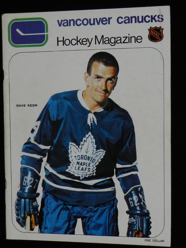
Related: Luke Wilson, Baseball Canada

-
Will they be on the retail sweaters? If so, what do they pay me for wearing an advertisement for GEICO, Honda, or Advil? Lump sum, or do I bill them every time I wear it outside? Oh, you mean I don't get paid to advertise multinational corporations? In fact, I'll probably pay more than I would have for old inventory? Well, then.I got another one... Recently the NBA and NHL started considering putting ads on their jerseys. Am I really the only one who would not mind if this happened? I mean, as long as it's kept to a minimum. Even MLS teams only have one presenting sponsor, and I don't see that changing in a hurry.
AHL and CFL retail jerseys come without ads, so I'd fully expect the NHL to do the same.
-
More Brodeur

Given how short his stint was, that's gotta be an all-timer.
Though I was hoping the Brodeur-to-Columbus rumours were true so we could get that interesting pair-up.
-
The Motherboard has these two listed as the Leafs' 1938-63 and 1963-67 logos, respectively:


While the latter is correct, the 1938 logo is wrong. On these graphics, it's just the 1963 logo without an outline. However, it was a whole different design. It's made worse by the fact that the team sells licensed apparel with the incorrect logo on it.

Clearly different logos.
-
The fonts on their old ones were a little odd, too, but overall they were a hundred times better:
-
@2001mark:
Here's the Gillick banner, complete with Alomar's original banner (they hung both on opening day, and then replaced Robbie's when they retired his number a few months later).

-
So the Sabres retired Dominik Hasek's number last night. They pretty much matched the old ones, so I'm happy. It would have been neat to see a red and black one, but he did wear the blue and gold, so it's not a big deal either way. They won't be retiring anyone's number that only wore red and black, and they even kept the original logos around for the alumni association during the red and black era.

Is there a reason for the font being different? Also, that gold outline is just brutal.
-
I don't know how unpopular this opinion is, but I've always liked these jerseys (might be nostalgia).
I would love for the Pats to wear these in the near future, maybe 2016 (20 years after the 1996-97 SuperBowl year)

Anyone know if that's the same font the Tiger-Cats used up until a few years ago?
-
It does suck over here. It was 10 degrees this morning.
Legitimately unsure whether or not this is sarcasm.
-
The team has a "Level of Ecxellence" for honoured players along the 500 Level ring. I couldn't fing a pic of Alomar's, but while the other players have just their names, he has both his name and number.
I googled this to be sure you were saying what I think you were saying. That his number (and not name) was on his retired number banner...and it is. I actually like that. However, that banner is kinda ugly...fitting in the HOF and team logos makes it far too big to just have the number. It almost needs a "watermark" photo or something. I wish they'd just use the "12" from his ceremony.It bothers me that the Blue Jays have retired 'Pat Gillick' & the '# 12'.
Future gens of fans won't all know right away that retired 12 is for Roberto Alomar. It's just a nameless number banner with the HOF logo.

I actually like just seeing the retired number and no name. For one, I just think the below looks really good...They have similar numbers at Fenway and I suspect some other places. Second, it's kinda a conversation starter. "Hey dad, what are those numbers for?" "Why does the 42 look different?" "Who wore number 29?" And in this day and age, it's pretty easy to look up.

-
Please read the FAQ thread before asking questions. The same questions are being asked a dozen times a month.
Thank you.
I always eagerly check "Forum Announcements" when I see new content, hoping to read about a new banning or suspension, only to be disappointed when it turns out to be somebody asking how to post a picture.
-
 2
2
-
-
EDIT: Wrong thread.
-
^I wouldn't call that Bkackhawks uniform BFBS. Blacks been a part of their colour scheme since day one, and they were all-black for a time. Even today, their roads are predominantly black.
Anyways, I utterly despise the fact that the Detroit Tigers have different colour schemes at home and road. Most people give them a pass because of history, and while I, too, sometimes let history excuse design flaws, this one is so awful that nothing can really justify it. It's horribly inconsistent, and while both designs look good in a vacuum, they need to go with one unified look. People give the Indians hell for their unwillingness to commit to either Wahoo/cursive or block scripts/caps - how is this any different?
-
@bubba....I can´t, i don´t know them.-But when the habs won alot of cups, there were only a handful of teams, and they got all of the good canadian born players, right ?
They won because they had good players. Yes. And so they honour those players by retiring their numbers. I don't see the problem.
(And keep in mind that there is no team in all of sports I hate more than the Montréal Canadiens.)
-
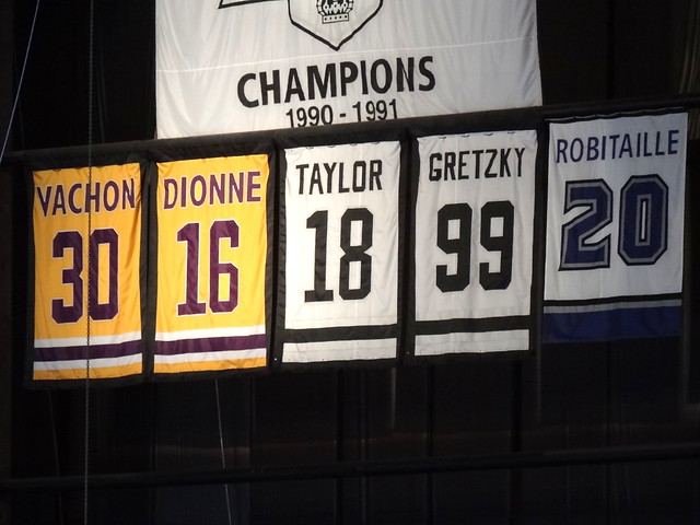
Maybe, but 12 of those were retired after the 93´ win, that is 12 in 20 years, if they continue the trend, my point will still be valid.
No. Player Position Career Date of honour 1 [url="/wikRight, but atleast the Heat don´t retire numbers left and right.
Like Montreal in the NHL, there is a number retired allmost every year, and they have not won the cup in 20+ seasons. *takes cover*
15 jersey numbers for 18 players over 104 seasons or 54 seasons since the first in 1960. Not quite every year
-
Name why any one of those players doesn't deserve his number retired any why.
-
I'll agree that their current look is (somewhat of) a mess, but that's due to poor execution. The gold sock cuffs and pants stripe (two features that weren't there initially) make it too gold-heavy and imbalanced.The Nashville Predators should go back to navy. The gold uniform was a nice novelty when it came out but on the ice, it looks like a train wreck.
This...


...with either just a solid navy yoke or no yoke/piping at all woul be a top-10 look IMO.
-
The "Phx" is pretty stupid, but I absolutely love the Orange and grey.
-
1
-
-
I think the fullest sections are the team benches.
-
Getting rid of the side panels and adding a hem stripe would go a long way towards improving that Thrashers jersey.
The only thing that could improve those jerseys would be a lighter and a bucket of gasoline.
-
2
-
-
From the past few weeks:

All are particularly bad.
-
1
-
-
I'm actually not opposed to BFBS.. in fact, I'm kind of a fan.. I mean, no one has a problem with WFWS, and GFGS gets decent reviews... to me, black, white, and grey are all interchangeable as "neutral" colors.. if a school thinks their color palette looks best against a black background, then I'm all for it...
Don't get me wrong, I still think you can screw it up and do it incorrectly, and black isn't right for everyone, but you can screw up a design using only your colors without black as well..
One example of BFBS done right in my opinion is Washington, although most might not agree.
...because they don't exist?
-
While going through my hockey cards I was reminded that New York Islanders legend Bryan Trottier was a Pittsburgh Penguin for a brief time. Weird.
And he was part of their Cup-winning teams in '91 and '92. I actually didn't know that:

-
While not without flaws (cartoony logo, inconsistent outlining, side panel on the home jersey), overall, this is a good uniform set:


-
1
-


Unpopular Opinions
in Sports Logo General Discussion
Posted
These are okay, but nowhere near as good as people claim them to be.