


BigBubba
-
Posts
5,014 -
Joined
-
Last visited
-
Days Won
7
Posts posted by BigBubba
-
-
And how about the ad on the foul pole? That's just cheap.
-
Wouldn't that just lead to post-padding?
-
The MVP ring is pretty stupid. Maybe add something to his personal ring, but don't give his a second big-ass gaudy one.
-
Colourful and has the trophy on it. Excellent.
-
Technically, because of Phoenix retaining all the records and history of Winnipeg v.1, all fans in that game were chanting in unison for the same team.
Technically.
No.
-
 1
1
-
-
Gary Carter. Until I watched him be honoured at The "O", I completely forgot these ever happened.


^Wrong number, too!
-
1
-
-
-
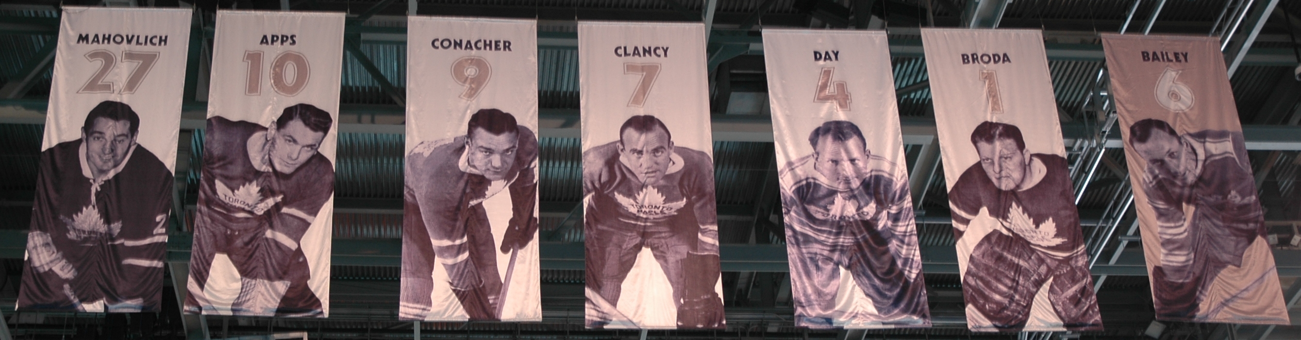
David Legwand

I hate the new trend of having patches that look exactly like the banner. That looks so boxy and clunky. I hate to be the "my team does it right" guy, but yeah, our team does it right.


-
The thing with the "ring of hono(u)r" and "forever a flame" is that they should leave out the number, and just hono(u)r the player.
Agreed. The Blue Jays have a two-tier system (a "Level of Excellence" for the team's great players; you get your number retired if you go into the HoF as a Jay). The Level of Excellence had the players' numbers on it until it was re-done last year, and rightfully so. There's no need to emphasize the number if you're just "honouring" it.
Related, I wish teams who had two-tier systems would have specific requirements like the Jays. There's no reason why Nieuwendyk and MacInnis shouldn't have their numbers retired. The way the Flames do it seems so arbitrary.
-
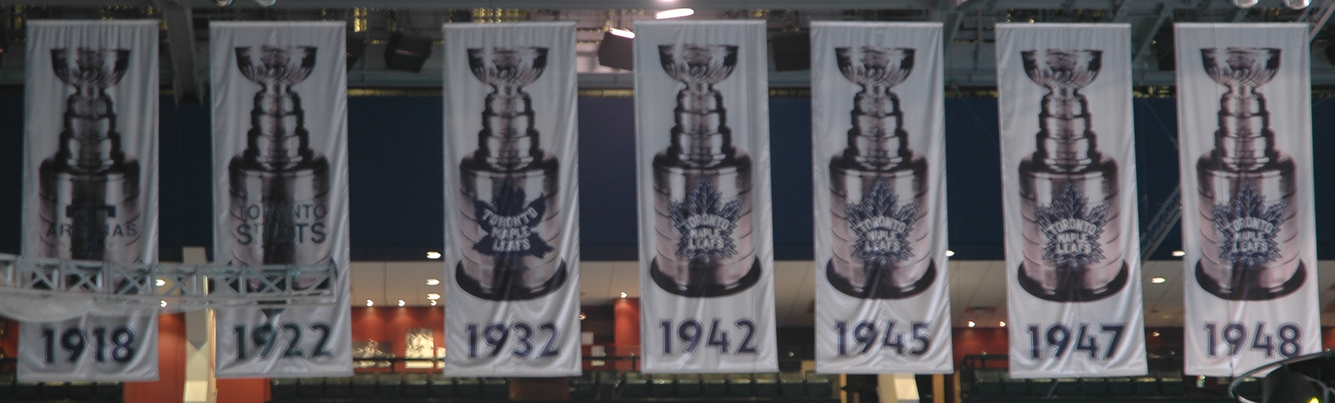
Put up in the last few days:


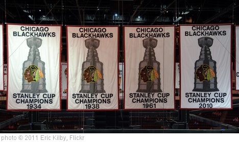
With regards to the best banners, I like when teams get creative. On top of the Flames, the Leafs and Flyers put images of the players on, which I love (although I wish the Flyers were uniform in the perspective of their pictures, i.e. Not having full-body shots, head shots, and partial shots like they do now). Also, the Leafs and Blackhawks put pictures of the Cup on their banners. I like how the Red Wings put the years a player played for the team on their banners, as well as a captain's patch (not sure why they didn't do it for Lidstrom, though). And, as shown above, the Bruins' retired numbers are really cool
-
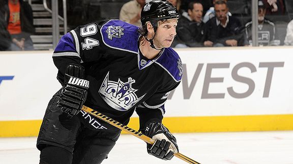
Still can't believe he acted that childishly over the Olympics.
And Callahan doesn't look that out of place in a Lightning uniform.
Well, he requested a trade to New York back in 2009. The Olympic snub must've been the straw that broke the camel's back.
-
whats OP
"Original Post"
-
Think it was cool when the players in the NBA All-star game had their respective team jerseys on. Repping their/your team bigtime......looked cool when there was 3 or more from the same team on the court at the same time
I agree. It bothered me that the West always had to be in dark, even if they were "home", because of the Lakers. Now that the Lakers have a white uniform, it would be a non-issue.
I wish the NHL would do this (really all leagues, for that matter). ASG uniforms tend to suck, reflecting the most awful of current design trends. There's just something really great about seeing all the different looks from around the league playing on the same field at once.
-
Ryan Smyth:

-
You need a few posts (3 or 5 I think) in order to start a new topic.
-
If you can't even take care of/keep track of your own freaking championship ring, I don't feel bad one bit if you lose it or have someone steal it.
-
Still think the Cavs have underrated uniforms
Top-three in the league in my books.
-
It seems as though Reebok is happy to charge more and more for replicas (charging $10 and $20 more for WC and SS jerseys, plus $15 for the patches) while putting less and less effort into the quality of them (hello, lightweight screen-printed crap!). How long until they turn into Majestic, who in my opinion, makes the worst replicas of any league?
-
I'm not sure which is more bothersome: when people unknowingly buy fakes and insist that they're real, or people who knowingly buy fakes and insist there's nothing wrong with it.
-
My mind is blown. I had no idea you could hang banners in that direction. Wow.
Sarcasm?
-
I greatly prefer them that way. It's less "interrupted" and allows more fans a better view of them.
-
Is the ACC the only arena that has all its banners (Leafs/Raptors...excluding that dumb new Bon Jovi one) parallel to the benches (i.e. Perpendicular to the blue line)?
-

That is a great looking ring. Way better than their previous ring.
Late here, but I totally agree. I can't stand rings with no colour.
-
I am a huge jersey collector. You know what? Spending $200 on a replica stinks. But that doesn't justify buying a "Reebko" fake. There are so many ways to get quality jerseys for cheap: eBay/Kijiji, thrift stores, end-of-season team clearances, websites such as SportsK.com, etc. It's not like the only way to get a jersey is to spend $200 on a brand new one. I own 22 jerseys (all licensed). Take out inherited/gifted ones, and I have 14 (jerseys I purchased myself). Eleven of those were bought for less than $100. You can build up a nice jersey collection without burning a hole in your wallet.
-
1
-


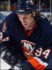
Players in the "wrong" uniforms
in Sports Logo General Discussion
Posted
This'll take a while to get used to: