


BigBubba
-
Posts
5,014 -
Joined
-
Last visited
-
Days Won
7
Posts posted by BigBubba
-
-
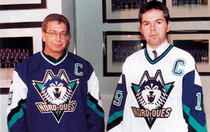
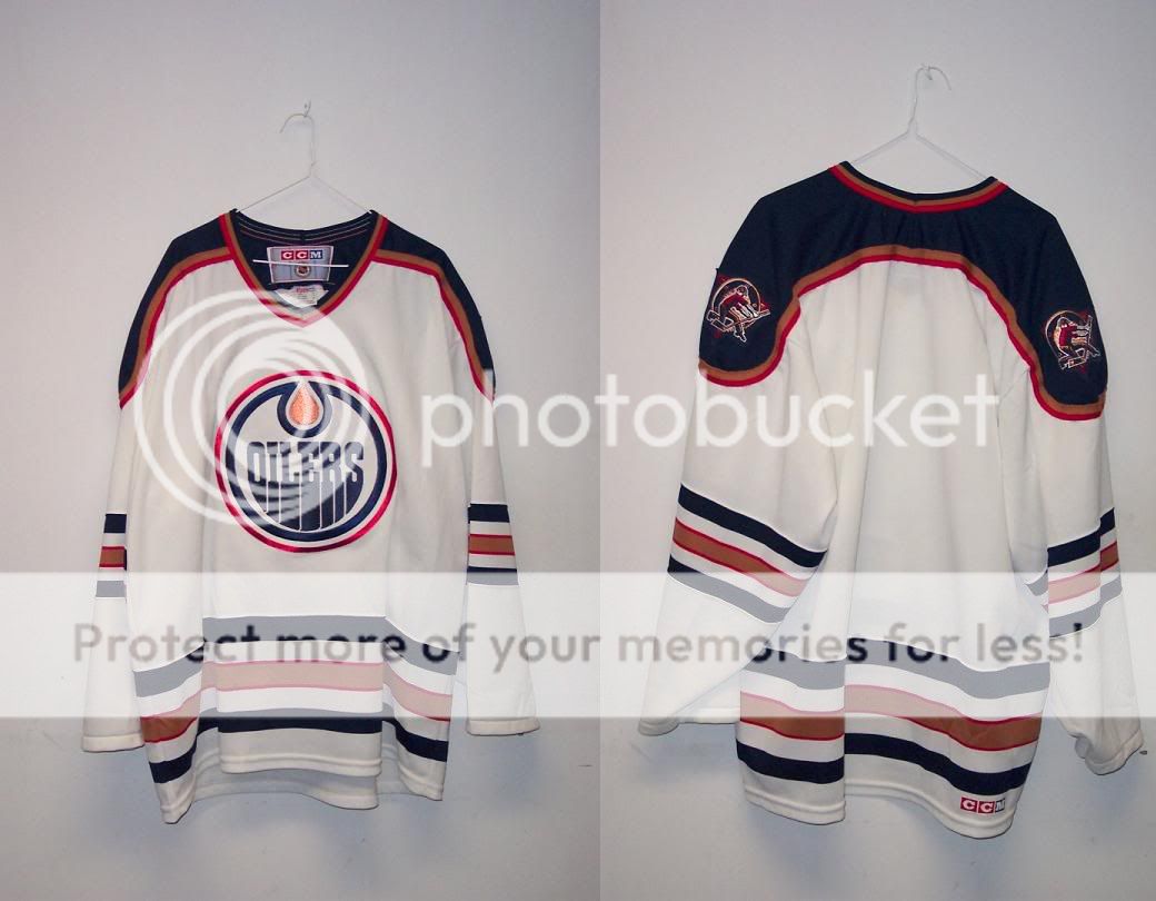
Fake. The black Beebok logo that is no longer in use is a dead giveaway.

Do you mean the Reebok logo on the lower part of the sleeve? Because A.) It's blue B.) All replicas come with the Reebok logo stitched on there, and the fact that it uses the old logo could simply mean that it's from a few years ago. Not exactly sure how that's a "dead giveaway", but sure.
It looks black to me..... but it could be navy.
It's royal blue.
-
I think the entire Nordiques set was "OK" at best. I think nostalgia for Québec hockey is the only reason people love them so much. Personally, I think the planned update was ten times better:
-
That looks really good, but Oiler fans wouldn't like it. Most miss the copper and how it looked on the jerseys. If this were copper, I'd buy it.
The only reason they returned to their 80s look is because they knew the fans were begging for it. If the navy/copper was really loved more by fans, they would've simply reverted back to their pre-Edge set.
-
Fake. The black Beebok logo that is no longer in use is a dead giveaway.
Do you mean the Reebok logo on the lower part of the sleeve? Because A.) It's blue B.) All replicas come with the Reebok logo stitched on there, and the fact that it uses the old logo could simply mean that it's from a few years ago. Not exactly sure how that's a "dead giveaway", but sure.
-
-
-
These Padres road unis...

...are the best road unis in their history. Not to mention the stylization of their city name is beautiful.
I agree with you on the first count, but not the second. As it stands, that was a very good road look. But I hated the bowtie script, and if they used the current "San Diego" script, instead, it would have been great.
-
 1
1
-
-
-
Similarly...

The "C", crest, Reebok logo, number, and NoB all look like they were put on during a drunk "pin the tail on the donkey" office party.
-
One of the ugliest uniforms of all time:
While I don't feel quite as strongly, I agree that it's a very overrated jersey. I've never understood all the love for it, especially when it gets called the best look in team history.
As an aside, I just realized now how bad it looks paired with the half-red gloves.
-
1
-
-
New:

Old:

MASSIVE downgrade.
-
Side note, but while I don't mind celebrating Conference Championships, it seems pretty unnecessary to hang banners for them in years you won the Cup.
A team would probably hang a conference championship banner if they are a relatively newer franchise or don't win a lot of Cups. If you're a team like MTL then I guess you can't find room for extra Conference Champs banners.
I have no problem with hanging banners for Conference Championships. If you're a newer team and that's all you have, you should celebrate it. However, if you won the Cup that same year, hanging a Conference Champs banner is just dumb. It makes it look like you're hanging a banner just to fill some space in the rafters.
-
At least the Stanley Cup Banner looked pretty good (simple, no giant Stanley Cup on it cough Lightning cough)
Tampa Bay isn't the only team to have the Stanley Cup featured prominently on their banners:
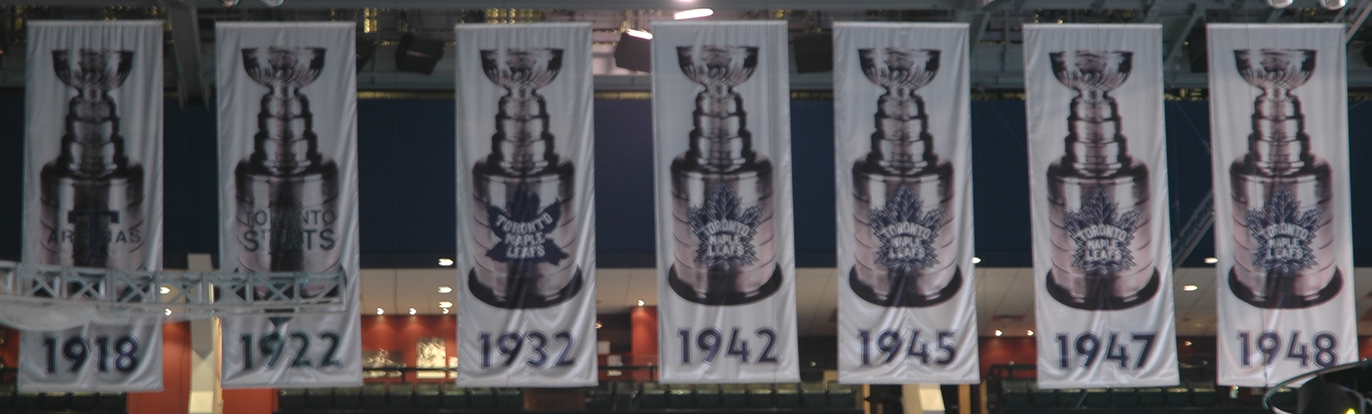
Also, here's a link to LA's banner. Not terrible, but nothing special either.
I haven't been to the ACC yet, but how visible are the Leafs logos on the banner? It always bugged me and I was wondering if it's just a crappy camera.
They're actually easily visible, even for the Arenas/St. Pats logos.
Side note, but while I don't mind celebrating Conference Championships, it seems pretty unnecessary to hang banners for them in years you won the Cup.
-
At least the Stanley Cup Banner looked pretty good (simple, no giant Stanley Cup on it cough Lightning cough)
Tampa Bay isn't the only team to have the Stanley Cup featured prominently on their banners:


Also, here's a link to LA's banner. Not terrible, but nothing special either.
-
Awesome uniform:
Okay uniform:

Bad uniform:
Horrible uniform:
One of the worst hockey uniforms ever:

(The Edge template panel cutting into the hem stripe brings this into full clownsuit territory.)
Since when is this unpopular? I mean with the exception of the top one, your opinions all seem to be in line with the popular view (for once!).
-
The Dodge Viper is my favorite car. I have been enamored with them ever since they came out. But I will never own one.
That's okay, you can buy a knockoff for half the price!

If you get a speeding ticket with one of those, do they cancel each other out?
-
Can't stand the Dallas Stars college look, should have stayed with this:
There are few opinions less popular than that one.
-
I like the fact that teams like the Tampa bay lightning are going for more classic looks, I don't see what the problem is.
They directly copied two of the most iconic looks in hockey and threw away a perfectly good modern identity (identity, not set) to do so.
----------
Unpopular opinion: I never really liked the Padres' sand roads. I didn't hate them, and I liked the uniqueness, but other than that, they're nothing special.
-
Isn't every opinion an unpopular one since they're very specific and come from one out of the billions of people on this planet?
Not really.
-
This is beyond hideous:
Every single one of those hats should be burned from existence. If this becomes their rumoured new alt cap next year, it will be the worst cap in the majors - and it's no contest.
-
I wasn't referring to IP theft.
Whoops, made a mistake there. I was of course referring to IP theft.
-
I wasn't referring to IP theft. Fact is, by purchasing an illegal fake, you are robbing a company of their money. If you were a musician, would you like it if people bought illegal copies of your CD instead of paying you the money for your content? If Derek here has no problem with stealing money off of companies and breaking the law to save a buck, then so be it. But I hope he understands what he's doing and why it's wrong.
It doesn't make it right, but the major sports leagues and apparel manufacturers definitely brought this one upon themselves.I can agree with this.
-
Well okay so buying jerseys from China/Hong Kong is considered illegal but Lol how do they keep getting through customs and to my doorstep. Hmm 5 jerseys for the price of uno authentic...think I'll do that lol.
If (lol) you don't care about (LOL) the law and want jerseys (lol) cheap, then you must (Lol) also see nothing wrong with (lol) stealing a jersey, right? Lol.
-
Well, it's also pretty foolish to spend $80 bucks on a really nice new jacket, so you may as well steal one, right?


ivVPmg~~60_12.JPG)
Unpopular Opinions
in Sports Logo General Discussion
Posted
^And the previous Nords stuff just screams 70s. Was it amazing? Naw, but sure a helluva lot better than the stuff they wore before. I actually quite like it.
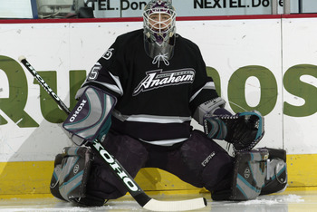
Plus, 90s doesn't necessarily mean bad. The Mighty Ducks set was very 90s, and I was a big fan of that Capitals set.