


fouhy12
-
Posts
2,341 -
Joined
-
Last visited
-
Days Won
11
Posts posted by fouhy12
-
-
The semifinals look very good. Four great uniforms.

-
 4
4
-
-
I like it, the all-red looks nice. Would probably be better with Georgia in red-red-silver and Cincy in black-black-black, though.
I'm a big fan of color v color. Give me more!
-
2
-
-
I wish Alabama was the home team, I think that's a better combination. I don't love Alabama's road look, it's a lot of white. But this is still a good matchup.
-
Utah-Colorado in the snow is just gorgeous. Both teams have sets that contrast well against the white background.
-
3
-
-
Is it just me, or does the orange on Clemson's pants not match the orange on the helmet or jersey at all? Maybe the lack of purple next to it is messing with my eyes.
-
2
-
-
It seems like every brand is going single color and sans serif fonts for their brandings these days. It's too safe and even boring at a certain point. I like the look, but I think we're getting close to the point where design shifts back the other way. You can't stand out in the marketplace by doing the same thing everyone else does. At some point, some company will bring back a gradient or complex color scheme or different font and things will trend in that direction.
-
2
-
-
These are all really cool! Well done!
-
1
-
-
Can you tell me what font the Patriots use now and where you found it?
-
-
Don't know if it's unpopular or if it's been talked about here, but the discussion over in the NFL week-by-week thread had me thinking. Super Bowl XLV is one of my least favorite Super Bowls aesthetically. Between the sheer amount of yellow on the field, the terrible Super Bowl patch that looks like it was printed on copier paper and glued on the jersey, the ugly field turf, and the even uglier job that was done painting it, nothing about that game is enjoyable for me to look at. I don't like the lighting in that stadium at night. I'm not a fan of the old Reebok jerseys. The Packers' green always seems to blend into the field turf for me, leaving the game as a mass of disconnected yellow objects. I think it's one of the most overrated Super Bowls in terms of appearance.
-
4
-
-
Real minor one here, but Brady's wearing the NFL shield on his jersey instead of the NFL 100 logo. Must have grabbed the wrong jersey or something.
-
That's a very bland logo. I'm not a fan.
-
On 5/9/2019 at 10:04 PM, fbjim said:
Meanwhile there's cricket, and honestly, if you're a nerd for sports graphics, and especially sports graphics which try to show you a massive amount of information, you should watch cricket, because, I mean,
(I wish we could find someone who didn't know anything about either sport, just to ask which one is more confusing for someone who doesn't know any of the rules)
As someone that knows absolutely nothing about cricket, I am thoroughly confused looking at that. I'm not even sure where the score is.
-
1
-
-
I really don't mind this uniform. I actually think the Chargers look better in monochrome with their current uniforms.
-
10
-
-
If CBS does unveil a new graphics package for the Super Bowl, I expect to see something "shinier". For some years now, we've seen sports graphics become simpler and flatter. Compare FOX graphics from 15 years ago to this season and you'll see a monumental difference. However, NBC bucked the trend last year with their new package featuring gradients and shadowing galore. I believe that this will be the first in a trend back in the direction of fancier scorebugs. If CBS does make this change, then I think we will be seeing changes in that direction all throughout the world of sports.
-
2
-
-
283 diamonds. That is absolutely absurd, and a hilarious dig at the Falcons by Kraft.
-
I'm not sure if your representation of the field really matches just how washed out it was.
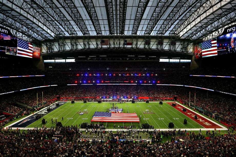
This picture really shows how washed out the Super Bowl logos were.
-
A white endzone would conflict with the field markings too much.
-
1
-
-
From the NFL'S snapchat:

The Super Bowl logo seems very washed out to me. They were putting finishing touches on this morning.
-
15 minutes ago, RayFinkle said:
^^^^
I agree with the paint on the 50. But, would the paint on the 20's be to close to the paint/SB logos at the 25?? Meaning, the paint on the outside of the 20 would be butted right up against the SB logo.
I think it would best to paint team colors on the 25's and red/white/blue on the 50.
-
1
-
-
In the last three years, the AFC team has had the top sideline from the TV view. Would that continue this year, or was XLIX an anomaly by having the visiting team on top?
Also, I think the Falcons go with red endzones, not black ones.
-
If the Patriots make the Super Bowl, then I think the field will go back to using conference logos. I think SBXLIX established that the Patriots will use the wordmark with the logo on it in the endzone, and they will not use both that and the logo. If the NFL didn't put a conference logo in the endzone, then it would be just a navy blue background with the wordmark and logo on top, presumably centered. This is the most boring possible combination, and I hope the NFL would avoid it.
-
I think that I like custom numbers more and more as the size of jerseys gets smaller. For example, I like custom jerseys in football more than in hockey. I think it's because on jerseys with less real estate for striping, a custom font can provide a distinct design element that clearly differentiates one team's branding from another's.
-
2
-
-
14 hours ago, pitt6pack said:
Patriots 2006 early season grass

I'm having some hard times finding a good image of Foxboro stadium in '01, but if I had to guess it would be like this field except with just the wordmark in the endzones and no Gillette Stadium logos. I found an image for this field though and it looked so nice I had to make it.
Thanks, that looks great!


College Football 2020
in Sports Logo News
Posted
You know we've gone too far when Oregon is the team wearing school colors in a bowl game.