


upperV03
-
Posts
6,365 -
Joined
-
Last visited
-
Days Won
44
Posts posted by upperV03
-
-
52 minutes ago, PaleVermilion81 said:
Seeing MNUFC in person tonight, I love that kit under the lights. Very vibrant.
Watching on tv, I thought it looked great in the few shots that showed it from the chest up. Other than that, it bugged the hell out of me lol.
-
 1
1
-
 1
1
-
-
Apparently St. Louis does have navy shorts in the rotation, as they’re now on sale on MLS Store:

They’re for the away kit, but they’d be well served wearing them with both kits. Would improve both looks substantially.
-
7
-
-
Looks like the league and Apple (sort of, not really) learned their lesson after Week 1’s light pink vs. gray Miami/Montreal matchup:
Ironically I really don’t think there would’ve been an issue with Nashville’s bright yellow, or at least certainly not as much of an issue as Miami’s light pink vs. Montreal’s gray. In any case, this is pretty dumb when Montréal literally wore their old primaries with the new badge in preseason. The home team should not have to accommodate the road team in a case like this. Montreal should have to wear their old kit or go buy some cheap teamwear before making the home team change (although I doubt Nashville minds showcasing their new kit @ home again).
-
3
-
-
Here’s my prediction of this weekend’s kit matchups. Once again, * = confirmed kit choice.
*Charlotte (blue/white/blue) vs. Atlanta (stripes/black/red)
Vancouver (all-white) vs. Dallas (red/blue/blue)
Cincinnati (royal/navy/navy) vs. Seattle (all-green or g/b/g)
DC (all-black) vs. Orlando (all-white or w/p/w)
NYCFC (all-city blue) vs. Miami (all-black)
Philadelphia (all-navy) vs. Chicago (white/light blue/white)
Toronto (gray/red/gray) vs. Columbus (all-yellow or y/b/y)
SKC (all-light blue) vs. *LAG (all-teal)Minnesota (all-white) vs. *NYRB (all-red)
*Nashville (all-black) vs. *Montreal (all-gray)
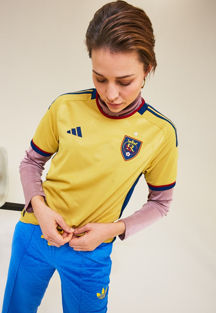
*RSL (gold/navy/gold) vs. *Austin (stripes/black/black)
Portland (all-green) vs. St. Louis (all-pink/red)
*San Jose (all-black) vs. *Colorado (all-light blue)*LAFC (all-black) vs. *New England (white/red/red)
-
1 hour ago, MJWalker45 said:
Why not have the refs wear blue and make the RSL keeper wear green or black?
The league probably wouldn’t allow the green or black keeper kits to be used against Austin’s primary kits.
52 minutes ago, officeglenn said:Or just have the ref wear black. It's still in the ref's rotation, and wouldn't clash as badly with Austin as the other options.
Ehh, Austin’s kit is still pretty black-heavy even with the green shirt back. Not just the shorts and socks, but from the front the shirt still has too much black for a black ref or keeper kit to be worn in the same match.
-
3 minutes ago, vtgco said:
!?!?!?!?
Not totally clear from that pic but the base color is “light bone”. The shorts will be green, which I’m excited to see. I like the idea behind the shirt a lot, but I’ll have to wait and see the official reveal before I can really judge it.
-
 1
1
-
-
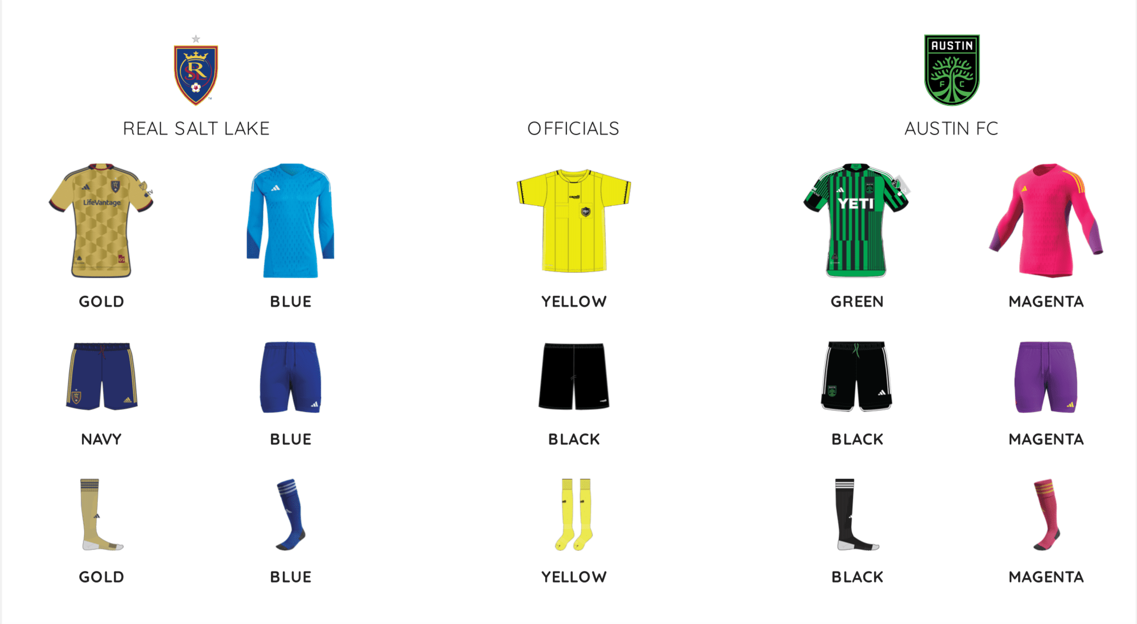
RSL is, to my knowledge, the only club that faithfully posts the kit assignment graphic on their website each week. Here’s the graphic for their home opener on Saturday against Austin:
Two things:
1) They are really pushing the new gold kits, having already (needlessly) worn them in their first two road matches and now for the home opener.
2) That ref kit has to be a mistake, no way the refs could wear fluorescent yellow with RSL in their gold kits. Gotta think the refs will be in either blue or pink instead. While it’s not ideal having the refs match one of the team’s keeper kits, it happens semi-regularly in MLS.
-
1
-
-
I think the current PL typeface is pretty close to perfect. Felt like a really nice modern evolution of the last typeface when it was unveiled and I still feel that way to this day. That said, there absolutely needs to be more color options. Royal blue and gold would be my top two choices, followed by claret and a regular yellow. Green would even be nice for a team like Norwich when they’re in the Prem.
-
4
-
-
Check out the tights that John McCarthy was wearing yesterday:
Seems like Adidas have added the three stripes to them this year since more and more MLS keepers have worn tights instead of/in addition to socks in recent years. I noticed Steve Clark had the same thing yesterday, with red stripes on yellow tights to match the yellow keeper kit colorway (Clark does have the socks on too, they’re just down by his ankles):
-
Montreal did use their old kits with the new logo in preseason:
You would think they could use them in a match if needed. At the very least they could use the black shorts and/or socks, or even the shorts and socks from their unreleased primary kit to provide some contrast below the waist. That would’ve made a substantial difference last week against Miami.
Speaking of old kits/kit elements, Minnesota should’ve worn the light blue shorts and socks from their 2021/22 secondaries last week against Dallas. Portland wore old white socks on a couple of occasions the last two seasons and DC wore 2020/21 red shorts a couple of times last season, so there is recent precedent for that sort of thing.
-
1
-
-
1 hour ago, MJWalker45 said:
Columbus should always wear yellow at home.

To be fair, I don’t really know what they’re wearing. Black is my guess, though.
54 minutes ago, Digby said:Whatever happened with that Montreal leak? Are we still assuming that one won’t see the light of day? They’re away to Vancouver and SKC early in the season, which are two matchups where I assume the grey kit won’t work.
There haven’t been any updates on that situation since the team posted this message:
Chances are the inscription is either on the inner collar or back neck (neither of which were visible on the leak), so they probably won’t wear it until they’re able to get updated versions without it.
-
Once again, seems like MLS won’t be posting the kit matchups. Some teams have posted on social media or their website what they’ll be wearing this weekend, while others haven’t posted anything. Here’s an idea of what we could see. * = confirmed kit choice.
LAFC (all-black) vs. *Portland (pink/white/pink)Atlanta (stripes/black/red) vs. Toronto (all-white)
Columbus (all-black) vs. DC (all-white)
Miami (all-pink) vs. Philly (all-navy)
*New England (all-navy) vs. Houston (all-orange)
*NYRB (all-yellow) vs. *Nashville (all-black)
Orlando (all-purple) vs. Cincy (all-orange)
Austin (stripes/black/black) vs. *Montreal (all-gray)
*Chicago (white/blue/white) vs. NYCFC (all-orange)Dallas (red/blue/blue) vs. LAG (all-white)
*St. Louis (all-red) vs. *Charlotte (blue/white/blue)
*Colorado (burgundy/blue/burgundy) vs. *SKC (light blue/navy/light blue)
San Jose (all-black) vs. Vancouver (all-white)
*Seattle (green/blue/green) vs. *RSL (all-gold)
-
Meant to post this earlier, but I have to say that last night’s Timbers/SKC match was really a visual treat. Games between these two almost always produce good-to-great kit matchups, and last night was no exception. For my Timbers, seeing it action I think this new one is the 2nd best primary kit in their MLS history (behind only 2017/18). I really enjoyed the 2019/20 hoops, but I think I give a slight edge to this one for 2nd place on my personal list because of the distinctive plaid pattern and the way that both the white and gold accents really pop instead of “competing” with each other. Can’t wait to see it with white shorts. As for SKC, I wasn’t too high on their new kit when it was unveiled but it really grew on me while watching the game. I still think they left a good deal of potential on the table (and have on their last few kits, really), but I do think this new one was executed better than the one it replaced. I’m always a sucker for a henley collar, too. I hope they wear navy shorts with it a few times this year.
-
1 hour ago, GriffinM6 said:
Is there any reason why St. Louis doesn't have both kits on the World Cup template? I see they're using the template that was introduced in 2022 for their secondary.
Basically just to create uniformity with the rest of the league. This way St. Louis has one kit on the 2022 template and one on the 2023 template, just like every other club. It’s kind of been Adidas’ standard practice with the most recent expansion teams. When Miami and Nashville entered the league their inaugural primaries were technically on the 2019 template, while their secondaries were on the MLS 25 template with the large shoulder stripes. When Austin entered the league, their primary was on the 2021 template but their secondary was on the MLS 25 template with the large shoulder stripes. Charlotte last year was a bit of a departure from that practice, but there wasn’t much of a difference between the 2021 and 2022 templates. There have been some oddities with which kit the expansion team chooses to replace in their second year, but for St. Louis they’re replacing their secondary kit next year.
-
1
-
-
I actually found myself disliking the Austin kit more and more while watching last night. I didn’t like it that much when it was unveiled and seeing the full package in action didn’t do it any favors IMO. I do like that the back of the shirt is green, but the kit absolutely screams out for some green below the waist with how green-heavy the shirt is. Green socks would do wonders. I also hate the white side/back hem stripe on the shirt and shorts. The shirt is already incredibly busy and those two elements just end up standing out too much and cluttering it further. Ditto for the Adidas stripes. Make those and the side/back hem stripe black on the shirt and they would’ve blended in nicely with the stripeception design (exactly why Adidas and/or the club probably avoided that option).
-
2
-
1
-
-
Seems like MLS won’t be posting the kit matchups this year, or at least not this week. They didn’t post them at all during the playoffs last year, so not a total surprise but still disappointing. In any case, expect a lot of teams to debut their new kits today/this weekend. Based on what I’ve seen on social media and on some of the teams’ sites, here’s an idea of what to expect.
(* indicates a new kit)
*Nashville (all-black) vs. *NYCFC (all-blue)
*Atlanta (stripes/black/red) vs. San Jose (all-gray)
Charlotte (blue/white/blue) vs. New England (all-navy)
*Cincy (royal/navy/navy) vs. *Houston (all-orange)DCU (all-black) vs. Toronto (all-white)
*Miami (all-black) vs. Montreal (all-gray)
*Orlando (all-purple) vs. *NYRB (all-yellow)*Philadelphia (tan/blue/blue) vs. *Columbus (all-black)
*Austin (stripes/black/black) vs. *St. Louis (all-gray)
*Dallas (white/?/?) vs. Minnesota (all-black)
*Vancouver (all-white) vs. *RSL (yellow/blue/yellow)
Seattle (green/blue/green) vs. Colorado (burgundy/blue/blue)
*Portland (all-green) vs. *SKC (all-light blue)
-
2
-
-
I’ve noticed several teams have matched the color of their sponsor logo to the adidas logo on the new keeper shirts:
It’s definitely not a league-wide thing, as I’ve seen just as many examples so far of teams just using black or white for the sponsor logo. Plus, the green, blue, and black colorways already have white accents. It looks nice, though, so good on the teams that have decided to do that little bit extra. Would be even better if the names/numbers matched, too.
-
1
-
-
Speaking of Adidas… they’re sticking around through 2030:
https://www.cnbc.com/amp/2023/02/22/adidas-major-league-soccer-renew-deal.html
Quite frankly, I would’ve been shocked to see any other outcome.
-
 1
1
-
 1
1
-
 2
2
-
-
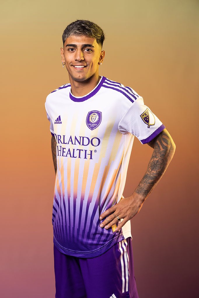
Orlando and New England both debuted their new kits in their preseason friendly last night:
Both are really solid kits. Surprising that it’s taken this long for Orlando to have gold names/numbers. New England has looked good in white and red secondaries in the past and I really like the stylized sash. I hadn’t realized previously that the side/back hem stripe on New England’s shirt is a red/white/blue stripe:
-
6
-
-
Still waiting on Orlando to officially reveal their new primaries, and who knows what’s gonna end up happening with the Montréal primary kit. That said, which teams are we thinking have the best set of kits for this season?
Portland, Vancouver, and Colorado immediately standout as having really good sets because of the strength of their new kits as well as the strength of their carried over kits. I think Columbus, LAG, and RSL all have pretty strong sets, despite having relatively simple kits. I think Orlando will be up there, too. There are several clubs that have one really strong kit and one weaker kit (Atlanta, Chicago, LAFC all come to mind.) Seattle probably has the wildest set, but I’m not a huge fan of either of their kits and they once again have a secondary that’ll cause matchup headaches. Toronto is definitely up near the worst of the bunch for me.
-
16 minutes ago, PaleVermilion81 said:
This is their secondary kit, though. Their primary kit is already all black.
Right, but the shirt could be almost entirely blue and pink with the black right near the bottom. Similar to Orlando’s secondary shirt that is purple at the bottom. Orlando even wore purple shorts with that kit all last season, even though their primary is all-purple. Minnesota could have done the same with a light blue/black/light blue combo.
-
4
-
-
Orlando’s shirt has leaked (just below Charlotte in this pic):
Believe it looks almost exactly like this mockup I made, but with purple side stripes instead of gold:
MLS Store is selling purple and white shorts, so it seems like they’ll have both options available for this new kit. Don’t believe they’ve ever worn purple/white/purple in MLS. -
I just really hate how the Northern Lights design terminates, feels too abrupt and too high up the shirt. I frankly don’t think the white is necessary at all; the design could be moved down or stretched out so the black is near the hem and the rest of the shirt is the blue and pink. In that case the kit could have black shorts and light blue socks and it would look 100x better IMO.
-
5
-
-
Minnesota’s shirt has leaked and it’s… not good. Fantastic idea, horrible execution.


.jpg)


2023-24 International Club Soccer Kits
in Sports Logo News
Posted
The typeface isn’t bad at all, I’m mainly just glad they focused on evolving the current one instead of reinventing the wheel. I think I prefer the curvatures of the current typeface, but I don’t mind the changes and can appreciate that they put an emphasis on increasing legibility. I’m definitely a fan of the increased size as well as the tonal pattern in the numbers. I haven’t seen confirmation that the color options will remain limited, but it certainly seems so. Certainly disappointing if true, especially because they could easily add 2-3 more options and it’d make a big difference on quite a bit of kits.
I am a big fan of the stand-alone lion being used for the sleeve badges.