


upperV03
-
Posts
6,361 -
Joined
-
Last visited
-
Days Won
44
Posts posted by upperV03
-
-
Texas Tech going white/red/red vs. the Ducks:

Should be a good looking game with Tech in red and white and the Ducks in white and green.
-
 2
2
-
-
Couple other Pac-12 combos here. Wazzu going dark gray/crimson/dark gray vs. Wisconsin. Glad to see them going with a healthy amount of gray since the Badgers will be in their white and red.
Utah going red/white/red at Baylor:-
6
-
-
-
57 minutes ago, Chawls said:
This uniform is so close to being perfect for my tastes. I really need them to switch back to the Clarendon font for the numbers.I’d go a step further and say lighten the blue just a touch as well. Otherwise, it doesn’t get much better in CFB.
-
As they showed off at Pac-12 media day and in preseason photo shoots, UCLA is still wearing the Vapor Untouchable this year. Mildly surprising since the other Jordan Brand schools all got upgraded and LSU (plus the Colts & Patriots in the NFL) is wearing the shoulder stripe version of the FUSE template. While the jerseys and pants are the same, last night the Bruins wore about as much gold as possible without wearing gold jerseys. As far as I could tell, all of the players wore gold socks, tights, and cleats. Plus, they’ve added gold front and back helmet bumpers and gold chinstraps:
-
6
-
-
Arizona has changed their navy uniforms from the catalog version of the Vapor Untouchable template to the catalog version of the FUSE. They’ve also changed the stripes to red/white/red instead of matching the helmet stripes. I don’t mind the stripe change as long as the white jerseys and pants still match the r/w/b helmet stripe. The number font on the new jerseys appears to be a slightly altered version of standard block (noticeable on the 1, 4, and 7) and is also very skinny. The placement of the Pac-12 patch and captaincy patches is also quite awkward.
-
Perhaps an unpopular opinion, but these are dumb. Couldn’t even get the helmet and pant stripes right since they’re a catalog order and were therefore limited in terms of striping patterns.
-
1
-
-
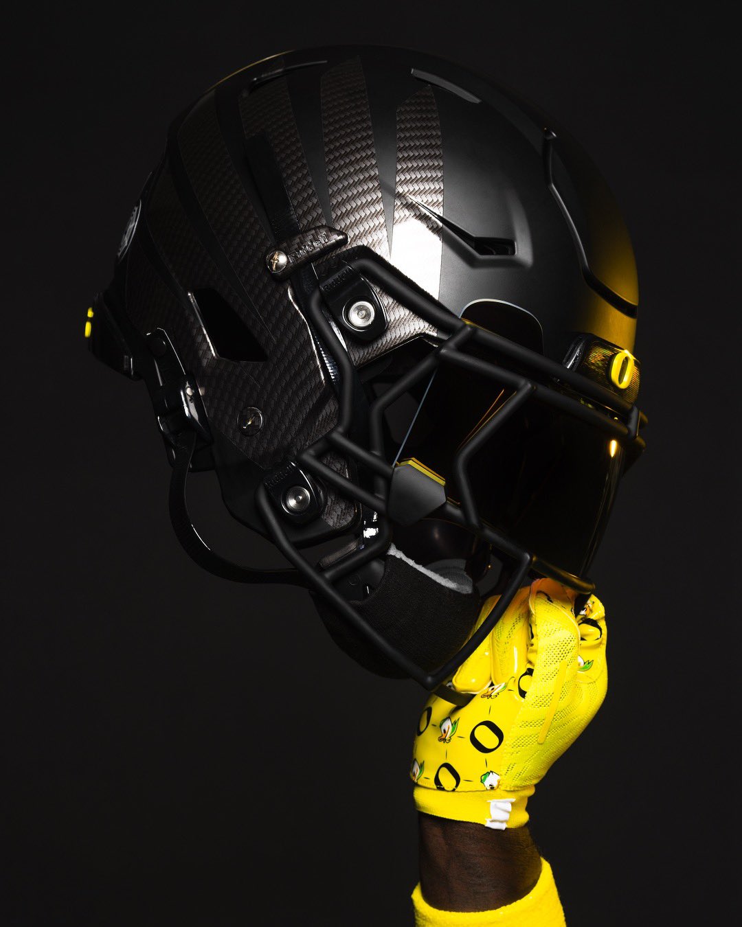
The Ducks are kicking off the season in black/yellow/yellow, a combo that’s been worn several times but surprisingly not since 2016. The black helmets are new, now featuring dark gray carbon fiber wings. Carbon fiber hasn’t featured on Oregon helmets since 2014.
-
8
-
 1
1
-
 1
1
-
-
Utah going all-red tomorrow night vs. Florida. Should be a good looking game with the Gators in o/w/b.
I have to say, though, that this Utah set has WAY overstayed its welcome IMO. The contrasting sleeve caps and multi-colored stripes are just too much, and I hate the way the helmet stripes never match the jerseys and pants. Their fauxbacks are nearly perfect and the one-color application of the stripes is far more appealing.
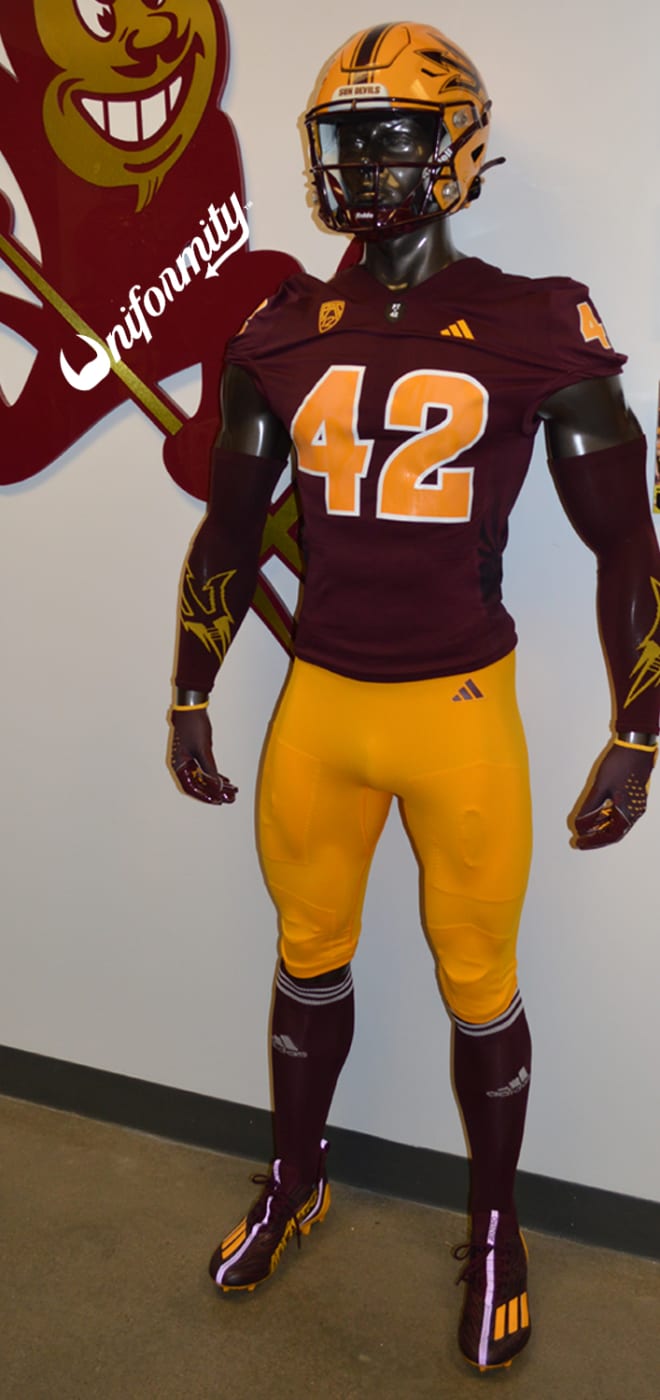
New year and new unis for Arizona State, but one thing that always stays the same: Sparky forking the uni mannequin in the ass (oh and also ASU going maroon/gold/maroon for the home opener).
-
4
-
-
I’m hoping Florida pulls a 2020 Browns and brings the orange pants out as a surprise during the season. We know they have them because their EQ account showed off the FUSE pants with the corrected stripe on the orange pants:
-
10
-
-
58 minutes ago, aawagner011 said:
USC did not show off the new template all off-season but did wear it yesterday. Their version uses the horizontal seam similar to teams with the Colts style shoulder stripes.
I would’ve been really surprised if they kept the Vapor Untouchable. One of the versions of the FUSE template available in the Nike Team catalog is called the Vapor FUSE Shard Stripe jersey and the example shown was/is USC’s jersey (just without the custom font & rubberized collar logo):
-
Both of the graffiti kits debuted today and I personally think they both looked as bad or worse than the initial releases made them look. I think the NYRB kit has a little more going for it overall, but I still can’t get on board with it. The ATL kit is just… awful.
-
2
-
-
49 minutes ago, SCL said:
Well aware but not to this degree, true ocassional alternate status.
These all happened before LeBron got to LA:
And yes I’m aware that the Lakers brought back the Mamba uniforms in the bubble due to Kobe’s passing, but they were originally worn the season before Bron got there.
In addition, both of these would’ve been designed 18+ months before LeBron decided to sign for the Lakers:
But yeah, the black must be because of LeBron.
-
6
-
1
-
-
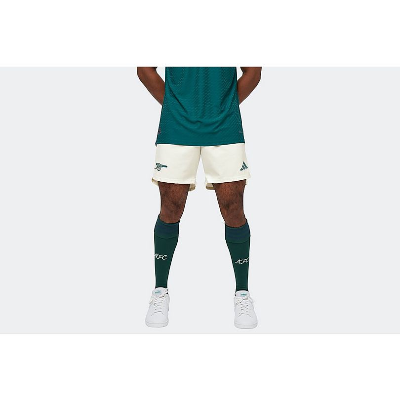
The Arsenal third might just be my kit of the season. Absolutely adore the dark green and blue shades that they chose, and I also love the tonal adidas stripes, cannon logo, and henley collar. I really can’t wait to see it on the pitch. Important to note that there are off-white alternate shorts available in addition to the first choice navy shorts. I think the shirt will look fantastic with either short option.
-
14 hours ago, HOOVER said:
Dude…good eye. That’s not the same shiny pant that the Cowboys & Raiders are wearing.I wonder if this is a new pant they’re adding back into the mix in 2024? Or, they had Ripon make these and it’s their template with a Swoosh sewn on?
I really don’t know what to make of the new Vandy pants, but I do think they’re dazzle. Kansas State is the only other big-name Nike program that wears dazzle pants, and those use a different template than these new Vandy pants. The pants that KSU have worn for the last several years seem like an altered version of Nike’s Elite 51 template, as they have the same exact upper thigh seams. I would say Nike makes them or at least provided specs for Ripon to use in manufacturing.
It’s possible that it’s the same for Vandy, but I find it a bit odd that it’s a different template. Very possible that they’re an actual Ripon template.
-
-
2 hours ago, GriffinM6 said:
Orioles in Orange at Mariners in Teal is one of the greatest uniform matchups in MLB history.
I wouldn’t go that far, but it was really easy on the eyes. The orange and teal looked great against each other, and I especially loved how both teams had the dark caps with colored brims to match the jerseys. I’m not always a proponent of color vs. color in baseball, but this was/is an example of it being done just about perfectly:
-
14
-
 3
3
-
-
I’ve mentioned on here a few times now about how Oregon will be wearing throwbacks sometime this year. A recruit leaked the pants a while back, and now a few items from the retail collection have been leaked. S/O to one of my buddies for finding the items.
Coaches polo:
Two t-shirts:
The expectation is that they’ll be 1994 throwbacks again. If so, I’m hoping they fix some of the inaccuracies that the 2014 throwbacks had. Here’s what I’d like to see:
- Champion number font (worn throughout 1994 season, but not in 1995 Rose Bowl)
- Large shoulder numbers
- Perforated numbers (least important, but I’d still like to see it)
- Helmet numbers
- “Oregon” on front bumper
-
9
-
-
2 hours ago, Digby said:
And the answer is... NYCFC. Going with an NYC Parks theme with the little green and gold leaf logo. I like the idea, execution's not quite there for me -- the pattern kinda loses the tree effect for me, and I don't like the bright green stripes. But otherwise I do like a dark green and gold and light blue color scheme, so that's kinda nice and pretty distinctive.
The lighting in that picture is a little weird, but I think all of the logos are white, not gold. The club changed their profile pic to this:
In any case, I don’t think it’s bad but the pattern isn’t my cup of tea and I think they should’ve made the adidas stripes light blue to match the side stripes.
-
1
-
-
1 hour ago, MJWalker45 said:
Anyone know what that little flag on the America jersey is?
It’s a little patch they’re wearing for Leagues Cup, with the inscription translating to “Eagles without borders”:
-
1
-
1
-
-
6 minutes ago, MJWalker45 said:
I'd expect all of the elite Nike teams to get them. But for training camp they probably don't have everything in yet, but will by the first game of the year.
It may well just come down to team or player preference, but in the CFP I didn’t see any Georgia or Ohio State players wearing them. At Oregon there have only been a few players opt for the conventional pad pockets, so it’ll be interesting to see this year which other schools have them at all and how many players wear them.
-
1
-
-
12 hours ago, SSmith48 said:
Not able to post any images at the moment, but Stanford looks to have dropped the black outlines around the numbers. A slight, but very good improvement. The little amount of black on there felt so out of place.
Good look here:
Definitely glad they axed the black outlines. Also interesting to see that they’re using the version of the Vapor FUSE pants with the integrated padding system. That’s what Oregon has worn since debuting the template in 2019, but so far I believe Stanford is the only other team I’ve seen to opt for it instead of the conventional pad pockets.
Speaking of pants, I wish Stanford would add stripes back to the pants. Either a double stripe like the Luck years or, preferably IMO, a single stripe to match the helmet. Similar to the throwbacks, but decrease the stripe width by 1/2 or 2/3.
-
13
-
1
-
-
17 minutes ago, BBTV said:
I actually find it very distracting - on all of them, not just the Eagles. That v-seam in the front stands out like a sore thumb. It's almost like when you see a concept here and the template's seams are shown in black lines. Also with the collar - it's just too much.
I don't get what the purpose of the giant-invasive V-seam is. I thought they were touting how their previous "seamless" template was as good as it gets. I'd think that having more seams would be a downgrade.
I’ve said this before either in this thread or the CFB thread, but I’ve heard from people inside the Oregon program that this new template fits tighter to the pads and isn’t as easy to grab as the Vapor Untouchable. Oregon players have been wearing the template since 2019, and were testing it for a couple years before that. Overall reviews have been very positive from what I’ve heard.The VU template was pretty much perfect in terms of aesthetics, but functionally I think it was almost too bare bones. I think there should be a middle ground between how few seams there were on that template and how many seams there are on the FUSE, but at least it’s consistent fabric still instead of having different fabrics on different panels like the Elite 51, Speed Machine, and Mach Speed templates.
-
1
-
-
19 minutes ago, aawagner011 said:
Clemson in the new template:
Interesting that they changed the swoosh on the pants to purple. Obviously a pretty inconsequential move, but I like them having a tiny bit more purple on the white pants.
Old, for reference:
-
4
-


/cdn.vox-cdn.com/uploads/chorus_asset/file/24028072/1388424189.jpg)

/cdn.vox-cdn.com/uploads/chorus_asset/file/23266859/usa_today_17454453.jpg)


/cdn.vox-cdn.com/uploads/chorus_asset/file/23971855/1350280843.jpg)
College Football 2023
in Sports Logo News
Posted
Despite getting a new uniform set this year, Arizona State is giving the heathered pajamas one last run-out this Saturday against Oklahoma State:
These have been one of the worst unis in CFB the last several years, but apparently they wanted to show them off one more time. As a reminder, ASU has a new black alternate with the gimmicky glow-in-the-dark number outlines that they’ll wear next month against Colorado: