


upperV03
-
Posts
6,361 -
Joined
-
Last visited
-
Days Won
44
Posts posted by upperV03
-
-
Really great update overall. I only have a few minor nitpicks, all of which have already been covered here.
The wordmark and numbers being so low does bug me, especially because it was somewhat avoidable (as it was on the Cardinals’ new red jerseys). I’ve mentioned it in the NFL thread, but Nike has an alternate version of the Vapor FUSE template with horizontal seams on either side of the collar instead of the V-shaped seam below it:

Had Nike used that version on the new OkSt jerseys, the wordmark and numbers could’ve been shifted up an inch or two.
-
 7
7
-
-
30 minutes ago, kimball said:
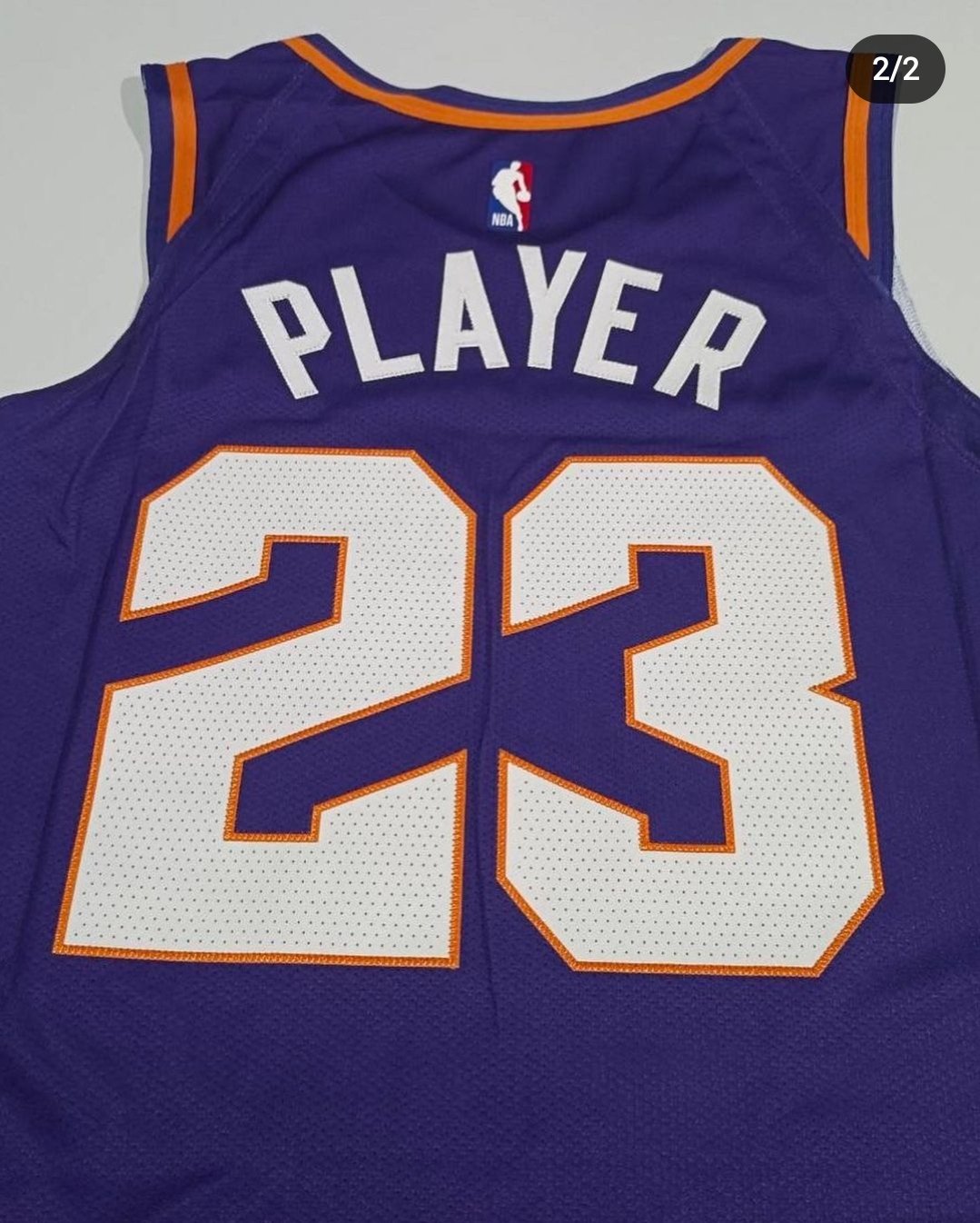
No ... the numbers originate from the 2013 change, but when the current set was introduced in 2017 the numbers were un-italicized. They're similar in the sense they're sad attempts at modernization, but they're not similar in any regard past that.
@Old School Fool was referring to the number font on the leaked prototype Suns uniforms (which may or may not become a reality). That’s what I was referring to as well.
Cavs number font:
Suns prototype number font:
The latter certainly seems to have been derived from the Cavs’ font.
-
6
-
-
2 hours ago, BBTV said:
They're not. Similar, but definite differences.
I think it was a case of them starting with the Cavs font and making some small tweaks to the forms to at least attempt to differentiate them a bit. It’s not the Cavs font, but it’s certainly derived from it.
-
3
-
-
Huge missed opportunity.
-
6
-
-
3 minutes ago, AndrewMLind said:
Interestingly, the template was originally called Vapor Fusion and the catalog version was Vapor F.U.S.E, just like the catalog version of Vapor Untouchable is Vapor Pro, but somewhere along the way, Nike adopted F.U.S.E. for both. I somewhat refuse to call it anything other than Fusion, though. Looks better, sounds better, etc.
It’s been called both things since it was first revealed by Oregon in 2019. When the Ducks unveiled the 2019 uniforms on social media, they called it Vapor Fusion. Then they put out this graphic before the first game of the 2019 season calling it Vapor F.U.S.E.:
-
1
-
-
23 minutes ago, Bmac said:
I love the Mariners CC uniforms, but I really can't stand that they're now wearing blue and yellow for two out of three games during a weekend homestand. The Sunday cream uniforms should have been replaced, not the road grays.
That’s a big gripe I have, too, especially because the CC unis are replacing the teals on the home uni schedule. The teals are their best look IMO and have now been relegated to occasional use instead of having a consistent set date.
-
8
-
 1
1
-
-
3 hours ago, Old School Fool said:
I really hope those perforated numbers aren't on every jersey, it will look stupid for teams like the Raiders, Bears and Packers among others.
They won’t be. Georgia and Ohio State wore the new template in the CFP and neither had perforated numbers. If a team wants perforated numbers, they’ll get them. If a team doesn’t want them, they won’t.
-
3
-
-
32 minutes ago, Frylock said:
I think the hats are where they missed an opportunity. For how many years were we told the upside-down trident-M is bad luck? And then they flip them and cross them inside the collar, complete with a story for what the W’s stand for. They should have put the flipped trident-W on the hat. I can’t un-see it now.The whole point of the trident logo was/is that it forms an M. Turn it upside down and it makes no sense as a cap logo for the Mariners. The bad luck thing is pretty dumb, but if fans think it’s that big of an issue then the cap logo should always just be an S (with or without the compass rose).
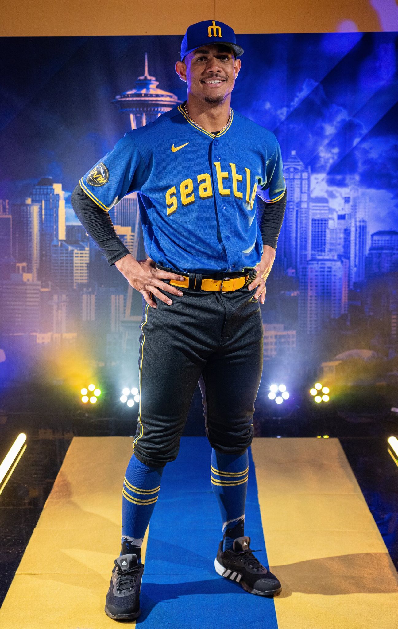
The Mariners’ City Connect unis look incredible in action… from the belt up. Love the bright blue and yellow on the jerseys, love the font, love the trident on the cap, love the yellow belts. Absolutely hate the black pants.
-
3
-
-
39 minutes ago, BBTV said:
can they do decals over brims? Seems like that would be cheaper than getting all new helmets just for a uniform that'll be worn a handful of times.
The Astros did that to match the gold-brimmed hats on their championship celebration uniforms this year and I believe the Brewers have done that a few times in the past to match holiday caps. I’m assuming the Mariners’ EQ staff didn’t want to have to remove decals in between Friday night (when they’re wearing the CC uniforms) and Sunday home games (when they wear the cream set).
-
2
-
-
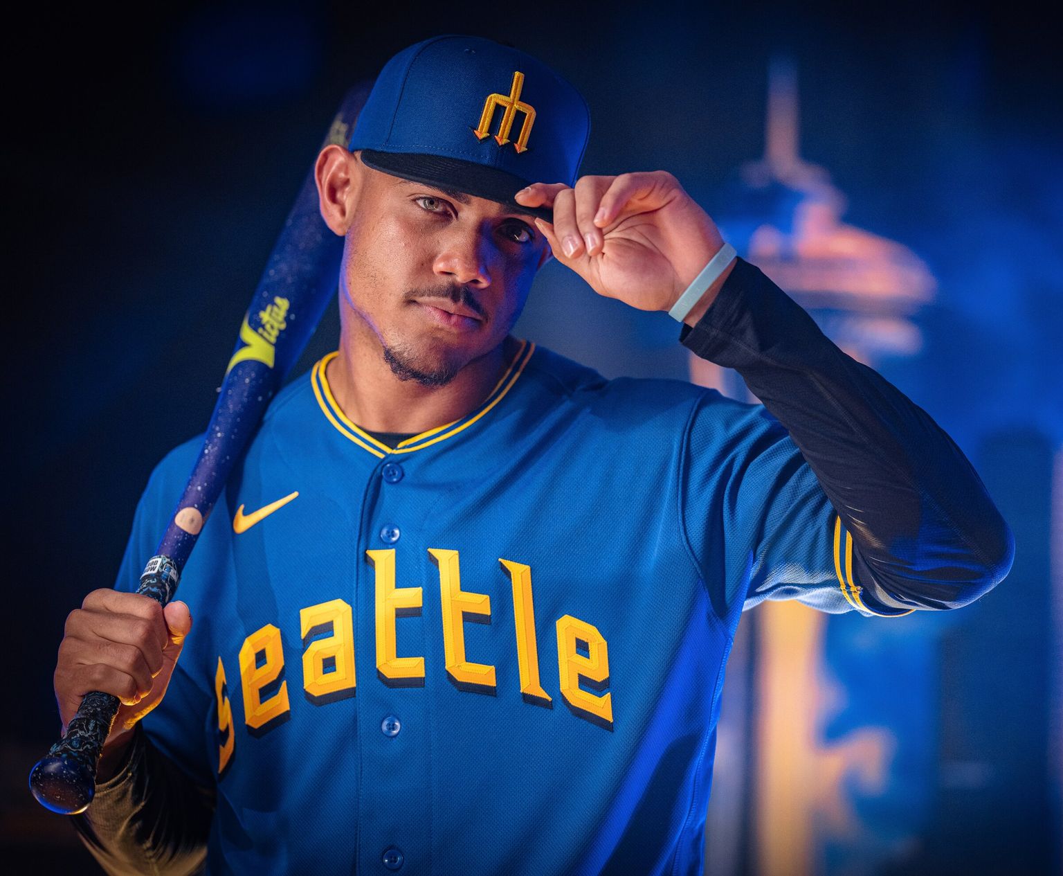
The Mariners will be debuting their City Connect unis tonight. I was thinking they might just do a decal swap on the royal batting helmets that go with the cream unis, but it looks like they did actually get new helmets to match the black-billed CC caps:
-
5
-
-
16 minutes ago, BBTV said:
I still don't see where the "v-seam" on the front has any benefit.
If there's a legit performance advantage by making them lighter and if the holes actually do that, then I guess that's fine - but the seam has a (minor, but still) impact on the actual look of some of the uniforms due to wordmarks and numbers being pushed down. Just seems unnecessary, when the marketing around the previous template was that the lack of seams is what made them great.
Take this with a grain of salt but the general consensus of Oregon players (who have been wearing the template since 2019) is that the new template is tighter and more “locked in” to the pads. The Vapor Untouchable template was all about eliminating seams and making it as light as possible, but the lack of seams made the jerseys easier to grab and stretch. Not trying to be a Nike apologist here, this is just what I’ve heard from people around the Oregon program in recent years.
-
1
-
-
22 hours ago, jbird669 said:
This is a really good up. Would love to see a trident M logo cap, though.
Haven’t made a 3D mock yet, but I did post a 2D version of a trident cap on Twitter:
I like the trident a lot, but I personally prefer the S compass on the cap. I would be good with the trident as an alternate or spring training/BP cap, though.
-
3
-
-
3 hours ago, GriffinM6 said:
Fantastic work on this concept. You did a great job of capturing various elements from the M's branding history. Just for fun, do you think we could get a look at a hat like the one below with the sleeve patch replacing the compass S? Could be a spring training/BP kinda hat.
Really appreciate the kind words, and yes here are a couple mocks with a teal hat. I like the idea of it being an occasional alternate for the white jerseys (kinda like Toronto sparingly wearing the white-panel hats) and the go-to cap for when the navy tops would be worn at home.
-
1
-
 1
1
-
-
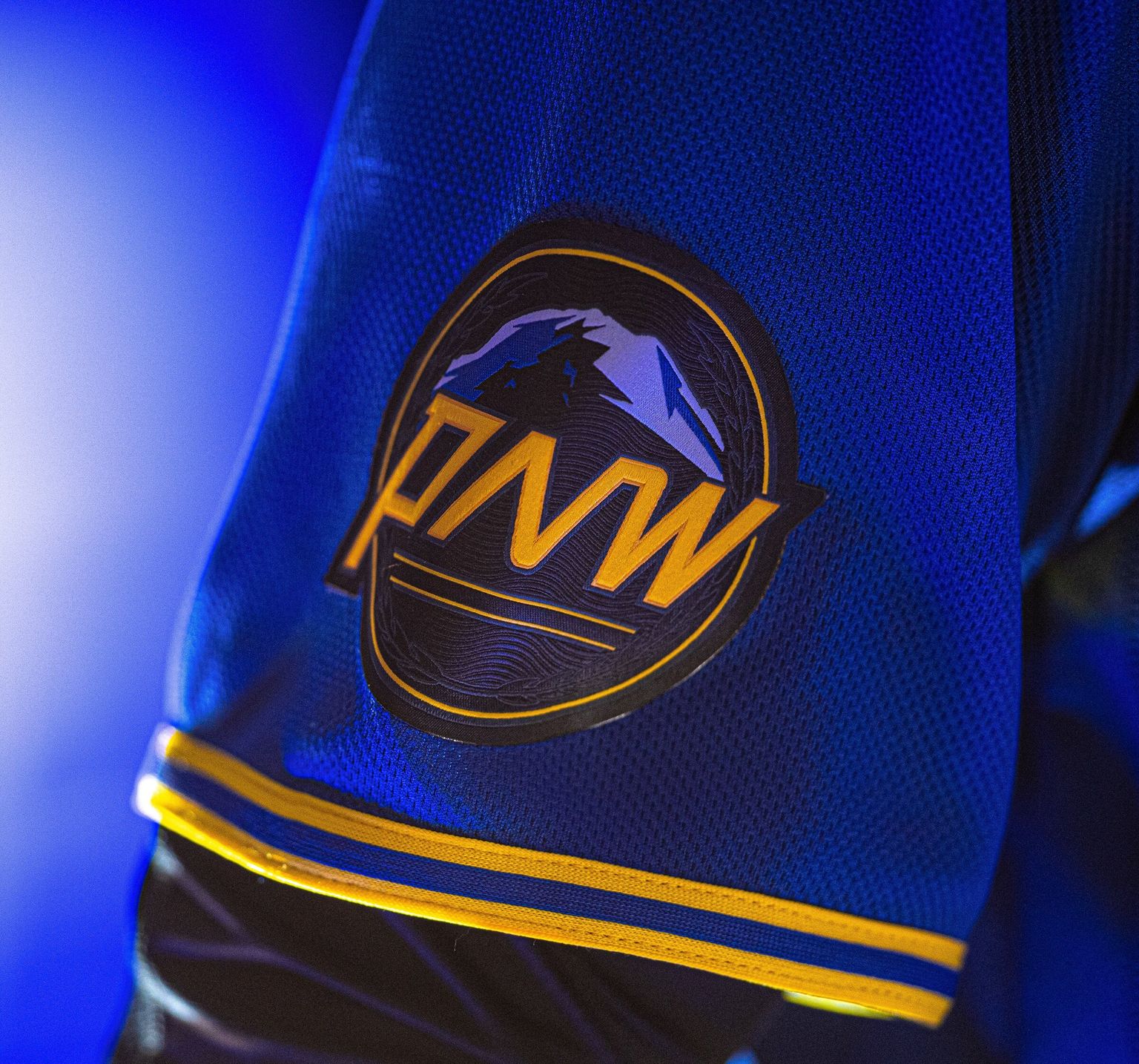
22 hours ago, CDCLT said:
I love everything about this except the gold NW on the compass. It's distracting and muddies the patch on the white and gray jerseys. Everything else is excellent and would be a great update for the Mariners. Nice work!
I get that, I definitely expected some people to have that reaction to it. I guess my response would be that it’s kind of supposed to be that way??? Not necessarily a distraction per se, but it’s definitely intended to draw your attention.
In any case, I decided to make some 3D mocks of the white, gray, teal, and navy uniforms:
-
3
-
1
-
-
Here’s a guess at this week’s matchups. * = confirmed shirt and/or full kit choice.
*Charlotte (blue/white/blue) vs. NYCFC (all-orange)
Cincy (royal/navy/navy) vs. DC (all-white)
Miami (all-pink) vs. Atlanta (stripes/black/red)
Montreal (all-gray) vs. Orlando (all-purple)
NYRB (all-red) vs. Philadelphia (tan/blue/blue)
San Jose (all-black) vs. LAFC (all-smog)
Toronto (gray/red/gray) vs. *New England (all-white)
Dallas (red/blue/blue) vs. St. Louis (all-gray)
*Houston (all-orange) vs. *RSL (all-gold)
Nashville (all-yellow) vs. Chicago (navy/navy/red)
*LAG (all-white) vs. Colorado (burgundy/blue/burgundy)
Portland (all-green) vs. Austin (all-mint)
Vancouver (white/navy/white) vs. Minnesota (all-black)
*Seattle (dragon/black/black) vs. SKC (all-sporting blue)
-
25 minutes ago, Carolingian Steamroller said:
Not sure if its a retail thing but this lacks the triangle stitching pattern we see on the new Vapor template.There are two versions of the new template, one that has the V-shaped seam under the collar and this one with horizontal seams on either side of the collar.
-
5
-
-
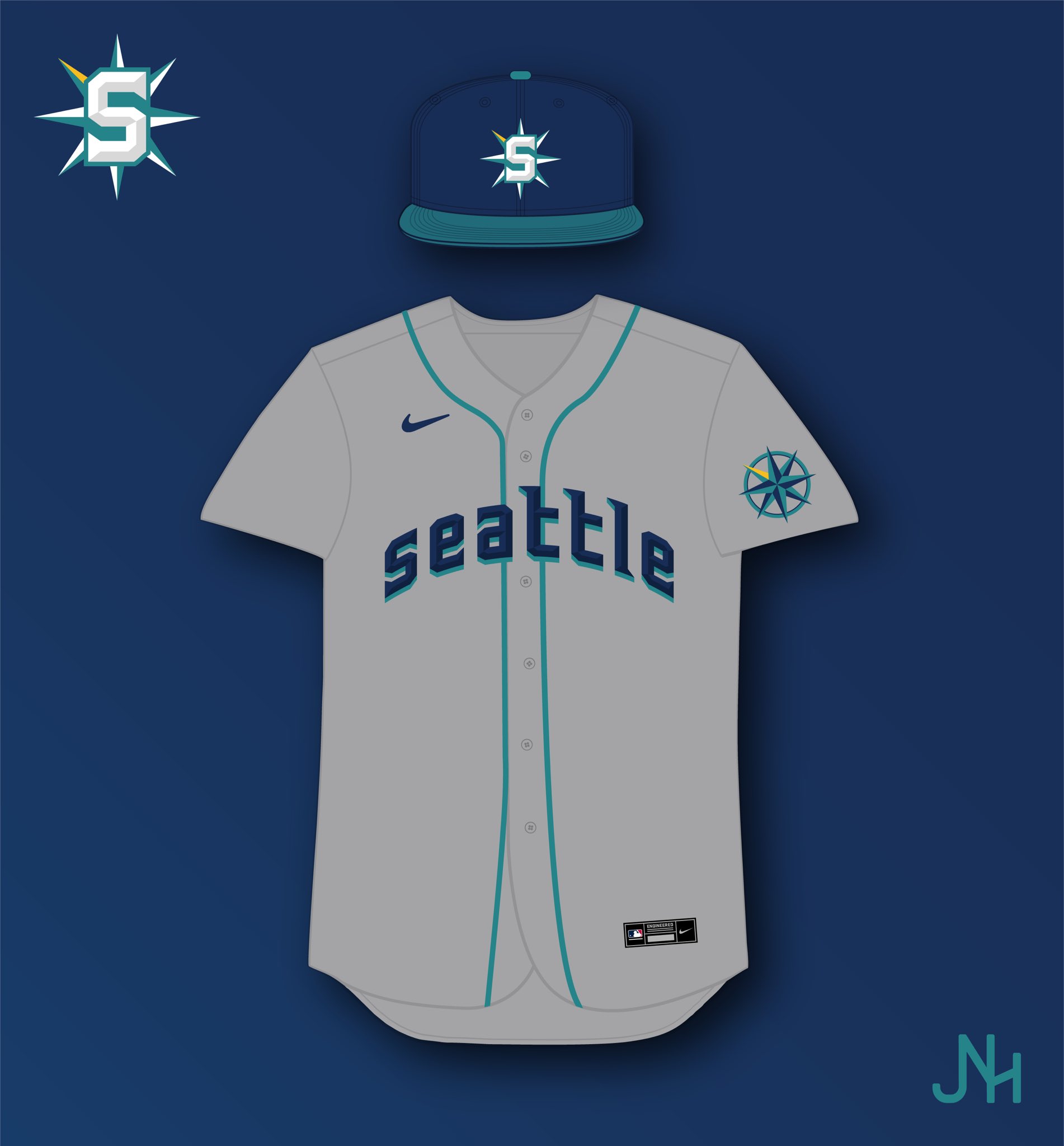
4 hours ago, colinturner95 said:
The updated S-compass logo is gets sort of muddled when it's on a white BG. A thinner white outline on the inside of the S might help there. But the northwest compass point is the perfect touch.
Yeah, that was definitely something that was bothering me but I couldn’t quite figure out the best way to fix it. I did try a thin white stroke on the inside, but still wasn’t completely satisfied. I think I almost like an approach like this better, just a larger compass rose patch on the sleeve of the white jersey and also a matching gray jersey as requested by @VampyrRabbit:
-
2
-
 1
1
-
2
-
-
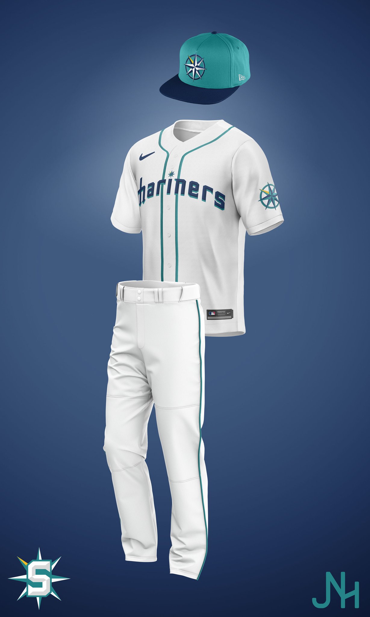
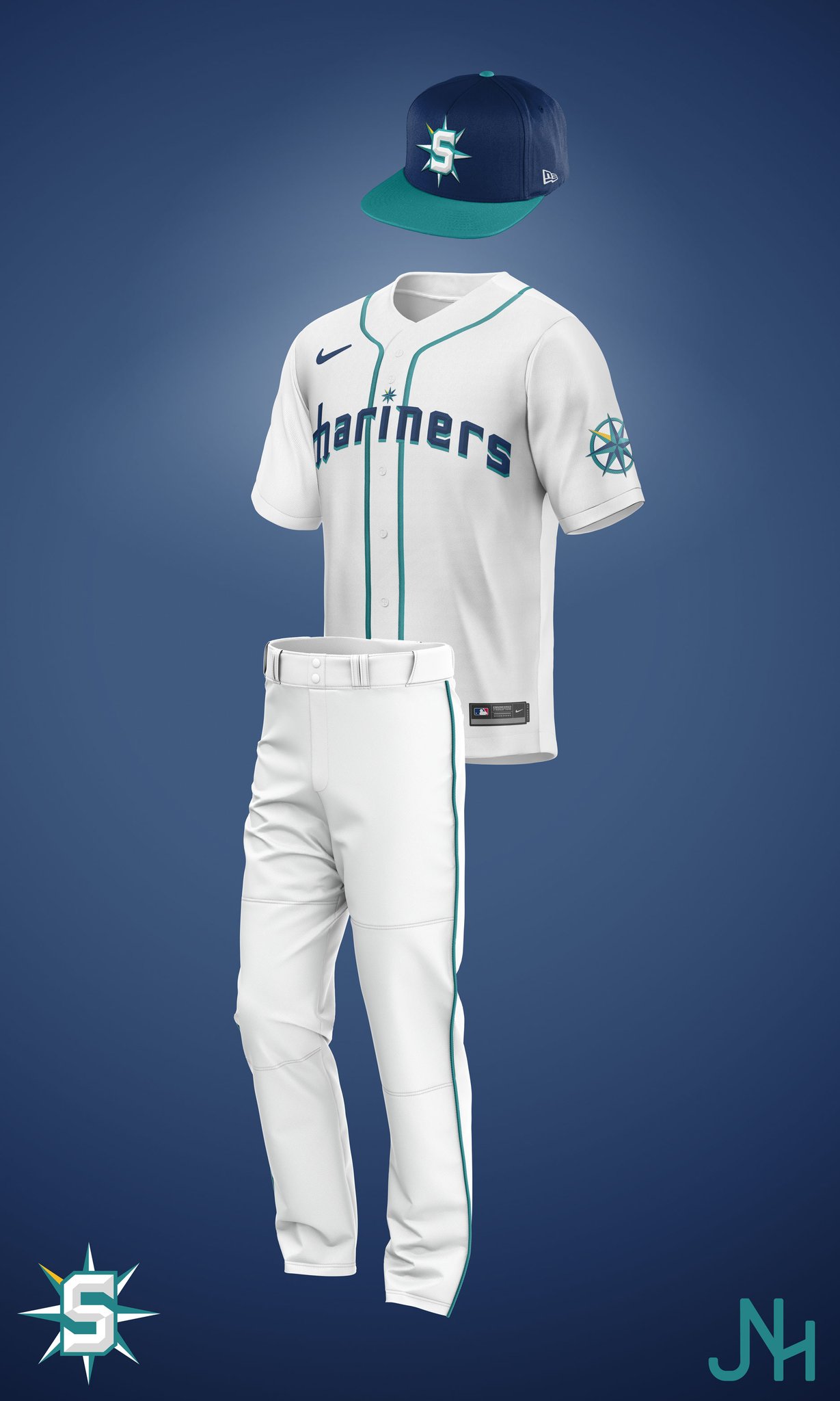
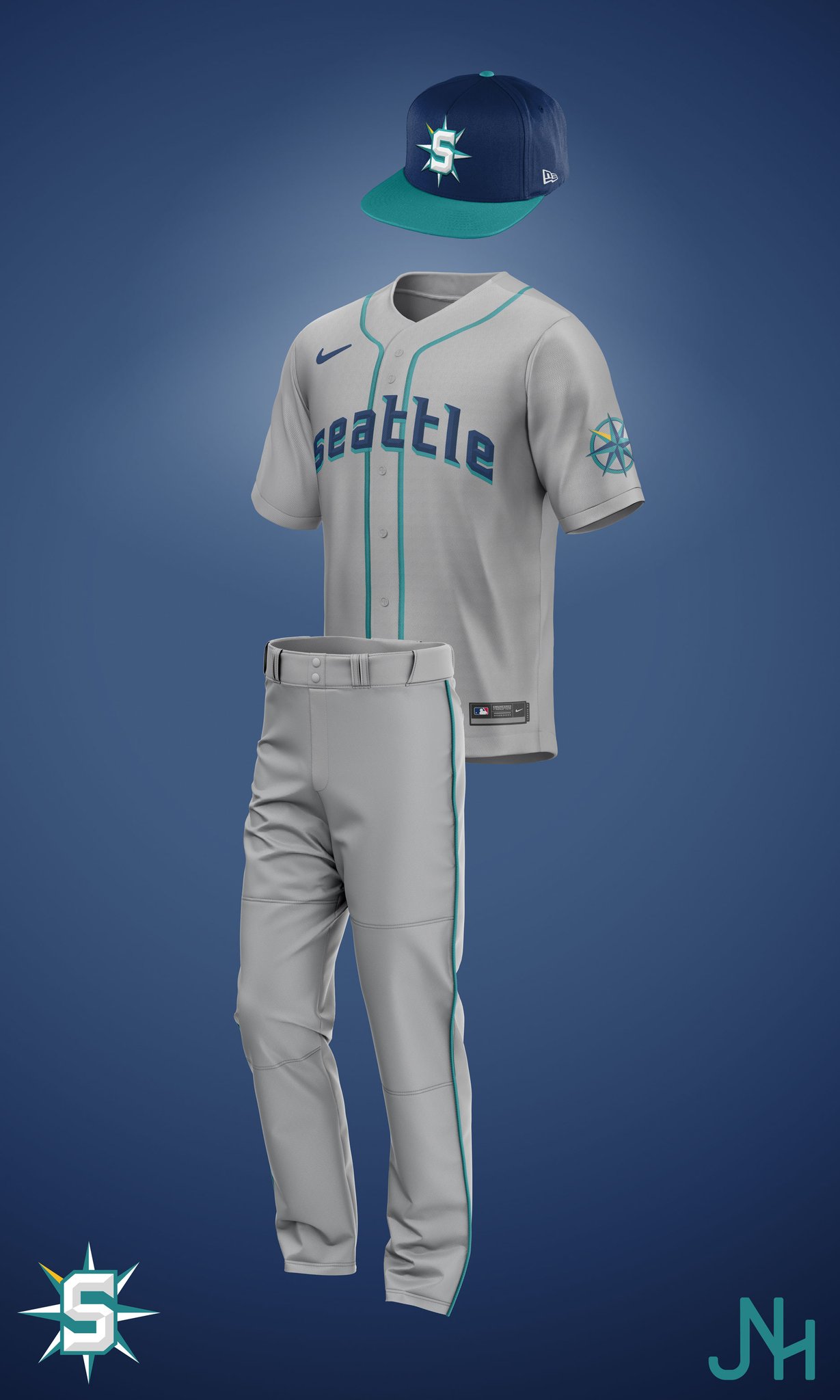
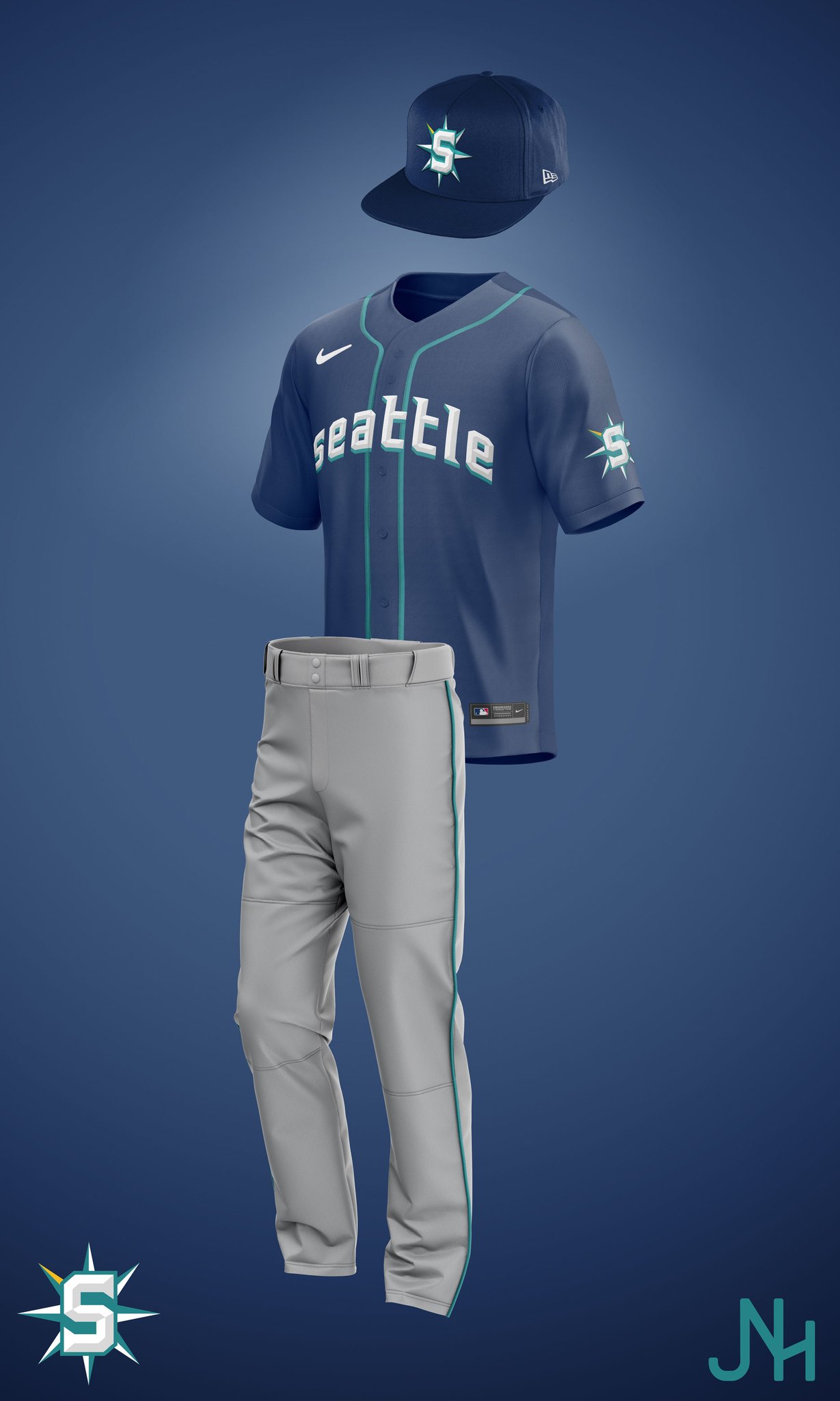
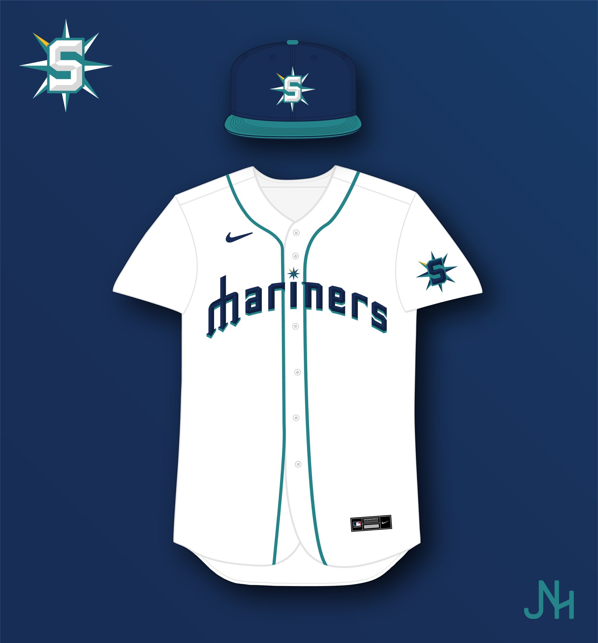
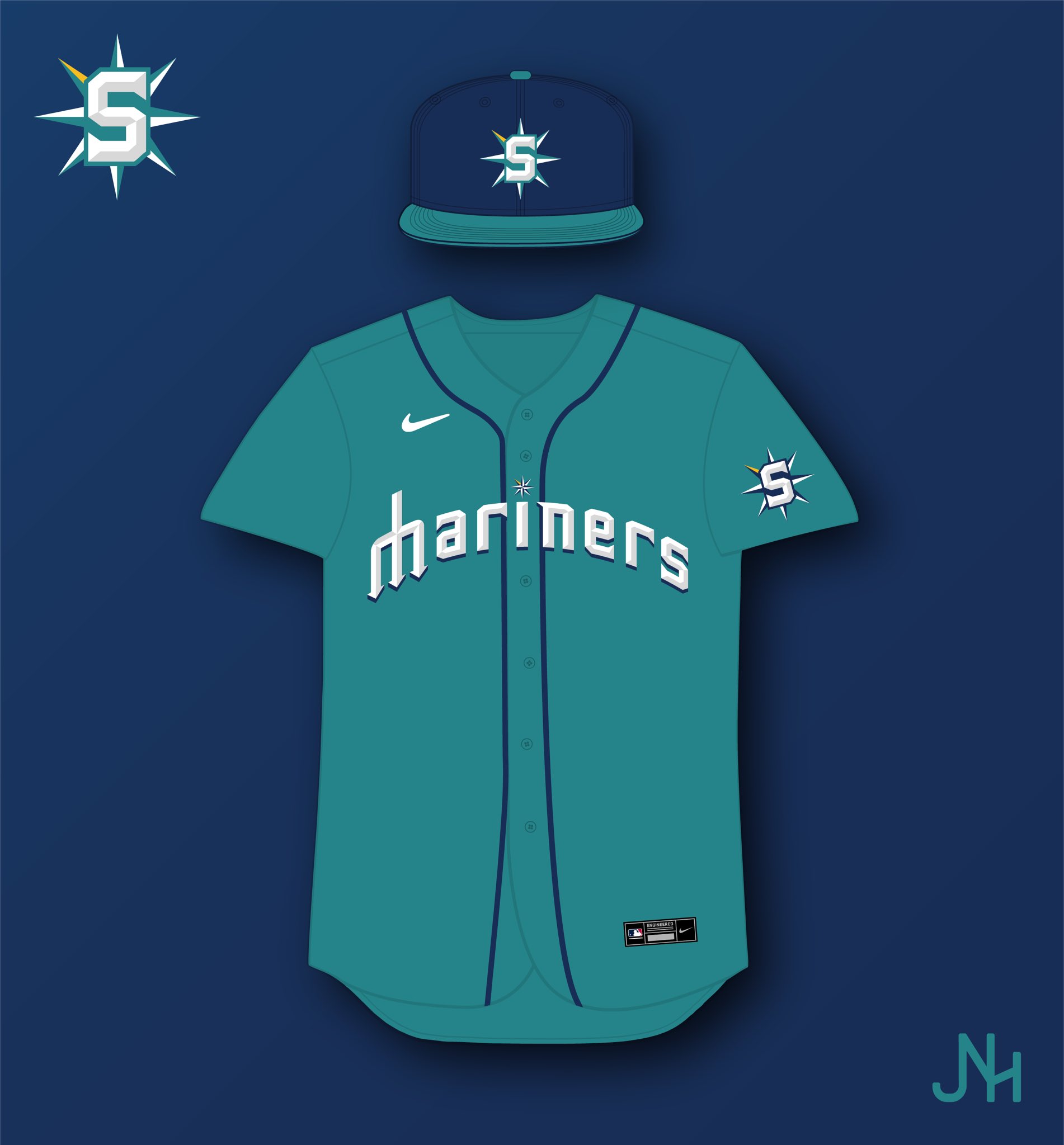
When the Mariners City Connect jersey first leaked, one of my first thoughts was how much potential the wordmark had for being the basis of an updated identity system. Ditto for the S logo on the leaked prototype socks. As a Mariners fan myself, I think the current identity has a lot of good bones but the logos and typography have looked dated for a while. Plus, the navy jersey is and has been a train wreck for quite some time. This proposed brand refresh addresses those issues and builds on the current identity while also nodding to the past.
- Primary cap logo is a tweaked version of what was seen on the leaked prototype CC socks. The compass rose has eight evenly sized spikes, with a yellow highlight pointing northwest. I was inspired in part by the inclusion of yellow in the All-Star Game logo.
- The teal-brimmed cap becomes the primary cap for both the white and teal jerseys. Could easily be worn with the navy jerseys as well.
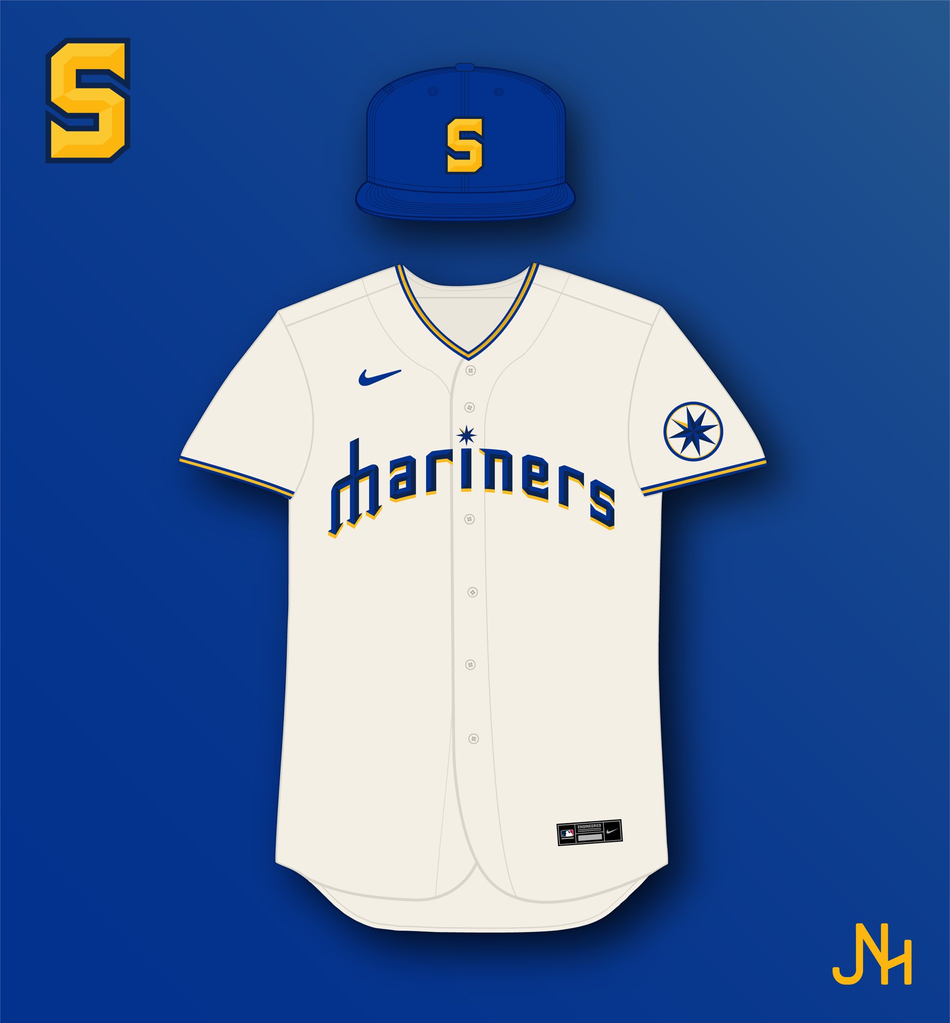
- Headspoon piping, used by the M’s since 1987, remains. The color of the piping matches the color of the drop shadow on the white, teal, and navy jerseys.- I personally would prefer a gray uni, but M’s fans love the cream set. With that in mind, I made a new version of it with collar and cuff striping like the new City Connect (just with the blue and yellow swapped). Cap is solid blue with a stand-alone S as a nod to the both the Pilots and the Mariners’ ‘87-92 caps.
- The trident is used in the “Mariners” wordmark, but the compass rose remains as the primary identifier. Frankly just a matter of personal preference there.
-
7
-
2
-
3
-
-
Just now, lahaye7 said:
Navy is a current team color, but pairing it with this just looks like a poorly dressed high school team.
It’s officially black:
-
1
-
-
Here’s the Mariners’ full City Connect uniform:
I cannot believe they went with black pants. I hadn’t even considered that possibility because it frankly seemed too dumb to be a realistic option. Can’t believe I’m saying this but I would’ve much rather seen blue pants. I do like the beveled trident on the cap, and I guess I’m fine with the black bill. Really though, these would’ve been close to a home run with a yellow brimmed hat and white pants. They got the jerseys right IMO but fell flat after that.
-
5
-
1
-
-
Oh, so we’ve officially reached the misogynist point of this discussion? Sheeeeessh.
Hey siri, play “Hey Jealousy” by Gin Blossoms.
-
4
-
 4
4
-
 1
1
-
 5
5
-
1
-
 2
2
-
 1
1
-
-
Columbus, please keep wearing this combo:
-
8
-
-
We had a full slate of US Open Cup matches last night and will again tonight, but I’m gonna jump ahead and give my predictions for this weekend’s MLS matches. * = confirmed shirt and/or full kit choice.
Nashville (all-yellow) vs. Atlanta (stripes/black/red)
Columbus (all-yellow) vs. Miami (all-black)
DC (all-black) vs. *Charlotte (blue/white/blue)
*New England (all-navy) vs. Cincy (all-orange)
Orlando (all-purple) vs. LAG (all-white)
Toronto (gray/red/gray) vs. NYCFC (all-city blue)
Austin (green/black/black) vs. San Jose (all-light gray)
Chicago (navy/navy/red) vs. NYRB (all-yellow)
SKC (all-navy) vs. Montreal (all-gray)
St. Louis (all-pink/red) vs. Portland (all-green)
*RSL (red/navy/red) vs. *Seattle (all-green)
Vancouver (all-white) vs. Colorado (burgundy/light blue/burgundy)
Minnesota (all-black) vs. Dallas (all-white)
-
25 minutes ago, McCall said:
I'm not on board with them changing or even bringing back the trident... but... with this concept, purely from artistic objectivity, I would try dotting the (lower case) 'i' with a solid compass rose silhouette, as a nod to the current long-time identity.
I went back and forth on whether or not to dot the i but ultimately decided against it to keep it more consistent with the ‘77-80 and ‘81-86 wordmarks. I think the compass rose idea works a lot better on @MJD7’s concept than it did when I tried it on the City Connect-inspired mark.
Also, I see no reason why the compass rose and trident can’t coexist. In fact I personally wouldn’t be in favor of bringing back the trident unless the compass rose was still the primary identifier. I think something like this could work (would need some small tweaks).
-
8
-
1
-

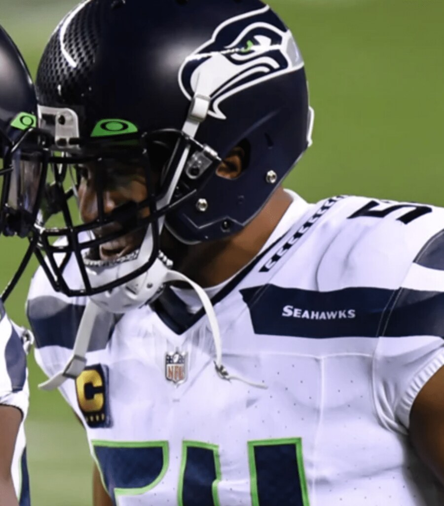


College Football 2023
in Sports Logo News
Posted
Not yet, but it’ll be the version that teams with UCLA stripes get. The catalog version with shoulder stripes has the horizontal seams as well. Based on the retail versions for sale, we’ll at least be seeing it in the NFL this year on the Seahawks, Colts, and Falcons. I have to assume the Falcons requested it because of the large chest wordmark; the Cardinals and OkSt. should’ve done the same.