


upperV03
-
Posts
6,365 -
Joined
-
Last visited
-
Days Won
44
Posts posted by upperV03
-
-
Good look at the pink keeper kit colorway:

This is probably my favorite with this current template, though I won’t be surprised if not very many teams use it. Works nicely for the Galaxy with the yellow accents.-
 2
2
-
-
The refs are going neon this year:
-
1
-
-
The Union will have Thomas’ on their upcoming secondary kits:
-
That does not look promising at all. Looks like it might have some sort of splotchy pattern on the front and sleeves (Adidas loves those), and the red printing doesn’t look good either. Club América has shown that a pale yellow/blue/red scheme can work really well (and Arsenal’s away last year), but I’m not holding my breath on this one.
-
A few looks at the star on FLEX Tools FC’s primary shirts:
-
 1
1
-
 1
1
-
-
Wanna find out what Providence is really all about? Here ya go:
https://www.truthaboutprovidence.org
As a Timbers & Thorns fan, the day can’t come soon enough that Providence’s name is off of our stadium and the Thorns’ kits. Many Sounders fans are bound to feel the same about their kits after this announcement.
-
2
-
 1
1
-
-
55 minutes ago, TacoCat83 said:
There is a white one as well
I know there are white/purple and pink/yellow colorways of this keeper kit template, but I haven’t heard whether or not those were made available to MLS clubs. Have you heard differently?
-
A look at the Quakes’ version of the new red keeper shirt:
And I believe I posted this last week, but here’s Andre Blake in the blue keeper shirt:
They’re pretty much identical to what was worn in the World Cup, although the socks for the blue kit are slightly different. The other available colorways will be black, yellow, and green (there may be one more, but not sure). -
The Red Bulls’ new travel gear and anthem jacket gives a glimpse at the likely color scheme of their new kit:
Wouldn’t surprise me if the kit ends up being similar to Arsenal’s away last year, but with the lighter blue:
-
1
-
-
Mockup of the full Toronto kit based on that leaked jersey pic^ and the shorts and socks that were seen at MLS Media Day. Really struggling to find anything positive to say about it.
-
23 minutes ago, hendocfc said:
Read on a listing on the same Foot Store website that provided a couple of leaks some time ago that Seattle's red shirt is inspired by Bruce Lee and will feature a "dragon inspired print". Not sure if I should/I'm allowed to link it up.
The Sounders sure do like their dead people!
-
1
-
1
-
-
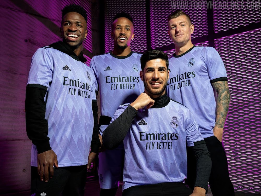
Here’s an idea of what San Jose’s new primary kit might look like. Not as confident in this one as the Orlando one I posted a couple days ago, but I do think it’s on the right track:
Based on this leak from MLS Media Day:If accurate, the jersey pattern would be recycled from Real Madrid’s current away shirt:
-
1
-
 1
1
-
-
The layered, ribbed Adidas stripes are by far my favorite part of this Adidas template. Having the flag colors on the underneath layer is a smart move for Italy.
Both kits are fine, I wouldn’t say either are exceptional and they both pale in comparison to the Puma 2020/21 Renaissance kits IMO. The marble on the blue kit still reads as more of a water ripple to me, and I think they either needed to add more gold accents to the shirt or scrap them altogether. The flag side/back hem stripe is great, though. The away is definitely the better of the two, but I can’t say I love the navy being used in the marble pattern when it’s already the primary accent color of the shirt. I do like the subtle gold veining, but shades of gray would’ve been a better complement to the gold in the pattern and would’ve been more true to what you most often think of with Carrara marble.
-
I love it when people on these boards tell on themselves

-
7
-
-
Feel pretty confident that Orlando’s new primary will look close to this:
-
5
-
-
-
38 minutes ago, SSmith48 said:
I wonder who the black jacket with green trim is for. Does anybody know who's wearing it? If it's an indication of a kit, it looks like it might be pretty unique. Maybe Austin?
It’s Austin’s jacket. Black with green Adidas stripes on the outside, the mint color of their away kit on the inside. The shorts and socks of their new home kit are almost identical to those of their inaugural primary, with white Adidas stripes instead of the green like the jacket:
-
27 minutes ago, GriffinM6 said:
Is the Austin player that can be seen in the foreground in this photo wearing a credential lanyard? If not, looks like there could be a hot pink color on the new home kits?
7 minutes ago, BltzW said:I think the hot pink is a laynard.
Yeah, all the players had pink lanyards for their credential cards:
If you look at the collar of the Charlotte player’s jacket, it looks like the inside is the rumored purple color of their new secondary. You can also see how the inside of the Galaxy jacket matches the color of their already leaked secondary. LAFC’s jacket also has olive green on the inside.
-
Here’s a look at this year’s training gear. Expect to see more teams wearing versions of this as their supply starts to come in.
-
1
-
-
That could (should?) look really good for the Loons… but it does seem to be a pretty obvious copycat of Minneapolis City SC:
-
2
-
1
-
-
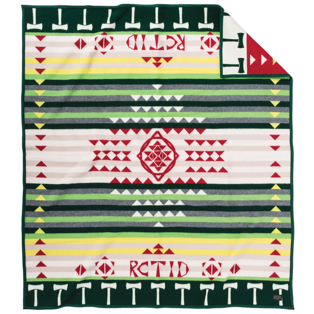
25 minutes ago, gosioux76 said:
You've just set the table for a future Pendleton blanket-inspired kit. Nice work.

They did do a blanket design contest in 2015 in collaboration with Pendleton…
-
4
-
-
3 minutes ago, Digby said:
Well I was going to ask. Do the Timbers have any specific plaid heritage? Like how the Blazers did this a few years ago but there was a reference to those signature Dr. Jack suits. In that sense the Timbers will probably finally have a PDX teal away kit in a few more years; hopefully not causing any apoplectic fits of rage from out-of-towners.Not really any specific plaid heritage, but there’s the lumberjack angle and I suppose the hipster flannel angle as well. Plus there’s the stripes on the PDX flag that can pretty easily form a plaid pattern. In a broader sense, Oregon has a pretty extensive history with woolen mills as well. I’ll be curious to see the marketing speak for the kit, as I could realistically see any of the above reasons being mentioned.
I really hope the Timbers never go the PDX carpet route. Now that the Blazers have done it, I think I’ve had my fix on that theme and I think most fans here would agree. The Timbers have had some PDX carpet hats and other merch, but I don’t really care to see more.
-
2
-
-
Mockup of what the Whitecaps’ new primary kit could look like based on what was seen at MLS Media Day (below):
-
1
-
-
42 minutes ago, aawagner011 said:
Timbers kit is fine, but too much white and not enough gold. As for NYCFC, I hope they have a pair of white shorts. That’s my favorite combo over both the all sky blue or even the navy shorts.
I kind of touched on this earlier, but while green & gold may be what non-Timbers fans associate with the Timbers nowadays (after the 2017 color change, at least), green and white and a green/white/gold scheme are just as synonymous with the Timbers around here. Since they’ve had three straight home kits that were more gold-heavy (or just green & gold, in the case of the 2017/18 home kit), I think it’s fitting to go more white-heavy this time around. Sort of a nod to the early MLS days, but also the pre-MLS eras and iterations of the Timbers when the scheme was often more green & white or green/white/yellow:
-
1
-


.jpg)

MLS kits 2023
in Sports Logo News
Posted
Those two have been up for a few days now. I believe Austin, Atlanta, LAFC, Nashville, NYRB, Seattle, and St. Louis are still the only ones active.