


upperV03
-
Posts
6,361 -
Joined
-
Last visited
-
Days Won
44
Posts posted by upperV03
-
-
According to the “Know before you go” email that the club sends out before home games, the Timbers will be wearing the pink rose kits at home against Seattle on Saturday. The last time they wore a non-green kit at home against Seattle was in 2016.
I have to assume the league stepped and said no more green vs. green matches, which is for the best from a contrast perspective. As a Timbers fan, I do find it incredibly frustrating that they’ll have to change because of the Sounders once again not having a kit that provides sufficient contrast. The same will happen to Austin later this year. Based on their most recent graphic for the match, it looks like the Sounders will be wearing their dragon kits so at least it’ll be secondary vs. secondary.
Every time this issue comes up I say the same thing: the home team should not have to change to accommodate the visitor. If it means Seattle has to go buy some cheap teamwear (even just shorts and socks), then so be it. Hell, Arsenal has worn grey keeper socks with their away kit a few times this year because it was necessary for clash purposes.-
 4
4
-
-
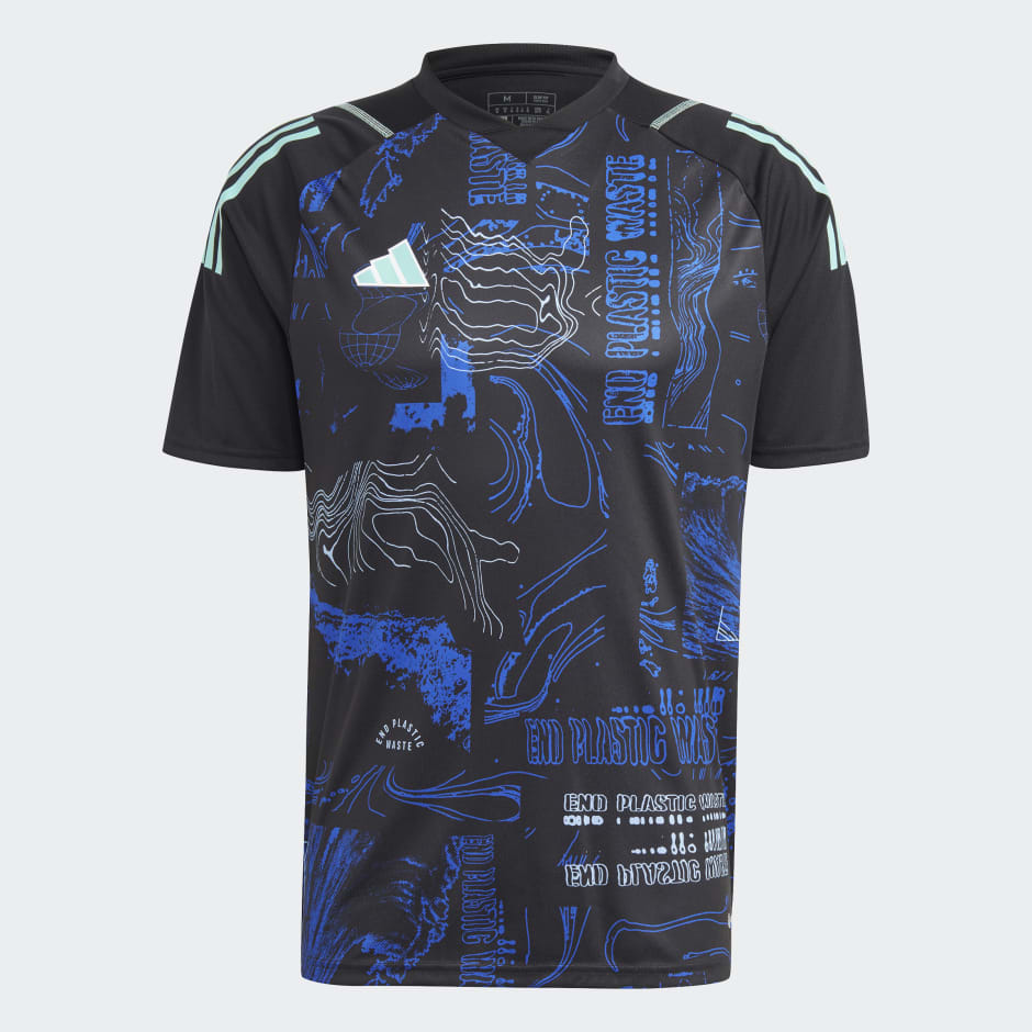
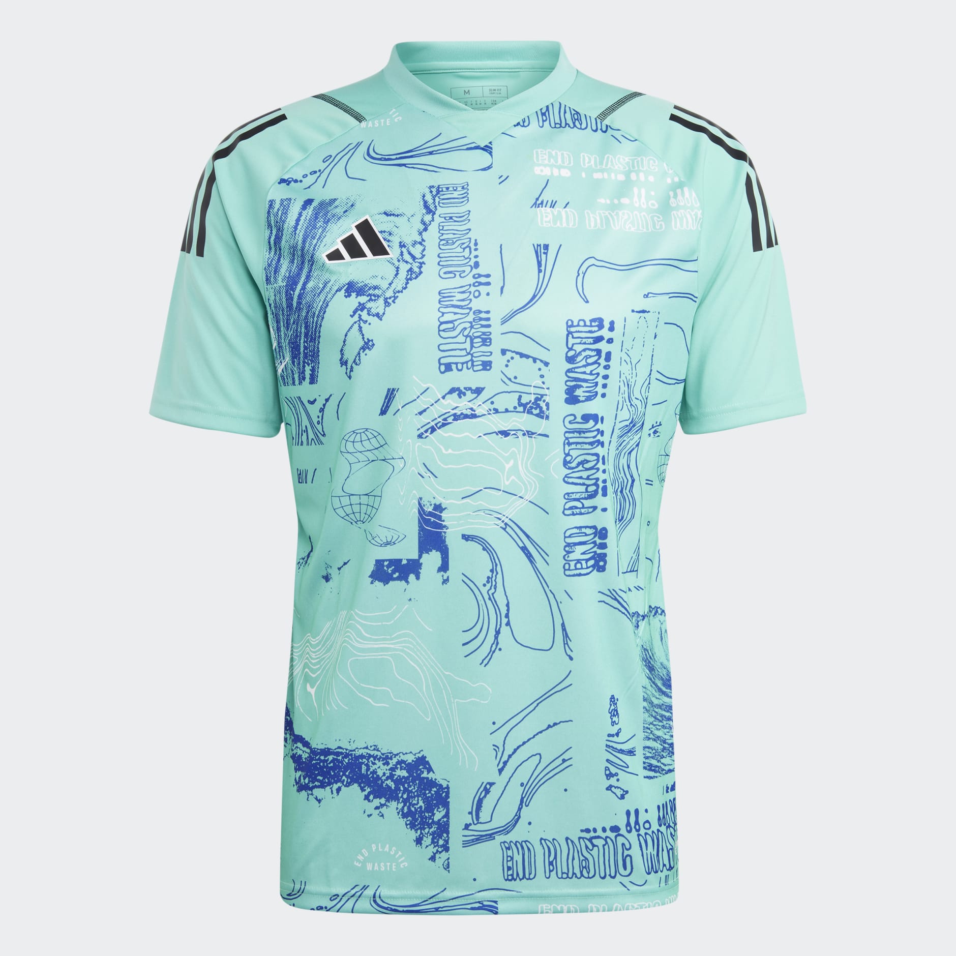
First look at this year’s Parley shirts, to be worn across the league next weekend:

Both are paired with shorts (and presumably socks) that match the base color of the shirt. The design is certainly more interesting than the last couple of years, but I still don’t care for them. Either have teams just wear the shirts as pre-match tops or have Adidas produce team-colored versions instead of forcing everyone to look the same.
Atlanta’s has already leaked, so we know that they’ll be in the black kit and Chicago, their opponents next weekend, will be in the turquoise.-
1
-
 3
3
-
 1
1
-
 2
2
-
-
15 hours ago, ThunderCeltic said:
Portland- Teal version of 2022-23 set honoring the carpet at the Portland airport
I can’t speak to the rest of ‘em, but for Portland this (thankfully) isn’t even remotely close.
-
 1
1
-
-
36 minutes ago, MJWalker45 said:
Columbus may be all black since they're having "90's Night" at the stadium.
New England has already confirmed all-navy in their weekly Matchday Guide article, so Columbus will be in yellow unless the article is incorrect.
-
1
-
-
Gonna go ahead and post predictions for this weekend’s matchups a little early. * = confirmed shirt and/or kit choice.
*Charlotte (blue/white/blue) vs. *Colorado (burgundy/light blue/burgundy)
Columbus (all-yellow or y/b/y) vs. *New England (all-navy)
*Montreal (all-gray) vs. DCU (all-black)
NYRB (all-yellow) vs. Houston (all-black)
NYCFC (all-city blue) vs. Nashville (all-black)
Toronto (gray/red/gray) vs. *Atlanta (mint/white/mint)
Austin (green/black/black) vs. Vancouver (all-white)
Chicago (navy/navy/red) vs. Philly (tan/light blue/tan)
*Dallas (all-white) vs. *RSL (red/navy/red)
Minnesota (all-black) vs. Orlando (all-white)
St. Louis (all-red) vs. Cincy (royal/navy/navy)
Portland (green/white/white) vs. Seattle (green/blue/green)
San Jose (all-black) vs. SKC (all-sporting blue)
LAG (all-white) vs. LAFC (all-black)
Will be very interested to see if Portland/Seattle does end up being green vs. green again. I have to assume it will be since the Sounders once again have an away kit that’s too dark to properly contrast. The Timbers could opt for pink, but they didn’t do that at home against the Sounders last year, and I personally do not wanna see that at all unless the Sounders also wear their away kits.
-
On 4/4/2023 at 9:03 AM, upperV03 said:
Interesting note for the Whitecaps, as their MLS NEXT Pro side has so far worn navy shorts with the new primary kit:
They of course have the WFC2 crest, but this suggests to me that navy shorts are an option for the first team as well. While I don’t mind the all-white look with their new kit, I hope the MLS side wears this combo at some point this year and next. I will say, I kinda wish the shorts and socks had white adidas stripes instead of light blue but that’s a relatively minor complaint.
The Whitecaps did actually debut the navy shorts last night against Portland:
Another note from yesterday, the Union debuted tan socks for their away kit:
-
1
-
 1
1
-
-
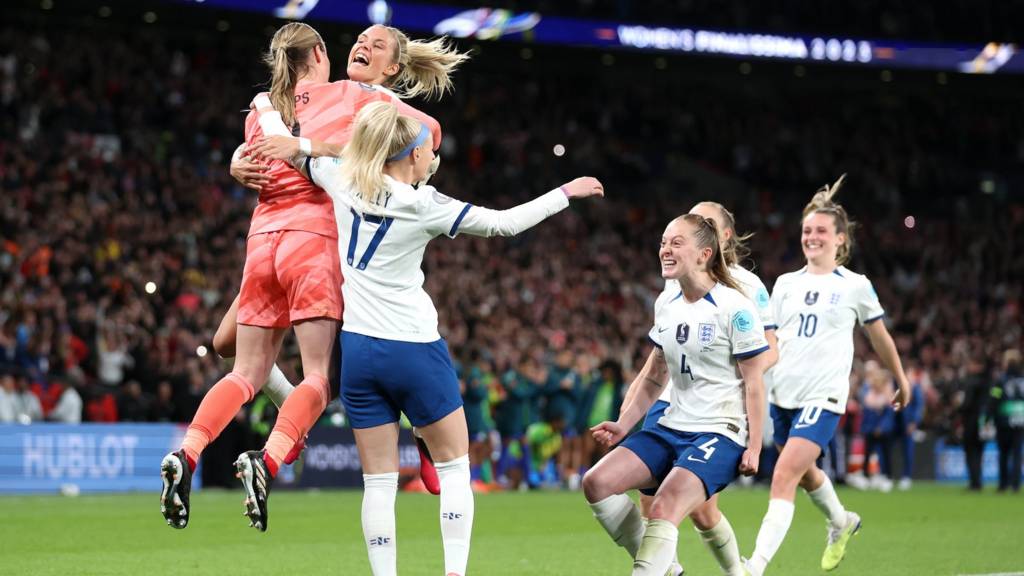
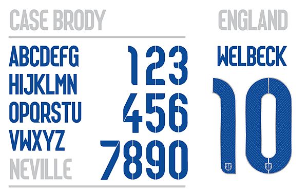
1 hour ago, MJWalker45 said:
England women look like they're using an older number font. It's much more legible than the previous numbers, but I was still surprised to see a throwback.
Here’s what the press release said about the typeface:
“The typography on the kits was produced by Neville Brody, a fixture in the England graphic design community.
Adapting the well-received fonts used for the England men’s squad in 2014, he and his team created a lighter font with adjusted angles to work with the women’s uniform size and scale.”I really enjoyed that 2014 typeface, so I’m happy to see it brought back (with some subtle tweaks, but still). I love both of the Lionesses’ new kits, especially that away.
-
2
-
-
Here’s a guess at this weekend’s matchups. * = confirmed shirt and/or kit choice.
Cincy (royal/navy/navy) vs. Philly (tan/light blue/light blue)
DC (all-black) vs. Columbus (all-yellow)
LAFC (all-black) vs. Austin (all-mint)
Miami (all-pink) vs. Dallas (red/blue/blue)
*New England (all-navy) vs. *Montreal (all-gray)
NYRB (all-red??) vs. San Jose (gray/black/gray??)
NYCFC (all-city blue) vs. Atlanta (stripes/black/red)
Chicago (navy/navy/red) vs. Minnesota (all-white)
Houston (all-orange) vs. LAG (all-white)
SKC (all-sporting blue) vs. *Colorado (burgundy/light blue/burgundy)
Nashville (all-yellow) vs. Toronto (gray/red/gray)
*RSL (red/blue/red) vs. *Charlotte (blue/white/blue)Seattle (green/blue/green) vs. St. Louis (all-gray)
Vancouver (all-white) vs. Portland (all-green)
Feel free to post corrections if/when more teams confirm their choices.
-
Interesting note for the Whitecaps, as their MLS NEXT Pro side has so far worn navy shorts with the new primary kit:
They of course have the WFC2 crest, but this suggests to me that navy shorts are an option for the first team as well. While I don’t mind the all-white look with their new kit, I hope the MLS side wears this combo at some point this year and next. I will say, I kinda wish the shorts and socks had white adidas stripes instead of light blue but that’s a relatively minor complaint.
-
5
-
-
Here’s an idea of what this week’s matchups might look like. * = confirmed shirt and/or kit choice.
Atlanta (stripes/black/red) vs. NYRB (all-yellow)
*Cincy (royal/navy/navy) vs. Miami (all-pink)
*Columbus (yellow/black/yellow) vs. *RSL (red/blue/red)
*LAG (all-white) vs. Seattle (dragon/black/black)*New England (all-navy) vs. NYCFC (all-city blue)
Orlando (all-purple) vs. Nashville (all-yellow)
Philadelphia (all-navy) vs. SKC (all-light blue)*Toronto (gray/red/gray) vs. *Charlotte (blue/white/blue)
Chicago (navy/navy/red) vs. DCU (all-white)
*Dallas (red/blue/blue) vs. *Portland (pink/white/pink)
St. Louis (all-red) vs. Minnesota (all-white)
*Colorado (burgundy/blue/burgundy) vs. *LAFC (all-smog green)
San Jose (all-black) vs. Houston (all-orange)
Vancouver (blue/white/blue?) vs. *Montreal (all-gray)
-
1
-
-
The NWSL kit situation is really frustrating because it seems like the clubs are in different tiers.
The Thorns are regarded by Nike as being in the top tier of their sponsorship deals, and as such receives fully custom kits, training gear, and other merch that’s generally on par with the likes of Barça, PSG, Inter, Liverpool, Chelsea, and Tottenham (USNTs, too). Not just from a design perspective, but from a tech perspective. The Thorns get Nike’s latest templates for both match kits and training wear.
Angel City, Orlando, and now Louisville seem to be on the tier below where they can get fully custom kit designs but are stuck using a 2 year old template and replica kit technology (sublimated polyester instead of the engineered knit).
The rest of the clubs have a couple of choices. If they want custom kit designs they can do that but tech-wise they’re stuck with Nike’s Digital20 template that’s the same as what college and high schools can get on Nike’s teamwear customization service and has been around since 2018/19. The other option is getting Nike’s newest teamwear template, which is plain but at least has the engineered knit fabric that’s seen on authentic kits.
The NWSL is arguably the premier women’s football league in the world, and yet the Thorns are the only club that gets the treatment befitting of that. It certainly helps that they’re in Nike’s backyard but it would be nice if the other clubs could be brought up to that level.
-
3
-
-
52 minutes ago, MJWalker45 said:
You can't even see the flame pattern on it.
Not from that angle, but you could from the front and side:
In any case, not sure what these have to do with the discussion of chrome helmets because they were definitely not chrome.
As for fully chrome helmets, the Ducks did it best with their original 2012 Rose Bowl lids. Every chrome helmet that’s come after (including by the Ducks) have just been a pale imitation. Not talking about helmets with chrome/metallic accents or decals, I’m talking specifically about helmets where the shell itself is/was chrome.
-
2
-
-
Definitely some strange matchups yesterday. Portland/LAG kind of just looked like the Timbers having an intrasquad scrimmage, although the colors did really pop in the sun:
On TV, Charlotte/NYRB looked more like Orlando vs. Columbus or Nashville:
In addition to Portland, Charlotte, and Columbus, DC and Houston also wore their secondaries at home.
-
The Galaxy posted on Twitter yesterday that they’ll be wearing their green secondary kits in Portland on Saturday. The home team gets first choice on kits (unless the league has to step in for clash purposes), so the Timbers are apparently choosing to wear their pink kits. My guess on the reasoning for that is because the Thorns have their season opener on Sunday, so sort of a way to honor them. It’s also the first weekend of spring, so I suppose it’s a fitting time to wear the roses at home. While I’d prefer the Timbers stick to their primaries at home (especially if the alternative is the visitors wearing green), this will make for a better kit matchup than all-green vs. all-white.
A few other teams have announced what kits they’re wearing this weekend, so here’s a guess at all of the matchups. Once again, * = confirmed kit choice or at least confirmed shirt choice.
*Portland (pink/crimson/pink vs. *LAG (all-green)
*Charlotte (all-purple) vs. NYRB (all-yellow)
Columbus (all-black) vs. *Atlanta (mint/white/mint)
*DC (all-white) vs. *New England (all-navy)
Miami (all-pink) vs. Chicago (all-navy)
Philadelphia (all-navy) vs. Orlando (all-white)
Austin (stripes/black/black) vs. *Colorado (all-light blue)
*Houston (all-black) vs. *NYCFC (all-city blue)
SKC (all-light blue) vs. *Seattle (dragon/black/black)
Minnesota (all-black) vs. Vancouver (all-white)
Nashville (all-yellow) vs. Cincinnati (royal/navy/navy)
*RSL (red/blue/red) vs. *St. Louis (all-light gray)
LAFC (all-black) vs. FCD (all-white)
San Jose (all-black) vs. Toronto (all-white)
I’ll update this post if/when more teams confirm their kit choices.
-
46 minutes ago, Lumbergh said:
The pinstripes on this uniform are actually red. I see it while watching the game tonight during closeups.
They’re actually navy and red, intertwined in a zigzag/DNA-like design;
-
10
-
-
Several interesting matchups yesterday other than the ugly Seattle/LAFC game.
Stripes vs. roses in Atlanta:
White/black/black vs. dark/light/light in Dallas:
Houston/Austin with the appropriate St. Paddy’s matchup:
I don’t remember San Jose having black shorts for their away kits last year, but that’s what they wore yesterday in St. Louis:
Always strange to see the Galaxy in an away kit at home (especially with the opposition in white), but their new kit is so good that I don’t even mind:
-
I will say, it is kinda fun that depending on how you look at it the front of the shirt can look like it has a shrimp tail on it, a depiction of a gutted fish, or maybe even a crossaint!
-
 1
1
-
-
About the only good thing I can say about the Seattle kit is at least they finally got the sponsors and names/numbers to match the color of the adidas logo and crest. Other than that I do not like how it looks in action at all, especially the inexplicable black shirt back that not only looks bad but is also a very impractical choice for clash purposes. They’ll almost surely force Austin to change at home again and will probably cause more green vs. green matches in Portland.
Oh, I actually did think of one more good thing to say about Seattle’s kit: it’s way better than LAFC’s, but that’s really not saying much.
-
1
-
-
Here’s an idea of what this weekend’s matchups might look like. * = kit choice confirmed by the team.
*Seattle (red dragon/black/black) vs. LAFC (all-smog green)
Atlanta (stripes/black/red) vs. *Portland (pink/white/pink)
Montreal (all-gray) vs. Philadelphia (all-navy)
*New England (all-navy) vs. Nashville (all-yellow)
New York Red Bulls (all-red) vs. Columbus (all-yellow)
NYCFC (all-city blue) vs. DC (all-black)
Orlando (all-purple) vs. *Charlotte (blue/white/blue)
Toronto (gray/red/gray) vs. Miami (all-pink)Chicago (all-navy) vs. Cincinnati (all-orange)
*Dallas (white/black/black) vs. *SKC (dark blue/light blue/light blue)
Houston (all-orange) vs. Austin (stripes/black/black)
St. Louis (all-pink/red) vs. San Jose (all-black)
*Colorado (burgundy/blue/burgundy) vs. Minnesota (all-white)
LAG (all-teal) vs. Vancouver (all-white)
Edit: Updated with the info from @Saathoff.
-
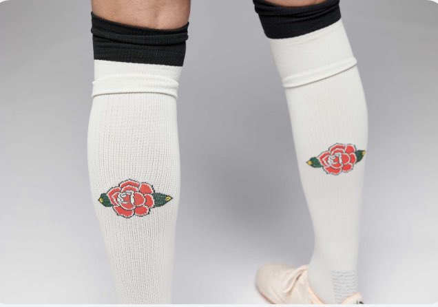
I think it’s pretty great. I think it’s an example of committing to the joke while also being a pretty true-to-life representation of the city and fanbase. I do find it a bit ironic that a bunch of the Thorns fans I’ve seen complaining about it are ones who have either contributed to tifos/signs with a similar artistic style and/or are the ones most likely to have tattoos similar to the ones on the jersey. My favorite parts of the shirt are the use of the originally colored crest and the incorporation of the stars into the tattoo design. My favorite part of the kit as a whole has to be the green shorts, which also have some nice rose detailing around the crest:
Nice little rose detail on the back of the socks as well:
-
5
-
-
The typeface isn’t bad at all, I’m mainly just glad they focused on evolving the current one instead of reinventing the wheel. I think I prefer the curvatures of the current typeface, but I don’t mind the changes and can appreciate that they put an emphasis on increasing legibility. I’m definitely a fan of the increased size as well as the tonal pattern in the numbers. I haven’t seen confirmation that the color options will remain limited, but it certainly seems so. Certainly disappointing if true, especially because they could easily add 2-3 more options and it’d make a big difference on quite a bit of kits.
I am a big fan of the stand-alone lion being used for the sleeve badges.
-
1
-
-
52 minutes ago, PaleVermilion81 said:
Seeing MNUFC in person tonight, I love that kit under the lights. Very vibrant.
Watching on tv, I thought it looked great in the few shots that showed it from the chest up. Other than that, it bugged the hell out of me lol.
-
1
-
 1
1
-
-
Apparently St. Louis does have navy shorts in the rotation, as they’re now on sale on MLS Store:
They’re for the away kit, but they’d be well served wearing them with both kits. Would improve both looks substantially.
-
7
-
-
Looks like the league and Apple (sort of, not really) learned their lesson after Week 1’s light pink vs. gray Miami/Montreal matchup:
Ironically I really don’t think there would’ve been an issue with Nashville’s bright yellow, or at least certainly not as much of an issue as Miami’s light pink vs. Montreal’s gray. In any case, this is pretty dumb when Montréal literally wore their old primaries with the new badge in preseason. The home team should not have to accommodate the road team in a case like this. Montreal should have to wear their old kit or go buy some cheap teamwear before making the home team change (although I doubt Nashville minds showcasing their new kit @ home again).
-
3
-


/cdn.vox-cdn.com/uploads/chorus_asset/file/24519571/1248576430.jpg)


:format(webp)/https://www.thestar.com/content/dam/thestar/sports/soccer/mls/2023/03/19/leerdam-helps-galaxy-earn-1-1-draw-with-whitecaps/20230319010324-64169ce7eb18302e8a49d052jpeg.jpg)


MLS kits 2023
in Sports Logo News
Posted
Then you have the red/green colorblind issue, although the league has allowed that to happen quite a few times over the years. That said, green/white/white vs. red/black/black or even green/white/green vs. red/black/red definitely would’ve been better than the green vs. green from the last few years. The biggest issue is that the league classifies the Sounders’ primaries as a “light” kit, allowing them to go with dark colors for their secondaries. The league really started to clamp down on the one dark/one light kit rule back around 2017/18, and yet the Sounders were able to go from having a white away kit in 2017/18 to now three consecutive dark secondary kits.