


upperV03
-
Posts
6,360 -
Joined
-
Last visited
-
Days Won
44
Posts posted by upperV03
-
-
Luckily for the Timbers, the new jerseys were initially manufactured without the sponsor logo so there should be some stock laying around. It’ll take a while for new runs of the jerseys to get produced, though. The most pressing thing is for the EQ staff to get jerseys ready for matches, but I believe they received blank shirts (both the primary and new secondary) before the season and were applying the DaBella logo in house anyways. Here’s my thought on what they’ll do for the rest of the season:
-
 6
6
-
-
On 2/27/2024 at 10:48 AM, MJWalker45 said:
I'm guessing they want to stand out and go home vs home kits when playing Seattle.
I was referring solely to the yellow color, not the red. I’m thrilled that they’ve gone back to red primaries, they never should’ve gone away from them. I’m still very lukewarm on the yellow accents, though.
In any case, my favorite part of the new red kit is easily the socks:

-
5
-
-
37 minutes ago, Digby said:
They've all dropped today. Everyone gets a bespoke primary and a secondary in this diagonal-gradient aesthetic. Too lazy to paste all the links so here ya go: https://nwslshop.com/collections/2024-unisex-jerseys
Lots of bold choices, some good and some bad. That San Diego sunset pattern jersey is the obvious banger of the year.
Of particular note: Portland is back to red at home and seems to have changed its color scheme to red with lime yellowish-green. Bay FC has that navy logo but their shirts are all varying shades of grey? Seattle Reign has the classic logo back but is using a navy base with metallic gold trim, none of the dark teal or silver they had like the old days. Washington seems stuck in year two of this weird black/yellow temp scheme.
The lime yellowish-green is just for these kits, not indicative of a brand change. There isn’t really reasoning given for the color, other than the usual marketing speak about joy, passion, energy, etc.
-
The Ducks just dropped their absolutely gorgeous throwback unis:
Perfection. No notes.
-
12
-
 2
2
-
 1
1
-
-
The league doesn’t appear to be posting the kit assignment graphics again this year (sigh), but here’s my guess at the rest of this week’s matchups. An * indicates a confirmed choice.
Columbus (new yellow/black/yellow) vs. Atlanta (red/black/red)*LAFC (new all-black) vs. *Seattle (new green/blue/white)
Charlotte (new blue-ish/white/white) vs. NYCFC (new all-black)
*DCU (new all-black) vs. *New England (white/red/red)
Orlando (all-purple) vs. Montreal (new all-light blue)
Philadelphia (new all-navy) vs. Chicago (white/light blue/white)
Austin (green/black/black) vs. Minnesota (all-white)
Dallas (new navy-red/navy/navy) vs. San Jose (new all-white)
Houston (all-orange) vs. SKC (new all-navy)
St. Louis (all-red) vs. RSL (gold/blue/gold)
Portland (all-green) vs. Colorado (all-light blue)
*Cincinnati (new all-cream) vs. *Toronto (gray/red/gray)
Nashville (new yellow/blue/yellow) vs. *NYRB (new red/black/red)
LAG (new all-white) vs. Miami (all-black)-
1
-
-
I said this when it was first “unveiled” by the Hawks, for my money it’s the best away kit ATL has had. That said, the more I look at it the more I think they should’ve swapped the yellow and light blue or forgotten the light blue altogether.
-
I didn’t see anyone post a picture of the full Whitecaps kit yesterday, but it’s too good not to share:
White shorts/navy socks would be a more fitting combo for the Caps’ kit history, but I love the Chelsea-esque combination. I can’t remember another MLS team wearing a kit combo like this, at least not as a first choice combo. I’ve long thought Orlando would be a natural candidate to wear a Chelsea-esque kit combo for their primary kit.
-
5
-
-
2 hours ago, DG_ThenNowForever said:
They wish. The standard Sounders fan is a combination of bearded or balding, is either incredibly skinny or incredibly not, and has never looked cool in their lives.
If you don't believe me, do a scan of the ECS. Their hearts are in the right place but fashion sense definitely not.
Seattle wishes that was their typical fan. The hipster shoot looks ridiculous.
They made no mention of it in the kit unveiling, but within Adidas Seattle’s new kit is apparently dubbed “The Macklemore Kit”. It helps to explain the nauseating stripes and the ridiculous hipster shoot. This is straight from the head of club football apparel at Adidas:
Now why didn’t the club make mention of it during the unveiling? Probably because they’re saving it for a future tie-in or someone within the club realized how embarrassing it was.
-
 1
1
-
 1
1
-
 1
1
-
 1
1
-
-
6 minutes ago, MJWalker45 said:
Are the shorts green, or white? Because I haven't seen them yet. I'd expect them to be green, but seeing what happened with New England who's wearing the same template, who knows?
They will have cream and green shorts options. I suspect cream will be used more.
-
3
-
-
24 minutes ago, VampyrRabbit said:
The colors on the crest not matching those on the kit and the solid green back of the jersey still drag the kit down IMO.Not only that, but the “Heritage Aqua” is really just a Carolina blue and doesn’t match the aqua in the crest at all. There’s a massive disconnect between the kit and the badge, both stylistically and in terms of the color palette. The badge is very vibrant and modern, yet it’s slapped on a kit that attempts to be overly retro-for-retro’s sake. It seems like a classic case where the kit design was done without consideration being given to the new crest and brand colors. On their own, I really like the shorts and socks. But they look like they’re screaming out for a white shirt similar to their Heritage white kits from 2017/18. And then the stripes? I just don’t get those at all, and I don’t think the two shades of green PLUS light blue PLUS white makes for an appealing shirt at all.
As always, I’m a Timbers fan so my viewpoint on anything Sounders-related is clouded by a puff of fish-scented air.
-
4
-
-
11 minutes ago, Digby said:
I guess asymmetric socks would be a real headache for the equipment manager?
Perhaps, although a lot of players like to get new socks (in package) for every game. I think it’s more that the players can’t be trusted to wear the socks on the correct legs.
-
15 minutes ago, Digby said:
Asymmetrical trim bothers me, especially if it's only on the shirt! Sigh. Also feel like, given the "24-7" theme, they could have used a more neon/vibrant shade for the blue instead of their standard, muted light blue. But maybe I'm reading too much into marketing.
The shorts do have the asymmetric trim, but the colors are flipped from how they appear on the shirt. It’s inexplicable though that the socks don’t have the asymmetric adidas stripes.
-
57 minutes ago, aawagner011 said:
Now having seen the full Portland kit, I think the logos would look best in the typical format with the crest over the heart. If the nature design creeped more into the middle of the chest, I’d like the current set up for the adidas logo and crest. As is, there’s too much open space. Looks like the logos would fit no problem.
There is plenty of room for the crest and Adidas logos to fit on either side of the chest, but I think that would just exacerbate the openness in the middle of the chest. Having the crest in the center not only fills that space but allows the crest breathing room to be more of a focus.
-
1
-
-
The Timbers have officially revealed their new secondary kit and it is a banger. I don’t love the horizontal DaBella logo but it does prevent the logos from occupying too much vertical space. The color scheme is wonderful and the hand-drawn tree detailing strikes the right balance between realism and artistic expression. The dark green shorts and the socks having lighter green turnovers are both really nice added bonuses:
The shirt is in partnership with the Nature Conservancy, whose logo appears on the back neck:
-
6
-
4
-
 1
1
-
1
-
-
The Timbers will be revealing their new secondary kit tomorrow morning.
-
39 minutes ago, aawagner011 said:
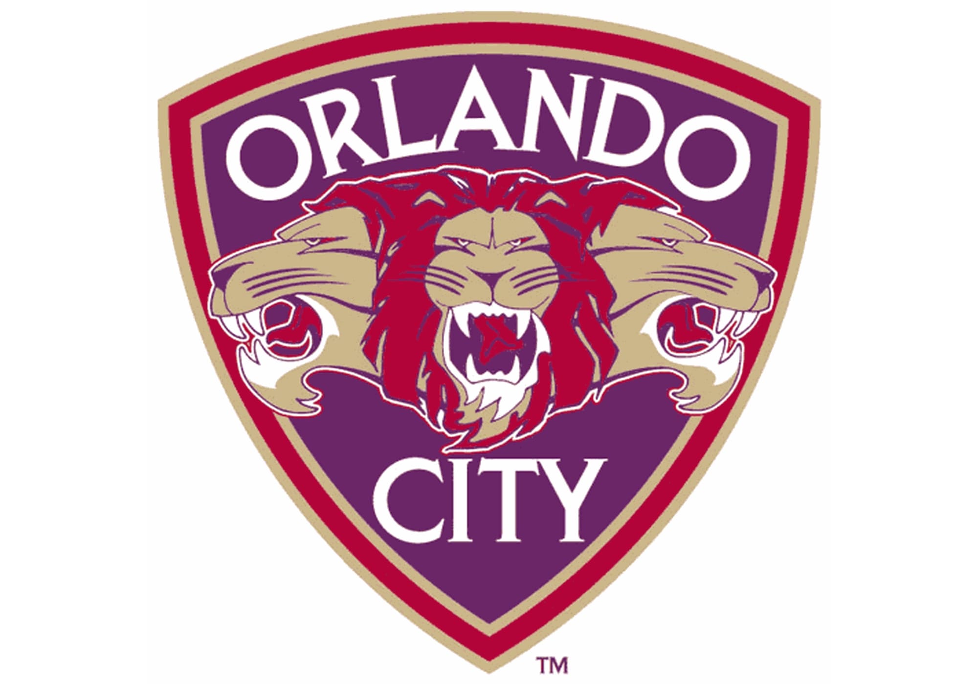
Better look at the new Orlando shirt. It’s fine for a one-off, but seeing this makes me glad they updated the crest when they jumped up to MLS.
The interesting thing is that they didn’t just slap the USL crest on there, they updated and modernized it a bit. This version has “Orlando City” arched across the top, whereas the USL crest had “City” below the lions. The lions themselves also appear to have been cleaned up substantially and now extend beyond the shield shape. Here’s the original USL crest for reference:
-
7
-
-
The shorts and socks for Minnesota’s new kit are black with white adidas stripes. That teaser for the shirt looks interesting, but I’m worried the kit as a whole will be mostly black and white with minimal blue accents.
In any case, they should’ve stuck with dark gray primaries anyways.
-
5 hours ago, hereandthere said:
Very nice kit. Has some Colorado 2023 feel to it, but way better executed. Only downside: all yellow will be completely absent from the replica jersey. But it is a regularly returning issue for MLS kits.
The side/back hem stripe will still be yellow on the replica. Your larger point still stands, though.
-
1
-
-
As a non-Atlanta fan, I think that immediately becomes the best away shirt in their short history. The flag tie-in feels natural and the color scheme is really pleasing. When I first saw the description of the shirt last week, I was worried the pheonix would have a distorted line graphic like the dragon on Seattle’s Bruce Lee shirt. Thankfully, it’s executed in a clean and clear manner instead.
-
4
-
-
5 minutes ago, VampyrRabbit said:
I was wondering why they were using a crest that was only used for a few seasons in the early naughties, one without an axe and that is pretty obscure and few wanted it to make an appearance. Guess Footyheadlines were as full of as a toilet at a music festival on the second day.
I think for some reason they thought that was the oldest crest in the Timbers’ history lol.
-
1
-
-
5 minutes ago, MJWalker45 said:
Reportedly, Portland's third will feature this throwback logo.
Nope. It won’t feature that color scheme, either. Based on what I know, it’ll feature their original NASL logo and a retro chest wordmark.
-
3
-
2
-
-
On 1/29/2024 at 11:33 AM, MJWalker45 said:
EA Sports leaked some NWSL jerseys as well. That Portland home shirt is so disappointing, if true. Did the Washington Spirit officially recolor their logo? Because they will not be wearing red or blue this year.
2023-2024 home jersey with iridescent logos.
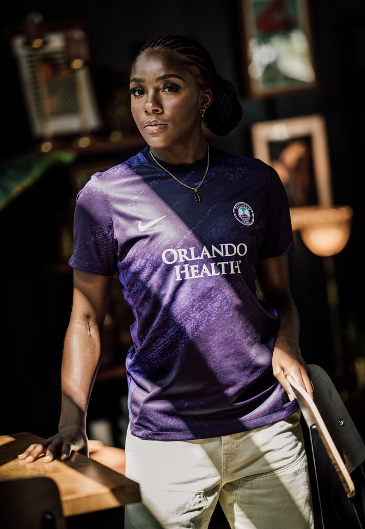
2023-2024 Orlando Pride home jersey. At least they won't clash with Houston if they wear their primary kits.
The move towards some women's teams trying to eliminate white shorts, I think Orlando has the best group of uniforms this year, for the moment.
That Thorns shirt is actually their away for this season. They’re returning to red for their home kits this year (although that pale yellow color will be an accent color on the home kit as well).
I can‘t confirm this quite yet, but I believe every team is actually getting two new kits this year and every team will be getting one kit with that diagonal gradient design seen on the Thorns, Spirit, and Gotham away shirt leaks. Previously the Thorns were the only NWSL club to get kits and training gear on Nike’s top-tier template but I think Nike is finally expanding that to all of the teams this year.
As for Orlando, that home kit from last year is getting replaced this year. I would bet on it having the diagonal gradient design. Either black and purple or two shades of purple.
-
1 hour ago, GeauxColonels said:
I’m truly curious, does anyone like the centered, stacked logo design? I’ve never been a fan.
For the centered logos to work, it has to make sense with the rest of the design. It doesn’t work on the new Miami shirt IMO because the centered logos are essentially the only design element. The centered logos work on the leaked Timbers and Union shirts:
In the Timbers’ case, the centered logos work because they’re flanked by the tree design on either side. For the Union, they work because they’re part of the center stripe design (also a return to “tradition” for them). A couple other similar examples from Adidas where the centered logos make sense IMO:
-
5
-
2
-
-
16 minutes ago, sky1324 said:
I dig it a lot. It reminds me of the Blue Ridge Mountains, and if they pair it with blue shorts I think it'll make for a really nice look. I like it a lot more than our current clash kit, anyway.
White shorts and socks can be seen here:


.jpg)


.jpg)
 as a toilet at a music festival on the second day.
.jpg)
.jpg)

.jpg)
.jpg)
.jpg)
2024 NWSL Kits/Branding
in Sports Logo News
Posted
I would agree with you there. I also like how the red badge pops off of the darker base color.
That’s a secondary logo for them, they’ve worn it on their shorts for a few years but not on the shirts (as far as I remember, at least).