


TheGiantsFan
-
Posts
1,415 -
Joined
-
Last visited
-
Days Won
3
Posts posted by TheGiantsFan
-
-
On 12/24/2022 at 1:01 PM, GriffinM6 said:
As a huge fan of Tillamook's products, this is fantastic. Linn County is spectacular as well.
Thanks so much!
I've been a huge fan of Tillamook's packaging and branding ever since its rebranding a few years back, so I'm glad I finally get to "work" with it a little bit
") On 12/24/2022 at 4:17 PM, harney said:
On 12/24/2022 at 4:17 PM, harney said:Sorry, I'm not too well versed in Oregon history, however from a quick Google search
https://www.oregonencyclopedia.org/articles/burns/
This encyclopedia website may be a great source. I know there is a similar state-wide encyclopedia for Georgia that has lots of interesting and detailed information, including some anecdotal bits of history great for basing a team identity off of. Seems like there is an annual Migratory Bird Festival, maybe that can be a start.
I ran into the Oregon Encyclopedia a while back, and it's proven to be a useful research tool alongside Wikipedia!
I was just curious because I thought you were a Harney County local with some insider knowledge
 On 12/24/2022 at 10:48 PM, vtgco said:
Always a special treat to see some quality Cascadian soccer content here! Hope your move has treated you and your partner well.
The counter-color collar plackets on Tillamook's away and Eugene are kinda odd, but those jerseys are otherwise really nice.
I like the logo for Tillamook. Even as colorful as it is normally, it looks even better when in just 1 color on the away! The idea of using it as a T monogram is a bit of a stretch though : P
Linn County's jerseys are really great; the best of the bunch so far! If I had any jersey suggestions, it'd be to ditch the second sleeve stripes (the peach one at home, the white one away), but otherwise they're perfect.
The logo is solid, especially that font, but I kinda want something inside that roundel... A full filbert?
Florence's and Oregon City's kits aren't far behind though, and I love their logos so much too : ) I love the dunes for Florence; I had a very pleasant visit there a while back. End of the Trail's home jersey is really classy, though I can't help but wonder if a white back would work?
Not feeling the banner on Portland's otherwise solid logo; maybe replace it with an "SC" to the right of the stem of the P. Also I think maybe yellow socks at home would be better than white?
Anyways, excellent work as always!
Oregon's been very pleasant! California will always have a special place in my heart, but I've really enjoyed the slower pace of life in Oregon, and I ended up getting my foot in the door as a Nike contractor
I've made the minor edits to the collar plackets that you've brought up. I decided to scrap Portland SC's banner entirely as I feel like a team of that caliber has an iconic enough crest to do without the banner (though putting "SC" on the lower-right of the "P" was part of my original sketches!). As for Portland's home socks, I think I'll just keep the socks white because of how minor yellow is in its branding.
Spoiler
I'm glad you enjoyed Florence and Oregon City's teams! You're totally right about End of the Trail's home kit having a white back, it does look better! I went ahead and switched the colors of the shorts and socks to better complement the predominantly-white top
SpoilerI'll work on Linn County's crest edits for the next post so I can give my poor laptop (I'm currently home in California for the holidays) a break
I'm excited to have you along for this one, and thanks for the detailed feedback as always!
---
North Division
Gorge Athletic
Hood River, Oregon
Championships: 0
DETAILS:
Spoiler-
 7
7
-
-
On 12/22/2022 at 2:29 PM, harney said:
Excited for Harney County's entry!
We'll get there soon enough! I do realize I should start working on more teams east of the Cascades

In the meantime, do you have any suggestions for what I should include for Harney County's team? I haven't quite started my research there yet
On 12/23/2022 at 11:56 AM, Blindsay said:Most Dramatic Fans in the League
The field they play on better be local grass…
On 12/23/2022 at 12:05 PM, Blindsay said:Also are you planning to put these in Football Manager?
Love the dramatic fans, and Linn County will definitely play on local grass!
I personally don't plan on putting these into Football Manager (I've never actually used that, myself), but it would be cool if someone's willing to do that!
---
Northwest Division
Tillamook County United
Tillamook, Oregon
Championships: 0
DETAILS:
Spoiler-
3
-
 4
4
-
 1
1
-
-
Central Division
Linn County Wanderers
Albany/Lebanon, Oregon
Championships: 0
DETAILS:
Spoiler-
8
-
1
-
-
On 12/5/2022 at 3:46 AM, Blindsay said:
Man it must be a pain to be a fan of the team and having to endure “ It looks like it’s the end of the trail for this player” or “ it’s the end of the trail for their season” every time they don’t win the championship
I'm sure they get tired of that one
---
South Division
Ashland Town
Ashland, Oregon
Championships: 1
DETAILS:
Spoiler-
5
-
1
-
-
On 11/27/2022 at 6:49 AM, TrueYankee26 said:
Lol I knew Blockbuster was going to be the sponsor
Hehe, it was inevitable
On 11/28/2022 at 10:17 AM, MDTrey4 said:These are great! Excited to see you back on the boards and for seeing how much detail you put into each of these concepts. Maybe one day in the far, far future, you'll be able to complete all 50 states!
Thanks so much!
I've been on these boards the whole time, just over on the General Design forum as I went through my license plate redesigns
Frankly, I probably won't have the personal interest to do leagues for all 50 states (I'm more interested in places that are closer to me and states I've been to). Some designers on here have done leagues for other states though, and those will suffice
On 11/28/2022 at 10:19 AM, raysox said:They're all good but Track Town is soooooo good. Great job, man.
Thanks so much dude!
I never realized that Eugene would end up having so many good visual references from its track scene
On 11/28/2022 at 10:36 AM, NicDB said:I know next to nothing about Oregon, but I love projects like this. Looking forward to seeing the rest of this league.
Thanks so much! Hopefully you'll learn a few things about Oregon from this series
---
North Division
End of the Trail SC
Oregon City, Oregon
Championships: 0
DETAILS:
Spoiler-
8
-
-
The first of Bend's two teams!
East Division
AC Bend
Bend, Oregon
Championships: 0
DETAILS:
Spoiler-
8
-
4
-
-
On 11/10/2022 at 5:36 PM, TrueYankee26 said:
Yeah this is going to be another great set of concepts

Thank you! I hope I won't disappoint with this league
On 11/10/2022 at 5:58 PM, Bomba Tomba said:Nice! I liked when you did concepts by hand but these are good too.
Will your old fictional league get a reboot soon? I had a couple of contributions there lmao
I realize now that I was indeed pretty limited by hand-drawn concepts, but I assure you these teams all start out as paper sketches still!
Unfortunately, I don't think I'll digitize my entirely-fictional leagues. I tried digitizing my Alton Baseball League last year (I think), but it kinda fizzled out as I'm more motivated these days to make fictional teams for real-life places around me
On 11/11/2022 at 6:03 AM, PascalHugo said:I expect a great job as usual! Come on my friend!!!
Thanks for the support!
---
South Division
Sporting Florence
Florence, Oregon
Championships: 0
DETAILS:
SpoilerI always get a kick out of the exploding whale story, and you can see it for yourself here!
-
9
-
1
-
-
I'm up against some pretty stunning designs in this round, so great job to you all!
- Wales #1 by gswansea
- Wales #2 by Josef_Bretones
- United States #2 by MDGP
- Ecuador #2 by dsaline97
-
2 hours ago, Brian in Boston said:
Rhode Island Pro Soccer will be unveiling the club name and crest for its Pawtucket-based USL Championship side today. The reveal is set to take place at The Guild Brewing Company in Pawtucket between 5:00 PM and 8:00 PM ET this evening.
They unveiled their look on Twitter this morning!
-
After redesigning license plates for the past few months, I'm back making to making fictional soccer teams!
Back in August, I moved from northern California to Corvallis, OR to follow my partner as she went to grad school at Oregon State University. In an effort to learn more about my new state, I decided that another fictional soccer league would be a fun way to go about that!
This is in the same universe as my California Soccer League and California Soccer League 2 concepts, where statewide soccer federations dominate American sports. For the sake of full creative freedom, all real-world teams (except for one!) don't exist in this world, so don't expect any Timbers concepts out of the Oregon League.
The Oregon League is a 50-team soccer league spread out across Oregon, with the distribution of teams correlating with the population of the state:
SpoilerI've already figured out the locations of the teams, but I'm free to any suggestions from y'all about how to uniquely represent Oregon communities through my soccer teams
With all that said, time to move on to the first two teams! I revamped my presentation templates to better show off the tiny details I put into my concepts, and those detail graphics will be inside spoiler tags.
---
Here's the first of the three Eugene-area teams!
Central Division
Track Town SC
Eugene, Oregon
Championships: 1
DETAILS:
Spoiler---
Followed by the first of five teams within Portland city limits
North Division
Portland SC
Portland, Oregon
Championships: 3
DETAILS:
Spoiler-
7
-
1
-
5
-
-
The Oregon League
2023 season
Northwest Division
AC Chehalem ValleyNorth Division
Club Sportif des DallesCentral Division
Club Atlético MarionSouth Division
Ashland TownEast Division
AC Bend---
---
Oregon League Map
SpoilerOregon League Logos
Spoiler-
4
-
-
-
Count me in for this one!
-
1
-
-
We've reached the golden finale for the Canadian leg of United Plates of America!
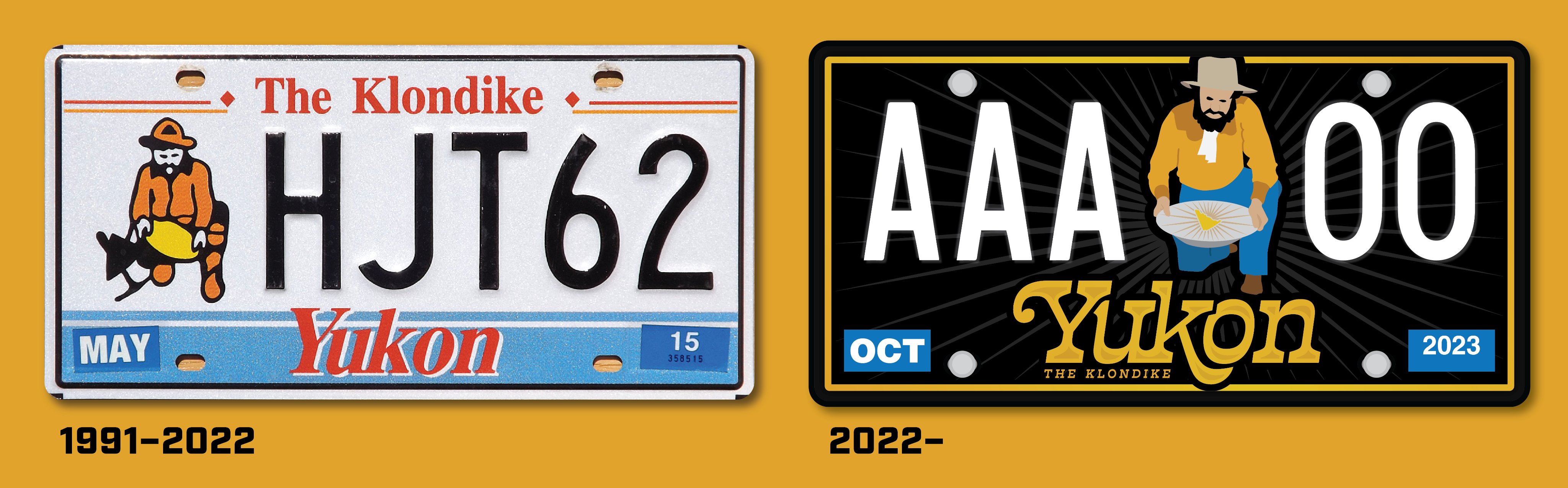
YUKON
The history of this Arctic territory is largely influenced by the Klondike Gold Rush of the late 1890s, so this license plate design is given a rugged gold rush look. The miner seen on Yukon plates since 1952 has been redrawn and updated, and the single speck of gold in his pan is now a golden map of the territory with the “shine” that brought many to the Yukon. To top this design off, the gold paint on the border, territory name, and the speck of gold has a metallic shine to it.
---
With the completion of Yukon, here is a compilation of all 13 of my Canadian license plate redesigns!
You can also read more about the Canadian plates (and the other 56 American plates) on my Behance page!
---
Thank you to everybody that followed along this little journey through the world of Canadian license plates! As always, it was really fun learning more about our neighbors up north (if you're American)
As far as my next series is concerned, I'll be doing some more soccer concepts! I moved up to Oregon a few months ago, and I thought that an Oregon League series would be a fun way to learn more about my new state; stay tuned for that in the coming months!
-
9
-
2
-
1
-
 1
1
-
-
Before the next Canadian province, here's a commonly requested redesign of my redesign...
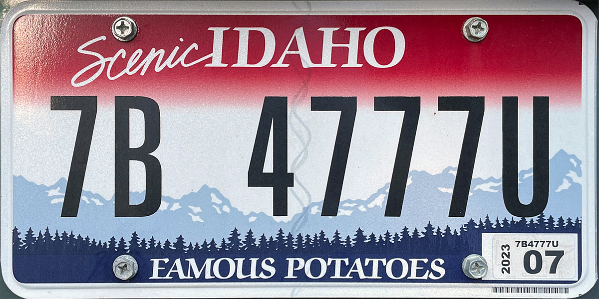
IDAHO 2.0
ORIGINAL POST:
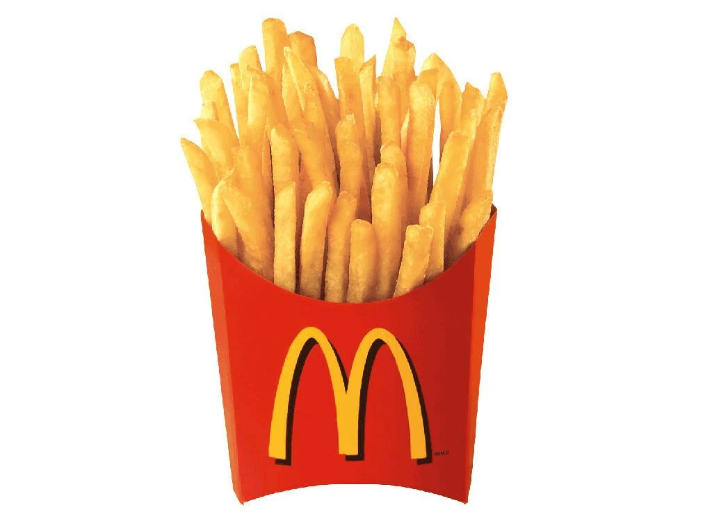
SpoilerI received at least three different comments about how my first Idaho redesign looked more like a Montana plate, so revamping my Idaho redesign was inevitable. However, I kept on pushing this one back due to extreme creative block for Idaho, as there was really nothing going for this state at all.

This new redesign for Idaho’s license plate is inspired by the various green-on-white license plates used between 1968 and 1991,
as well as thewhite-on-black Idaho state highway signs used until 2020. The wordmark features an “h” in the shape of Idaho, and the serial divider is a reference to Idaho’s “Gem State” nickname (first suggested by @BrySmalls). As a nod to the state’s famous potatoes, a mountain landscape is depicted using French fries.Now back to Canada!
---
SASKATCHEWAN
My Saskatchewan redesign retains the elegant simplicity of the current plates but adds the prairie province’s famous fields of wheat. An Alberta-style script font adds organic character to the license plate while the serial divider is now a map of the slightly non-rectangular province.
---
One more Canadian license plate left!
-
3
-
1
-
-
QUÉBEC
My Québec license plate is an homage to the symmetric, modernist design that flourished in Montréal in the 1960s and 1970s. The royal blue of Québec’s provincial flag shines prominently, and each corner is adorned with a French fleur-de-lys from the flag. The provincial slogan (meaning “I Remember”) is retained as a symbol of Québec’s strong French-Canadian identity.
-
5
-
1
-
-
On 10/14/2022 at 6:58 PM, Halian said:
All of your Canadian plates so far look amazing

Thanks so much! I'm glad you're enjoying them
---
PRINCE EDWARD ISLAND
My Prince Edward Island license plate is essentially a modified version of the provincial flag. The flag colors have been adjusted to better reflect the island’s landmarks: the red is darker to represent the unique red soil and the green references the setting of Anne of Green Gables, a famous children’s novel. The generic “island” on the provincial flag has been now changed to be a map of the province.
-
5
-
-
Moving on from Canada's most sparsely populated territory to the province that contains ~40% of Canada's population...
---
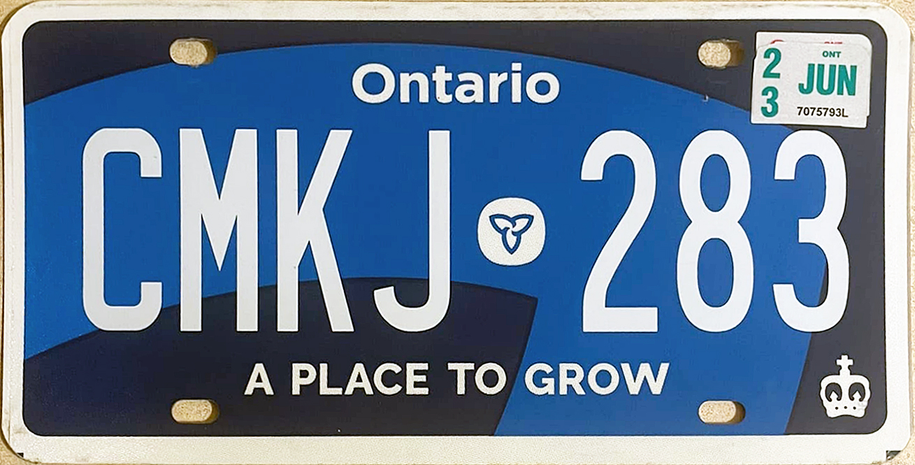
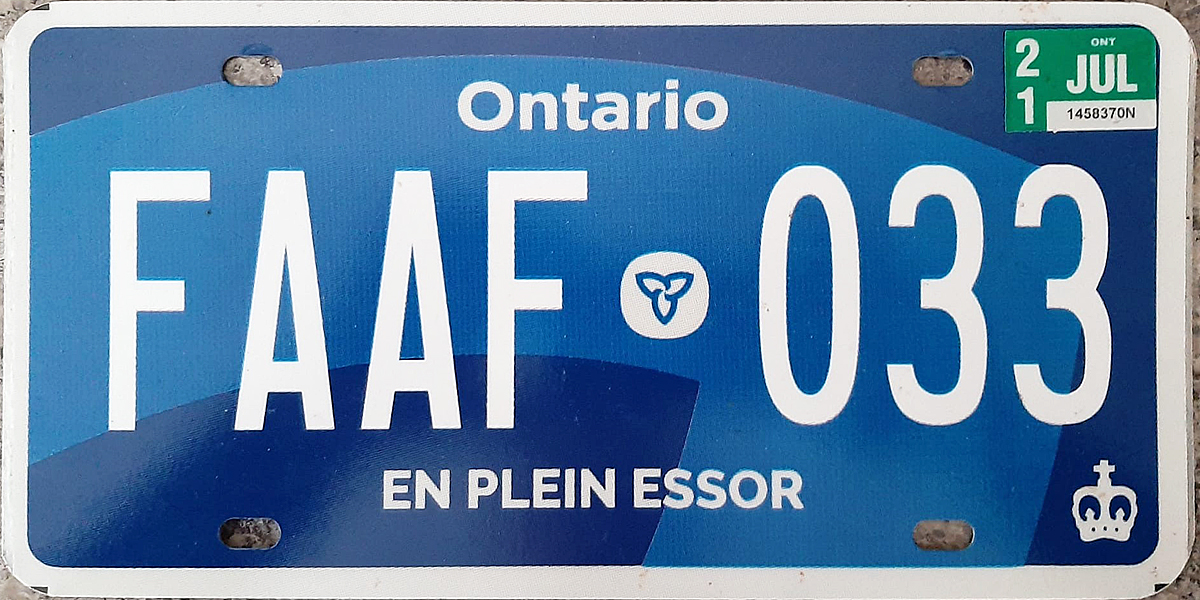
ONTARIO
Improving upon the disastruous 2020 license plate redesign, my Ontario license plate is an embossed white-on-blue design that features the centered crown used on license plates from 1938 to 1966. This design retains the classy serif fonts from the current plate but uses the slogans from the 2020 redesign, itself taken from “A Place to Stand, a Place to Grow,” the unofficial anthem of Ontario. The three leaves from the provincial coat of arms are found in the lower corners.
-
3
-
1
-
-
NUNAVUT
In honor of Indigenous Peoples' Day today, here's a license plate for the land of the Inuits!
My license plate design for this remote Arctic territory features the inuksuk, a stone navigational tool used by the native Inuit population. The inuksuk (also found on the Nunavut flag) is shaped like the territorial map, and the 25 stones represent the 25 communities scattered across the vast territory. The North Star found on the flag is above the inuksuk. Similar to the current license plate, the Nunavut wordmark is also shown in the native Inukitut alphabet.
-
3
-
1
-
-
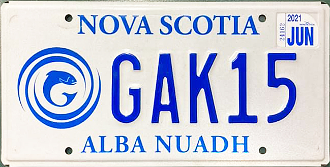
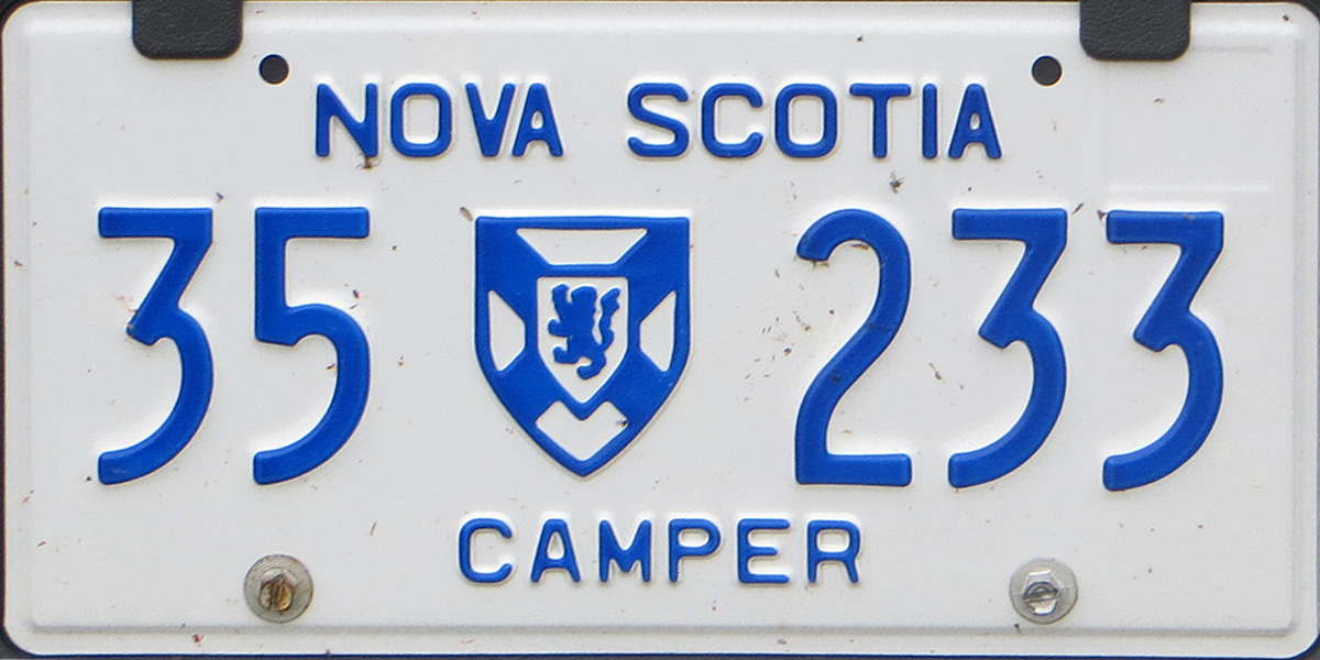
NOVA SCOTIA
Inspired by Nova Scotia’s Scottish heritage, my license plate redesign features blackletter typography that resembles Gaelic scripts used in Scotland and Ireland from the 16th to 18th centuries. The province’s Gaelic name is featured at the bottom, and the Nova Scotia coat of arms (seen only on Camper plates) serves as the serial divider in full color.
-
5
-
1
-
-
On 9/28/2022 at 10:56 AM, OnWis97 said:
I just stumbled on this today and it's fantastic. The Hawaii approach with the different plates for each island is terrific.
The majority of these are upgrades. Being from Minnesota (and painfully into color schemes, etc.) I was disappointed when they reduced the raised/blue letters to flat black letters. So while I like your design, it would be even better with blue letters.*
I think Vermont was my favorite but there are so many great ones.
*As evidenced by this comment, the only criticisms I would have would be nit-picks. Nice work.Random thoughts:
- A few states have plates that are getting really stale. Most notably, Wisconsin.
- New Mexico probably offers the most to work with due to their red/yellow colors, the Zia symbol, the chilies, and the significance of turquoise (And the balloons, which I just noticed...).
- Someone pointed out that Idaho almost looks like a nod to Montana. Maybe putting the state in the lower-right corner would solve that...
Welcome, and I'm glad you enjoyed the series!
I'm a huge fan of the light blue/brown color scheme and love using it any opportunity I can, but here's a version with dark blue letters just for you:
SpoilerI do agree with you that some states with older, dated-looking license plates do need some refreshing. California needs a fresh coat of paint too!
I'll look at other ways to tackle Idaho's license plates. It's really tough when Idaho's current plate already sums up everything the state has going for them
On 9/30/2022 at 5:13 AM, stumpygremlin said:I do think you could've narrowed all the text up there to avoid it. You wouldn't have had to narrow it by much, either. Just a thought.
Other than that, just want to say that I've loved watching this project!!
You know, you're absolutely right there! I tightened up the kerning, lightened up the font, and played with some ligatures on the New Brunswick plate so that it all fits between the bolt holes now!
SpoilerThank you very much for your feedback!
---
NORTHWEST TERRITORIES
Inspired by the Northwest Territory’s Aurora borealis souvenir license plates, my redesign of the iconic polar bear license plates features a bright green aurora above a nighttime forest scene.
(On a side note, my 1993 NWT bear plate is one of the crown jewels of my license plate collection back home in California)
-
5
-
3
-
On 9/21/2022 at 7:33 PM, jzn110 said:
Your Canadian plates are fantastic so far!
But I'm curious why you have the New Brunswick text overlapping the mount hole?
Thanks so much!
I try to avoid it as much as possible in my designs, but there are a few real-world cases of text overlapping the mount hole. Ones I can think of off the top of my head are Georgia, North Carolina, and Wisconsin.
As far as New Brunswick is concerned, I only did it because of how busy the license plate design is and how awkward the bilingual province name is laid out

---
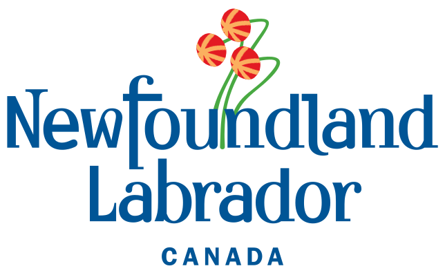
NEWFOUNDLAND & LABRADOR
My Newfoundland and Labrador license plate is based around the province’s location at the easternmost edge of North America, positioning it as the first part of the continent to see the sunrise. Illuminated by the ocean sunrise are some pitcher plants, the provincial flower. The Atlantic puffin, the provincial bird, serves as the serial divider and is colored like the provincial flag.
(I tried to incorporate the province's unique wordmark, but there were so many visual inconsistencies with the font heights and widths to properly redeem it
)
-
4
-
1
-
-
I got stuck on this one pretty hard, but finally here's the next province!
---
NEW BRUNSWICK
The main inspiration behind my New Brunswick license plate is the heraldic-style flag that the province flies, with two lions on either side of the bilingual province name and the ship serving as the serial divider. A star has been added to the ship as a reference to New Brunswick’s French-speaking Acadian population. The “Picture Province” slogan used on license plates from 1958 to 1971 returns as a bilingual slogan.
-
3
-
1
-
-
2 hours ago, TheRealPepman said:
Please fix the image for the Alberta plate. I don't see anything. (I tried putting this link on two different browsers and neither browser had the image above show up.)
Thanks in advance.
Sorry about that! The picture link for Alberta should be fixed now
I tend to re-upload these pics on social media and forget that the forum image is linked to the tweets I end up deleting
(I know I can just upload my Flickr images to here, but the tweets usually come first)
-
2
-


.jpg)
#/media/File:Green_Gables_02.jpg)
.jpg)
Oregon League (FINALE)
in Concepts
Posted
As promised, here's a revised Linn County with a full filbert in the roundel! I decided to keep the sleeve stripes as-is to remain consistent with the crest, though
---
Central Division
Salem SC
Salem, Oregon
Championships: 0
DETAILS:
A big shoutout to Salem native @upperV03 for suggesting the cherry blossom theme for this one!
---
The disclaimer on this Nike concept is a good time to announce that since the end of November, I've been working as a graphic design contractor at Nike's Beaverton headquarters! I'm currently making training materials for Footwear engineers, but I'm hoping that I'll be able to get into Global Football making kits for real!