


TheGiantsFan
-
Posts
1,415 -
Joined
-
Last visited
-
Days Won
3
Posts posted by TheGiantsFan
-
-
Northwest Division
Forest Grove SC
Forest Grove, Oregon
Championships: 0

DETAILS:
Spoiler-
 4
4
-
 1
1
-
-
On 3/22/2023 at 4:56 PM, Bomba Tomba said:
The home also looks kinda radioactive, and as we all know Homer works in a nuclear plant
I was struggling with the color scheme until I had that very same thought: Gotta give this team a dangerous and radioactive color scheme. That's when Springfield's volt yellow was born!
") On 3/22/2023 at 5:27 PM, eegl75 said:
On 3/22/2023 at 5:27 PM, eegl75 said:missed opportunity to make the NOB on the kits say "simpson"
I reserve the NOB for a notable person from each location but at your request, here's a version with a notable person from fictional Springfield!
Spoiler---
After a busy stretch at work and some artist's block, I finally have the next team for y'all!
Northwest Division
St. Johns SC
Portland, Oregon
Championships: 1
Quite possibly the last real-life team I include in the Oregon League, here's a heavily-rebranded incarnation of the NPSL's St. Johns FC (who used to have literal marijuana leaves on their crest)
DETAILS:
SpoilerA shoutout goes to @vtgco whose St. Johns-inspired Portland Timbers home kit concept served as a springboard for this team's identity
-
7
-
-
On 3/20/2023 at 4:46 AM, PascalHugo said:
I really like this logo! Keep going my friend!
Thanks so much, my friend!
On 3/20/2023 at 9:13 AM, TrueYankee26 said:From a person who used to dislike egg yolk... damn this is amazing
I appreciate it!
---
The inevitable Simpsons reference!
Central Division
Springfield Isotopes SC
Springfield, Oregon
Championships: 0
DETAILS:
SpoilerAlso, a shoutout to @Green27 for the tidbit about the Springfield Creamery and the Grateful Dead!
-
5
-
2
-
 1
1
-
-
On 3/16/2023 at 2:26 PM, Megildur said:
I never thought that I needed a Pendleton x TheGiantsFan crossover, but this is absolutely awesome. I love the home kit -- the design, the colors, all of it. If I have one nitpick, though, it's that the white name and number is somewhat hard to distinguish from the orange top. Would an all brown name & number look more clear? Or white with a brown outline?
I really like what you did with Roseburg too. The tree rings and diagonals are well-thought out.
Also, I realized after commenting on Brookings that you mentioned in its details that it was influenced by Brighton & Hove Albion. I had to laugh at myself a little for stating the obvious with my comment.
Glad you liked Pendleton and Roseburg!
To improve the NOB legibility on the home kit, I went ahead and added a brown outline as well as removed part of the blanket pattern on the back:
SpoilerThanks for the helpful feedback!
---
North Division
Sunnyside Sunbreaks
Happy Valley, Oregon
Championships: 0
DETAILS:
Spoiler-
7
-
1
-
2
-
-
On 3/14/2023 at 5:33 AM, FinsUp1214 said:
Pendleton is an absolute A+. I love the Tottenham style crest, and you’ve executed perfectly on your inspiration for each kit. This is one of my favorites in the series so far. Excellent job!
Thank you very much!
---
Starting off the second half of the Oregon League with Roseburg!
South Division
United Roseburg SC
Roseburg, Oregon
Championships: 0
This crest was repurposed from a concept I pitched for a real-life redesign of Deportivo Rose City in Portland that unfortunately got scrapped

DETAILS:
Spoiler-
5
-
1
-
1
-
-
On 3/13/2023 at 6:50 PM, eegl75 said:
love that home kit for the cowboys, but what if the shorts were brown
The orange shorts were definitely a last-minute change from the original brown shorts, and you're totally right that it looks better with brown!
EDIT 3/15/23: At the suggestion of @mcrosby on Twitter, the crest has been redrawn so that the soccer ball is underneath only the horse's front feet. The kits have been updated accordingly!
-
4
-
-
East Division
Pendleton Cowboys
Pendleton, Oregon
Championships: 0
DETAILS:
Spoiler---
Now that we're halfway through the Oregon League, here are how the league's crests look all together:
Still got plenty of teams and cool ideas left, and I'm still open for any suggestions that anyone may have for the remaining 25 teams
-
8
-
1
-
-
On 3/6/2023 at 1:06 PM, Megildur said:
I really like Brookings! It reminds me of Brighton & Hove Albion, but better.
Thanks so much! Let's just say that Brookings is a sunnier version of Brighton & Hove Albion

---
North Division
Milwaukie-Lake Oswego United
Milwaukie/Lake Oswego, Oregon
Championships: 1
DETAILS:
Spoiler-
6
-
2
-
-
Here's the southernmost team in the Oregon League!
South Division
Brookings SC
Brookings, Oregon
Championships: 0
DETAILS:
Spoiler-
5
-
1
-
1
-
-
On 2/27/2023 at 6:11 PM, the_grateful_ted said:
Slam dunk as always
Thanks so much!
On 2/27/2023 at 9:31 PM, vtgco said:Updated Fort Astoria is nice; I'll have to check out that column the next time I'm over there! I doubt it'd be an upgrade but I do kinda wonder how the back would look primarily yellow. Haven't watched the movie but that away is fun.
Chehalem looks good, as they do IRL, and that home jersey is cool, though I'd maybe consider putting the Icarus logo up to one side like Adidas used to do? And I also think tonal blue herons might be nice instead of gold. Away jersey is solid.
I definitely tried having a primarily-yellow back for the Astoria clash, and I promise you it didn't look great

While I personally prefer the gold herons and stripes for the Chehalem home, I made a version where those are light blue just for you! Your Adidas link didn't work, so I hope I assumed the placement of the Icarus logo correctly
 SpoilerOn 2/27/2023 at 9:31 PM, vtgco said:
My goodness that Klamath Falls logo is really nice, and so is that home jersey! Definitely captures the beauty of Upper Klamath Lake IMO. The away is classy too, and it might be nice to do it in the tan color that the home's sleeves are.
IDK why I find Hermiston kinda sillier in comparison to the other food teams but it's still pretty nice. Maybe it's just giving me bad flashbacks?
Mt Hood's jerseys are gorgeous, especially that home jersey, which totally conveys skiing. Love it. The logo is quite nice too though I'd say the diamonds feel a touch lopsided.
I'm glad you liked all these other teams!
That's an...interesting Sounders kit
I tried the Klamath clash in tan instead of white, but the tan ended up muddying the look of a kit that I wanted to keep as crisp as the lake. As far as Mt. Hood's crest is concerned, the slightly lopsided diamonds are actually intentional so that the diamonds fit the curved shield better (I couldn't make a good shield with straight-on diamonds).
Thanks for the thorough feedback as always!
---
Northwest Division
Multnomah Athletic Club
Portland, Oregon
Championships: 11
In a world without the Portland Timbers, the real-world Multnomah Athletic Club has taken over neighboring Providence Park to field the most dominant team in the Oregon League
DETAILS:
Spoiler-
9
-
-
Happy to see another state-level soccer league on these boards, and I appreciate the shoutout!
May I ask what program you're using to make these concepts? You've got some solid designs with great rationale here, and I'm excited to see what else you make for Alabama!
-
On 2/20/2023 at 7:20 PM, TrueYankee26 said:
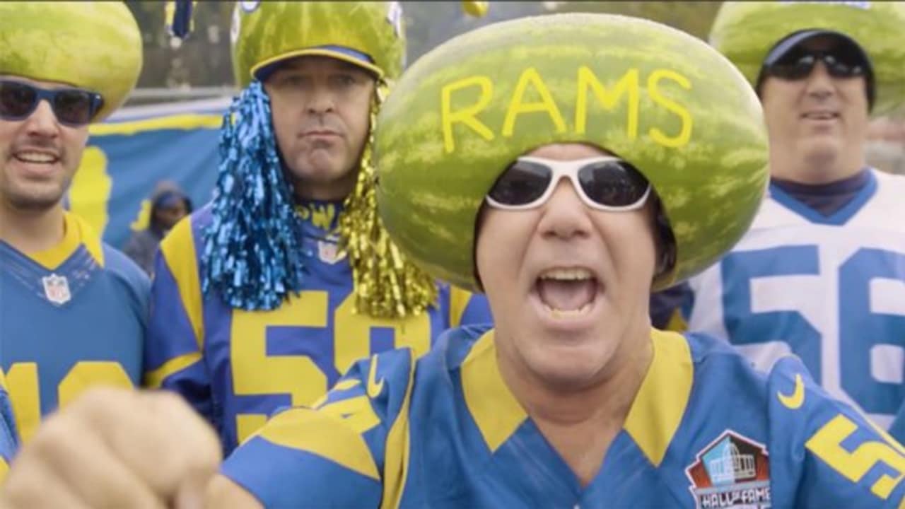
Could see their fans putting melons on their heads
 On 2/21/2023 at 12:12 AM, Bomba Tomba said:
Could also see them smashing melons after a win
On 2/21/2023 at 3:17 AM, eegl75 said:or opposing fans smashing melons as a threat
Looks like we already got ourselves a fan culture! It's gonna be a really rowdy area, with neighboring Pendleton being home to a rodeo
---
Staying close to the Columbia River for this next team...
North Division
Mt. Hood SC
Sandy, Oregon
Championships: 0
DETAILS:
SpoilerHere's the YouTube video that I reference on the clash kit explainer:
Peter Dibble has some excellent mini-documentaries about Oregon history, and I'm definitely referencing another one of his videos for a future team
-
9
-
-
20 hours ago, VampyrRabbit said:
Two kits that are majority dark blue and have gradients going to a lighter blue, I can see an issue with clashes.
With this pointer in mind, I decided to change the dark blue clash to a white kit with the same pattern:
SpoilerThanks for the feedback!
---
The second food-related team of the East Division!
East Division
Hermiston Town SC
Hermiston, Oregon
Championships: 1
DETAILS:
Spoiler-
5
-
1
-
1
-
-
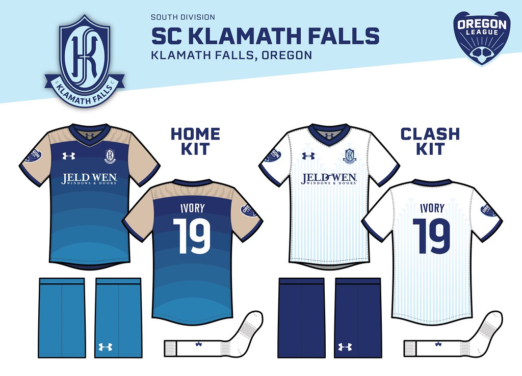
5 hours ago, GriffinM6 said:
The KF monogram is absolutely brilliant!
Thank you so much!
49 minutes ago, Bomba Tomba said:Um, it seems like instead of counting up, you counted down
You know, I definitely caught that numbering error on Illustrator but forgot to re-export that image file with the number 19

Someone on Twitter suggested that I revisit the home kit gradient to better connect the kit design, so here it is with the gradient starting as a dark blue at the top and a light blue at the bottom (instead of the other way around):
-
2
-
-
Staying in the South Division for the next team!
South Division
SC Klamath Falls
Klamath Falls, Oregon
Championships: 0
After the relocation of the original SC Klamath Falls in the California Soccer League in 2017, a new Oregon League team has taken its place with a completely different identity but with the name of the defunct CSL team
DETAILS:
Spoiler-
6
-
1
-
-
On 2/6/2023 at 9:34 AM, logo-maker said:
Based on the heron migration graphic you developed for the AC Chehalem Valley home shirt, this might be a great opportunity to center the crest on the shirt, lower the graphic of the other herons a bit (as well as the front ad placement) so it looks like the heron in the crest is "leading" the others on the shirt.
Great design work connecting each team to their location.
Thank you so much!
Here's a version of the AC Chehalem Valley home kit with a centered crest:SpoilerSpoilerOn 2/6/2023 at 9:56 PM, Bomba Tomba said:If I may ask, what template is this?
The template I've been using is this ancient but versatile template by @raysox from 2015
---
The other real-life team (kinda) in the Oregon League...
South Division
Eugene United
Eugene, Oregon
Championships: 1
In this universe, the real-world Lane United FC has merged with the fictional Eugene SC. Also, a shoutout to @Green27 for suggestions for the Eugene team as well as the two remaining Lane County teams!
DETAILS:
Spoiler-
7
-
5
-
1
-
-
Staying in the Northwest Division, here is one of the very few real-life teams in the Oregon League!
Northwest Division
Astoria, Oregon
Championships: 1
I'm in touch with AC Chehalem Valley's founder, and he gave me the blessing to give his team a men's side for this league! He also provided me with the heron graphic drawn by Richard Miller of Calyx Design
DETAILS:
Spoiler-
9
-
-
On 2/1/2023 at 2:22 PM, jmoe12 said:
All I can see with the crest is a necktie
On 2/1/2023 at 7:39 PM, Bomba Tomba said:A necktie on a surfboard
The home looks yummy for some reason
On 2/2/2023 at 9:20 AM, MDTrey4 said:I'll echo the necktie resemblance as well. I think one way to fix it would be to decrease the angle that the stripes show and make it 14 stripes to represent the 14 different events from the tower. That might make it look less like a necktie and more like the tower itself. Another very minor critique that I have is that the stripes that go through the banner don't come out on the other side in the same spots
Seeing that the necktie was the elephant in the room, I decided to ditch the Fort Astoria shape entirely and replace it with a simple oval with a redrawn Astoria Column:
DETAILS:
SpoilerThank you everyone for the feedback, and I'll have another team in the Northwest Division up this weekend hopefully!
-
2
-
1
-
2
-
-
On 1/27/2023 at 2:51 PM, vtgco said:
Big improvement! Thanks for humoring.
Actually looking back into it again, it was supposed to happen for the MLS Next Pro launch. Fingers crossed it's still gonna happen, but there's been no word for a while.
As for Yaquina Bay, it's a gorgeous crest and a gorgeous home kit! One of your nicest.
Not wild about the away. It's a good idea but I think it'd work better if the contours were more pinstripe-y than color block-y? IDK.
Glad you liked Yaquina Bay! That crest definitely look a while to make because of all the intertwined elements

Speaking of which, I changed the clash kit to have a more striped contour instead of a color block one:
SpoilerOn 1/28/2023 at 4:28 AM, Megildur said:I had to login again so that I could congratulate you on this. It seems like a great (and well-deserved) thing for you. I've always loved your work here!
I really appreciate the support, my friend!
---
Northwest Division
Fort Astoria SC
Astoria, Oregon
Championships: 0
DETAILS:
SpoilerORIGINAL NECKTIE VERSION:
SpoilerDETAILS:
SpoilerI've only watched part of "The Goonies" once in grade school a very long time ago, so I'm open to any suggestions for a better Goonies-inspired kit
-
6
-
-
On 1/17/2023 at 2:58 PM, vtgco said:
Up the Bridges!
Prineville has a good look, though the home jersey might be improved with some red diagonal pinstripes within the yellow hoops (and vice versa), and maybe red numbers at home too.
Otherwise the set is really nice.
No complaints for Hillsboro; the circuit-board pinstriping at home is inspired and gorgeously executed! I'd say Timbers 2 should take on the brand for their upcoming rebrand but maybe Hops colors are too Sounders-y for that

You got it with the Prineville home kit edits:
SpoilerI didn't know T2 was going through a rebrand, I'm excited to see what they do. I'm glad you liked the Hillsboro team, I had a really good time putting that one together!
On 1/17/2023 at 5:50 PM, PERRIN said:God, every single concept in both this project and your California league is absolutely stunning. You've constantly put out some gorgeous crests and kits and the level of local detail in each one is astounding. It's enviable how you manage to work in the most obscure local symbols and industries into these concepts. Hillsboro, Salem, and Marion are downright awe-inspiring. Incredible series so far, cannot wait for more in the future.
Thanks so much for these kind words, I'm really glad you're enjoying the leagues!!!
Researching the local details for these teams really helps me learn about my new surroundings, and inspiration is definitely everywhere!
---
I know the Central Division is disproportionally represented (the fifth team!) in the first 15 teams of this league, but several trips to Newport in the past week have given me plenty of inspiration and motivation for this next team...
Central Division
Yaquina Bay SC
Newport, Oregon
Championships: 0
DETAILS:
Spoiler-
9
-
2
-
2
-
-
Northwest Division
Hillsboro Semiconductor SC
Hillsboro, Oregon
Championships: 2
DETAILS:
Spoiler-
11
-
-
On 1/6/2023 at 1:32 PM, Blindsay said:
You have an Onion Themed Team with a Green Jersey and you DON’T MAKE A SHREK REFERENCE?!
Aw man!
On 1/6/2023 at 6:48 PM, vtgco said:Ontario vs Gilroy "BATTLE OF THE ALLIUMS" / "ATTACK OF THE AROMATICS" CCL matchup when???
All jokes aside, way to totally class up the silly MiLB food theme brands! Ontario looks great, and I love that Marion away jersey so much : )
Would maybe be nice to see matching cuffs & collars for Marion at home, but not necessary. Curious if the purple outline going beneath the white outline at the bottom of the logo is on purpose? It looks good!
Thanks for the tasty designs!
That'll be quite the smelly (or flavorful) matchup!

I didn't add red to the collars for the Marion home kit because it would've overlapped with the sash border; the bit about the purple outline was definitely intentional, and I'm happy you caught that!
The tasty designs are definitely fun to make, and there will still be some more down the road!
On 1/9/2023 at 10:55 PM, Green27 said:I think the Simpsons theme makes sense for Springfield! As a Deadhead, I have to mention one of the greatest (IMO) shows they ever played was in nearby Veneta as a benefit for the Springfield Creamery, that still exists today. The largest hospital group in Lane County (really anywhere other than PDX and Salem) is PeaceHealth and they have their primary campus in Springfield. I think they are still one of the largest employers in the county. Hop Valley is a large nationally-owned and distributed brewery that started in Springfield.
I loved the Track Town theme! That's definitely what Eugene is most well-known for. I'd throw out a nod to the original settlers of the Willamette Valley, the Kalapuya, either on a Eugene kit or one of the other nearby town kits. The two rivers played a big part in both the ancient and current Eugene. The city has also garnered a reputation for the 60's hippie movement that never really went out of fashion here, with Ken Kesey growing up in town. Eugene is also very into the craft beer scene, and has many large nationally distributed breweries (Ninkasi and Oakshire are the two biggest, Oakshire sponsors the minor league soccer club Lane United FC).
For Cottage Grove, I think there's a lot to work with. They are very proud of their history of covered bridges and movie filming locations (Buster Keaton's The General, Animal House parade scene, Stand By Me railroad tracks). It's a small town but has a cute historic downtown stretch to walk. There are no notable companies that come to mind for the sake of kit sponsor.
These are extremely helpful suggestions, and I'll be sure to look into all of these for the remaining Lane County teams. Thank you very much!
(On a side note, Ninkasi was definitely one of the places I applied to during my recent job search
)
---
Staying east of the Cascades for just a little bit longer for this next team!
East Division
Prineville 1870
Prineville, Oregon
Championships: 0
DETAILS:
Spoiler-
10
-
1
-
-
On 1/3/2023 at 5:42 PM, Green27 said:
As an Oregonian, I love this project so much. I never even thought you could combine city history and iconography with uniforms for such hyper-specific locales.
Thank you so much!
I actually got the inspiration for these hyper-specific state leagues from @-kj's 2015 League du Nord series! After seeing the cool work he did for Minnesota teams, I went ahead to make teams in California and now Oregon
Seeing you're from Eugene, is there anything you would like to see for Lane County's three remaining teams? I have a Simpsons theme in mind for Springfield, but I'm wondering if you have any [non track-related] ideas for Eugene and for Cottage Grove. Any ideas would be very appreciated!
On 1/4/2023 at 6:08 AM, FinsUp1214 said:Atlético Marion’s crest is absolutely beautiful. The tulip shape is genius, and it absolutely looks like a Latin/South American club crest. If I didn’t know any better, I’d totally believe it was a crest from those regions.
That one’s probably my favorite entry yet. Well done on them, and the whole series so far too! I always dig hyper-regional league series, and yours has been very fun to follow.
On 1/4/2023 at 2:10 PM, TrueYankee26 said:CAM so far is my favorite and like @FinsUp1214 said it is very Latin American
Thanks so much y'all! I'm glad that I was able to accurately capture the style of Latin American soccer design with Woodburn's team
---
Happy New Year everyone! My first design of 2023 is a trip all the way to the Idaho border for The Oregon League's easternmost team:
East Division
Ontario SC
Ontario, Oregon
Championships: 0
DETAILS:
SpoilerA big shoutout to @-kj's onion-themed Eagan FC team for helping shape Ontario's look
-
9
-
-
On 12/28/2022 at 12:46 PM, CDCLT said:
Stunning work on Salem, I love the cherry blossom theme. And congrats on the Nike job! I can't wait to see your work on the pitch in due time.
Thanks so much!!!
On 12/30/2022 at 12:47 PM, vtgco said:Nice work for Salem!
And thanks for the Linn County and Portland updates; look much better to me.
Hood River's away is really gorgeous! Not a huge fan of olive green, but you make it work well. Did the home originally have more green below the numbers? Maybe you could either continue it below, or you could have the green on top flair outward rather than inward (so it continues the front's striping.)
Glad you're enjoying it, and kudos for the new job! Excited to see your work on the field; you've got the talent for it : D
Thank you, I really appreciate it!
The Gorge's home kit did originally have the green stripe continue below the numbers (like Salem's clash), but I decided against it. I went ahead and tweaked the back of the home kit so that it flairs outward now:
Spoiler---
Completed Salem's geographic rival as my last design in 2022, but didn't have time to post it here until now!
Central Division
Club Atlético Marion
Woodburn, Oregon
Championships: 1
DETAILS:
Spoiler-
8
-
1
-
1
-


2023 North American Soccer Kits
in Sports Logo News
Posted
My hometown USL Championship team unveiled a new third kit today:
In my opinion, the hype graphics with the players posing with military vehicles and stuff kinda left me underwhelmed with the final kit design. While the colors are inspired by the US Army colors from the old Fort Ord base, there's no official explanation for the actual patterns on the kit (Morse code, Humvee tires?). I tried to ask them on Twitter for some clarifying questions on the pattern, but I haven't heard back yet
Many people online have also compared this kit to New Mexico United
(I am excited about this Legacy Collection they're starting out, though; I'm lowkey hoping they might reach out to me )
)