


TheGiantsFan
-
Posts
1,415 -
Joined
-
Last visited
-
Days Won
3
Posts posted by TheGiantsFan
-
-
Super excited about this next one!
---
HAWAI'I
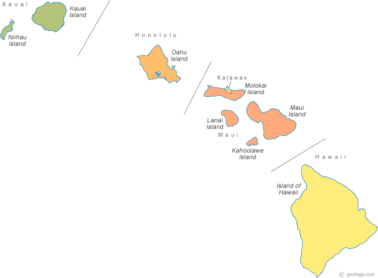
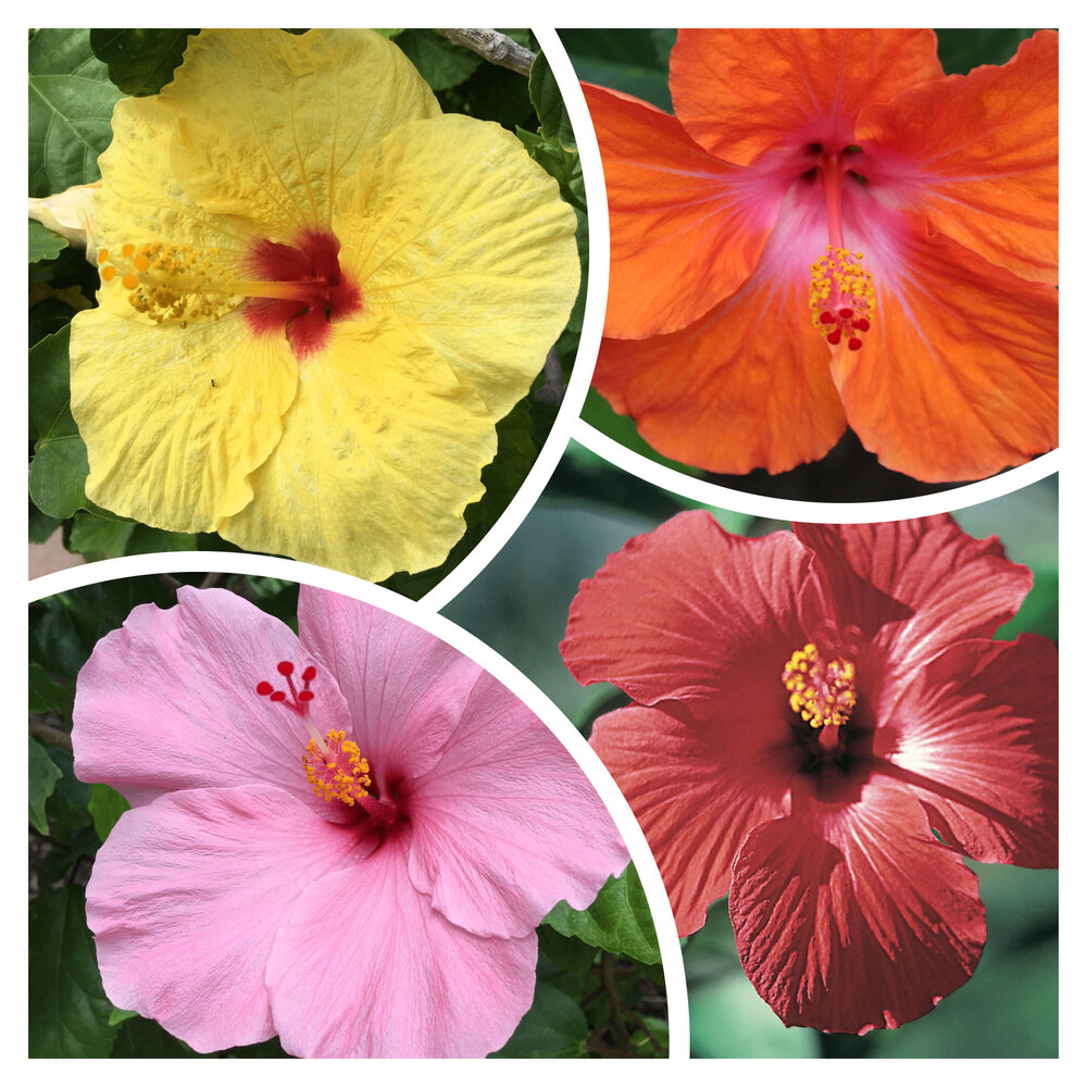
 The template for my series of Hawaii license plates is my 2019 Snapchat Geofilter design for the island of O’ahu, where a map of the Hawaiian archipelago is depicted a series of hibiscus flowers (the Hawaiian state flower). Each island’s license plate features a unique base color, and a darker-colored hibiscus denotes the island’s location in the state. A modified version of Hawaii’s tourism logo is proudly displayed at the top of the plate.The color schemes of each island’s license plates reflects the bright colors of Hawaii’s landscape and flora. The light red for O’ahu and the pink for Moloka’i are taken from the colors of hibiscus flowers. The explosive volcanoes of Hawai’i are the inspiration for that island’s orange color. The green for Kaua’i is taken from the island’s lush green rainforests, and the turquoise for Maui is inspired by the Pacific Ocean. The Pineapple Isle of Lana’i naturally gets a golden yellow color. Lastly, the 190 residents of Ni’ihau have a faded gray color to signify its isolation from the rest of the state.
-
 7
7
-
 8
8
-
 5
5
-
-
Oh my goodness, your San Diego kits are absolutely phenomenal!

I love how detailed your wave texture is in terms of the "randomness" of the wave lines and the color gradients. The Gaslamp kits are also great, and I love the "grittiness" that your texture gives to the design. My only thing against it is that the sponsor logo seems a little small, but that's no big deal

San Diego is easily the best concept that I've seen you knock out (out of soooo many cool concepts), so excellent work here my friend!
")
-
On 3/24/2022 at 3:10 PM, NicDB said:
Love the peanut shell for Georgia! I would kind of want the peach and state outline to swap places, but even as is, you have a massive upgrade.
Thank you very much!
I did consider using the peach as the divider instead of the state, but putting the peach as the tittle on the "I" was some low-hanging fruit
 On 3/24/2022 at 6:59 PM, GriffinM6 said:
As a Georgia resident, I'm loving this. I think it would go over very well if the change were to happen in real life.
Thank you so much, and I'm glad that a Georgia resident approves of this!
On 3/25/2022 at 7:38 AM, BrySmalls said:
Thanks!
On 3/28/2022 at 11:22 AM, Moseph said:Man, this is a great series! So far, my favorite plates have been Alaska, Delaware, and DC, but they are all very well done.
I'm glad you like it so far!
---
Work's been busy the past few days, but here's the next design!
GUAM
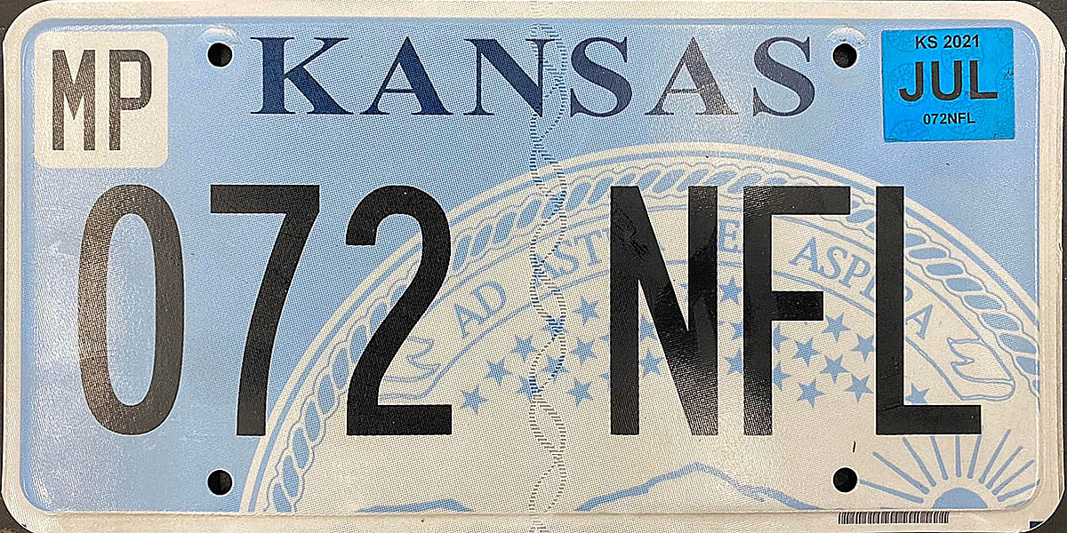
My design for Guam takes the current plate’s color scheme and gives it the Kansas license plate treatment with Guam’s territorial seal. The beach landscape in the seal continues outside of the seal across the rest of the license plate, with the palm tree and the Chamorro sakman boat redrawn with more detail. A more accurate Chamorro translation of the slogan (which means “Land of the CHamoru” is at the bottom of the plate.
-
6
-
 1
1
-
-
On 3/22/2022 at 6:10 PM, NicDB said:
For Illinois, I don't think you have to reinvent the wheel too much since all the elements (Lincoln, Chicago skyline) are already there. Although instead of the state capitol (oh, you have a dome like every other state!), use Monk's Mound if you feel inclined to represent Southern Illinois with a landmark. I was always a fan of the old New York plates that reacted to the criticism of the Statue of Liberty being too NYC-centric by having the NYC skyline on one side and Niagara Falls on the other.
For Wisconsin, I would recommend using the state motto "Forward" in place of "America's Dairyland." I would love a plate based on the Milwaukee Art Museum. They rejected the idea for the state quarter claiming (surprise, surprise) it was too Milwaukee-centric, then made it a tribute to the dairy industry when almost 20% of Wisconsin lives in Milwaukee County and a small fraction of that amount works in dairy. If you wanted to work around this, maybe do the New York idea, but have the Apostle Islands on one side to represent Lake Superior and the MAM or some image of the Milwaukee lakefront to represent Lake Michigan.
Otherwise, maybe a depiction of a whitetail deer in its natural habitat. It's the "other" official state animal for Wisconsin, but it says "Wisconsin" to me more than the badger does. I would just hope that if you went this route, you'd go with a dark green and cream color scheme because #FearTheDeer.

Those are extremely helpful suggestions, thank you very much!
I actually think it would be a very good idea to complement the "Forward" motto with an image of the Milwaukee Art Museum, so I'll lean more into that direction. Maybe the deer and Bucks colors would come after that!
On 3/23/2022 at 5:18 AM, BrySmalls said:Good execution on the Delaware plate. The script and gradients are on point. The only suggestion is changing the travel slogan from "Small Wonder" to "Endless Discoveries" since the State retired the "Small Wonder" slogan about 7 years ago even though it was slowly being phased out since 2001.
Glad you liked Delaware's plates! Just for you, here's a version of that plate with the "Endless Discoveries" slogan:
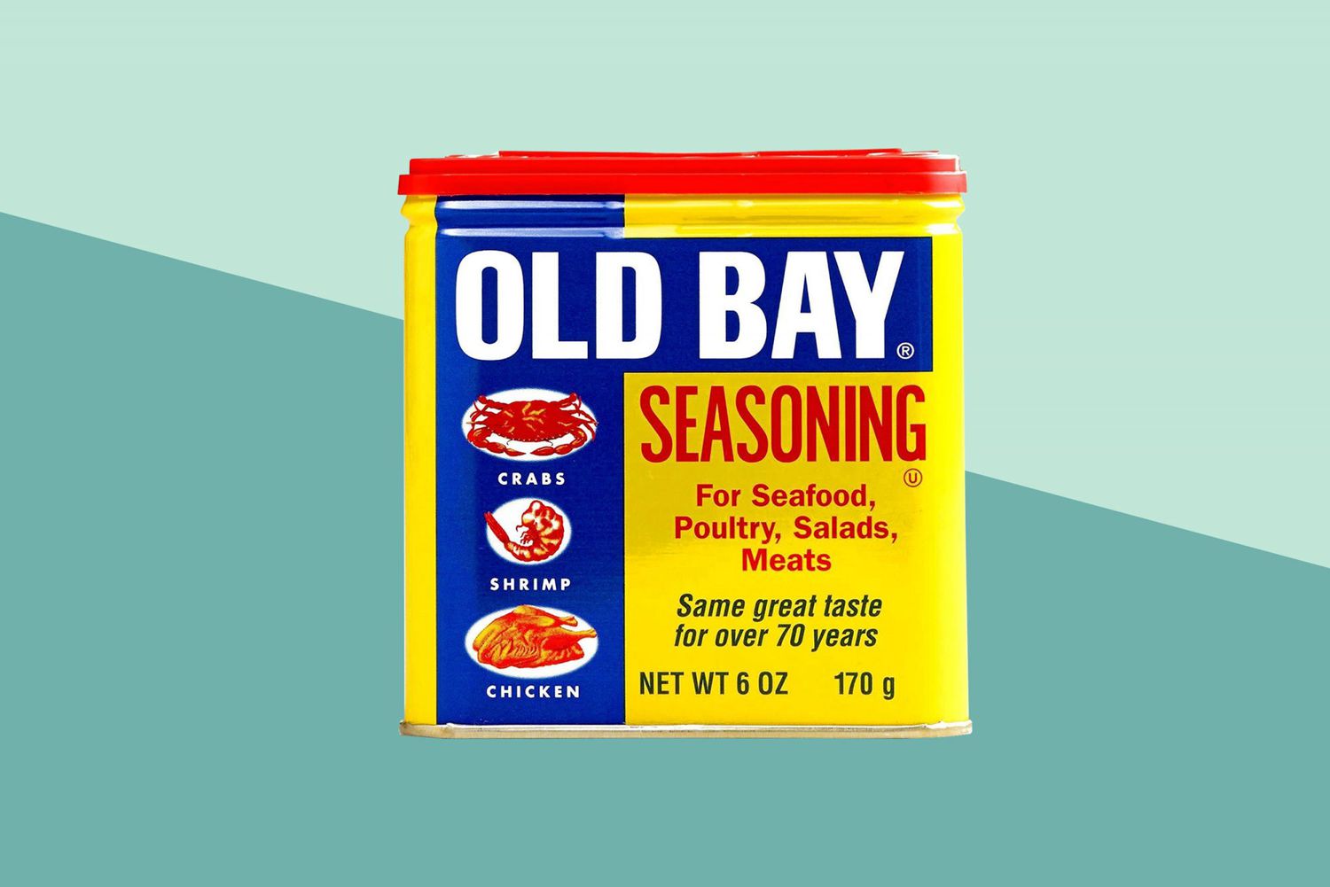
SpoilerOn 3/23/2022 at 1:00 PM, DCarp1231 said:Now that I think about it, a plate mimicking the Old Bay container would be incredible
Spoiler
I think that Old Bay packaging would make for a really cool layout on the Maryland plates, and I'll see what I can play around with there!
8 hours ago, Cosmic said:I decided to finally look up what "myflorida.com" is. I assumed it was a tourism website, which wouldn't be the worst thing considering how many Florida license plates spend summers in other states. It's just a janky, bare-bones site for generic state government. Get that damn thing off the license plates.
I thought that it would be a tourism site as well, and I was unpleasantly surprised to see what it actually was. It reminds me of the very odd decision to give California license plates the DMV website instead of the tourism website
---
GEORGIA
I'll admit I got a little stuck with this one, but here goes!
My Georgia design is a modernized version of the peach gradient license plates that the state issued from 1989 to 1996. The background features a whale shark pattern (the Georgia Aquarium is the only place to find whale sharks in captivity outside of Asia) that turns into the texture of peanut shells (another widespread crop grown in Georgia).
-
10
-
2
-
-
2 hours ago, NicDB said:
The only thing Marylanders love more than their flag is Old Bay seasoning.
If you're taking suggestions, I'm all for getting away from America's Dairyland for Wisconsin. It's a dying industry that fewer than 5% of Wisconsin even works in anymore.
I'll definitely keep that in mind for Wisconsin at the very end of the series!
Do you have any local suggestions about what you would like to see on a Wisconsin (Illinois suggestions would be cool too!) license plate? That would be appreciated if you have any!
---
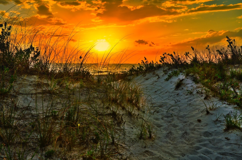
FLORIDA
My colorful Florida license plate depicts a beachside sunset scene. Referencing Florida’s “Sunshine State” nickname and famous citrus industry, an orange slice sun is featured in the middle of the design. The font choice is inspired by the short-lived Miami Floridians basketball team of the late 1960s. The formerly embossed county names return as county stickers.
Also, shoutout to @raysox for suggesting a beachside sunset design for this license plate!
-
5
-
3
-
2
-
-
Another excellent design by Chris Payne here!
I particularly love the striking shades of green and the beveling work for this one
-
2
-
-
DISTRICT OF COLUMBIA
My District of Columbia license plate is inspired by DC plate history and federal imagery. The layout combines the off-center design of DC’s 2016 low-number plates with the embossed Capitol dome of DC’s 1976 plates. The stripes are inspired by both the DC flag and the American flag, and the stylized “DC” in the middle ofthe plate is inspired by typography on dollar bills.
-
7
-
-
19 hours ago, dont care said:
I’d have the lettering darker on the Connecticut one, like a dark chocolate to make it easier to read when driving around. Contrast is key with license plates because they have to be easily readable by LEO’s or the public trying to identify a particular car.
You're right that it needs slightly more contrast; here's a darkened version of the dark brown for you!
Spoiler18 hours ago, DCarp1231 said:I have three ideas off the top of my head!
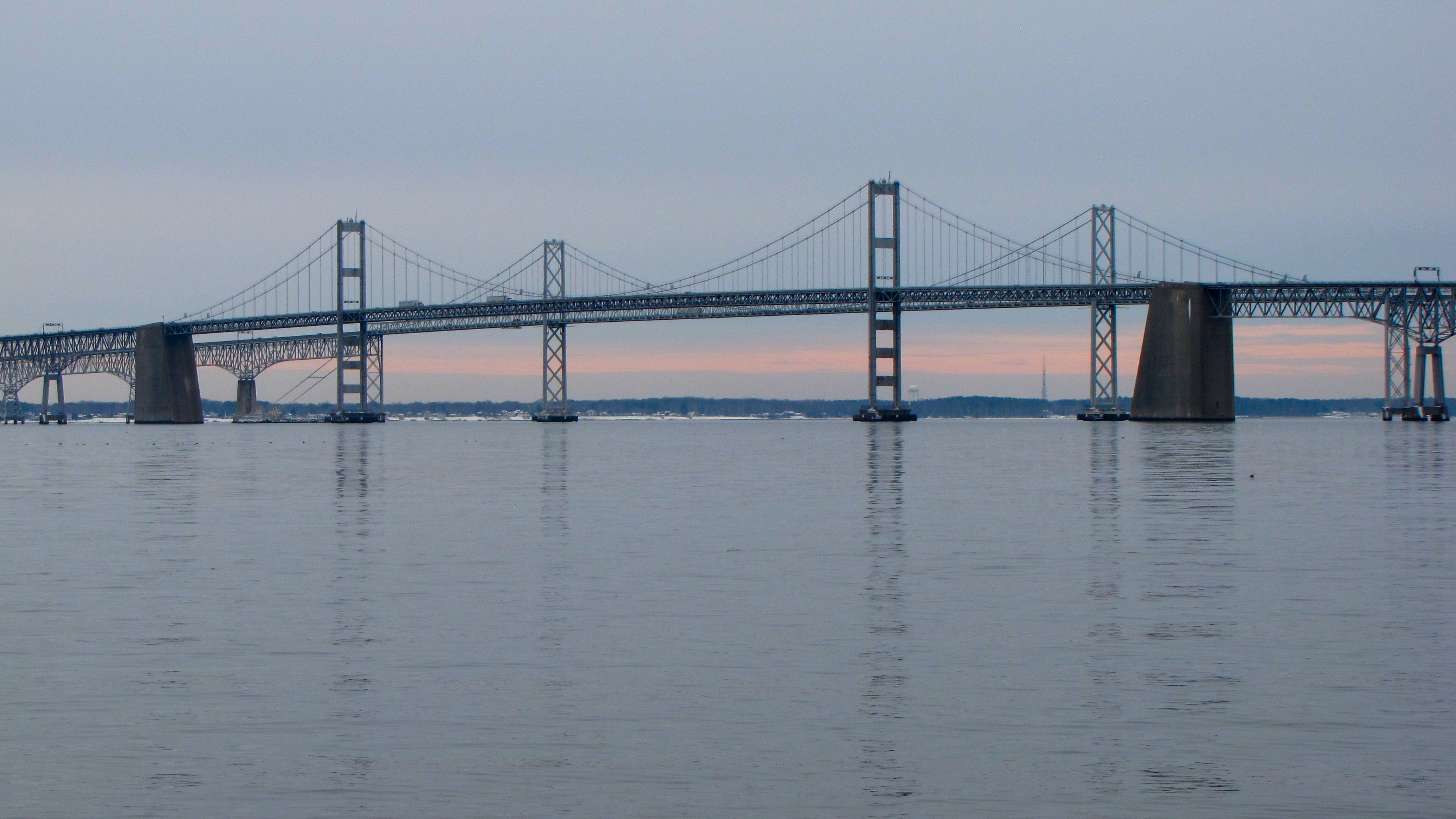
• I’d love to see the incorporation of the Chesapeake Bay Bridge
Spoiler
• Music notes from the Star Spangled Banner (MD being the birthplace of the National Anthem)
• A simplistic approach using red, black, yellow and white. Nothing special or out of the box
Ooh, thanks for the suggestions! I'll see what I can do for you once I reach Maryland!
---
DELAWARE
Delaware has maintained a consistent look for its license plates since 1962, so my license plate redesign is a simple modernization of the state’s classic design. The sans-serif “DELAWARE” font is replaced by a script inspired by the iconic Dolles sign* (dismantled in 2021) in Rehoboth Beach. Delaware’s “Small Wonder” slogan replaces “The First State”, and a blue gradient brightens up the design.
*Suggested to me by a coworker who happens to be a Delaware native!
-
10
-
-
We don't know what the World Series logo looks like yet, but maybe the Red Sox are winning it all this year because of the two pennants?
-
On 3/14/2022 at 12:37 PM, DCarp1231 said:
All of these are fantastic! I can’t wait to see what you do with Maryland.
(hoping you don’t incorporate the flag)
Thank you very much!
I know it's cliche for any Maryland concept, but it's gonna have to have the flag somehow because it's just so cool!
Regardless, is there anything you would like to see on a Maryland plate (I have yet to do any research for that because it's still a while away); I would love to incorporate your suggestions!
On 3/15/2022 at 7:16 AM, GriffinM6 said:On 3/14/2022 at 3:31 PM, dont care said:Only one I’d say that isn’t an improvement is the Colorado one. Colorados current one is completely unique and immediately identifiable. Yours looks like any other blue license plate at a distance, only thing that makes it slightly different is the jagged line.
I agree with this as well. I think you could keep the same design, but use green, white, and grey instead of the flag colors. Colorado is the only Western state that uses green as far as I'm aware. The only other two state that use it are Vermont and New Hampshire AFAIK.
I also agree that the current Colorado plate is a modern classic and should never be changed!
However for the sake of this series, I'm challenging myself to create entirely new plates for every state regardless of how perfect some states' current plates are (Arizona and Colorado, for example). Every state is a blank slate in this series, so there will definitely be many curveballs down the road (especially this next one!)
I did make a quick mockup of how my Colorado plate design in the green seen on the current plates:
SpoilerThere will definitely be some Western state green in this series, but that will be much, muuuuch later down the line. Stay tuned for those!
On 3/15/2022 at 11:42 AM, CS85 said:Sidebar: This graphic is amazing.
That is actually super cool and useful, thanks for sharing!
18 hours ago, DTConcepts said:I didn't think the Colorado plate could be improved, but here we are.
Bravo.
Thank you very much! Glad you liked Colorado
---
This next one is a drastically different plate design!
CONNECTICUT
A radical departure from Connecticut’s history of blue license plates, this brown design combines the state’s “Constitution State” and “Nutmeg State” nicknames. Connecticut is home to the Western world’s first written constitution (the Fundamental Orders of 1639), so the text is inspired by the decorative flairs of the state’s historic documents. The colors are inspired by faded parchment paper as well as the colors of nutmeg!
-
9
-
-
On 3/10/2022 at 3:19 PM, LMU said:
Just be aware that the crescent moon/star is universally seen now as the main symbol for Islam so that may not fly.
You're definitely right there, especially with the island being 96% Christian (according to Wikipedia). Considering that the island only has 46,000 people and is relatively isolated from other American possessions, I think that only the locals will really ever see these plates.
On 3/11/2022 at 6:33 AM, CS85 said:Regarding Illinois, nah, I'll leave it to you!
I'm torn on the AZ plates. I like the new design, but it definitely feels spartan.
The AZ Highways magazine plate is one of my favorites, and it really adds something to the experience of being out in the valley.
I quickly photoshopped a different blend of colors that I feel like works a bit better, IMHO.
I was actually a huge fan of keeping the relative simplicity of the design so that the vibrant colors would do the heavy lifting for this plate. I thought about adding a cream base to the plate, but that would probably muddy up the design more.
As for your color suggestions, I think I would still prefer the color scheme that I used solely because it's an even balance of colors throughout the design. In your color scheme, I personally think that the bright turquoise overpowers the dark red and orange instead of complementing them equally. That's just me, though, and I appreciate the Photoshop!
On 3/11/2022 at 8:55 AM, raysox said:Thank you for doing a project i've always wanted to do Lysander. Love all of these so far, i'm glad you're content with making changes instead of relying what already exists.
Glad you're really enjoying it Michael, and sorry for taking that off your plate!
Throwing away all the existing designs is easily the most challenging part of this series, and it's definitely a challenge that I'm willing to take!
On 3/11/2022 at 12:19 PM, tp49 said:Really like the Alaska tag a lot. I also like the California plate as well but to me it looks very similar to the current Pennsylvania tag. Looking forward to seeing what comes next.
Glad you liked Alaska!
My roommate from New York state definitely commented on the similarity of my CA design with PA's current plates, but that will only make Pennsylvania's design much more interesting to make!
---
ARKANSAS
Arkansas was quite a challenging state to redesign since its license plate history has been relatively plain and unchanged, so here goes!
Arkansas is home to the Crater of Diamonds State Park, which is the only American diamond mine accessible to the public. This simple design combines elements of the diamond gem as well as the diamond and stars on the Arkansas state flag.
---
COLORADO
My Colorado license plate is a new take on the classic mountain range design that has been on Colorado license plates since 1960. The jagged mountain motif is based off the two blue bars of the Colorado state flag. The previously-square divider has now been stretched to better depict a Colorado map, and the new slogan commemorates Colorado’s upcoming 150th statehood anniversary.
-
11
-
-
On 3/8/2022 at 6:08 PM, seasaltvanilla said:
Love this. Good work.
Thank you very much!
On 3/9/2022 at 9:15 AM, CS85 said:That Alaska plate is amazing. I want to see all of 'em. Please improve the Illinois plates.
Thank you, I'm glad you liked Alaska! I'll see what I can do for Illinois, and would you happen to have any suggestions for that state?
---AMERICAN SAMOA
American Samoa’s license plates are inspired by two flags from the territory’s history. The crescent moon is taken from the precolonial Flag of Paradise that the Kingdom of Samoa used until 1873. The triangle design is taken from the current territorial flag of American Samoa. Traditional designs found on the American Samoa seal are found on the left half of the plate, and the “Motu O Fiafiaga” motto (meaning “Island of Paradise”) is retained from the original license plate.
---
ARIZONA
Arizona’s license plate design is inspired by the vibrant colors and geometric designs found in Native American art throughout the American Southwest. A saguaro cactus towers over a sunrise in the middle of the plate.
-
13
-
-
Hello once again!
The MLB lockout has kinda dampened my motivation for the Revisiting the Alton Baseball League series that I started a few months back, so I decided to shift to a different passion project in the meantime.---
My new United Plates of America series combines my appreciation of license plates and love for well-researched designs. I will be redesigning the license plates in all U.S. states and territories, giving each one a completely new design based on a state's sights, histories, and license plate histories.
Many states already have perfect license plates, but I will be challenging myself by creating original designs for every single one of them.
---
To start off, here is my home state of California!
CALIFORNIA
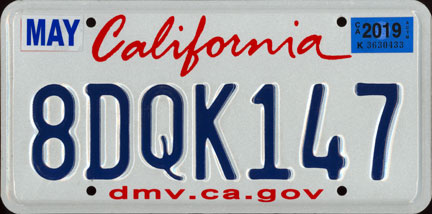
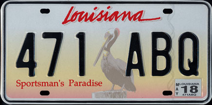
California's iconic "Lipstick" license plates first debuted in 1995 and has remained mostly unchanged since then, give or take a few taglines and resizes. However, these relatively plain license plates (which can be compared to similar license plates from Louisiana) do not represent the diverse landscapes and population that is seen in the vastness of California.
The standard passenger plate is a simple design that utilizes California's unofficial state colors of blue and gold and a font inspired by California's "Sunset" license plates of the 1980s. This design then sets up a template for the redesigned specialty license plates. While many of these new specialty plate designs are simple carry-overs from the state's existing selection, there is a new series of sports and collegiate license plates.
You can see all my redesigned California specialty plates on my Behance project page!
---
With California out of the way, I will be going through the rest of the states and territories in alphabetical order starting with...
ALABAMA
My Alabama license plate honors the state’s role in the civil rights movement of the 1960s, as Rosa Parks’ act of defiance and the Selma to Montgomery marches occurred in the state. A sunrise behind Selma‘s Edmund Pettus Bridge is featured at the bottom of the plate, and the English translation of the state’s motto is underneath the state name. An Alabama flag heart is at the upper-left corner, but the longtime “Heart of Dixie” motto has been dropped due to its racist connotations to the Confederate South.
---
ALASKA
My redesigned Alaska license plate features the unique aurora borealis that can be seen in this arctic state. A mountain landscape with a glacier is at the bottom of the plate, and the Big Dipper/North Star from the state flag serves as the divider.
---
I'm super excited for this new series, and I welcome any suggestions for things to put on any of the states and territories that I haven't done yet!
(I'm finishing up American Samoa and Arizona as I write this, but please suggest away for everything after that!)
-
17
-
-
United Plates of America
UNITED STATES
CANADA
-
1
-
-
Another Matt Wolff design, this time the final logo for Vermont Green FC!
-
2
-
-
Those Sky Carp wordmarks are a thing of beauty! I love how elegantly they're shaped, and I love the great contrast between the black/gray and the light blue jersey especially

-
The Royals seem to have a new jersey lined up for Friday:
-
3
-
-
Nice to see you back with yet another impressive design!
I love the subtle stained glass pattern on the home kit, which itself is a very striking set with a great contrast between the shorts and the shirt. My only suggestion, however, is potentially making the top of the "R" in the monogram more distinguishable as an "R" (I'm aware that you're fitting it into the circles of the full monogram), as right now it's looking a little bit like a "KG" monogram
-
1
-
-
It looks like the first bits of design for MLB's 2022 season is starting to make its way out!
The Giants tweeted out the 2022 Cactus League logo, which is a cool old-school style logo, in my opinion:
---
The full Spring Training logo was shown off by the Padres:
-
3
-
-
You've got some good stuff here, my friend! You have some nice illustration skills that I probably won't have for a while

I'll definitely have to borrow your Bordeaux crest idea (with credit, of course) for a future team of mine very soon. As for Chicago, I prefer Option A to emphasize "Chicago Fire" a lot better.
-
1
-
-
That Valencia crest is a thing of beauty! There's a lot of different elements and colors going on, but they're all integrated so well and cohesively. Some of your recent third kits have also been spectacular and well-detailed, namely the Bilbao and Español thirds.
Keep up the great work, my friend!
-
2
-
-
Your version of the Nats look like something the Kansas City Royals could easily pull off! Your second draft fixes some of the potential legibility issues with the first draft (specifically the home and the home alt), and I particularly like the gold and blue alts!
The Rays are a really solid look, and I like the Angels alts as well. I feel like I'm in the minority of people that actually liked the short-lived volt Hawks, and the way you pulled off the Braves looks nice and modern
Some good stuff here!
-
2
-
-
The Iberaliga looks great so far, even starting with the league logo. I look forward to seeing how you take on the unique Spanish style, and the Alicante crest is fantastic! For Breogan, I particularly like the pirate theme you got going here, and how you've "torn-up" the sash on the black kit.
I look forward to seeing the rest!
-
1
-
-
The Dbacks look much better, and it's much easier on the eyes now! Also, that orange Dbacks jersey is an absolute beauty; well done!
-
2
-


#/media/File:Oranges_-_whole-halved-segment.jpg)
_as_reported_in_the_Flags_of_Paradise_chart.svg)
United Plates of America (CANADA FINALE!)
in General Design
Posted · Edited by TheGiantsFan
New revamped design
Thank you so much!
I was definitely looking forward to getting to Hawaii once I started this series, so I'm glad that it's one of your favorites so far!")
Ni'ihau an island that's not even open to the public, so it's not like isolation is something they're unfamiliar with
Glad you liked it!")
Thanks so much!")
---
IDAHO 2.0
After at least three different comments about how my first Idaho redesign looked more like a Montana plate, so revamping my Idaho redesign was inevitable. However, I kept on pushing this one back due to extreme creative block for Idaho, as there was really nothing going for this state at all.
This new redesign for Idaho’s license plate is inspired by the various green-on-white license plates used between 1968 and 1991. The wordmark features an “h” in the shape of Idaho, and the serial divider is a reference to Idaho’s “Gem State” nickname (first suggested by @BrySmalls). As a nod to the state’s famous potatoes, a mountain landscape is depicted using French fries.
IDAHO 1.0
I'll admit that I actually had a very difficult time making Idaho's license plates. The current license plates encapsulate the mostly rural and mountainous state pretty well, and any attempt to recreate these 1928 potato plates was thwarted by a potato that looked like a turd . I also wanted to stay away from using brown because I'll be reserving that color for neighboring Wyoming at the very end of the series. Ultimately, I decided to keep it simple just so that I can move on to the next state
This Idaho license plate redesign is inspired by the various green-on-white license plates used between 1968 and 1991, as well as the white-on-black Idaho state highway signs used until 2020. As a nod to the state’s famous potatoes, a mountain landscape is depicted using French fries.