


TheGiantsFan
-
Posts
1,415 -
Joined
-
Last visited
-
Days Won
3
Posts posted by TheGiantsFan
-
-
On 9/2/2022 at 11:06 AM, Halian said:
God, that looks amazing.
 I wonder what a color-reversed version would look like, since I personally find the turquoise-on-brown 1959 issue to be more striking.
Glad you like it!
")
Just for you, here's a turquoise-on-brown version of my BC plate! Frankly, it doesn't quite work as well as brown-on-turquoise in terms of the color contrast
 Spoiler
---
MANITOBA
An important symbol for Manitoba, the plains bison is once again promoted to the focal point of my license plate redesign for the province. My plate combines the left-aligned bison from the 1971-75 plates with a lower bar reminiscent of the metal registration tabs that the province used until 1970. The wavy pattern references Manitoba’s 110,000+ lakes, and the colors are taken from the University of Manitoba.
-
 4
4
-
 1
1
-
-
BRITISH COLUMBIA
My British Columbia redesign is heavily inspired by the unique brown-on-turquoise license plate used by the province in 1960 and the province’s “hand-crafted” tourism branding. A pattern inspired by indigenous Salish art decorates the top, and the waves from the provincial flag are drawn in a similar “hand-drawn” style at the bottom.
-
4
-
2
-
-
On 7/15/2022 at 11:44 AM, raysox said:
Oh man, I was along for the ride. Great great work consistently through this thread. The recent W states were phenomenal as always.
If you do want another idea i've wanted to forever make these unique license plates for EU countries. Have that one for free! Looking forward to Canada!Thanks so much Michael, and I'm glad you enjoyed the tail-end of the American plates!
Unfortunately, I don't think European plates are on my radar as I don't have too much of a vested interest in designing for Europe (as someone who's never been there)
On 7/15/2022 at 11:46 AM, Halian said:I somehow only just noticed that Florida's tag is green on white when it should be black on yellow. ^^;
Nice catch there! I did deviate from Florida's normal stickers because of the visibility concerns about having a black-on-yellow sticker on top of a yellow background
On 8/24/2022 at 8:35 AM, JTernup said:I'm a bit late on this, I was following along until about Puerto Rico but then life happened, so I just caught up. I'd just like to say that this is by far my favorite and one of the most impressive creative endeavors I've seen on this site in the 12 years I've been around. Truly excellent work, there isn't a single state that I don't like and each one would instantly be a fantastic primary or alternate plate. You've represented each state excellently and it's cool to see so much research and effort yield such great results.
I'm excited to see a potential Canada, Philippines and EU series. May I also suggest an African series? There would be all kinds of great imagery and history to pull from there!
I really appreciate your kind words there! I'm glad that my efforts to give each jurisdiction an accurate and appropriate plate paid off
As cool as an African series would be in terms of designs, I personally don't have too much of an interest in designing plates outside of North America
---
After a month-long hiatus from design work due to my move to Oregon, I'm back to start off my Canadian license plate redesigns!
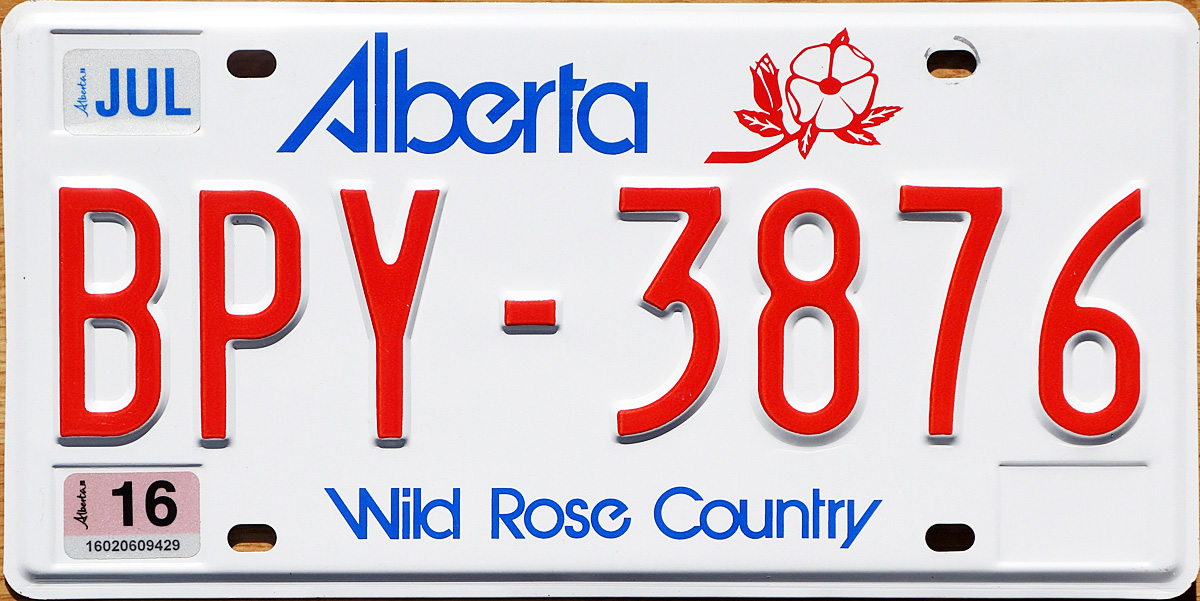
ALBERTA
My Alberta design revives the jagged, retro wordmark that the province used on their license plates from 1984 to 2019. Complementing the angles of the wordmark is an abstraction of the mountains of Banff National Park, with each “peak” shaped like a map of Alberta. The provincial coat of arms serves as the serial divider.
---
I've only been to Canada twice in my lifetime, so I don't know too much about the Canadian provinces aside from what I learned in J.J. McCullough's YouTube videos. As I've done with the American plates, I'm opening up the comments to any design suggestions for any of the remaining 12 jurisdictions in Canada
Looking forward to this (relatively) quick series!
-
7
-
-
11 hours ago, Halian said:14 hours ago, jzn110 said:
Dude, you killed it with all of these! Well done!
Have you given any more thought to doing Canada next? I'd love to see those as well!
I think it'd be cool to do other countries as well.
Thanks so much!
I do have plans of making Canadian plates, but those will have to start next month (at the earliest) because I'll be busy in the coming weeks. As far as other countries are concerned, the most I might be willing to do is my homeland of the Philippines
3 hours ago, NicDB said:13 hours ago, packerfan21396 said:First off, congratulations on the completion of a top tier project; truly some fantastic work. Recreating all the renewal stickers is also a top tier detail that adds a lot to the authenticity.
While the Wisconsin highway shape is unique, the current shape is a compromise so that numbers can fit well; originally, the Wisconsin highway marker was just a downward pointing triangle:
Could be a bit cleaner to make the divider the downward pointing triangle, plus then it could look like some minimalist cheese and who doesn't love a bit more cheese?
The dots in the i's of the Wisconsin wordmark are already wheels of cheese. I like the use of the current shields. Especially for something traffic related.
Thanks so much!
I'm glad that someone finally caught on to the renewal stickers! I wanted to make sure that those and the serial fonts were as accurate as possible, right down to the sticker colors
I have heard of the history behind the Wisconsin state highway shields, and it does make for an interesting design. I kept the cheese to the dots on the "I" to keep the cheese references subtle
---
COMPILATIONS
ALABAMA - KENTUCKY
SpoilerLOUISIANA - OKLAHOMA
SpoilerOREGON - WYOMING
SpoilerYou can also read all about these plates on my Behance page!
- CALIFORNIA: https://www.behance.net/gallery/138247417/United-Plates-of-America-PART-ONE
- ALABAMA - MISSOURI: https://www.behance.net/gallery/138654139/United-Plates-of-America-PART-TWO
- MONTANA - WYOMING: https://www.behance.net/gallery/143973585/United-Plates-of-America-PART-THREE
---
It was a real pleasure to work on this series, and I'm really glad it's gotten a relatively positive reception. To get some "local" insights and suggestions about certain places, I consulted several people to help me out on this project. A HUGE shoutout to @raysox, @DCarp1231, @NicDB, @stumpygremlin, @CDCLT, @tBBP, and @TenaciousG for making sure these designs are as authentic as I can make them
---
As far as what's next, I am thinking of going through Canada's plates! That'll have to wait a month or so, though, so enjoy these 56 plates in the meantime
-
1
-
3
-
 3
3
-
1 hour ago, NicDB said:
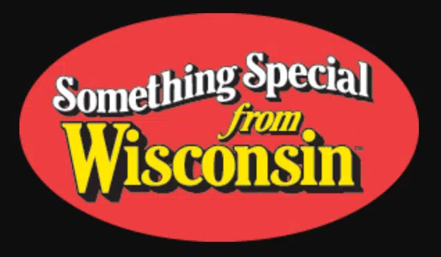
Oh man... you nailed it on Wisconsin. If you told me that had been the plates for the past 30 years I wouldn't even question it. Also, not sure if that's what inspired it, but your wordmark looks remarkably like the Something Special From Wisconsin logo.
I especially love the buck staring at the skyline. #FearTheDeer
Thanks so much for helping out with Wisconsin, and I'm glad you liked it!
I'd never seen that Something Special from Wisconsin logo before, and it's such a fun coincidence!
---
Last but not least!
WYOMING
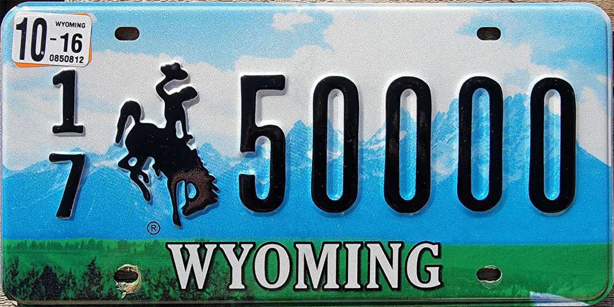
My Wyoming license plate is heavily inspired by a fictional Wyoming sports logo designed by Jordan Grimes, which features colors from the Grand Prismatic Spring at Yellowstone National Park. The hot spring motif is combined with the mountain scenes featured in previous license plates, and the red border and shade of blue is taken from the state flag. The historic bucking bronco used on Wyoming plates since 1936 remains.
---
Compilations coming up a little later!
-
7
-
2
-
-
WISCONSIN
At the request of @NicDB, I eliminated the state’s longtime “America’s Dairyland” slogan to reflect Wisconsin’s urbanizing population. Inspired by the 1998 Sesquicentennial license plates, my redesign combines several Wisconsin landscapes: dairy farms, the Apostle Islands, and the Milwaukee skyline. The wordmark is inspired by an optional plate design and contains two truckles of cheese above each “I”. The serial divider is inspired by Wisconsin’s unique state highway shields and the state’s motto is found at the bottom.
-
6
-
2
-
-
On 7/10/2022 at 8:15 PM, jzn110 said:On 7/10/2022 at 8:03 PM, Seadragon76 said:
Not bad for Washington... I caught the Space Needle and the whale, but the map of the state eludes me.
I think it's in the center of the salish art "cell" just to the right of the whale. The blue shape has a little notch out of the top right, like an abstract shape of the state.
That is correct! An abstract map of Washington can be found to the right of the whale
On 7/11/2022 at 7:11 AM, GriffinM6 said:That Washington plate has got to be top 5 in the series so far for me. The intricate details really do a great job of representing the state.
Thank you very much! It took me a little longer so I can get the details just right, and I'm glad it paid off!
On 7/11/2022 at 8:14 AM, tBBP said:Definitely one of your best, probably THE best thus far. Side note: this and @sparkychewbarky's Battle of Seattle concept thread have to rank among the best concept threads the Creamery has ever known.
Now, having said that...the way you managed to weave *almost* 300 lateral miles of landscape into a 12" × 6" piece of stamped aluminum is just genius, the hidden symbols and overall art style even more so. That said, and I only add this because I done been to and through Washington state so many times over the past three years: this might not be too well known to those who ain't been out there, much much if not most of eastern Washington is virtually treeless open prairie. (At least until you get down into Walla Walla aka wine country.)
That though is a hair-splitting nitpick...only people in/of eastern Washington may raise it--or a certain former trucker around here who's seen it with his own two eyes--but at a glance, yeah, your plate design SCREAMS Washington. No mistaking that at all.
Thank you so much, I'm happy you enjoyed Washington!
Funny you mention sparky's Battle of Seattle thread; I actually skimmed through that entire thread to gain some Salish design inspiration for my license plate!
I did try to keep eastern Washington in mind for the design but honestly, I think the mountains would help represent them in this design. I'm glad you think it represents the rest of the state very well, though
---
WEST VIRGINIA
The main focal point of my West Virginia license plate is the New River Gorge Bridge and is depicted like the state's optional "Scenic" license plate. The mountainous landscape of the state is represented by a smoky sunrise over the Appalachians. The "Almost Heaven" tagline above the state name is a reference* to "Take Me Home, Country Roads" by John Denver, which cemented West Virginia into music history.
*Referencing "Take Me Home, Country Roads" was inevitable with this one

---
Two more states left!
-
9
-
2
-
-
On 7/7/2022 at 2:35 PM, Halian said:
Doubleplusgood as usual
BTW, I was able to get my original account back.
Thanks so much!
On 7/7/2022 at 9:02 PM, TenaciousG said:I’m so excited for Washington. Our department of licensing is the worst - over the last several years, they
1. Got rid of the cool font (same one as Oregon) and replaced it with some boring Arial type font
2. Stop raised lettering 6 digit plates; for 7 digit illegible printed letters that can only be seen if you’re directly behind the other car
3. Forced people to change their plate numbers every few years unless you pay more in an obvious cash grab
And all this from the Evergreen State, which continues to not have a single speck of green on our plate. And it is a little easier to understand the DOL’s need to make people pay when we have massive infrastructure needs but live in a state that claims to be liberal but in reality is a tax haven for the ultra-wealthy.I definitely agree with you there, and I much prefer the original version of the Rainier plates over the current ones. Lucky for you, I also thought it was weird that the Evergreen State doesn't have any green on its plates...
---
WASHINGTON
My Washington license plate redesign is based on the landscapes and the indigenous Salish art (which also inspired the region's sports identities) found in the Pacific Northwest. Hidden in the illustration is the Space Needle, a whale, and a map of the state. A script state name is a reference to a prototype Washington license plate from the 1990s and the placeholder logo for Seattle’s NHL team.
-
11
-
1
-
1
-
-
VIRGINIA
Virginia has a unique history of black license plates, so I decided to combine that history with the state’s current tourism campaign with its unique black, white, and red color scheme. The typography for the state name is inspired by the optional George Washington Bicentennial plates and the shape of the black “box” is inspired by the colonial architecture seen in Mt. Vernon and Monticello.
-
3
-
3
-
-
On 7/4/2022 at 9:31 AM, tBBP said:
Much gooder...much much gooder.
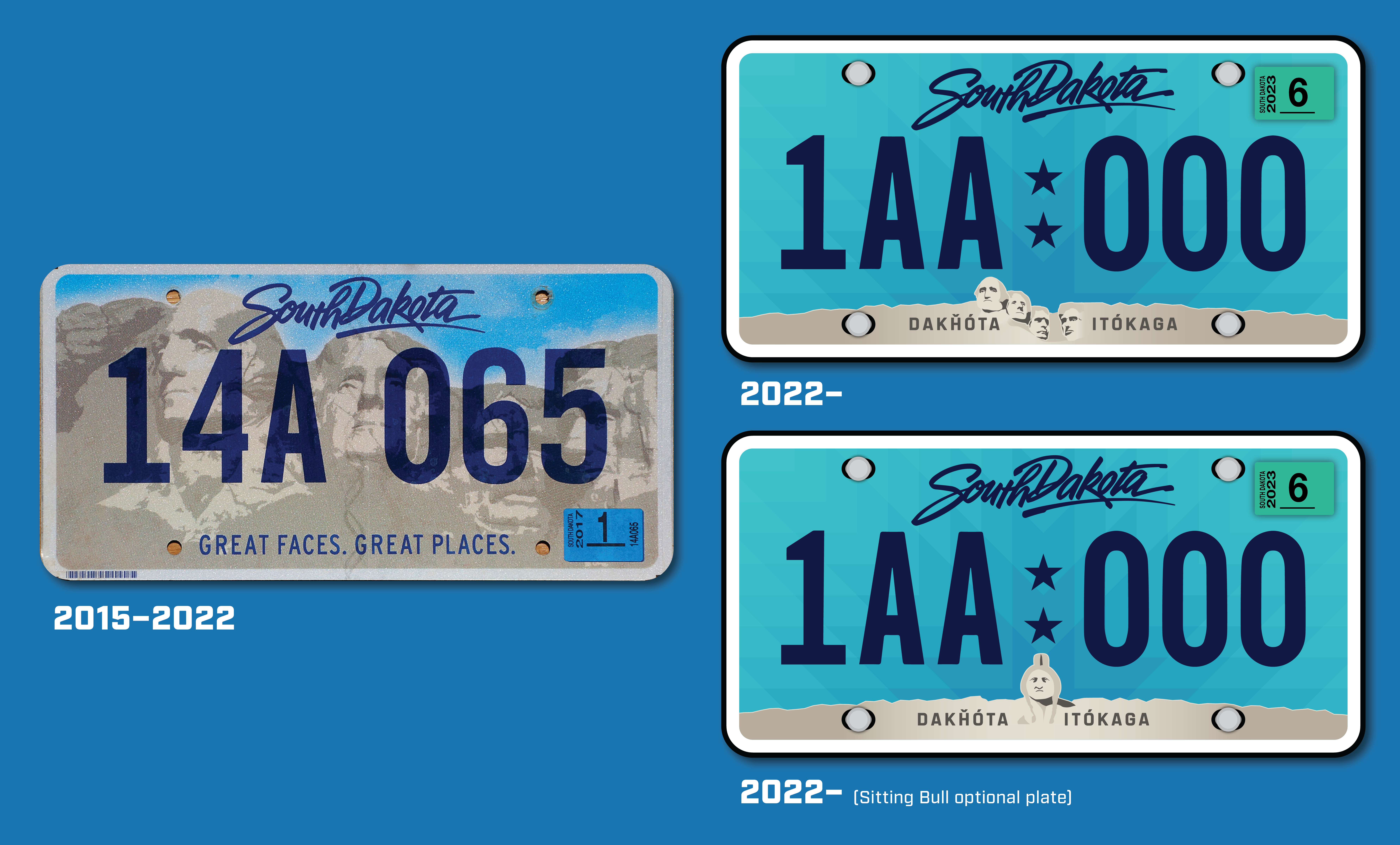
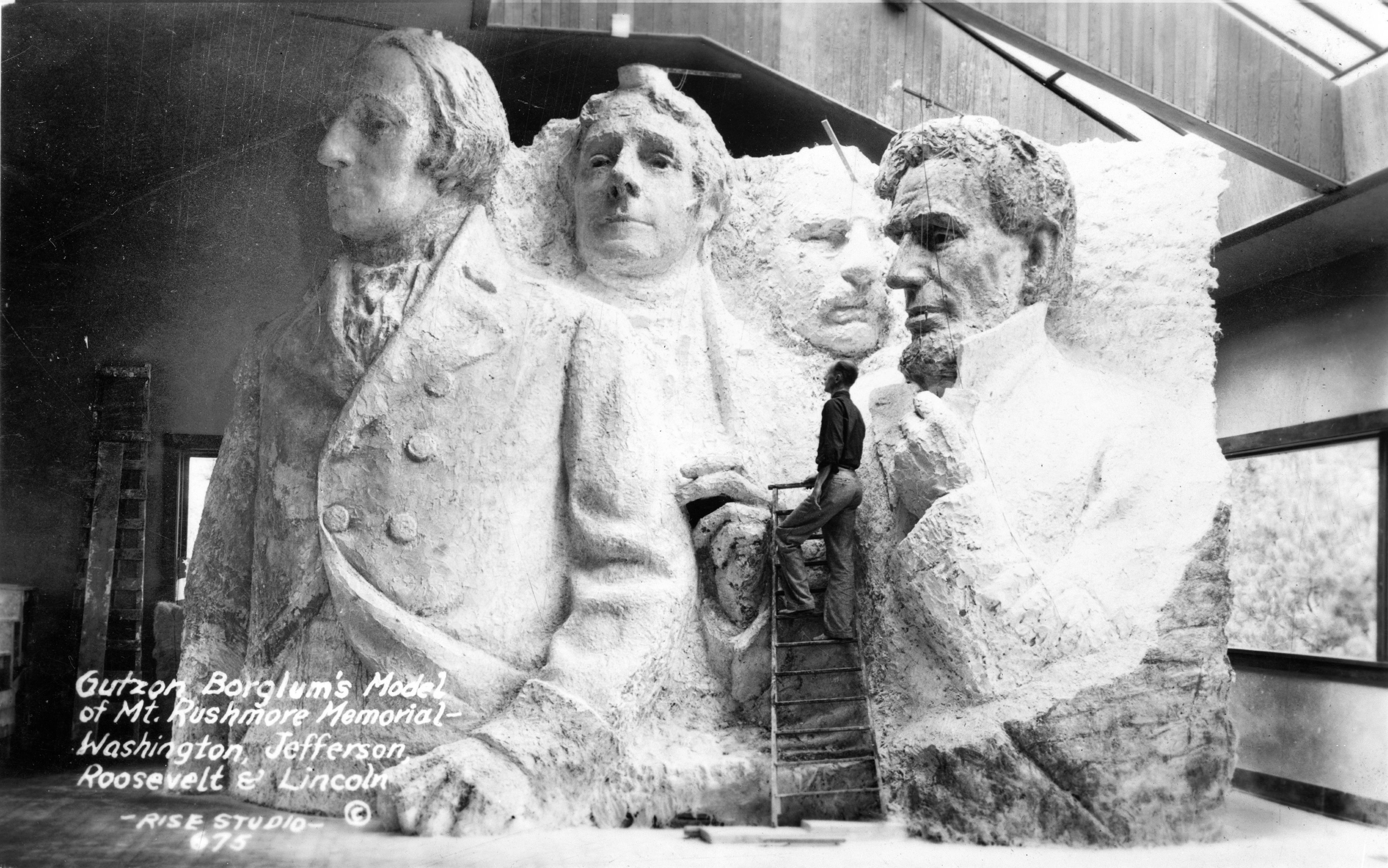
South Dakota resident here (and I still sometimes wonder how that happened, lol), but I'm glad you opted for an alternate version of the plate with Chief Sitting Bull depicted in the Black Hills mosaic--and I'm glad you reduced the size of the Rushmore imagery in the plate. From the state government's perspective, it definitely is a source of state pride--and, aside from the annual Sturgis biker rallies, pretty much the only thing anyone outside the state knows South Dakota for--but the monument itself is mired in much controversy. Most folks on East River are completely unaware--I myself never knew until I moved up here and, on account of becoming acquainted with a good many of the Native people up here (including dating a Native woman for a short bit), I decided to investigate it for myself--but it may be just a little bit more known on West River by those who actually care.
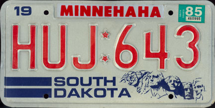
This really ain't the place to go too deep, so I'll just hit the highlights: The Black Hills themselves are sacred lands in the eyes of the Lakota nations, which after being effectively stolen from them by the U.S. government on account of gold being discovered in them, then became the site of what's now known as Mount Rushmore. Here's where things get twisted: the four faces on that mountainside--Washington, Lincoln, Roosevelt and Jefferson) were originally not supposed to be there; the site was originally intended to be a testament to westward expansion and was supposed to have had the faces of Meriwether Lewis, William Clark, Buffalo Bill Cody, Sacagawea, and Chiefs Red Cloud and Crazy Horse. However, all that changed on account of one man: Gutzon Borglum, the man commissioned to design and oversee the project. He unilaterally chose to carve the faces of those four aforementioned presidents into that mountainside, "reasoning" that they would have more widespread appeal than the aforementioned six. The rest, as we know, is history. So, while the site is an amazing feat of human engineering in its own right, imagine it from the Lakota perspective: looking up there at the faces of the men who stole your land from you. (For that reason, my license plates are a different version that doesn't feature the Rushmore motif.)
With all that said...if you were to go back and do a version had had the originally intended faces in that motif, that might well be something to behold.
On a far wider and much more positive note, this series ranks right up at the top of all the concept design series I've seen in the fifteen or so years I've been a part of this site. Absolutely top-notch work.
Thank you so much for your kind and insightful words! I'm glad you've really enjoyed the series, and that really means a lot to me
I've always known that Mount Rushmore was controversially sculpted on Native land, but I never knew about the non-presidential proposal for Mount Rushmore! I really wish I could recreate a president-less Mount Rushmore for you, but it doesn't look like there were even prototype sculptures built without the presidents; all I was able to find was this illustration unfortunately
---
VERMONT
Vermont’s timeless green license plates are updated with a forest gradient reminiscent of the state’s namesake Green Mountains. The thirteen stars from the Green Mountain Boys flag make its license plate debut in the lower-left corner of the plate.
At the request of the Vermont DMV themselves (the only time so far that a DMV account actually responded to a plate concept!), I changed the treescape from evergreens to sugar maple trees
-
9
-
1
-
-
It's official for the Padres:
-
1
-
-
UTAH
Here's the direction I think the Utah Jazz should have taken with their black/yellow redesign
The beehive is an important symbol for Utah, so my license plate redesigns are based around a hexagonal honeycomb theme. The beehive seen on state highway shields and used on license plates from 1975 to 1978 returns as the serial divider. Replacing the Delicate Arch optional plate is a honeycomb representing the state’s two distinct landscapes: the snowy peaks of northern Utah and the red rocks of southern Utah. At the bottom is a quote that is attributed to Brigham Young’s first sighting of the Salt Lake Valley in 1847.
-
8
-
1
-
-
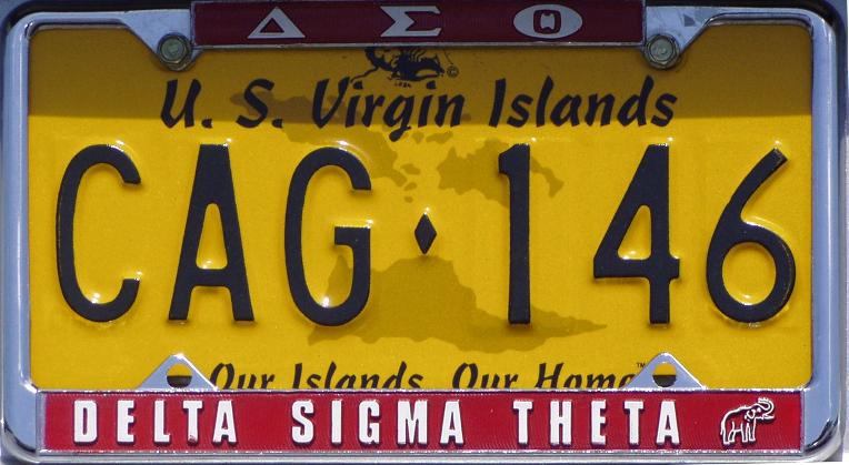
U.S. VIRGIN ISLANDS
My redesigned license plate for the U.S. Virgin Islands is a return to the yellow “Our Islands, Our Home” license plates last used from 2000 to 2005 and retains the map of the territorial islands that have been seen since 1994. The bottom of the plate references the many coral reefs seen in the territory, and the colors are taken from the official madras design for the U.S. Virgin Islands.
-
7
-
-
On 6/27/2022 at 5:59 PM, jzn110 said:
Tennessee looks awesome, but I think I would shift the "Soundtrack of America" slogan so that it appears centered in the white space between the "T" and the mount hole - or maybe track out the lettering so it stretches across that space - because it feels a little off-balance with the way you have it set now, even though it's technically on-center.
Y'know, you're totally right! A revised Tennessee license plate can be found later on in this post, and thanks for the feedback!
21 hours ago, stumpygremlin said:South Carolina, the stars get lost. I didn't see them at all until I zoomed in, and wouldn't have known they were there if you didn't point them out. I'm not sure if that was intentional, but it might not be the worst idea to lighten them up a bit?
That was actually intentional! I didn't want the stars to clash with the rest of the design, so I made sure to make them subtle. I did lighten them up just slightly, though:
Spoiler---
Before I proceed with Texas, here are some more edits to recent plates!
A friend of mine suggested that I make an alternate South Dakota plate that features the Sitting Bull Monument instead of Mount Rushmore, so here are the two South Dakota plates:
SpoilerAs for Tennessee, I wasn't fully satisfied with the version that I put out.
So in addition to "Soundtrack of America" tweaks suggested by @jzn110, I also changed the vertical blue bars at each end of the "sheet music" to light gray so that there's a little more breathing room in the design:
Spoiler---
TEXAS
For a place with as much state pride as Texas, I wanted to go for a simple and bold design based on the Texas flag. The flag striping pattern is based on one of the finalists for Texas’ 2009 license plate redesign, and the slab serif font is reminiscent of the wordmarks that the Texas Rangers used from 1972 to 1993.
-
7
-
-
On 6/25/2022 at 6:33 AM, Halian_ said:
This is my second account; I can no longer access my first one. The first one poked its head into the original ABL's stadium thread, among other places, leading to the Lafarge & Samara Forum.
Ahh, I see! Good to see you again after all these years!
---
TENNESSEE
ORIGINAL DESIGN WITH BLUE SIDE BARS:
SpoilerMy Tennessee redesign plays off the state’s “Soundtrack of America” tourism slogan with a design that honors Tennessee’s contributions to country and blues music.A country music-inspired wordmark is placed above an abstracted map of Tennessee. Inspired by the horizontal lines in posters created by Nashville’s legendary Hatch Show Print, horizontal sheet music lines form the background of the license plate. The colors and tri-star roundel from the state flag make an appearance.
-
11
-
1
-
-
On 6/24/2022 at 8:25 AM, GriffinM6 said:
Great job keeping the same general idea for SC while improving on what they already have. Love Puerto Rico as well. The bright blue looks great.
Thank you very much!
It was so tempting to go the easy route with South Carolina and give its plate the 2009 Indiana plate treatment, but I'm glad you like how the nighttime scene ended up!
On 6/24/2022 at 3:27 PM, Halian_ said:I love the Florida plate!
I should point out, however, that Dade County residents haven't had the option of county name plates since 1994, due IIRC to a rash of tourist killings that year (rental cars were mostly registered in Dade County). Besides, it's not even the most populous city in the state, so you should put Duval County (Jacksonville) instead. 
Glad you like Florida, and welcome to the forums!
I do remember hearing about the Miami-Dade county sticker situation once! I totally understand your point, but I've been going with the most populous county for any state with county-based stickers or numbering just for simplicity's sake. If it were to be implemented in real life, I'm sure Miami-Dade stickers wouldn't exist!
---
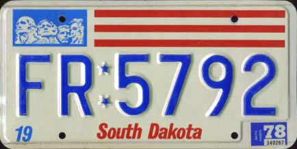
SOUTH DAKOTA
Every South Dakota license plate since 1952 has had an illustration of Mount Rushmore. To differentiate my redesign, I decided to add references to the native Sioux tribes: the background is a blue gradient stylized like a Sioux star quilt, and the Sioux name for the state is listed at the bottom. The shades of blue are inspired by the state flag, and the star dividers from 1976 to 1986 make a return.
---
Ten more jurisdictions left!
-
9
-
-
Work has been extremely slow this week, so I'm able to breeze through the states!
SOUTH CAROLINA
My South Carolina license plate depicts the state flag as a nighttime beach scene, with the crescent moon lighting up a single palmetto tree and the Atlantic Ocean. There are 46 stars to represent the state’s 46 counties; 8 of the stars are slightly larger to represent South Carolina being the 8th state in the United States.-
13
-
2
-
-
RHODE ISLAND
This simple design for Rhode Island features the state flag for the first time in its license plate history, with the stars rearranged so that the anchor is more prominently featured. Some finalists of the 2022 Rhode Island redesign contest feature the waves from the current license plate, so a sublimated wave pattern is seen in the background.-
9
-
-
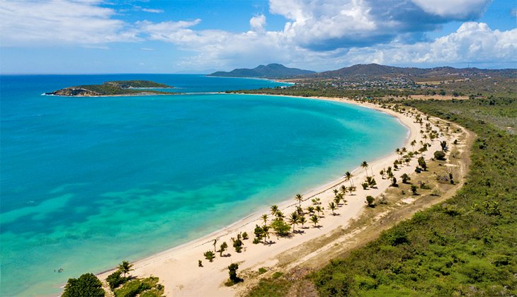
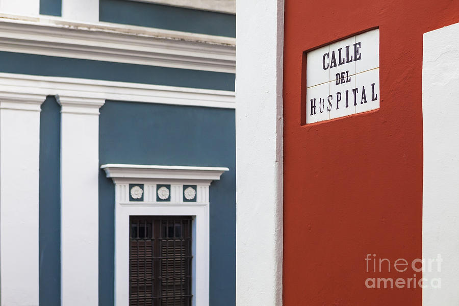
PUERTO RICO
The color scheme for my Puerto Rico license plate is based off of the pre-American Puerto Rican flag from 1895, which uses a lighter shade of blue than the current one. Flag elements are used to portray a beach scene, complete with a sand-colored gradient. The wordmark is inspired by street signage in old San Juan and is inside a bomba skirt, referencing the traditional Puerto Rican music and dance style. In the middle is a traditional Taino coquí symbol, representing the island’s symbolic frog.-
8
-
2
-
 1
1
-
-
PENNSYLVANIA
This license plate for the Keystone State depicts the keystone on a structural arch for the first time in license plate history. The arch has a brick center to represent the colonial-era architecture of Philadelphia and eastern Pennsylvania. Steel beams form the outside of the arch to represent the steel industry of Pittsburgh and western Pennsylvania (including a wordmark inspired by steel I-beams). Blue and gold have been on the state’s license plates since 1923, so those colors remain.An alternate license plate commemorates the upcoming 250th anniversary of American independence with a patriotic color scheme.-
8
-
1
-
2
-
-
I'm super excited about this plate for the state I'll be calling my new home in a few months!
OREGON
Although Oregon’s current douglas fir license plates have become iconic to the state, I decided instead to tweak the retro license plates that I ended up loving on a recent trip to Oregon. Originally used from 1955 to 1973, my modernized gold-on-blue plates feature the beaver from the back of the Oregon state flag and the wordmark from Travel Oregon. A sublimated wood pattern references the state’s vast forests and love for the outdoors.
-
3
-
2
-
-
2 hours ago, buckeye said:2 hours ago, jzn110 said:
For some reason the image link for Ohio is showing as broken on my end, but it shows up just fine on your Twitter. Looks awesome!
Same for me
37 minutes ago, Jake3roo said:Same with me, posting for accessibility https://twitter.com/mustbe_lys/status/1536844396485677056/photo/1
Re-linked the image, so Ohio should show up for y'all here now!
-
6 hours ago, panthers_2012 said:
It's true. I have the "old" one, the one with all the gray wording on it. Even though I miss my bicentennial plates from my old car. I liked those plates.
This concept is a whole lot better and this is what should be used for the plates. Nice job!
Thanks so much!!! Glad it's approved by an Ohio resident
The red/white/gray Ohio plat you're talking about definitely grew on me through the years; I really liked how simple it looked from far away, and I always thought of the triangle thing at the top as an abstract Ohio lakeshore map
 5 hours ago, StevenGrant94 said:
This entire series has been superb so far, the Hawaii and New York plates are especially awesome!
Your Ohio plates are a big improvement over their current design.
Glad you're enjoying the series, my friend! Hawaii is definitely one of my favorites in the series
---
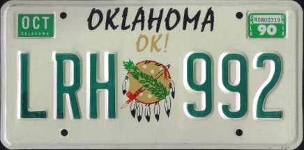
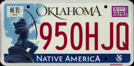
OKLAHOMA
The centerpiece of my Oklahoma license plate redesign is the return of the state flag shield previously seen on the state’s plates from 1990 to 2017. Similar to the flag and the current license plates, the background is light blue in color. The sunburst design is inspired by the Oklahoma City Thunder’s 2018-19 City Edition jerseys, which were themselves inspired by Native American art. A flowy serif font is inspired by Oklahoma’s 1982 sunset license plates.
-
6
-
1
-
-
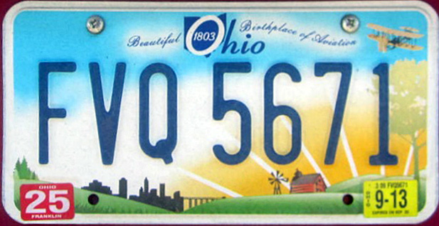
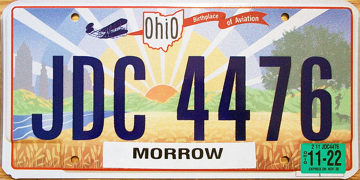
OHIO
Ohio's newest license plates are honestly such a trainwreck, so here's my simple remedy!
After a series of very cluttered license plates in the 2010s, I decided to keep it simple for my Ohio redesign. This red-based plate focuses on the uniquely shaped Ohio state flag, which adorns either side of the Ohio wordmark like one of the concepts for Ohio’s 2013 license plate redesign. The map from Ohio state highway shields serves as the tittle for the “I” in the wordmark. Despite the 2021 plates having flat-screened numbers, I decided to re-emboss these plates for my redesign.
-
4
-
2
-


#/media/File:Noble_Knob_looking_North.jpg)
.JPG)
#/media/File:USA_Tennessee_location_map.svg)
.svg)
.svg)
United Plates of America (CANADA FINALE!)
in General Design
Posted
I fixed the link for the Manitoba image, so hopefully it works for you now!
Hmm, I'll probably make some more tweaks for the turquoise-on-brown for legibility and color balance stuff, but it could work as an alternate plate!