


YelichGraphics
-
Posts
2,455 -
Joined
-
Last visited
Posts posted by YelichGraphics
-
-
On 4/9/2024 at 3:38 PM, CDunn said:
Can anybody identity the font for "National Champions"? It looks kinda like Bebas with serifs.

I think that is exactly what that is. Would'n't be surprised that the designer on this just messed with the text a bit.
-
19 hours ago, AluxEcheverria said:
Hi! @KG_grfx My name is Alux Echeverría, returning to the publication about your design and conceptualization nowadays, there is a topic that has me with questions, the concept you created about taking and abstracting the image of the rocky mountains, applying it to the sides of the shoulders, is very clear, the colors and layout in general. Now, with the release of the Broncos' new 2024 uniform designs, my questions would be: Has the team contacted you about your design and concept? Were you part of the uniform design team? Were you given any mention or compensation for the use of your idea? My question is that if this has not been the case, as an industrial designer it would be unethical for the design team not to give credit to your idea and concept, if you have not been given compensation, and credit for the clear use of your concept, for me we would be facing a design plagiarism.
I mean you can go ahead and take on the NFL, and Nike, and I guarantee you lose that battle.
-
 1
1
-
-
Just now, infrared41 said:
First off, I don't "make excuses." I state my opinion. My uniform opinions are based on one thing - does the uniform look good? I don't give a flying
 about "design process" or any of the other industry-speak that tries to justify an aesthetic disaster. It's not about "playing it safe" vs. being "bold" or whatever. The design is either good or it isn't. Anything after that is just a circle jerk that I'm not particularly interested in taking part in.
You aren't going to change my mind and I'm not going to change yours. How about we move on and annoy different people?
I didn't know I was annoying you my apologies I was just debating my take. One of the things that annoys me is the instant negativity to all new things among these boards and I would like to at least a little leeway to a team trying to expand their brand. At the end of the day it's not that serious, just some uniforms. Agree to disagree
-
1
-
-
2 minutes ago, infrared41 said:
True, but the Eagles aren't wearing white helmets, brown jerseys with sublimated feather textures, and yellow shoes and socks because it represents the quality craftsmanship and hardworking, high flying example of the American eagle. That's the difference.
And neither are the Texans. I'm really just saying the whole "They look so unprofessional" line is just an excuse to say you would rather the design play it more safe and you don't like the look. And the examples you give I still don't think there's a team that is overtly being ridiculous in their design choices. I would agree with you on the Jags 2012 look and the Commanders but that's about it.
-
16 minutes ago, BBTV said:
They could put the horn on their helmet and make that their look, rather than it be part of many looks.
They don’t need to double down by also having bull horns on the jerseys… which are actually backwards from the ones in the helmet - that looks ridiculous.
Nothing wrong with trying new things - but commit to it. For better or for worse, make it your brand. Don’t have a different look for every day of the week because you’re afraid of commitment. They no longer have a brand.
This might be the best counter-argument I've been given. You got me, there are inconsistencies. I'd also argue just because they released 4 "different" uniforms doesn't mean they aren't all connected in some way, shape, or form. You can still tell that they are the Texans, the Home and Color Rush are basically the same but colored differently and the Away and Alternate are the same but colored differently.
I'd also still argue that having separate options that are all connected in some way doesn't make it unprofessional. I'll come back when you are all begging for a certain pair of pants to be paired with whatever they planned on top. -
Just now, infrared41 said:
The NFL has teams using "swords for shoulders" and "bull horns" on their jerseys and claiming "triangles represent dissipating oxygen." This stopped being about looking professional a while ago.
.
And the Eagles have had giant bird wings on their helmets forever. Just because it doesn't look good, pointing at the Titans, doesn't make it any less professional. It's a sports league meant to entertain. Just because its not the 60s anymore and every team isn't wearing some variety of stripes doesn't mean a team can't branch out to explore new ways to express their brand.
-
10
-
-
1 minute ago, infrared41 said:
My guess is someone was saying the same thing about the NBA back when it started adding alternates.
And I would argue that the NBA has gone out and changed their alternate identities WAY more than the NFL has. Don't get me wrong there is a lot of BFBS in the league atm however I can't name one alternate in the league where I still can't tell who that team is.
-
1
-
-
Just now, OnWis97 said:
I was referring to the fact that they will wear multiple helmets, thereby watering down that identity. Most fans won't understand the helmet/jersey combos and won't know in advance what's being worn. They'll just know that the Texans wear three different helmets. That they've indicated their plans doesn't really solve the watering down problem.
So if you were to tune in to a week 14 and you see the texans wearing a red helmet would the casual fan know that the team playing is the Houston Texans. Yes
-
 1
1
-
-
The only thing that makes it less professional is the perceived notion that an NFL team should have nothing more than a home and away uniform, and that since the league began we should stick to limited options but nothing they have done has made me feel like we are at an NCAA level where Oregon has a new uniform each week.
-
6 minutes ago, infrared41 said:
How about this? We've reached the point where even logo geeks like us can tune in an NBA game and have no idea who's playing because the teams have so many uniforms. It's like if Coca-Cola had 20 different "can combos" for Coke Classic and most of them had an alternate logo and colors. That's how it dilutes the brand.
Sure, but this isn't about the NBA. I understand the comparison but 2 "extra" helmets doesn't dilute the Texans brand.
-
1 hour ago, OnWis97 said:
To me it waters down the identity. Universities are not as tied to football and football helmets for their identity, as they have bigger athletic departments and more. While Michigan bringing out an "M" helmet and a cartoon mascot helmet to go along with their famous helmet would raise eyebrows, at most schools, it's all an expansion of a broader identity.
I'm well into my 40s and so maybe this isn't the same for younger people but the the helmet was a defacto alternate (or occasional primary) for all teams when I was younger. T-shirts, jackets, hats, stickers, etc. displayed the helmets. I still remember my Vikings pajamas with the helmet taking up most of the front. While this has diminished some, the helmet has remained a part of the identity...now you have no idea which helmet the Texans will wear. This holds true to several other teams. The helmet, outside of maybe Dallas and a couple of other teams, is going away as a key team identifier.I'd argue that the Texans very much spelled out which helmet they will wear. Nothing about their release gave me the impression they were planning on mix and matching the helmet, and I don't think there has been another instance in the NFL, maybe other than the Broncos release, where that was and or is the case. I could be wrong though.
-
1
-
-
5 minutes ago, DG_ThenNowForever said:
The NCAA-ification of the NFL is a real drag.
And I don't even hate the Texans, especially if they hold tight to actual home and away designations.
But all of these uniform combos and billions of helmets; it cheapens the game to me.
I've simply never understood this take. What makes having more options less professional? What makes having combinations and the ability to put show your brand in an another way that it contrasts the competitors brand on the same playing field. Hey if it looks good it looks good. By no means am I happy with all of the Texans choices but I don't think choices makes a team any less professional. In fact it gives this forum another thing to argue about on a week to week basis when it comes to pants and socks choice.
-
1
-
 1
1
-
-
I'll be honest the only thing that bugs me is the helmet stripe. The rest is fine and will make for pretty decent uniforms with the right combinations. The triangles are so small (besides the helmet) that I really don't think it matters in the grand scheme of the design. I really think some of y'all are just being negative for the sake of being negative.
-
3
-
 2
2
-
-
Color me wrong, pun attended, but as far as I know the Browns are still using the same Pantones as last season. @TruColor could verify but from what I saw on the style guide they still use PMS 2028 and NFL Brown
-
Just now, MJWalker45 said:
It's been changing at least over the past four years. It was Under Armour, then New Era, and now No Bull. Under Armour had it for a long while after Nike took over the gameday uniform contracts.
It'll change again next year as well. At least the performance gear which I don't really know if it matches the interview gear or not.
-
1
-
-
23 hours ago, MJWalker45 said:
No Bull has replaced New Era as the clothing provider for the NFL Combine this year. They are also the primary sponsor this year.
I want to say this changes year by year
-
1
-
-
I started here when I was 12, 10 years later I have a design gig with New Era. I send everyone in saying build up your portfolio, that's the best way to find yourself in a design gig.
-
2
-
-
1 hour ago, VikWings said:
I've seen a few decent looking chrome college football helmets, but have yet to see one that doesn't look horrendous in hockey.
The only team that gets the pass IMO is Notre Dame. They are the only team that should be wearing chrome in hockey
-
2 hours ago, wildwing64 said:
The Penguins with their throwbacks in 2016, before switching to them full time
Sabres also did something similar to this in the last year of their slug uniforms. I know it was said previously that they wore their 2007 royal in the playoffs, however they did the same thing when the navy "classic" alternate was introduced. They wore them as their primary dark uniform in the 2010 playoffs during their first round exit to Boston, only to switch to them full time the next season.
-
12 hours ago, kaleb_girod said:
This has probably been talked about here before, but anybody else think the Broncos should’ve never made orange their primary jerseys and kept the navy?
Or is it just me?They are the Edmonton Oilers of the NFL. I will always think they will look better in blue.
-
 1
1
-
-
44 minutes ago, PlayGloria said:
Agree with both of you. Honestly, this is really the only set of pants they need. Just swap out the jersey for home/away and they would look fantastic. I don't even mind the white socks on the road.
Home:
White helmet, red jersey, white pants, red socks
Away:
White helmet, white jersey, white pants, white socks
Black set: get rid of it
That's all they need. The pieces are all there with this set. It just needs to be matched up.
The might be an unpopular opinion but out of all of the BFBS uniforms the cards pulls theirs off the best. Its a nice alternate for one to two games a season.
-
6
-
-
Bills in white pants vs Dolphins in teal pants, chefs kiss
-
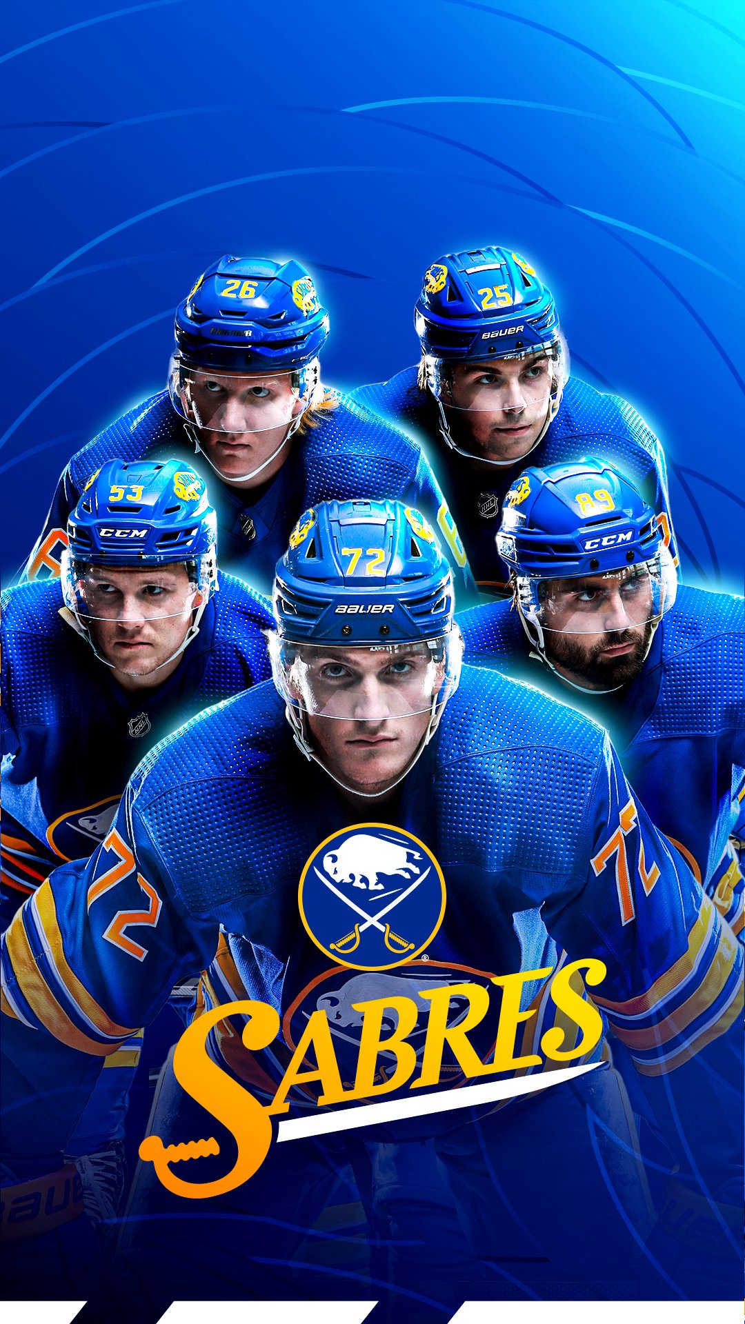
13 hours ago, mattwillcox said:
Some interesting stuff from the Sabres. Anyone with access to the logo slicks know if this wordmark is official, or just for social use?
I believe it's just social use, but it's been used pretty regularly during the past couple of seasons. In fact I'm almost positive it was designed by our very own @MrWonka
And to follow up on your question it is not on any logo slicks that I can find
-
1
-
1
-
-
Isn't the Adidas contract over after this season? If so my fear is a Nike centric modern Flyers


 about "design process" or any of the other industry-speak that tries to justify an aesthetic disaster. It's not about "playing it safe" vs. being "bold" or whatever. The design is either good or it isn't. Anything after that is just a circle jerk that I'm not particularly interested in taking part in.


2024 NFL Season week by week uniform match-up combos: From HOF Game to Super Bowl LIX
in Sports Logo News
Posted
Ladies and Gentlemen.... we back
By far my favorite thread on this site