


DCarp1231
-
Posts
9,327 -
Joined
-
Last visited
-
Days Won
136
Posts posted by DCarp1231
-
-
13 minutes ago, MCM0313 said:
Right. This is not soccer. This is not Europe. This is American football, and NFL teams have plural names. They need to stop with this nonsense and pick an *actual* name.

-
 11
11
-
 1
1
-
-
6 minutes ago, ptaylor said:
I do get the appeal (feels classic and old school) and if the on-field product continues to improve then it could work.
But man, any time someone calls them 'The Football Team' I want to vomit. Will always feel like a placeholder name to me.
IIRC, when the team announced the temporary identity, they did it in a way as to not get fans too attached to it...
-
9
-
-
Washington is reportedly “warming up” to the Football Team name as its permanent choice going forward
-
3
-
-
@IceCap out of curiosity, what are your thoughts on the Browns in this regard?
-
Y’all are diving hard into the Ship of Theseus... err Senators of Ottawa
-
2
-
-
On 3/19/2021 at 12:25 PM, ManillaToad said:
Definitely true though there are a fair amount of people here who prefer the new helmet for whatever reason
For me, it’s the simple fact that the old helmet horns had an incredibly wonky shape compared to the newer ones. I don’t mind the break in the horn either.
-
3
-
-
Washington has already given numbers to some of their free agent signings
• WR Curtis Samuel- 10 (currently worn by WR Antonio Gandy-Golden)
• QB Ryan Fitzpatrick- 14
• CB William Jackson- 23
-
He sure is an awkward lookin’ fella, ain’t he?
-
10
-
1
-
-
1 hour ago, JustForFun said:
2 what? 2 jockstraps?
-
5
-
-
27 minutes ago, guest23 said:
Amazing call as nobody else could have put 1 and 1 together to arrive at your conclusion.
-
10
-
1
-
-
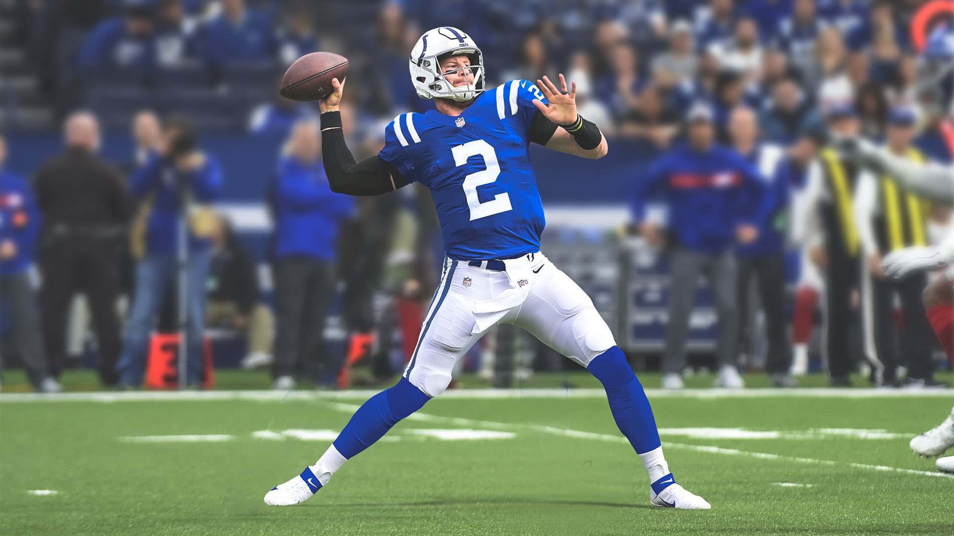
On 2/22/2021 at 12:04 PM, DNAsports said:
I’d like to see Wentz go with 2.
Called it. -
The Colts announce Carson Wentz will wear 2
-
4
-
-
I’m sure it’s just photo editing, but I love that the shade of purple is more prominent. Especially in the helmet stripes
-
3
-
-
If Washington keeps the numbers on the helmet beyond 2021, I’d be okay if they dropped the sleeve numbers.
-
3 minutes ago, Old School Fool said:
I think that Browns jersey is almost a confirmation that the one helmet rule has been changed. The rumors of the Browns having a white helmet have persisted forever and there's no reason to wear this jersey unless you have the proper helmet or else it's just the regular away uniform with drop shadow.
I mean these teams wear their respective throwbacks without the proper helmet and still look fine...
Obviously the correct helmet is necessary to have a true throwback, but it’s also not completely necessary. The Browns can still use their orange helmet and be fine.
Like @Cujo said, give us true Tampa Bay and New England throwbacks (plus other notable ones like Seattle), then we’ll talk.
-
8
-
-
So, the 49ers are going the Dolphins route. Having a standard set and a throwback set.
-
7
-
-
45 minutes ago, TheOatsMustFlow said:
He is right that the 9's used in the Cardinals' Tweet are a different font than what is used on the Cardinals uniforms.
But, the Cardinals social media team has been using the incorrect font for these types of posts for the last couple of years, so it's no evidence of new uniforms.
Interestingly enough, they did not give JJ a jersey to hold up at the press conference yesterday, so maybe that is evidence of new unis coming! But probably the real reason for that was him finding out earlier that day that he would get to use #99 which was previously retired by the Cardinals.
More or less the same deal with what the Ravens have been doing with lettering in social media for a few years now-
-
2
-
-
I can’t see how anyone thinks the 1995-2012 Jaguars logo is better than the current. It got a much needed and ideal facelift. However, since its inception, it has been constantly overshadowed by the poor uniform choices.
-
11
-
-
-
7 minutes ago, Sport said:
- The Steelers need something there so when you're looking at the player from the left there's at least one logo present. Why not just put a logo on the blank side of the helmet? Sure, if I could time travel to Pittsburgh in the 1960's and slap stickers on the left side of their helmets to calm my OCD I would, but at this point you can't mess with the helmet.
Weird.
-
5
-
 1
1
-
-
Guys, I think Teal would be proud of us
-
8
-
1
-
-
Looks great!
For the Phillies, I see two options-
• Eagles
• Sixers Iverson-Era
-
1
-
-
2 minutes ago, AgentColon2 said:
Good call. His number should reflect his play style.
I mean, I had different reasonings behind it...
1+1=2Indianapolis being his 2nd team
-
5
-
-
I’d like to see Wentz go with 2.
-
1
-


NFL Changes 2021
in Sports Logo News
Posted
I highly doubt they’d do it, but would it be worth it to just go by DC instead of Washington?