Ferdinand Cesarano
-
Posts
3,979 -
Joined
-
Last visited
-
Days Won
4
Everything posted by Ferdinand Cesarano
-

Players in the "wrong" uniforms
Ferdinand Cesarano replied to larrypep's topic in Sports Logo General Discussion
Staying with the A's, there are two guys who qualify for the right-team-wrong-uniform distinction: So, one guy whose career Billy Martin tried to destroy, and one guy whose career Billy Martin actually succeded in destroying.
-
Players in the "wrong" uniforms
Ferdinand Cesarano replied to larrypep's topic in Sports Logo General Discussion
Absolutely everyone looks great in that A's uniform, even guys you wouldn't think of as wearing it. Willie McCovey Orlando Cepeda (Note: It's amazing what lighting can do. Those jerseys above are the same colour.)
-
Players in the "wrong" uniforms
Ferdinand Cesarano replied to larrypep's topic in Sports Logo General Discussion
And I will never understand how someone could not prefer this clean and dignified set to the jumbled mess that that team has worn since 1981. Furthermore, the fact that this look resembles the Browns is not a drawback, especially considering that Brown himself founded the team. -
On yesterday's episode of Harry Connick, Jr.'s talk show, the host did a segment in which he read a real news headline, and then did some musical joke while sitting at the piano. One of the headlines was "New Orleans AAA baseball team changes name to 'Baby Cakes'". After that one, Connick (a New Orleans native) basically stopped the bit, and said something to the effect of "No joke for this one; it's just a bad idea".
-
If you're counting words rather than syllables, nothing is worse than "New York / New Jersey MetroStars", which was technically five words but which felt like six, on account of the fact that the nonexistent word "MetroStars" strikes a normal person as two words. Anyway, this Fond du Lac name is indeed too long.
-
"Baby Cakes" comes off like some kind of smarmy, creepy, inappropriately sexual name, like "Sweet Cheeks" or "Honey Lambs" (the latter's presence in the lyrics of "Alexander's Ragtime Band" does not redeem it).
-
Those two teams should be held up as ideals. The uniforms identify the teams with their organisations, and the cap logos are unique to them, but within the aesthetic of the uniform style. It wouldn't be so bad if a few minor league teams here and there had their own separate identities, such as the longstanding Durham Bulls and others of that sort. But the aesthetic universe would be a much better place if 95% of the minor league teams took the approach that Oklahoma City and Grand Junction have taken.
-
My hope is that these silly excesses will eventually bring about a correction whereby minor league teams start being called "Tigers" or "Pirates" or "Giants" -- you know, like baseball teams -- and start looking like their parent clubs.
-
At least those guys are all wearing their stirrups and pants correctly. (But the logo is terrible and the name is embarassing.)
-
forum questions Ask A Moderator
Ferdinand Cesarano replied to Nick 1733's topic in Forum Policies and Announcements
Welp, it was nice knowing ya. Please be aware that the S7 is significantly less explody than the Note 7. -
forum questions Ask A Moderator
Ferdinand Cesarano replied to Nick 1733's topic in Forum Policies and Announcements
I have tried refreshing, to no avail. This problem has existed ever since the latest update. At the time of the update I had a Samsung Galaxy S5; currently I have an S7. I use the Chrome browser. -
forum questions Ask A Moderator
Ferdinand Cesarano replied to Nick 1733's topic in Forum Policies and Announcements
Will it ever be possible to make edits on the mobile interface? I can reopen a post and type in it; but hitting the "Save" button does nothing. -
Ugh. This is painful. Losing the dignified name "Staten Island Yankees" for any of this garbage will be a shame. (I say this not as a fan of baseball or of the Yankees, but as an opponent of stupidity.) Also, in baseball, the Killer Bees are the Pirates of Bonds and Bonilla (and Bell and Berryhill and Belliard and Bream).
-
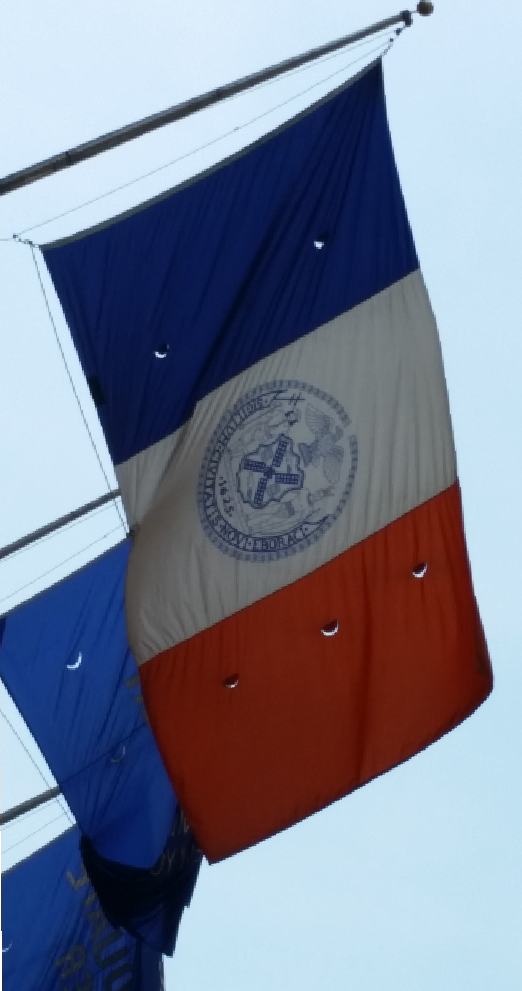
However, it is possible to find the version with the motto, also with a round seal. The desk flags for sale have oval seals, some with the motto and some without.
-
I bought that flag about four years ago. It is not difficult to find the version with the round seal and no motto in the wild. (Incidentally, I have framed and hung this last shot.)
-
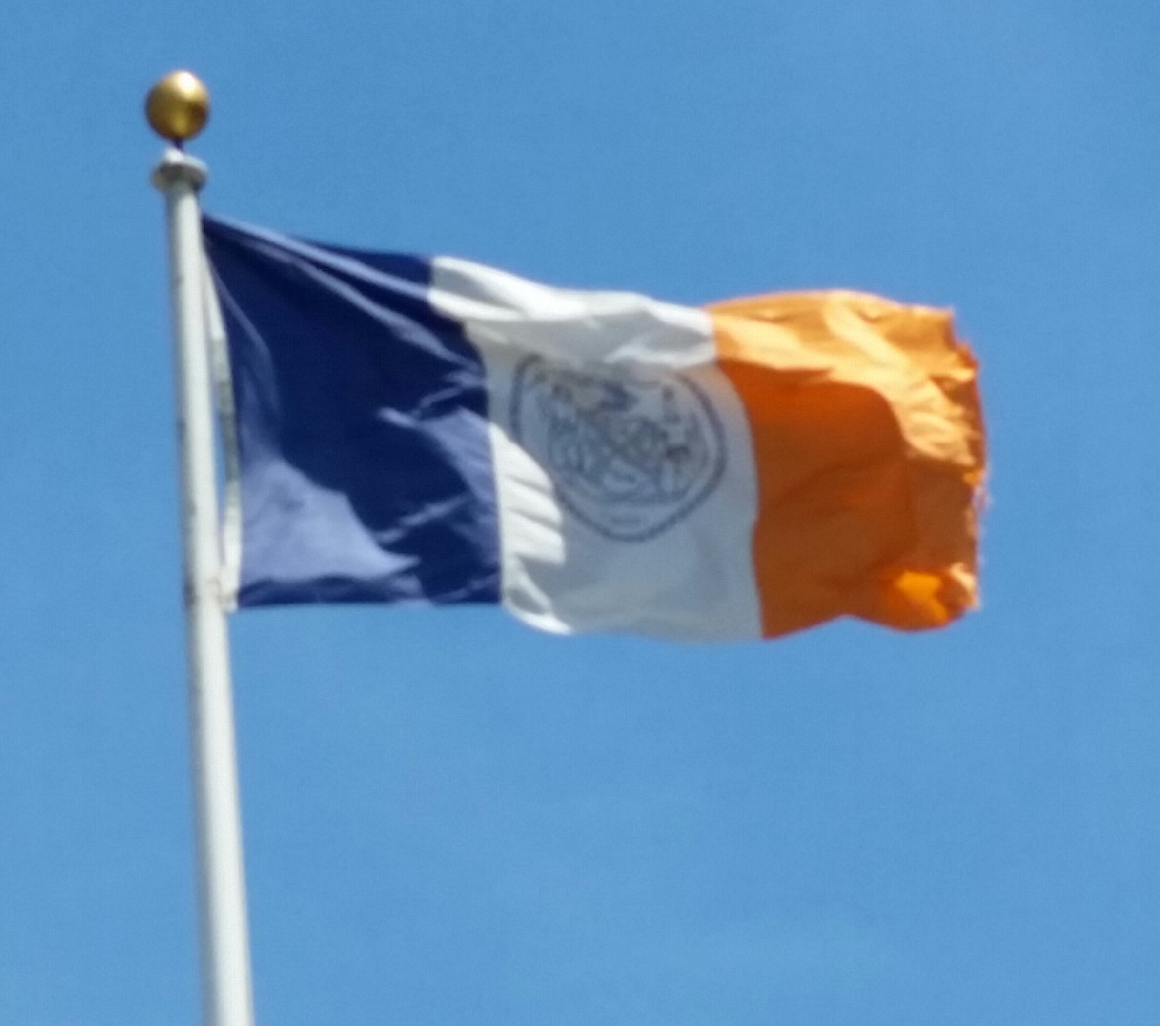
I wouldn't be so sure about that seal question. I have an official full-size 3 x 5 New York City flag on my wall that I bought from the City itself. The seal is round on that flag. Also, I don't mind the seal being on the flag. It's beautiful in full size; but I realise that it is hard to make out in any other size. Still, I like the seal better than that torch concept, which I find a bit garish. But I do agree that best of all would be a simple tricolour. I wish there were an official variant without the seal, the way there is for the flag of Spain. This is a great shot. I would have to concede that this justifies the departure from vexillological guidelines. Though I would be morally remiss if I did not suggest one fanciful improvement to the flag of this place that was for a long time a part of the Soviet Union:
-
The new logo:
-
That's true. I was using a colloquialism that, strictly speaking, is not correct. These rules for flags make intuitive sense to many people; that's why they emerged. It's analogous to the rules for chords in Western music, which codify patterns that many people instinctively find pleasant. So when there's a violation of one of these rules, it's only natural that this should run afoul of someone's aesthetic sense. Furthermore, it is silly to claim that adherence to these well-founded vexillological standards would lead to identical flags, as there is room under the rules for infinite variation. Likewise, the tonal conventions of Western music don't result in compositions sounding alike.
-
The Fraudulent Fondue Forks.
-
The Oklahoma flag is disqualified for its prominent use of text. If text is going to appear on a flag, then it should be small and tasteful, as on the flag of New York City's borough of Queens (seen in my sig): ...not big and gaudy, as seen in that Oklahoma flag and in the flag of New York City's worst borough: Also, the U.S. flag is a mess from a design standpoint. Placing it next to a superbly-designed flag such as Canada's only underscores how horrid it is. The Union Jack is not much better. It gets points for clever combining of multiple symbols: the St. George's cross for England, the St. Andrew's cross for Scotland, the St. Patrick's cross for Ireland (now representing Northern Ireland). But the finished product is visually jarring when considered dispassionately. We're just used to it (which is also why we tend not to notice the awkwardness of the U.S. flag). On top of this, the Union Jack is hard to draw correctly. One often sees depictions with the St. Patrick's cross (the red X) centred in the St. Andrew's cross (the white X) rather than offset in a counterclockwise (or, as the Brits themselves would say, "anticlockwise") direction, sort of like this:
-
This flag is vexillologically unsound. Two colours that are not white or yellow should not abut one another without a strip of white or yellow (a "metal") between them. The flags of Russia and Armenia are other notorious violators of this design principle which should be obvious.
-
I remember the first time I saw Jamaica's flag when I was a kid. I immediately thought it was great; and I have not changed that position. Also, Canada's flag is a marvel of simplicty. It is striking, and one of the best in the world. I have a rather strong ideological thing against nationalism; so national flags (even the aestheticallly attractive ones) kind of rub me the wrong way. I love city flags, however. My bicycle helmet has the flag of New York City atop it, with decals for the flags of Philadelphia and Washington. My favourite flag, however, is my own personal flag: It incorporates the blue and orange from the New York City flag, the green star of Esperanto, and the red that is symbolic of the working class.
-
Players in the "wrong" uniforms
Ferdinand Cesarano replied to larrypep's topic in Sports Logo General Discussion
Hmm. As a Ranger Nolan Ryan had two no-hitters -- at ages 43 and 44! -- and notched his 300th win and his 5000th strikeout. It was as a Ranger that Ryan became a truly larger-than-life national phenomenon, known to people beyond baseball fans. And then there was the fight with Robin Ventura! (An interesting reconsidering of which is found here.) Despite Ryan's long career before he went to Texas, and despite the fact that the Rangers are the only team of his with whom he did not reach the post-season, I would say that he is best known as a Texas Ranger. Of course, this does not make any of his other uniforms "the wrong uniform", as Ryan, like Rusty Staub, is a guy who made a mark with all his teams. But if the question is "does anyone seem like a Ranger?", then the answer is "Nolan Ryan". Other players who make you think "Rangers" first and foremost are Rafael Palmeiro, Jeff Burroughs, and Jim Sundberg. -
Players in the "wrong" uniforms
Ferdinand Cesarano replied to larrypep's topic in Sports Logo General Discussion
Oh, right you are! Thanks for the correction. I guess I was fooled by the captain's armband. I didn't know that Mata had ever skippered the team. Anyway, Mourinho's moves yesterday sure proved that the United uniform is the wrong uniform for Mata! -
Players in the "wrong" uniforms
Ferdinand Cesarano replied to larrypep's topic in Sports Logo General Discussion
Ah, right! Rooney is a self-hating baldie.