


Dynasty
-
Posts
3,232 -
Joined
-
Last visited
-
Days Won
1
Posts posted by Dynasty
-
-
I'm not sure if this was mentioned yet, but Andre Johnson (who has been with the Texans for his entire career) will be in a Colts uniform next season. It's one thing to go to another team, but it's another when you've been with one team for so long and then you join another team (who happens to be in the SAME division). That's going to look very weird if you ask me.
-
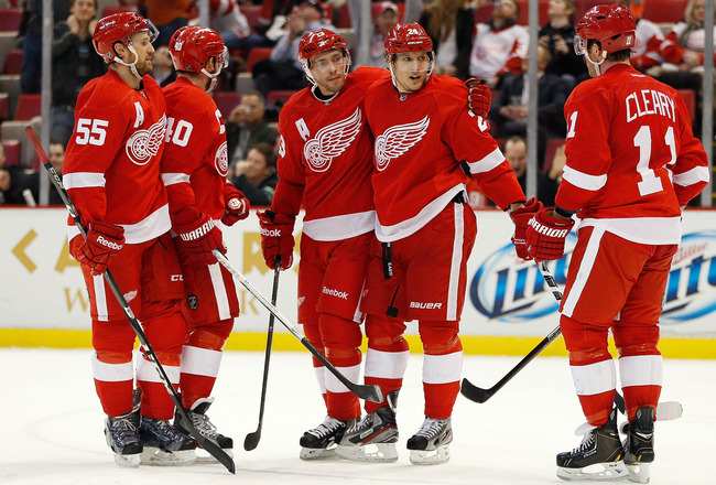
Don't get me wrong, these aren't really awful... but they are SO generic. They have very few stripes on their uniforms and taking away the stripes makes it look like a standard red sweater. I have said multiple times that the Red Wings logo is one of the best logos in sports, but it's so well-detailed and something so well-detailed like their logo being paired with those generic uniforms seems to me, out of place. I wouldn't have minded if they made a slight change to the number font or at least added an extra stripe, but these just aren't doing it for me.
If you take away the stripes from any jersey it's a blank jersey. The most intricately striped jersey is blank without any stripes. Not sure what you're trying to say there.
I'd argue that the detailed logo pairs nicely with simple striping. Too many stripes matched with that logo would be visual overkill.
They've worn these since the 30's. There's some historical context to why they're so simple or as you put it "generic". They were actually one of the first to adopt that template and the red sleeves on the aways are hardly generic. That so many other teams have borrowed the look since they created it is not their fault. Imitation is the sincerest form of flattery. It's not like these are a new design adopted by a 1990's Florida expansion team or something.
Also, they tried a different number font and it lasted exactly one season.
Well, I didn't say it was a "popular" opinion.

And while I hear everything you said, the uniforms still bore me and I don't think of them as great just because they are classics.
-
Don't get me wrong, these aren't really awful... but they are SO generic. They have very few stripes on their uniforms and taking away the stripes makes it look like a standard red sweater. I have said multiple times that the Red Wings logo is one of the best logos in sports, but it's so well-detailed and something so well-detailed like their logo being paired with those generic uniforms seems to me, out of place. I wouldn't have minded if they made a slight change to the number font or at least added an extra stripe, but these just aren't doing it for me.
-
I think the Oakland Raiders have the most boring identity in professional sports and I wouldn't have a problem at all if they made big changes to their identity. Their logo is incredibly outdated (especially the Raider head) and their jerseys are absolutely dull (they're home jerseys are practically black t-shirts with duct tape number font). I still like the silver and black color scheme, however and wish for them to never change that.
-
 1
1
-
-

I'm going to be honest with you, it's not an overall bad logo. In fact, I think it's really creative. I mean who would've thought of combining an "M" and "B" together to form a baseball and mitt? Well, the reason why I think this is overrated is because I believe it is an overrated design that ANY baseball club besides the Brewers could use as a logo (without the trademark, of course). I also don't think it looks very modern and screams "throwback". I still like the logo and all, but I think it gets way too much love.
-
1
-
-
This one is really out there but... I think the Buccaneers have the best uniforms in their division.
The NFC South is the ugliest division in the NFL when it comes to uniforms (excluding the Saints when they don't wear black pants).
-

The only time this happened was 2012.
-
I personally think it's stupid for the Seahawks to wear grey when it looks like they're wearing white. It's kinda pointless if you ask me...
You could at least make the "wolf grey" darker or something just so it actually looks grey and not white.
-
1
-
-
Kelly green sucks. There's something that feels washed out and unsubstantial about it.
YOU SHUT YOUR WHORE MOUTH!!!!
(Ahem... I think kelly green is the most underrated color in sports and isn't used nearly enough.)
I like kelly green and I don't think it's a bad color. I agree that it isn't used enough in sports (green in general isn't really used enough). However, it depends what other colors it goes with because there are some colors kelly green does not look good with.
-
Not sure if this was mentioned...
The Pelicans (previously the Hornets) and the Bobcats (now the Hornets) only went against each other in just one year.
-
1
-
-
In my generally unpopular opinion, the Rams' current navy and gold uniforms are better than their royal and yellow throwbacks. Purely aesthetic.
Agreed.
-
I actually liked the NBA uniforms in the 1990's...
-
I think the Tennessee Titans' helmet logo would like better without the flames. Honestly I've always been a little confused as to why they decided to include flames on the logo. Seems unnecessary.
I think they would look better as well, but I believe the flames have something to do with the Olympic torch or something. You know... that's part of the Olympics? That came from Greece? And Nashville being known as the "Athens of the South"? And also where the name "Titans" came from? Possible speculation, I know, but it's just a hunch.
-
I know this is the unpopular opinions thread, but sometimes opinions are wrong.
Opinions are never right or wrong; they're "opinions".
-
Figured I'd bring this up since the MLB playoffs are on.
The San Francisco Giants are the best looking team in baseball by a wide margin.
I think most people would agree it's one of the best looks in baseball, but by a wide margin?
-
I'm probably in the minority, but I never really liked the whole "Mighty Ducks of Anaheim" scheme.

Unpopular Opinions
in Sports Logo General Discussion
Posted
What? WHAT?! How dare you! (Just kidding ) It wouldn't bother me if anyone said it was overrated. That being said, I like to think it's one of the better logos in sports.
The logos that I think are underrated and overrated both come from the same franchise. I think the Brewers current logo is underrated and their retro logo is overrated.