


Dynasty
-
Posts
3,254 -
Joined
-
Last visited
-
Days Won
1
Posts posted by Dynasty
-
-
1 hour ago, jp1409 said:
These aren't drab at all. Nike has made the Rams drab. They were looking gorgeous in metallic gold with gold pants.
Sorry, I meant drab compared to the royal and gold. But I agree, Nike just ruins it with their matte material.
-
 1
1
-
-
This was, IMO, the best the Rams have ever looked (even with the drab color scheme).

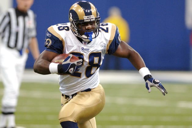
Reebok's shiny material just made the metallic gold look even better.
-
4
-
-
Derechos is a pretty cool name. The rest are kinda "meh", but I'm surprised Hillcats is an option considering that they specifically said they were going to change it.
-
3 hours ago, ltjets21 said:
One of the only AFL legacy games that wasn't against another original AFL team.

I just want to make a note that the more I look at Miami's old uniforms, the more I start to miss them.
-
2
-
-
I like the Rays current look. It may not be the most inspiring look, but it most certainly beats the horrible black and gradient look they use to use.
-
The Thunder's uniforms aren't even that bad; I actually like them. Although, I still can't say the same for their logo.
-
1
-
-
I fail to see how the Panthers and Lions are considered identical.
-
6
-
-
The thing that brings the teal jerseys down is the black numbers. If the numbers were white, they would stand out better.
-
2
-
-
On 5/25/2016 at 2:49 PM, Brian in Boston said:
The Lynchburg Hillcats have launched an online "Name the Team" contest as part of a rebranding effort that will see the franchise take the field with a new identity in time for the 2017 Carolina League season.
The team will be working with San Diego-based Brandiose on the project.
Bring back the Hill Climbers!
-
2 hours ago, Metro Boomin said:
The Lightning's current set is the best they've ever had
I agree, but that isn't saying much.
-
6 hours ago, steven919 said:
It's a moot point though since the team is almost certainly moving either this summer or the next.
People have kept saying that for years; still hasn't happened.
-
1
-
-

This is a terrible logo and I'm hopeful that the Pistons will never bring this back. Any basketball team can use this as their logo and yes, the same can be said about the current one but at least that one has a little bit more character. IMO, the best logo they've ever used was the one from 2001/02-2004/05 (and even that one screams 90's).
-
3
-
-
13 hours ago, Cujo said:
Love love love these.

Simply removing the half-assed fade effect would do these wonders.
-
2
-
-
I like customized fonts and I think most of them are better than generic block.
-
2
-
-
Yeah, I'm still not digging the over-sized logo. Although, I do like the brighter and more vibrant shade of red.
-
Believe it or not, the Brewers actually have the 2011 NL Central Champions stuff plastered all over the walls in their office area. They're not exactly banners, but I still just wanted to point it out.
-
I'm digging the SB cap.
-
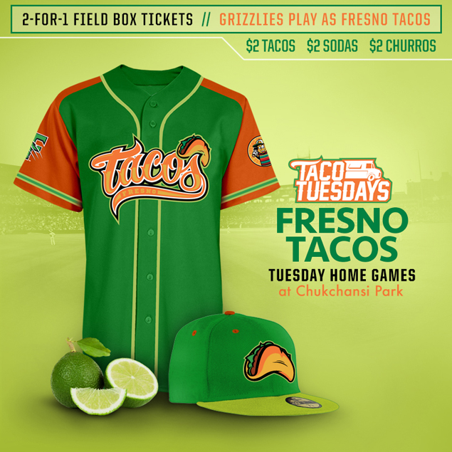
It's not really an identity change, but the Tacos are BACK!
-
On 2/20/2016 at 10:58 AM, KittSmith_95 said:
Not sure if these were posted in here already, but here are some Indiana Pacers prototypes:

Teal? Check. Gradient? Check. All they needed to do was change the navy to purple and you got a complete 90's uniform.
-
1 hour ago, Griffinmarlins said:
The swinging loon looks like he has a diaper on hahaha.
Great, now I can't unsee it.

-
Are the eyes really necessary? I think the logo would be good without them.
-
I probably should've took cover before posting that.

-
The Maple Leafs' new logo isn't bad, but it's a downgrade from their previous logo.
-
3
-
-
I agree. It's just that their current home and away sweaters, (If you can call them thatI actually like the flames identity better with the black.
 ) are awful.
 These were perfect...
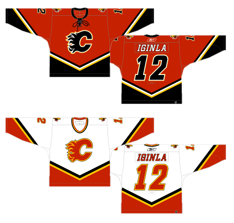
I hate the addition of black, mostly because it just adds another red and black to hockey. But yeah, these are still pretty solid in a vacuum.


Minor/Independent/Collegiate League Baseball Logo/Uniform Changes
in Sports Logo News
Posted
Overall, that's a pretty good update for Chattanooga. My main annoyance is their color choices... red and black? How many teams in the minors use that scheme?