


Dynasty
-
Posts
3,306 -
Joined
-
Last visited
-
Days Won
1
Posts posted by Dynasty
-
-
11 hours ago, TheHealthiestScratch said:
I love Brandiose... and everything they have done for minor leagues baseball. At least they keep everything fun, creative and fresh. Hell, some might not be my first choice, but everything they put out is impressive and different. That is what minor league is about, and you can find me deciding what new brandiose branded teams hat I want to snag every year off of my low college income, just because it's worth the looks from others when they see the hat.
I think they've been outstanding in the logo department, but I'm growing tired of the overused adjective-noun names.
-
 3
3
-
-
On 7/24/2017 at 11:41 AM, KJTALBOT said:
I don't mind the New Era logo on the on field MLB hats. It's a maker's mark.
Yeah, I think the initial reaction was way overblown. It's hardly noticeable and I honestly think it makes the 59fifty caps look more like the real thing.
-
8 hours ago, mr.nascar13 said:
Here's something that's unpopular: I prefer the cutoff shoulder stripes on football uniforms, rather than those that loop all the way around.
I actually mentioned that a while back (and I agree). It makes it look like they have giant rubber bands going around their shoulder and armpit. I hated it... and still do.
-
^ I was gonna point out that his opinion was suppose to be unpopular, but yours might be as well.

-
9 hours ago, mr.nascar13 said:
The Tampa Bay Lightning have never had a good logo. The current is the closest to being "good", but none of them have been good at all.
I feel like their logo would be better if they added a silver outline to it along with some small details that would make it pop more. In it's current state, it feels unfinished and quite frankly, flat.
-
1
-
-
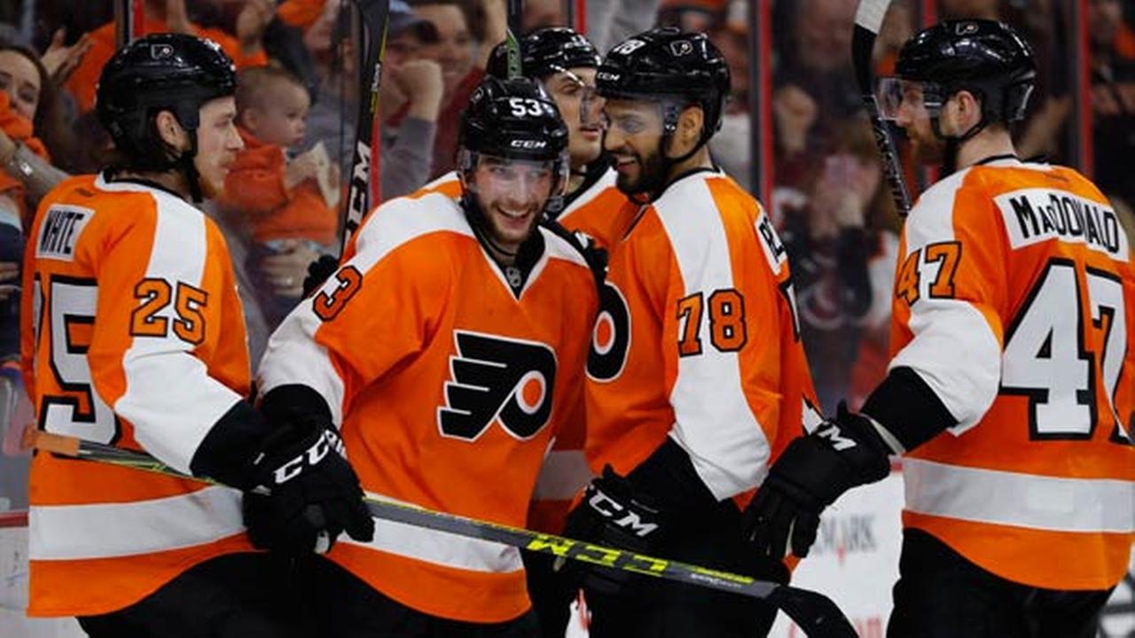
The Flyers' uniforms aren't very good. That white yoke on the arms (and how it curves near the gloves) is ugly... and the numbers don't even fit either.
-
6
-
-
These aren't good uniforms, even without the sleeves...
Bland font, plus the stars and panels don't look good in black and white.
-
3
-
-
10 hours ago, Big Yellow Flag said:
I almost got killed at a Jackals game back in 2004.
Well, that came out of left field...
-
4
-
-
3 hours ago, FinsUp1214 said:
I have to admit, I actually really liked this look:

Now granted, the Blue Jays look the best they've ever looked right now (I dare say it's the best look in the whole league), so I'm not at all screaming "bring it back!". BUT I did like the color scheme, appreciated them going out on a limb a little, and they were in my mind just a few touch-ups and tweaks (namely a little more light blue, toning down the beveling a little) from being a really excellent look.
If the Blue Jays were a 2004 expansion team and ran out of the dugout in this, I think with those tweaks it definitely could've survived and survived well. As it was, though, its days were numbered from the get-go due to the history they'd had before.
Agreed, but I still hated how the wordmark was slanted. It looked awkward, mainly because of how the logo was facing downward.
3 hours ago, joey joe joe jr. shabadoo said:I hate this. The Panthers have ugly dated uniforms that still reek of the mid 90's. That shade of blue doesn't work with black in the least bit. The black jersey and silver helmet don't look all that great together either.
I don't like how the striping on the pants and helmet come to a point. The pant stripes in particular are hideous in how they start off as way too fat and thick on the top and then taper down.
You were so close to getting a like from me until you mentioned the shade of blue not working.

-
2
-
-
On 5/9/2017 at 6:51 PM, Rj0498 said:
I think the Miami heat's unis are kind of boring
I personally think they're a modern classic. If they end it changing them, you know it's gonna be something complete bland... or over-the-top.
-
1
-
-
The Reds' use of black is okay I guess, but I just think of them better as red and white. The thing that really gets to me (and I've said it before) is that black is excessively used in their merchandise. I mean, they're on the equivalent of being the Atlanta Falcons or Chicago Bulls. The Reds don't use that much black in their uniforms; they shouldn't be treated in the same manner those two teams are.
-
I think the LSU-styled shoulder stripes look stupid as hell when they go all the way down...

They look much better cut in half...

-
7
-
-
I like this whole food promotion thing and all, but I'm concerned of it becoming tiresome (if it isn't already for some people).
-
1
-
-
27 minutes ago, daniel75 said:
I don't like red, white, and blue (navy blue ) color schemes. They come across as generic to me.
Wha...? You mean to tell me that you don't like AMERICA?!
(joke)
-
5 hours ago, Ice_Cap said:
I'm sure I've posted this before, but all the sock talk in the MLB thread got me thinking about it again.
I prefer the baggy look when it comes to baseball pants. It's because that's how I wear them when I play. It's just more comfortable. I can't stand the feel of high socks or stirrups.
That's kinda how I feel. I think the stirrups look more fitted to a baseball look, but my understanding is that players wear the baggy pants because it's just more comfortable (and I can related to that).
-
2
-
-
Pat Patriot is more of a clip art icon than a sports team logo.
-
6
-
-
This is probably old news, but apparently ESPN's Mike & Mike are about to split. I haven't watched them much in recent memory, but I'm a little down; they we're actually one of the few talk shows I liked.
Is the show going to cease? Greenberg is the one that's leaving so are they going to find a replacement?
-
12 hours ago, SilverBullet1929 said:
I used to like cream MLB jerseys but now they just look like dirty, stained, old uniforms to me. I realized it last weekend when I saw someone wearing a cream Mets jersey for the first time since the Mets dropped it. My first reaction wasn't "Oooh what a beautiful cream colored jersey!"... my reaction was "Ewww, when was the last time that guy washed that jersey?" It's like my brain forgot the cream existed and my mind read it as being the white jersey but just stained.
IMO only the Giants make cream work. I don't know... some about cream next to black and orange looks good. It makes me think of cream soda for some reason (and I've never even had cream soda!).
-
2
-
-
Purple + Crushers = GRAPES! (of course)
Logo sucks; uniforms are average.
-
Okay, I'm going to ask... Why do so many of you refer to the Patriots' logo as "Flying Elvis"? How does it look like Elvis?
-
8 hours ago, Htown1141 said:
I don't really get what everyone's love of standard block lettering is, especially for unique/modern uniform sets. An example of this is the bengals IMO

Lose the drop shadow and I'm all for it.
-
6 hours ago, Rj0498 said:
These are the magic's best unis imo

I love how the pinstripes curve.
-
I'll never get the Flames being "too bright". The Chiefs are practically an NFL clone of them and they look fine to me. Black is NOT needed.
-
6
-
-
Those were pretty hard to read from far away, but yeah... I still liked them.


Unpopular Opinions
in Sports Logo General Discussion
Posted
Most O's fans (at least in the Baltimore area) absolutely LOVE the cartoon bird, so it's not likely to be pitched anytime soon.
The realistic bird is okay I guess, but I really like the "O's" logo more.