


Dynasty
-
Posts
3,259 -
Joined
-
Last visited
-
Days Won
1
Posts posted by Dynasty
-
-
Pat Patriot is more of a clip art icon than a sports team logo.
-
 6
6
-
-
This is probably old news, but apparently ESPN's Mike & Mike are about to split. I haven't watched them much in recent memory, but I'm a little down; they we're actually one of the few talk shows I liked.
Is the show going to cease? Greenberg is the one that's leaving so are they going to find a replacement?
-
12 hours ago, SilverBullet1929 said:
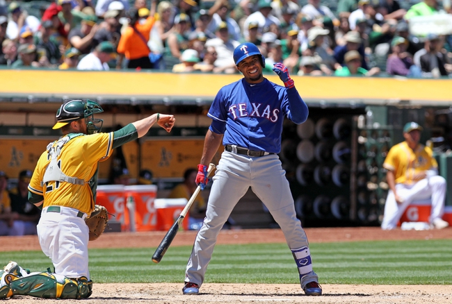
I used to like cream MLB jerseys but now they just look like dirty, stained, old uniforms to me. I realized it last weekend when I saw someone wearing a cream Mets jersey for the first time since the Mets dropped it. My first reaction wasn't "Oooh what a beautiful cream colored jersey!"... my reaction was "Ewww, when was the last time that guy washed that jersey?" It's like my brain forgot the cream existed and my mind read it as being the white jersey but just stained.
IMO only the Giants make cream work. I don't know... some about cream next to black and orange looks good. It makes me think of cream soda for some reason (and I've never even had cream soda!).
-
2
-
-
Purple + Crushers = GRAPES! (of course)
Logo sucks; uniforms are average.
-
Okay, I'm going to ask... Why do so many of you refer to the Patriots' logo as "Flying Elvis"? How does it look like Elvis?
-
8 hours ago, Htown1141 said:
I don't really get what everyone's love of standard block lettering is, especially for unique/modern uniform sets. An example of this is the bengals IMO

Lose the drop shadow and I'm all for it.
-
6 hours ago, Rj0498 said:
These are the magic's best unis imo

I love how the pinstripes curve.
-
I'll never get the Flames being "too bright". The Chiefs are practically an NFL clone of them and they look fine to me. Black is NOT needed.
-
6
-
-
Those were pretty hard to read from far away, but yeah... I still liked them.
-
On 2/15/2017 at 2:17 PM, JerseyJosh said:
This is def my favorite thread - mainly because I have so many unpopular opinions and I love sharing them.
Guess what -- here's another:
Brooklyn Knight was awesome

I didn't even know that existed; pretty cool.
-
3
-
-
I wasn't expecting a team called the "Fire Frogs" to have such generic uniforms.
-
The Reds' affiliates are still my favorite (even with the Bats going in the red and navy direction).
-
The Dolphins could use a tad more orange I suppose, but the main issue isn't the amount they're using. I think the issue is that both the aqua and orange were brightened in the update, so now they don't contrast as well as they use to, making it difficult to see the orange outlines from afar. Despite that, I love the brighten colors; it's very tropical-y. The previous logo and uniforms will always hold a special place in my heart, but the update overall was nice. I love the consistency with the striping and number font (they literally match) and I'm a sucker for custom fonts (though I would've preferred a different kind of custom font). While I do think the logo is a bit of a downgrade, it's not that bad. I think it's pretty tolerable.
And whether this is an unpopular opinion or not (it probably is), the Dolphins won the 2013 rebrands.
-
1
-
-
I like Devil Rays as well, but I also like it when team names consist of less than four words.
-
3
-
-
I'm just glad they kept the "S Spinner" logo. It's got that special charm to it.
-
1
-
-
I like seeing colored alternates against each other in baseball, as long as they are different enough from one another where they can be appealing to the eye.
-
13
-
-
The Redbirds did it well.
I was honestly gonna complain about the uniforms being a little plain, but then I remembered who they're affiliated with. It's all executed very nicely.
-
2 hours ago, Typhoon said:
Not sure if it's the number font or the placement of the bolts on the shoulders but I prefer this look for the Chargers
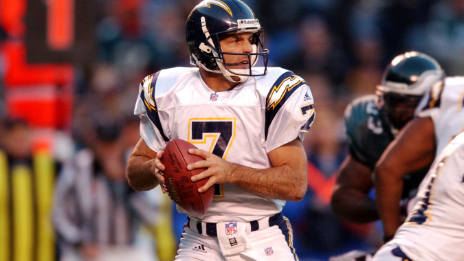

The only thing I don't like are the pants stripes (or bolts). It looks awkward going that straight down and they have too many jags. If they were somewhat curved to match the helmet and shoulders (not sure how you could make it work, but the current set does it fine), I'd be good with that.
-
1
-
-
3 hours ago, ~Bear said:

The Raiders logo is cool in a retro way, but it's outdated. The facial lines reminds me of the 1940s in design. Fix the face and the helmet, maybe add a thin silver outline around the shield.
I guess something along the lines of what the Vikings did could work, but I really don't want that part of the logo to be changed much.
Now, I don't think the RAIDERS text is really needed; maybe that's another unpopular opinion.
-
3 hours ago, Nyk33 said:
WTF Tampa?
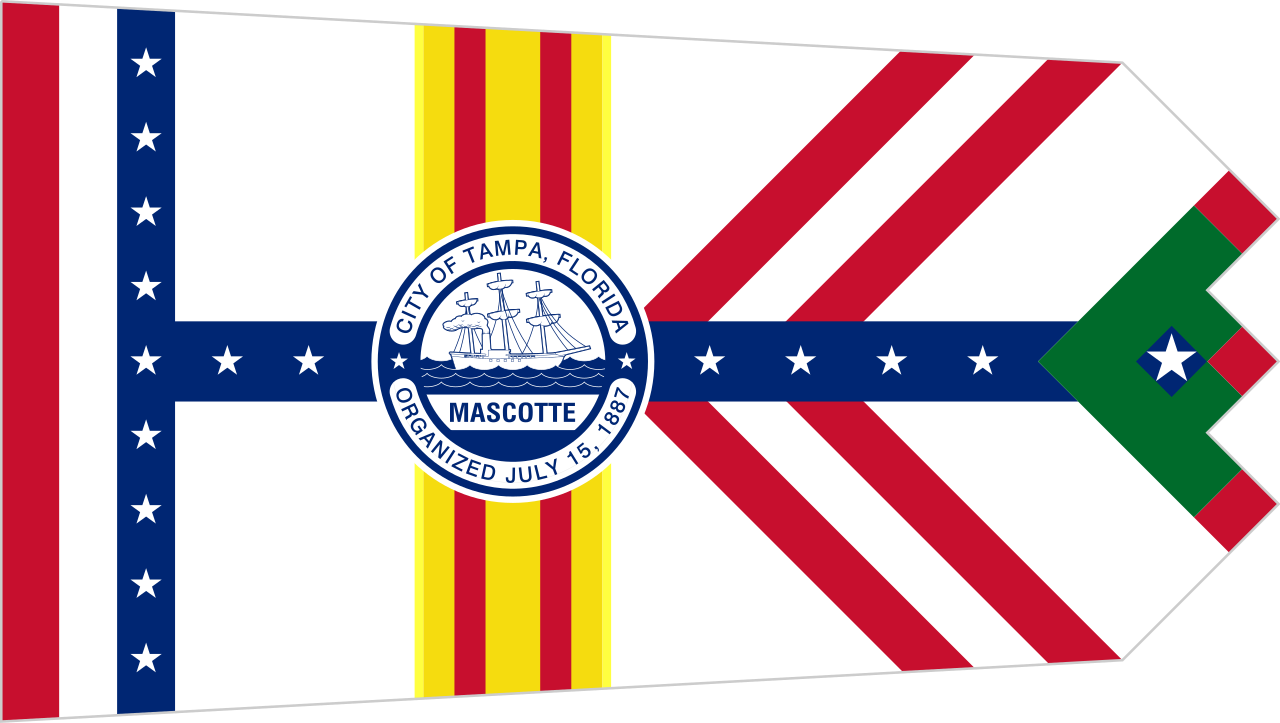
They just wanted to do everything, I guess.
-
1
-
-
It's not exactly on par with most of the logos in the MLS, but I still think this is a pretty solid logo.
-
2
-
-
FWIW, pewter is more of a grey-toned color than it is brown. While I do like the more brown-toned color they use to use, you can't really say what they're using now isn't pewter.
-
1
-
-
There are several things in that uniform that need changes, but I do like the more vibrant shade of red.
-
1
-
-
On 12/14/2016 at 1:08 PM, DeFrank said:
*sigh*
I miss that logo so much...


Unpopular Opinions
in Sports Logo General Discussion
Posted
That's kinda how I feel. I think the stirrups look more fitted to a baseball look, but my understanding is that players wear the baggy pants because it's just more comfortable (and I can related to that).