


MCM0313
-
Posts
4,552 -
Joined
-
Last visited
-
Days Won
1
Posts posted by MCM0313
-
-
It makes me unreasonably angry that virtually every team has a black uniform in their rotation - including those whose primary color is already something dark. James Madison, Wazzu, Stanford, Middle Tennessee, Tulane. Sports are supposed to be colorful, and I am bothered that so many people seem to think they should just be black against white.
-
 6
6
-
-
On 1/1/2024 at 9:09 PM, maxwasson said:
Happy New Year, SportsLogos.net! And to kick off the New Year, I have a redesign of Kansas City's current ABA franchise that has been active since 2018, the Kansas City Grillers who get a massive facelift in this part of the series.
BRANDING

For the logo, I asked the artist to make a basketball-shaped sirloin steak, I went with a color scheme consisting of a dark reddish brown, a super dark brown, salmon pink, and white. The font used for the wordmarks, insignias, and jersey numbers was Snappy Service.
EXTRA HOME SCRIPTS & ROAD SCRIPTS PT. I
There was a lot of wordmarks I made for this one, with the remainder of the road wordmarks being contained on the next slide
EXTRA ROAD SCRIPTS PT. II & INSIGNIAS
And here are the rest of the road wordmarks I put together, and the extra insignias.
HOME COURT
On to the home court, the current-day ABA Grillers do play their home games inside the HyVee Arena (formerly known as Kemper Arena) right near the Kansas-Missouri stateline.
UNIFORMS
I assembled together a 5-piece uniform set, with some "grill puns" for the dark brown and salmon pink alternates.
This whole concept is so clever!
-
1
-
-
8 minutes ago, MJD7 said:
I noticed this in the earlier renderings, as well:
There seems to be the ability to have different stripe sizes, which I wasn’t expecting. The Twins are another team that appear to have bigger stripes than the average. The Twins & the Rangers were two teams that had larger stripes on the previous template, as well, so it seems they were able to accommodate more than we would’ve expected, even though we can’t have stripes above the edge of the sleeve anymore.
Nike: look at our cutting-edge designs and space-age fabric!
Also Nike: we struggle to reproduce several shades of green, we can’t do metallic fabrics, stripes can go in some places but not in others, let’s muddy the waters of the NBA so much that fans can’t tell which team is which, monochrome is in, leotards are in, putting every single team in black is in, color blocking is out.
-
2
-
-
4 hours ago, spartacat_12 said:
I was thinking about pro sports in general. There are a lot of royal & red teams, but the Clippers are the only ones that have made black another one of their main colours. I guess the Marlins are the closest thing, but the shades of blue & red they use aren't quite the same, and they're a mostly black team. The closest example I can come up with for an ideal Clippers colour balance would be similar to the old Colorado Avalanche alternates, just with a bright red instead of burgundy.
The Pat Patriot-era New England Patriots are another example. And the mid-late-1990s Texas Rangers.
-
4 hours ago, projectjohn said:
The Pistons have pivoted heavily into black and gray in recent years (thankfully gray seems to have mostly passed), and also seem to be actively minimizing red to the best of their ability - refusing to bring back their old red alternate as the Statement edition, and eliminating their classic court design which was red-heavy. I keep hoping sanity will prevail at some point, but the trend just keeps getting worse.
Well, this season isn’t one they’re going to want to remember, so hopefully they pivot away from that trend.
-
1
-
-
17 hours ago, pepis21 said:
If you don't like Clippers wordmark, there are also two less known versions with Los Angeles wordmark. One with blue numbers:
and second with white numbers:
Like this?:
Precisely.
-
2 hours ago, spartacat_12 said:
I feel like the addition of black isn't a bad thing for the Clippers, but they haven't found the right way to execute it yet. It's always felt tacked on, but I'm sure there's a design that would make it feel less like BFBS. Considering how many other royal & red teams there are, the black does help them stand out.
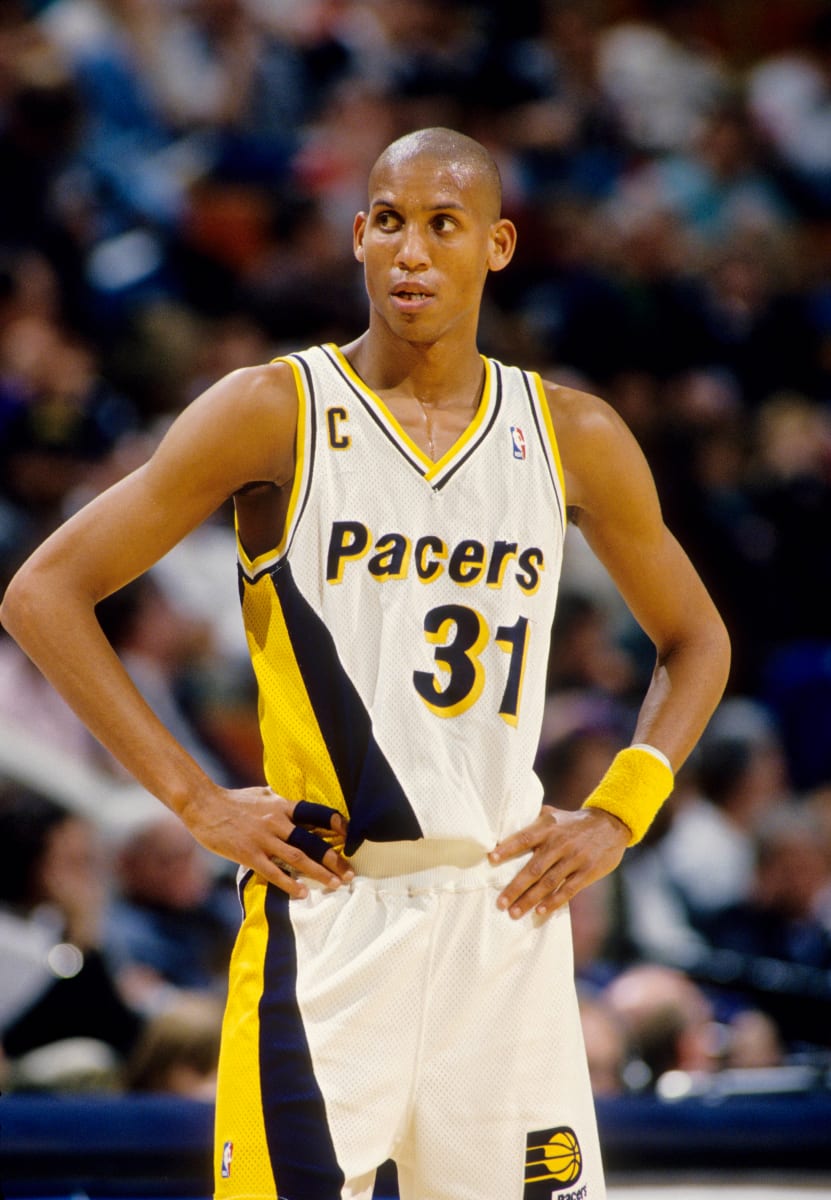
I actually think the Pacers are one of the few royal blue teams that improved their set by switching to navy in the '90s. The Warriors have owned the royal & yellow look in the NBA for a little while now.
There aren’t that many royal and red teams, are there? Pistons come to mind and they’ve always rocked those colors wonderfully, with the exception of their absurd foray into teal. Sixers have usually looked good in those colors too. There are way more red and black: Bulls, Raptors, Blazers, Rockets, Hawks (plus yellow), Heat (plus yellow), Cavs (dishonorable mention). LAC going back to royal and red would be a breath of fresh air at this point. (So would the sky blue and burnt orange from their distant past.)
-
15 minutes ago, pelicanfan said:
If you’re someone who pays attention to the Pelicans, you may have heard fans raving about this year’s City Edition line. To a point many people are calling for the team to even rebrand around the theme. And honestly, its
for pretty good reason. I’m not one to be impulsive but I really do think the Pelicans hit the mark this year and now have a great opportunity to rebrand (and i rarely give props to this team’s marketing.)
Purple and green is a color combination rarely used in sports. Let alone purple, *lime* green, and black. Not only is this so unique, it also speaks to the VooDoo and supernatural culture of New Orleans. It’s something i never thought of before and I personally think it’s a lot better than the surface level stuff the team has done like Red White and Blue and Mardi Gras.
So with that being said here’s my take on what a Pelicans “Skelican” rebrand would look like. Credit goes to the team for the coming up with the basis of all of this. I’m just branching off it.
So for the wordmark i actually had to recreate the font myself. The font the team used was a custom made one so i had no choice but to piece together every letter i can find from promotional pieces. i tried to upscale them as much as i can, put them all together on a template, and then put it through an AI font maker. So it’s not perfect but it’s close.
For the middle logo, it’s of course the famous “Skelican” logo that many fans have been raving about. I couldn’t find any official image of it so i had to cut it and upscale it myself.
And for the third logo, i have no idea if this would be legally allowed in the real world but i combined the old New Orleans VooDoo logo with one of the secondary logos the team currently has. And then adjusted colors accordingly. This probably wouldn’t be allowed but it’s fun to imagine. And i’m sure the team can pull off something like this the right way if they wanted to.
And for the main logo, this surprisingly took a long time to make, longer than anything else here. But long story short, i managed to combine the smaller city edition logo with the bigger official logo the Pelicans have used (up until this year they decided to remove it for no reason) Also added a little drop shadow to the letters mostly so the NEW ORLEANS doesn’t just blend in with the green bones.
And for the jerseys, I actually feel like i could have done a lot more but i didn’t want to stray too far from what the City Edition jerseys look like. I have to admit I was not sold on the plainness of the actual jerseys that came out so I added some more striping all around so the colors can pop more.
For the City Edition jerseys here’s some designs of my own that take a less traditional route. The first one goes all in with the skeleton theme with a bone-like font, pinstripes made of bones, and a skull pattern all around the uniform.
For the second jersey i was inspired by the one of the retro Hawks jerseys with the big bird in front. with how much the fans love the logo i thought this would be a bold but slick way to incorporate the logo and let it do the speaking.
And as a bonus here is my third jersey concept, this actually came from an old concept I made before the Pelicans came out with their City Edition stuff. As you can see I opted for a teal color to pair with the purple. Added VooDoo doll stitching on the sides and used a haunted spooky font. Then i added the logos and recolored accordingly
And if you’ve made it this far, congrats. I now lastly present my court design. Personally this is my favorite part as it required the most thinking from me. I was mostly inspired by the current Pelicans home floor that has Louisiana nature all around the border of the court. I took that same design and took it up a notch by using dead trees and *flying Pelican Skeletons* at the top. and at the very bottom of the court is the classic “Let The Good Times Roll” motto in French.
As for inside the court, I of course used the beloved “Skelican” logo at center court and in the 3pt arch’s I added more Pelican Skeletons. Is it a *little* horrifying? yea, but one can say that perfectly fits the the vibe of New Orleans
These are sharp, fun, and unique. Could we see a neon green jersey concept?
-
 1
1
-
-
1 hour ago, tBBP said:
I feel you on that. I honestly don't know how the Pacers never had a yellow alternate of that set, either. They definitely made it a point to include one in the set that followed.
As for the navy blue, yeah I kinda do wish they'd brighten it up a good bit. The hue of electric blue they're using for this year's City theme is one I'd have liked to see them try years ago in another scheme (one that also happens to be one of my favorite colorways)...but I must admit that electric blue looks pretty sharp alongside that bright yellow.
I have a soft spot for the set they wore at the beginning of Reggie Miller’s career. I think using that colorway (basically, royal blue instead of navy) would freshen up their look nicely.
-
1 hour ago, tBBP said:
They were that way on the original FloJo jawns, too.
(Total aside: how did we let the Pacers get away with Helvetica Bold Italic for all those many years?? )
Huh. I guess I just remembered the parts I liked.
While I do like that design, I wasn’t as crazy about the set as some. Navy blue is such a boring color and it would’ve been fun to see a yellow alt (which is kind of what the Siakam photo is).
-
1 hour ago, CaliforniaGlowin said:
They said there will be one traditional jersey, so it might not be all bad.
Eh, the jerseys they’re leaving behind are traditional, but when they wear white socks with (especially) their blue jersey, it still makes me grit my teeth.
-
3
-
-
On 1/20/2024 at 11:33 AM, TheBigFiz21 said:
I know the new "sponsor" went into effect almost two weeks ago and the whole ad patch thing isn't going anywhere, but...
...having a QR code on a jersey is the unquestionably worst thing about this.
I dunno, the fact that the jersey and pant stripes don’t line up is pretty irritating.
-
2
-
-
6 minutes ago, tscuzzy said:
Paul George mentioned on his most recent podcast that the Clippers are getting new uniforms next season. Specifically they were discussing how they don’t wear red uniforms anymore and he said “something in store next season. I can probably drop that. They fire too… it’s gonna be the favorite”
Does that mean they *will* wear red uniforms after this season? That would be nice. I like LAC as a red-first team, and they’ve gotten away from that.
-
1
-
-
34 minutes ago, CaliforniaGlowin said:
I like the idea of all of the jerseys being different and they said there's something for everyone. Could be a disaster, could be good.
Split the difference: I’m calling one good, one meh, and two disasters. Which will be which I don’t know. I bet the horned helmet will be cool though.
-
3
-
-
1 hour ago, PurpleHayes said:
"Super Bowl Licks?"

They should have The Rolling Stones play the halftime show and call it just that.
-
3
-
 3
3
-
-
3 hours ago, Sec19Row53 said:
2000 World Series - Mets Yankees
Yes. Also any of several Dodgers-Yankees Series since the Dodgers moved to LA. Yankees-Padres, 1998 (although the letters on the Padres’ caps were two different colors). Dodgers and Twins…um, sometime in the sixties, although same color issue as Yankees-Padres. Um…have the Yankees and Cardinals played each other? Would that count? How about the White Sox’ script? Baseball does a lot of interlocking letters in logos.
3 hours ago, ruttep said:More footage of the photoshoots shows Nick Bosa not wearing any socks, which I doubt he'll do for the actual game (the fine for the Super Bowl is probably some ungodly amount). So maybe the photoshoots aren't 100% indicative of what we'll see on gameday?
Rather, no football socks. Black ankle socks instead. I hate wearing socks that short - I’m liable to get blisters on my heels or ankles.
-
10 hours ago, The_Admiral said:
SAY THE LINE,BART!
...we live in a culture of working the refs
You didn’t do it.
-
20 hours ago, Germanshepherd said:
Looks like all the players shown have worn white instead of red in the past.
I think we’re getting a mix, but primarily white like the Commanders game earlier this year.
Yuck. Why are players allowed to choose their own sock colors? It should be uniform just like jerseys and pants. (Also, red, not white.)
-
5
-
-
1 hour ago, PERRIN said:
'Tis both a blessing and a curse. I can't count the number of times my family has stared at me like I'm crazy after I gasp at the TV and point out a player is wearing an outdated jersey template.
I can’t count how many times my poor parents have had to hear me grumble about plain white socks, or stripeless pants, or team social media posts using the word “icy” or the stupid
 emoji.
Although, in fairness, I’ve never NOT noticed and opined on uniforms, ever since I started watching the NFL at the tail end of the 1993 season.
-
1
-
-
1 hour ago, GriffinM6 said:
This looks like something a rec-league basketball team would wear.
FTFY
-
On 1/4/2024 at 3:14 PM, nbitterman said:
With word that the Houston Texans plan on unvieling their new uniforms this April, I decided to give it a go. I actually like the Texans brand and I don't hate their current set, so I kept the changes minimal. That being said, I think minimal changes can go a long way for this team with the right approach. Also excited to hear that the light blue color will be returning in some capacity! Of course I had to incorporate it, but I left it subtle... for now. Enjoy!
Primary Home & Away
Please throw the white socks into a fire.
-
1
-
-
I’m loving this thread!
-
1
-
-
1 hour ago, GoHawks said:
Yeah but that comes at the cost of most 49ers players wearing white socks with the road uniforms
Not to beat a dead horse, but I still don’t get how the league allows that. They fined Jalen Ramsey just a couple years ago for wearing different socks from the rest of the team. How is it they let this happen over and over?
-
3 hours ago, fouhy12 said:
I would definitely be in favor of each team having to declare primary home and road uniforms, complete with pants and socks, and the league setting minimums on how often those uniforms must be worn. Those would also be the uniforms teams would wear in the playoffs.
I have no issue with rotating pairs of pants or switching things up, but part of a brand is establishing your color blocking.
YES! Color blocking is so important and teams just ignore it. I’m all in favor of your proposal.
-
6
-


2023 NFL Season week by week uniform match-up combos: From HOF Game to Super Bowl LVIII
in Sports Logo News
Posted