


MCM0313
-
Posts
4,516 -
Joined
-
Last visited
Posts posted by MCM0313
-
-
7 hours ago, PurpleHayes said:
It's the pants that don't match, the helmet has been the same color since 1964. The pants used to be grayer and looked better with the helmet until1974, and when they adopted the navy blue jerseys in 1981 they brought in silver pants since the blue-green pants they wore with the white jerseys would have looked terrible.
The pants worn with the white jerseys look even more ridiculous now, but that's not surprising for a team that can't even match it's blues or silvers.
According to @TruColor and his wonderful site, the Cowboys’ helmet has changed shades multiple times since 1964. It’s definitely less blue than it used to be.
-
 1
1
-
-
1 hour ago, ruttep said:
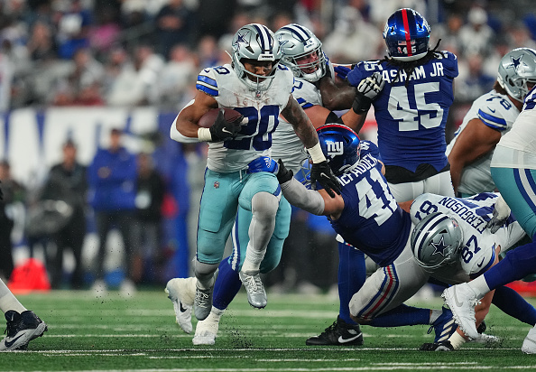
Yeah - the Cowboys' pants are infamously mismatched, but they looked especially egregious Week 1 last year when they played in a downpour against the Giants

The wet fabric was noticeable enough that people outside this forum were calling it out
Those pants are basically from the 2010-era Titans!
-
8 hours ago, ruttep said:
This is one of the best uniform matchups in the league when both teams wear proper socks.
The problem is that both those teams often have sock inconsistency from one player to another.
…which, by the way, is a fascinating topic by itself. Why is it that when you’re watching, for example, an AFC North team, or the Chiefs, or the Giants, or the Falcons, or the Cardinals, or the Seahawks, you know that you won’t have half the team wearing team-color socks and the other half white, but if you watch the 49ers, Packers, Cowboys, Chargers, or Buccaneers it’s a virtual certainty that the socks won’t match across the whole team?
-
8 hours ago, Cujo said:
If the Broncos ever go navy over orange

That’s a pretty solid look for the Illini…er, Orange…I mean, Cavaliers.
-
3
-
 1
1
-
 2
2
-
-
52 minutes ago, Sec19Row53 said:
So? It's still a tertiary color that isn't present in sufficient amount to merit use as a sock color, just like the two examples I listed. Add gold socks for the Ravens, red socks for the Titans, black socks for the Jets or 49ers (all of these are using the base home uniform as an example).
There’s way more red in the Falcons’ uniforms than any of those other colors in their respective uniforms.
-
7 hours ago, tBBP said:
Completely unrelated to the uniform topic discussion...but can someone tell me just exactly what the freak is going on in this photo in context??
I say the best way the Texans could have differentiated themselves was by picking a completely different colorway from the onset...but Texo-jingoism apparently won out and, well, this is what we're stuck with. Granted, Houston can still so that someday down the line, but they probably won't. They could at least brighten up the red, though.
And the reason for this is the red jersey numbers, which the red socks help a/ balance and b/ bring out. (This is another reason why the Texans should have kept the red road numbers...but I digress.)
The Texans actually just did brighten their shade of red. There’s just not enough red on their standard home and road sets for it to be obvious. If you go back to the reveal and look at the picture they posted of the H-Town alt with red socks, you’ll see just how bright that red is. It’s Pantone 185 C, which had long ago fallen out of fashion in favor of the darker 186 and the rather boring 200. I for one am glad to see 185’s return to the NFL. I’d also like to see 485 come back, but I’m thankful for what I’ve got.
-
2
-
-
7 hours ago, Sec19Row53 said:
In both cases, the socks are the color of the numbers. In the case of the Falcons, those red socks are only used as a trim color, so it's a color that isn't used enough anywhere else. It would be akin to the Vikings wearing yellow socks, or the Dolphins wearing orange socks.
Except the pant stripe is entirely red.
Generally I think socks should match jersey, numerals, or pant stripe. Preferably two of the three. But never white.
-
12 hours ago, McCall said:
Even better still... (crude Illustrator edit ahead)
I find it almost infuriating that they have red stripes on both pairs of pants, but no red socks.
-
19 hours ago, ruttep said:
I'm never okay with the sock color matching the pants color, which trumps any other sock argument in my mind.
I’m okay with the sock color matching the pant color if the socks are striped. Just not solid-color.
I will also begrudgingly accept the socks and pants being the same color if it keeps the socks from being solid white.
Ideally, though, there should be substantial contrast between pants and socks.
-
1 hour ago, NeauXone said:
It could be...

If either of us can find a picture I'll try it.
Awesome, thanks! This article has one from 1994. It is the Lions’ 1950s logo because it was a throwback game (probably Thanksgiving).
http://amp.awfulannouncing.com/2014/the-evolution-of-the-nfl-on-fox-score-bug.htmlSome of them looked a bit odd - the Eagles’ was just the helmet wing, the Rams’ the horn, and the Vikings’ their own horn - but that added to the charm IMO.
-
6 hours ago, DCarp1231 said:
My goodness, those black socks make all the difference. The Bengals’ sartorial choices are definitely a step above those of the rest of the league. I don’t know if that’s a natural byproduct of having team leaders who are into fashion or what (you KNOW Joe Burrow understands the value of contrasting socks), but I’m here for it, and would be even if I weren’t a Bengals fan.
Now, as for the name: the team is making a new tradition they call “Open in Orange”, but I propose that the orange jersey-orange pants combo be given its own name: the Hobbes. Complete with a Cincy artist’s drawing of a tuna fish sandwich on the inside back collar.-
4
-
-
38 minutes ago, Silver_Star said:
@PERRIN and here's the thing about the Reebok (2002-2010) and Nike (2011-current) cuts. To me, the NFL should have stuck to having teams have a different sports brand companies like they did in the early 1990's where the Bills, Jets, Bears, Saints, and Bengals had Champion, by 1995 when the Panthers, Lions, and Giants switched from Apex to Reebok since Apex went under by 1996 and where Dallas Cowboys switched to Nike in 1996. Starter had the Chargers, Raiders, Packers, Patriots switched from Apex to Starter in 1995, Vikings, Steelers all had Starter between 1993-1997. Wilson handled the Oilers, Seahawks, Chiefs, Colts, Buccaneers (switched from Russell Athletic to Wilson), and the Dolphins. The 49ers switched to Reebok in 1996 along with the Giants in 1995 and the Lions; the Lions and Giants left Apex just like the Patriots who left to have Starter do their uniforms). The Panthers became part of Reebok because in 1996, the Cowboys and Panthers were the last two teams to leave Apex. The Cowboys (switching from defunct Apex), Raiders (Raiders switched from Starter), Jaguars, and Broncos (switching from Wilson) switched to Nike in 1996. Russell dealt with the Eagles, Rams, Cardinals, Falcons, and Ravens by 1996 loaning from the Browns who were part of Russell Athletic years prior to 1996.
I used to like that because they settled on certain teams being from different sports brands and not one brand. The guy who took over Nike in Seattle in the 2000's reminds me of those lame late Gen X people who want to be cutting edge and cool because they listen to advises from the Vince Russos of the world.Yeah, just having competition rather than a leaguewide contract makes for better designs too.
-
I know it’s a big step down in complexity, but do you think you could do the simple team-logo-in-an-oval score bugs from the mid-1990s, updated for 2024? I don’t even know for sure which station used them. FOX, maybe?
-
On 8/9/2024 at 4:38 PM, oldschoolvikings said:
Those tricolor socks are a thing of beauty.
-
18 minutes ago, rfraser85 said:
True, but the team owners will likely be around the team longer than the players. I don't mind the players choosing the pants and socks, but the owners should consider limiting the choices after this year. At least we can see if any combos are a surprise hit.
The owners should consider switching to the throwbacks full-time in 2028. Even the best combos from this set look like a harebrained attempt to combine Boise State’s style with UVa’s shades of orange and blue.
-
1
-
-
11 minutes ago, PERRIN said:
If/when the Patriots change their uniforms, I’m praying they go with something along the lines of this. A middle ground between the royal blue flying Elvis shoulder set, the Brady-era set, and the current set. Something that feels natural but stays unique to only them. Nobody really owns the half-and-half stripe in the NFL.
That doesn’t look half-bad.
-
2
-
-
2 hours ago, PurpleHayes said:
Yup, but that's the way the NFL is going now: looking like high school teams on the field.
It started with the monochrome unis, then morphed into mono-black, then "icy whites", pants without stripes, shirts untucked, underarm sections on jerseys cut out, and all-white socks.
The only thing missing now is a cheesy marching band.
At least the marching band would have better uniforms than the team. Lol
-
2
-
-
1 hour ago, Jezus_Ghoti said:
I just hate these stripeless pants, man. I know it's nitpicky or whatever. Old man yells at cloud stuff. But these ruin the entire uniform for me. I hope they change again in 5 years.
I don’t hope they do a complete overhaul in five years. I just hope they add stripes to the pants and contrasting, non-white socks for each pair.
-
4
-
-
On 8/7/2024 at 8:46 PM, Dynasty said:
The Dolphins unveiled their throwback dates for the season.
Always like seeing them paired against the more traditional teams.
Wear your damn socks right, Tua. I love ya, but stop the icy nonsense.
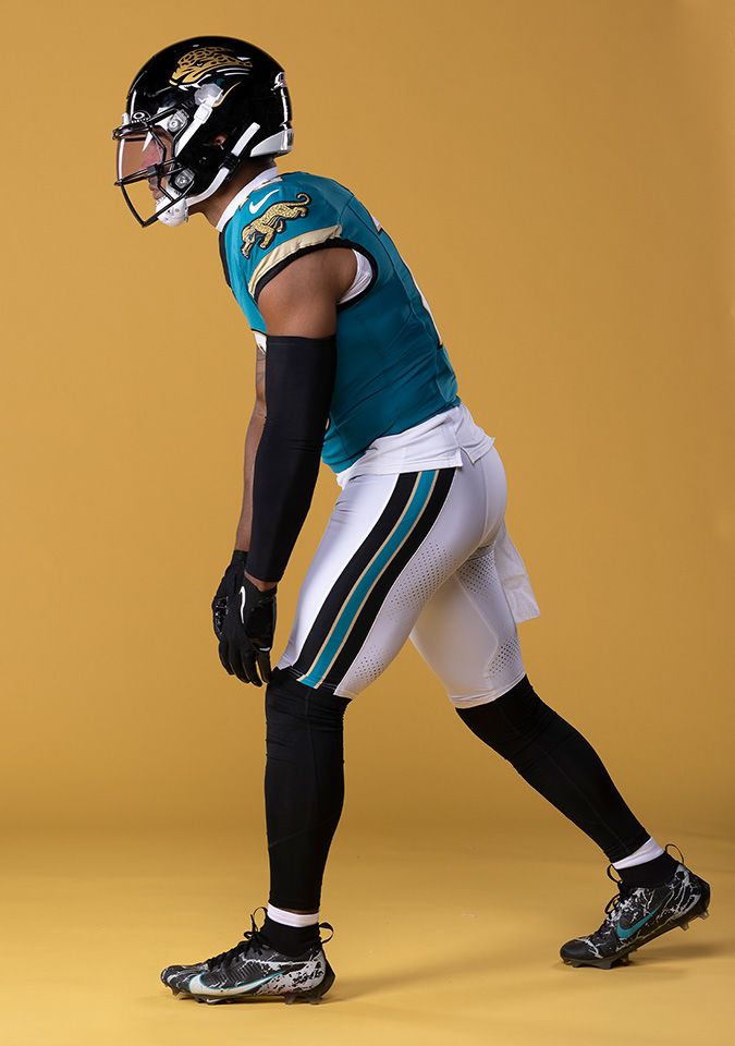
8 hours ago, Carolingian Steamroller said:Hmm the classic Jags logo with a white outline on the black background looks pretty good. They don't use that on the helmet.
I’m guessing that’s because it was designed to have only moderate contrast between the helmet and the logo, like a jaguar coming out of the shadows.
-
1
-
-
6 hours ago, ruttep said:
I think your link's broken - I assume you wanted to show something like this
tbh you still can't really see the pants stripes on this one either
If only they had all worn red socks with the Color Rush jersey and pants.
-
1
-
-
3 hours ago, Ark said:
This looks like teal
The Jets’ current shade is darker and bluer than what we’re used to seeing with (the direct ancestor of) that logo.
-
5 hours ago, Cujo said:
Vs the Chiefs.
Vs the Raiders.
The Broncos are doing this right.
They’re doing it 2/17 right, anyway.
-
4
-
-
9 minutes ago, Carolingian Steamroller said:
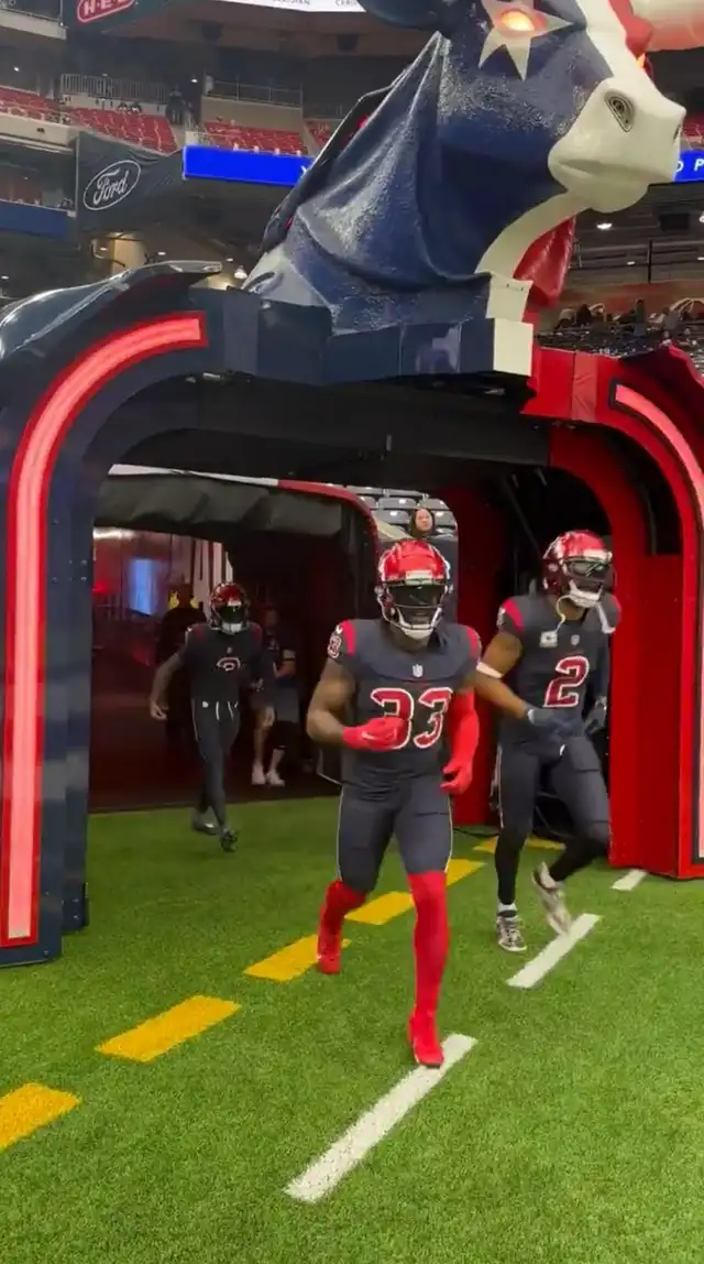
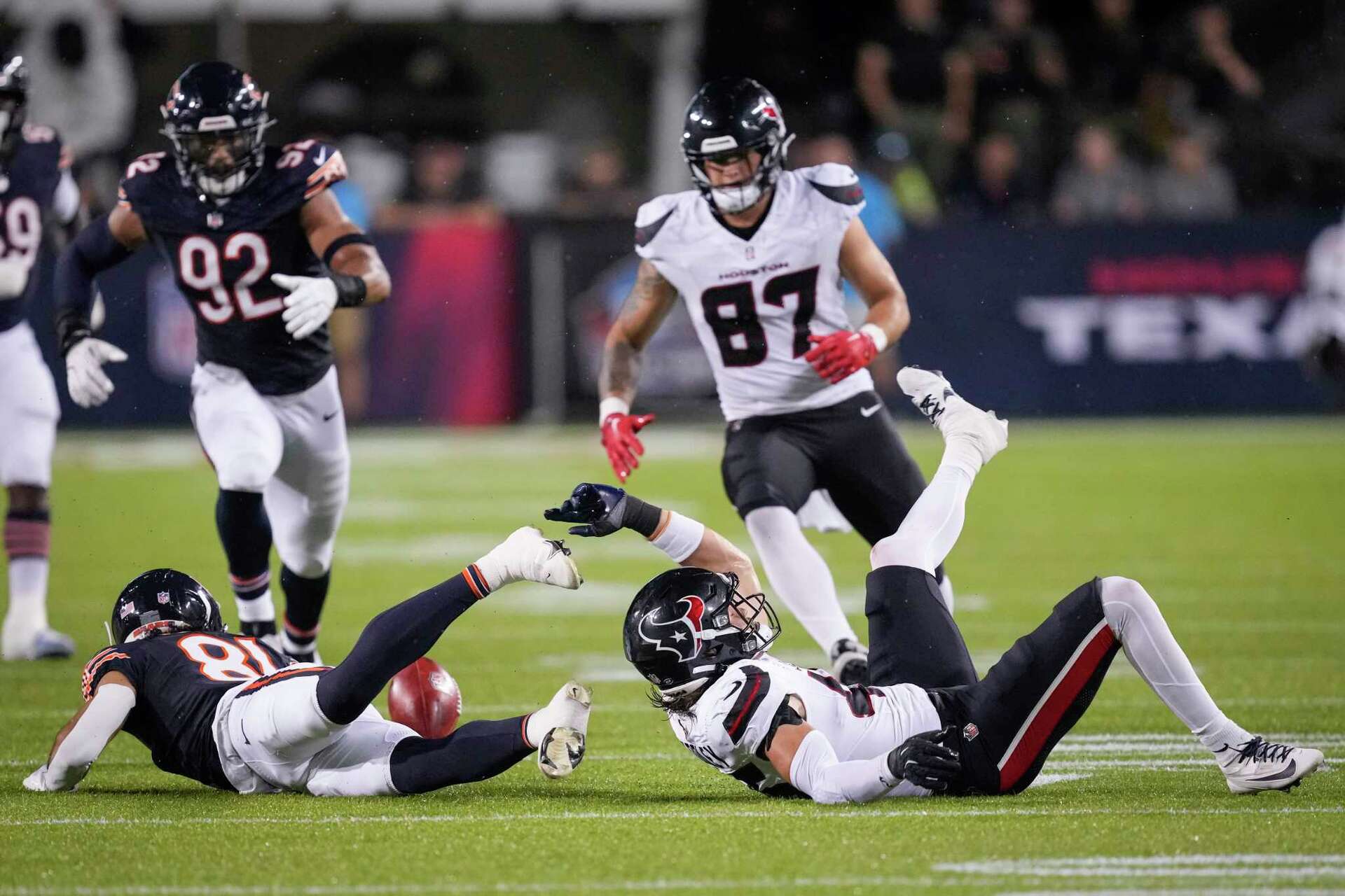
It's a very interesting contrast debuting the Texans new road uniforms against the Bears.
I actually think the horns are fairly well executed. They aren't stretching in odd shapes (at least not that I've seen) and provide more or less the intended effect. I think going with more red on the pant stripe was the right call and I would definitely welcome red socks.
If I have one complaint its that the horns aren't connected to the helmet logo but it feels like they should be. The horns are basically an abstracted version of the logo but it's not so abstract that the mind (at least a mind hyper focused on uniform details) can't quite let it go.
I wonder it the uniform would look better overall by using a version of H mark on the helemt?
They do use a version of the H mark on the helmet…it’s just tiny and way in the back.
-
1
-
-
9 hours ago, ramsjetsthunder said:
Valid. But it would seem strange for them to go out of their way to change it on the site...I don't think they're changing back (although I would certainly welcome it), but it is interesting nevertheless. I wonder if the Jags will be doing something similar to what the Bruins did, and use this logo as a primary this year in honor of their 30 year anniversary.
Remember when the Indigenous Persons wore two separate uniform sets fit a whole year, and the league was a-OK with it because it was some sort of anniversary, but the same season they also nixed the Seahawks having separate helmet colors for home and road? Pepperidge Farm remembers.
-
1
-


2024 NFL Changes
in Sports Logo News
Posted
I did too for a bit, at least football when I first started to pay attention to it. I didn’t quite get why Washington was in the NFC East, but it also had teams from Texas and Arizona, so…