


MCM0313
-
Posts
4,331 -
Joined
-
Last visited
Posts posted by MCM0313
-
-
37 minutes ago, rfraser85 said:
Sounds good to me. For future reference, why was my post changed? I don't believe in re-writing history, but I would have worded it differently if I knew that wasn't allowed.
It’s a filter on the boards. As far as I know it’s automatic. It changes any instances of the franchise’s post-Braves, pre-2020 name to their current one. I don’t find it necessary but it’s in accordance with site policy around controversial topics.
-
17 minutes ago, JayMac said:
I wish the Seahawks would get a clue.
I get the feeling that they have one, and their current set is generally popular with their fans. But you are one of their fans; what have you heard others say?
-
2 hours ago, VDizzle12 said:
I think anyone who designs anything for a living knows exactly this. I have almost never had a project go from start to finish without a client putting their fingerprints all over it. Usually the more cooks you have in the kitchen, the worse the end result will be. Especially when you have someone pushing for "new, innovative, cutting edge". At the end of the day they are the one's paying the bill and will get whatever they want. Not everything we do as designers works. But sometimes we don't deserve all the blame. I've never worked with a company like Nike or a league like the NFL. But even on a smaller scale I used to take criticism personally on social media and message boards. I've learned to just focus on the positives and appreciate the work being done. Regardless of how some people on the internet feel.
When it comes to the NFL and Nike. One positive is that most of the time teams recognize their failures and eventually go back to what works. The Browns, Bucs, Chargers, Cardinals, Jets, etc all have nice sets now after trying way too hard to modernize everything.
They say that too many cooks will spoil the broth; honey, I think that’s not true. Well, maybe too many cooks will spoil the broth, but they’ll fill our hearts with so much, so much love!
-
 1
1
-
-
13 hours ago, DCarp1231 said:
It’s foolish to ever think a team will only ever wear one set of pants. Raiders are the only holdout.
In my proposal they could technically have two pairs of pants…they’d just both be grey. For the main three jerseys they could simplify the stripes to Braisher stripes. Then they could wear the more complex (and historically accurate) stripes with the throwback.
-
20 minutes ago, DCarp1231 said:
They’ll never be you

There’s no Dick involved, but anybody remember Fair Hooker?
-
1
-
-
3 minutes ago, gosioux76 said:
His own child had to modify his name just to avoid the embarrassment.

Oh, that’s just too perfect!

-
6 minutes ago, GFB said:
Yeah, I meant the 90s throwbacks replacing the 50s throwbacks and then the main set of uniforms
Gotcha. Man, I hope the main set is decent. It has to be better than the way they wore the old set last year, right? The
 combo made me angry. It was like the designer got bored and quit halfway through.
-
 1
1
-
-
4 minutes ago, DCarp1231 said:
So, Atlanta is definitely getting a redesign after this season, right? RIGHT?
Bring back 1997-2002 set but with current helmet and logo. Make pant stripes narrower. Add red alt jersey in the same style. Bartkowski-era red-helmet, red-jersey throwback. Only ever wear silver-grey pants with all combos. Done.
-
4
-
 1
1
-
-
1 hour ago, GFB said:
That preview makes me think we are getting the 90s throwbacks (the big white stripe shot between blue) and I’m happy to see the block letters.
Just the WCF patch removed, no sleeve wordmarks, and the pants having stripes left to clear, but this is promising
I’m sure the Barrys will have striped pants and no sleeve wordmark, but I just have a feeling they aren’t the main thing.
-
 1
1
-
-
7 minutes ago, HOOVER said:
I think the perfect Jacksonville Jaguars uniform would be a mash-up of all 4 of their historic uniforms:'95 Pant
'97 Jerseys
'09 Black helmet with Teal metallic fleck'13 Logo
'13 Number outline color scheme on White jersey, '95-'08 color scheme for numbers on Teal jerseys
'18 Number font
I’m just glad you didn’t say the gradient helmet. You’ve been a constructive contributor here and I would hate to see you perma-banned.
-
5
-
1
-
5
-
 1
1
-
-
On 4/15/2024 at 1:53 PM, rfraser85 said:
I don't think choosing the jerseys for games is as difficult as people may think. Using the Jaguars, I would imagine they start with something like this:
White: September home games and road
Teal: non-September home afternoon games and road for WAH (white at home)
Black: London and primetime home games
The throwback will likely be used for primetime home games.
As for the full uniform, the Jaguars likely are taking requests for pants and socks with each jersey.
My requests would be simple:
pants - white with teal jersey, teal with black jersey, either white or teal with white jersey.
socks - black always
-
4 minutes ago, GFB said:
The lighting is so harsh for the Lions set photo there's no way to discern heads from tails, but from the neon logo on the wall, my guess is that the 90s Lions throwbacks will replace the 50s Lions throwbacks.
EDIT: Or not. IDK, 48 hours to go!I also noted that as a possibility. The plain throwbacks are cool, but the Barry look is better IMO.
-
3
-
-
44 minutes ago, KouPilot said:
The broncos posted a new jersey tease and well, I tried to brighten the image...
Well done, Broncos, you magnificent bastards. Not on the actual uniforms most likely, but on this nice little prank.
38 minutes ago, MDGP said:Yeah, it's probably black. Under blue lighting (assuming it's true RGB blue) a blue jersey almost certainly wouldn't get that dark. Red would look considerably darker under blue light (depending on the shade), and would have historical precedent, but come on, that's not happening. In theory the green in honolulu blue would make it darker under blue light but I can't imagine it would be that dark.
So that leaves black or an uber darkhorse navy blue, which would also have historically precedence. But like red, I can't imagine the Lions ownership would ever go in that direction when black is on the table.
Of course, the above could all be rendered entirely moot by a variety of factors affecting how the room and the set are actually lit.
They have already said they’re staying with Honolulu blue and silver, so if it’s a black uniform, it’s just an alt. Less than ideal to be sure, but honestly, probably better than that absolute garbage whiteout crap they kept pushing last year, and that wasn’t even an alt.
I’m more intrigued by what looks like their Barry Sanders-era logo. Are they adding a ‘90s throwback in place of the plain Thanksgiving set? Simplifying their current logo to be more like its more distant ancestors? Just trying to hype some nostalgia in advance of the reveal?
-
2 hours ago, SportsFan12 said:
The admin seemed to be replying to a bunch of comments. Most of them were reasonable requesting the regular green over white. No idea why they responded to this one.
I wish they had said something along the lines of “no, you little buttwagon, we won’t give you plain white socks, especially with white pants, because that looks like hot garbage and we want our uniform set to look good, and frankly you should be ashamed of yourself for even asking” but I suspect that might’ve been construed as poor customer service.
-
3
-
-
4 minutes ago, WSU151 said:
Jets will have at least two alternate helmets this year according to retailers getting ready to sell them. The second alternate could be green or black for all I know, and the MSRP is significantly higher than the unveiled green and black helmets. So perhaps a very unique paint and/or decal scheme.
If the throwback isn’t unveiled for ‘24 (assuming a regular price point) then decent chance we’ll see it for ‘25.
Really? One of the articles (mothership maybe?) specifically said the Jets would NOT have a third helmet this year.
-
1 hour ago, SportsFan12 said:
The internet will ruin the Jets for us. Don't worry.
Please, just once in the preseason and then never again. I wonder if Buhlahkay there wants to go to war?
For what it’s worth, the brief, largely buried ESPN article has about two thousand likes. Most people (unlike Buhlahkay there) really enjoyed the combinations shown.
I’m not on Twitter (which I refuse to call X). Could any of you go on there and refute his stupid request? Pretty please? Maybe something like “they’re the New York Jets, not the New York Ass”?
-
4
-
-
55 minutes ago, SSmith48 said:
Looks like a pretty convincing leak came out for the Broncos, but I'm not sure if its actually legit. Metallic royal blue helmet, silver facemask, orange throwback jersey. Would line up with rumors about a throwback look too.
As for the Jets, no complaints from me. They made the changes they needed to keep the look fresh and new. The small tweaks to the logo make a huge difference.
That’s a gorgeous, shiny finish on the helmet. I would still prefer the old robin’s egg blue, but that’s super nice. Not sure what to think of the shiny silver facemask. The grey ones they wore pre-Elway definitely weren’t shiny, and the white ones they wore after that definitely weren’t silver.
-
1
-
-
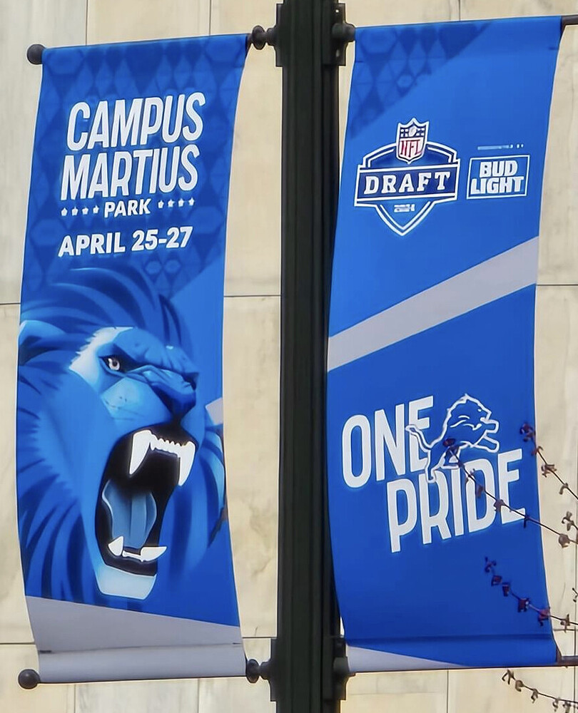
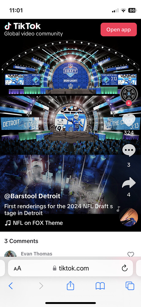
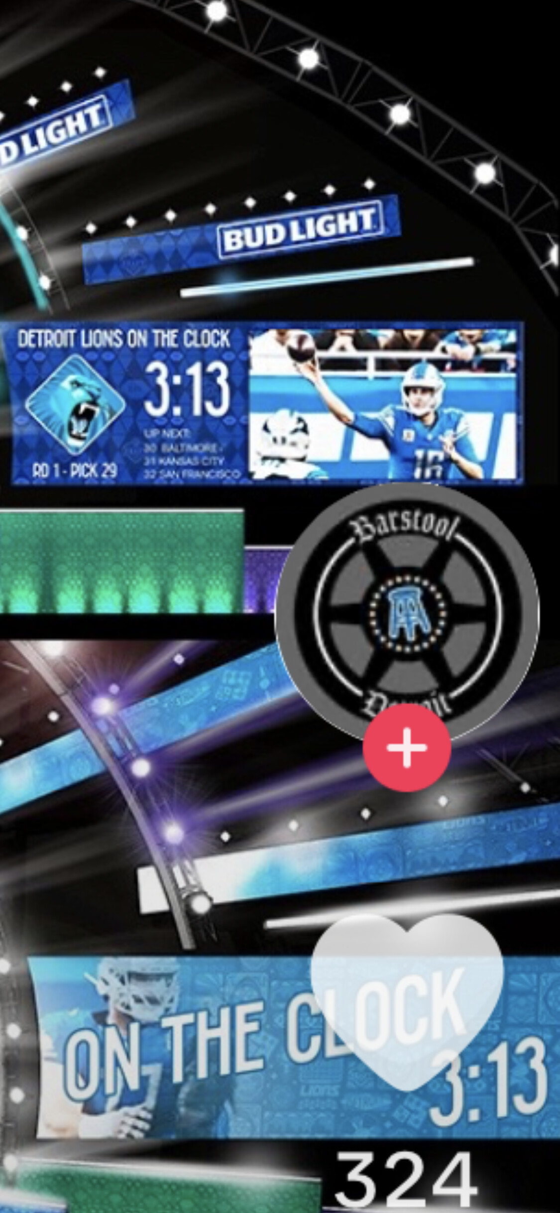
3 hours ago, jp1409 said:
Anyone talked about this yet? Went back quite a bit and couldn't find anything...
Remember last year’s draft? Every team had an original logo that looked hand-designed. Very cool, but I believe all were one-offs. This is probably just the Lions’ iteration for this year’s draft.
-
5
-
-
On 4/8/2024 at 5:10 PM, Conrad. said:
from the mothership:
https://news.sportslogos.net/2024/04/07/raptors-drop-epic-vince-carter-logo-hints-for-a-future-uniform/basketball/you might want to remember this for next season (disregard the use of "icon" here btw):
I never cared for how those were purple in the front and black in the back, and they’re very late-nineties/early-aughts, vaguely industrial-looking uniforms - but they have a heck of a lot more personality than the junk they’ve been wearing for the past decade-plus (however long it’s been since they dropped purple, really).
-
1
-
-
7 hours ago, MJWalker45 said:
They're also wearing the Jackie Robinson numbers today as well.
Those are surprisingly good for a once-a-year uniform.
-
3
-
-
1 hour ago, tscuzzy said:
uhhh has anyone pointed out the massive gap between the decal "S" and the helmet?
I think that’s just an unavoidable part of that helmet model, short of painting the logo on, in which case the logo would have to be moved back.
-
1 minute ago, gothedistance said:
Actually, it came out in 2019. And I liked the previous set. I thought it was underrated.
It had promise but was poorly executed. Kind of like the Falcons’ current set.
-
1
-
-
4 minutes ago, Sodboy13 said:
Well, it takes a lot to make a stew.
When it comes to me and you…
-
26 minutes ago, PERRIN said:
Could just be my bias as a Pats fan but I’ve never cared for the Jets’ classic massive shoulder stripe look. Something about having that much white space on a home jersey feels wrong to me, but it looks fine on the away set. The logo that comes with that set is hot garbage, the shade of green is hopelessly drab, and the white helmet feels far more bland than a green one.
I don’t think the Sack Change set is perfect, but it works a lot better as a uniform set in my book, even if the Jets weren’t as successful in it. I’m fine with moving to them full time so long as monochrome is avoided. The updated logo suite is absolutely perfect, the exact modernization of a classic logo that the Jets desperately need. Gets an A+ in that department.
The neo-Namaths looked fantastic in 1998, when they were first brought back. In 2002 (I think, @TruColor?) they darkened and muddied their shade of green, and the set was never the same. It’s a shame because the green pants that they introduced after the color change would’ve looked great before.
Then Nike came along and infamously had a lot of trouble matching shades of green, with the Eagles unable to wear their standard home set for a half-season, and the Jets (probably even worse) somehow sporting multiple shades of muddy dark green on the same jersey.
With the color element ruined (and that 1998 forest green had been fantastic!), it became a lot easier to notice the drawbacks to that set: logo that was somehow boring, unrepresentative of the team name, and too busy all at once; generic uniform design that basically aped that of the Colts; and one of seemingly a billion sets with white lids (one of three in their own division).
Fact is, all the Jets’ uniform sets have been too plain for my liking, save the 2019-23 set, which was ruined by a lack of consistency across uniform elements, and a design that tried to do too much, and the team constantly wearing combos that weren’t designed to be worn together. If you’re gonna have plain threads, you need a distinctive logo and color scheme. These new-old uniforms are simple but designed and executed better, and the new-old logo is arguably one of the most distinctive in NFL history.
Fact is, the Jets didn’t NEED to change in 1998. Bill Parcells took over in 1997 and said the Namath-era set was what a football team should look like (I suspect he was salty that he hadn’t gotten to coach the white-lidded Patriots), and the organization modernized that set to suit his liking. They looked fine from 1990-97, but that look was made stale by the numerous bad moments that accompanied it: losing in Week 18 to miss the playoffs in 1993; utterly collapsing down the stretch in 1994 (a collapse precipitated by Marino’s fake spike); and the embarrassment of having the bottom fall out under Kotite in 1995-96. Something had to change and Parcells had an idea, so they took it and ran with it.


2024 NFL Changes
in Sports Logo News
Posted
The best option has been staring them in the face for nearly two decades.
Potomac. Drainage. Basin. Indigenous. Persons.