


MCM0313
-
Posts
4,311 -
Joined
-
Last visited
Posts posted by MCM0313
-
-
7 hours ago, eRay said:
The Jazz want to "own" a color...
but they want to give the fans their purple back...
but they want to be ahead of the trends...
but they want a clean and simplified palette.
Lavender and black is right there, being very patient and waiting to be picked.
How about lavender and dark purple? And maybe a medium blue for trim?
-
2 hours ago, pepis21 said:
Too late for that. They should do this back in 1979 when they relocate.
Yeah - strange as it may seem, “Utah Jazz” has built a lot of brand equity in 45 years.
-
 8
8
-
-
10 hours ago, DJT said:
Supposedly a Jazz beat writer has said that the Jazz will not be bringing back yellow next year. If the 5 year rule is legit I would assume this means the black becomes the icon.
However the beat writer said the rumors are that it will be a mountain jersey presumably in black, purple and white (yay kings)
C’mon, Jazz. Just drop the black. Purple, sky blue, copper. If you absolutely must have a neutral trim color, go with silver. Not every scheme needs black in it.
-
4
-
-
11 hours ago, The_Admiral said:
"We're disrespecting our past while also dishonoring our future." Actually, that's what the half-gradient-helmet Jags set did.
Those disrespected and dishonored everyone on earth with halfway-decent taste. Even the players hated them.
-
7 hours ago, DCarp1231 said:
I distinctly remember red pants and socks being unveiled that never saw the field

Put those red socks and shoes with the gradient jersey and black pants, and that alt would at least have had some balance to it. Still would’ve been unnecessary though.
-
1
-
-
29 minutes ago, DCarp1231 said:
Eh, I like the black numbers on the red jersey.
Pair it with updated versions of these jerseys
Ooh, that 1997-2002 road white. Be still, my beating heart.
-
2
-
 3
3
-
-
2 hours ago, chakdaddy said:
They weren't terrible yet in 1988!
Touché. They were never good in those duds, though. In fact, you could say they were duds in those duds.
-
On 3/24/2024 at 7:19 PM, Telemundo219 said:
I always the Hawks should go with Red and Yellow (i.e. Chiefs) and the Rockets should go with Red and Gold (or Double Red and Gold) (i.e. 49ers). Something like this for the Rockets (plug included).
Rather…cavalier of you.
-
2
-
 1
1
-
-
25 minutes ago, Cujo said:
Googled this also -- It was Eric Dickerson who opted out of TSB, partly because of the truncated name. I knew that story had applied to someone. Just assumed Cunningham because of his lengthy name
That makes sense. “Cunning” is a pretty positive description, but I could see someone not wanting to be called “Dickers”.
-
On 3/18/2024 at 7:34 PM, oldschoolvikings said:
Bone!
That works waaaaay better than the Rams’ use of it.
On 3/21/2024 at 7:11 PM, DCarp1231 said:The purple and bone is a good look
If you’re going to use cream, I think you need a dark color with it. Maroon/crimson is my favorite partner for off-white, but purple, navy blue, forest green, brown, burnt orange, and even black can work.
-
2
-
-
On 3/13/2024 at 4:51 PM, VikWings said:
The new Clippers logo still looks more like a cruise ship than a clipper ship. I feel like if you look at it from the side view it will have the Dolphins logo on it.
Of course this is all brought to us by Aquafresh!
-
55 minutes ago, Discrim said:
IIRC 1994 actually (Madden 95).
I had Madden 95 for Game Gear. Never quite got through a season - it turned off when the car turned off. Still fun memories.
-
1
-
-
2 hours ago, BBTV said:
Nice work... except didn't the Browns have Bernie?Bernie was “QB BROWNS” in Tecmo Super Bowl.
That was still an incredible game for its time though. Unlike the earlier Tecmo Bowl, it had all (at the time) 28 teams, with official names and helmet logos. It also had real players and more or less accurate rosters, plus a season mode. And thanks to cleverly designed alternate uniforms, you could always tell the teams apart. Plus it was 11 on 11, and you could sub and shuffle the guys who handled the ball on offense. It was also nicely fast-paced.
Now let’s look at the NES competition. Tecmo Bowl had 12 teams, real players, no team names, no subs, and fewer players on each side than in real life. NES Play Action Football had eight teams with real players, had subs, was eleven on eleven, and even had a tournament mode…but gameplay was painfully slow, there were no team names, and uniforms were pretty generic. NFL Football had all the teams and their names and helmets, but lacked real players and any non-single-game mode. (Haven’t been able to tell whether or not it had the full eleven to a side.) Plus TSB could simulate games!
Now keep in mind that TSB came out in 1991. The first of the Front Page Sports: Football series for computer (a much more powerful medium than an NES!) wouldn’t come out till the next year…and wouldn’t have real player names until 1993…and wouldn’t have real logos until 1994. Even Madden wouldn’t feature actual player names till what…1993?
TSB was phenomenal. It was a blast to play and, as a simulator, wasn’t even that far behind 16-bit games (and was ahead in some respects). I wish innovative pro football games hadn’t become a thing of the past with EA’s monopoly on the NFL license.
-
1
-
1
-
-
9 hours ago, MNtwins3 said:
The Peter Man is a zero. Zach Wilson is a zero
How Nathan Peterman continues to get paid by NFL teams, I just don’t know.
7 hours ago, DustDevil61 said:
And now we wait for a QB on the Bills, Browns, or Eagles to wear 0.Tecmo Super Bowl reference?
-
3
-
1
-
-
19 minutes ago, oldschoolvikings said:
Appropriate.
He isn’t a zero. He’s whatever the most boring QB number would be. I think of 11, remembering the twilight years of Drew Bledsoe’s career, but Mariota isn’t a sitting duck in the pocket, nor was he anywhere near as good, at his peak, as peak Bledsoe. But I still think of Bledsoe’s time in Dallas for some reason.
Mariota is a plus runner and a team player. But he doesn’t make many big plays as a passer, and he commits too many turnovers for a game manager. He’s a high-end backup and a low-end starter. But he isn’t a zero.
-
2
-
-
2 hours ago, WSU151 said:
Sorry for the TLDR post in advance...but the new Broncos snowcapped/white helmet/5280 rumors are still really flimsy
Jesse Schultz was the guy who posted on the mothership in January, but his comments on the main pages have been deleted. He’s the self described “graphic designer from Ohio that has access to logo slicks”.
Not sure which page on here his initial comments were discussed, but I do know he wasn’t 100% on point. This screen grab here is likely just a rehash of Brady2024’s comments from the Uniwatch article.
Anon 1: Here’s a leak
Rando 1: Repeat Anon 1 leak after publication
Anon 1: See it’s confirmed
(no it’s not)
Brady2024, who was 100% sure Brady was going to be the Denver QB and a deal was done, now says “the ball is in Tom’s court and the situation is fluid”.
Brady2024 also claimed Tom was definitely going to to be the Broncos QB because you couldn't order a 12 BRADY Broncos jersey from Fanatics/NFL Shop...supposedly because a deal was signed and new jerseys were going to be sold here in March. In January and February, I did spot testing and the only teams you could get 12 BRADY jerseys for were the Buccaneers and the Patriots, but now in late March, you can't even get that. And you can't customize any other team's jersey with 12 BRADY. And if a deal was in place...you know they'd already be selling jerseys I think.
L-O-L.
Brady2024 also claimed that the Broncos will let players choose the jersey during the week...and we all know that's not possible.
That claim sounds so similar to ”I'm a photographer and Russell Wilson is demanding the team to wear all navy and we just took all the photos of the Broncos in all navy” ….six months later…”oh, well these things change, guys, I’m just a photographer”
Has to be the same guy. And maybe Brady2024 is "Jessie Schultz"...
The Cardinals’ leak felt more real last year because a) I don’t think any rumor was on reddit and 2) Tru saw the helmet and it matched the unpublished rumor
.
I’m reminded of a particular variant on the well-traveled “vanishing hitchhiker” folk tale. Set during WWII, it features said hitchhiker, in lieu of paying the beleaguered driver, imparting a pair of predictions before vanishing: “There will be a dead body in your car today, and (the mustachioed fellow running swastika-land) will be dead within six months.”
Pondering these words and the mysterious disappearance of his erstwhile passenger, the driver comes across the scene of a terrible wreck. Ambulances are behind schedule due to (insert reason here) and the hospital is just a mile away; could he transport the most critically injured victim of the crash?
The man agrees, and he takes the injured victim to the hospital, but the poor fellow is pronounced DOA. The driver goes home, shaken by the day’s events but hopeful for the future.
It isn’t a true story, but it was circulated as such…in, like, 1942. Ultimately the failed-artist-turned-dictator held on till 1945, putting paid to the tale’s veracity. Yet, in the moment, the first part of the prophecy looked to be true.
My point? This fella could be a troll, a gullible guy who thinks he has inside info…or even someone who’s right about one thing and wrong about the other. But the veracity of one statement is ultimately independent from that of the other. Maybe some of what he said turns out to be right and he looks prescient; certainly doesn’t mean a 47-year-old Tom Brady will be exchanging his slippers for cleats. Heck, a broken watch is right twice a day; dude could end up hitting on something due to simple dumb luck.
For the record, though, I think he is most likely of the same ilk as that weirdo who used to make wild-ass predictions in here. He may even be said weirdo. I don’t think he is privy to a chest of insider information, so I doubt he’s completely correct, but that doesn’t guarantee he’s 100% wrong - just like said hitchhiker, had they been real.
-
3
-
-
6 hours ago, PlayGloria said:
Mono blue, mono white, same helmet but with sparkles in the paint. No side panels. Denver on the chest above the number so you know what team it is.
Done.

Well, let’s see…who’s the closest the Broncos have to a franchise player? Probably Pat Surtain, right? Where did he go to college? Take their styling, add a dash of inspiration from Bronco history, and make everything monochrome for ultimate fire and icy emojis. Done.
-
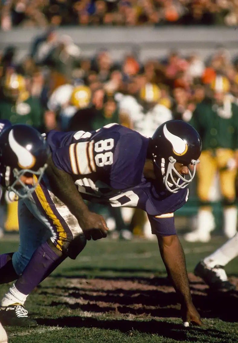
On 3/16/2024 at 6:12 PM, tBBP said:
YES.
There's several I can list right off the bat, but the first one I think of, THE preeminent DL with an 80-89 jersey number, is this guy:
(His fellow HoFer linemate Carl Eller wore a number in the 80s, too...81 to be specific.)
Former Minnesota Supreme Court Justice, the Honorable Alan Page! He is not purple and does not eat people.
-
2
-
-
10 minutes ago, shaydre1019 said:
Honestly I mean almost generally speaking a colored facemask doesn't look good on a dark/black helmet.
I think these would both look better with black facemasks.
Ooh, I really like that chrome gold facemask on the Colorado helmet. (Although I believe they got their uniforms right in the ‘90s and shouldn’t have changed much since then.)
-
1
-
-
8 hours ago, shaydre1019 said:
I feel like I'm going crazy, but I hate red facemasks on dark helmets. It gives generic high school vibes.
It always looks worse than a solid dark colored helmet to me.What examples have we ever even had? 1996-2008 49ers, or does metallic gold even count as dark? Cardinals’ black alt maybe?
-
13 hours ago, HOOVER said:
Yes, and they tied in with the Red numbers.
No Red numbers, no Red socks.
Too unbalanced.
I could be on board with a red facemask and red socks for the newest set.
-
1
-
-
2 hours ago, chriscj1983 said:
I want to be extremely clear that if these shoulder horns extend across the back of these jerseys, it will be the exact opposite of 'cool'.
Eh. It would’ve worked better for the Jets than on these Texans jerseys. The horns are too curvy to look good being straight in the back.
With NYJ, think of a white NOB box with black text on the green jersey, green with white text on the white jersey, white with green text on the black jersey (I know the actual black jerseys had green stripes but white would work better). It would also help if the sleeve (and pant) stripes had a thin outline in the color of the NOB text.
Just kind of where my own mind went almost immediately after they unveiled those. Wouldn’t likely have been as good as what they will soon be wearing, though.
-
1 hour ago, CS85 said:
Thank you! You, sir, are the real MVP.
1 hour ago, chriscj1983 said:Why do I get the feeling the blue shoulder horns extend to the nameplate on the back of the jersey?
14 minutes ago, WideRight said:Weird Idea: What if the horns on the sleeves of the uniform that has been leaked are not the same on the back as the front. What if they actually extend across the entire back to form one huge set of longhorn horns, with the player name in white within the center of the two horns (blue)? Hmmm.. that may be worth a concept.
I’ve said essentially the same thing about the now-outgoing NYJ uniforms, with their pointy plane wing jersey stripes, since they were introduced. That could’ve been really cool.
-
23 minutes ago, MDGP said:
Took me a bit to find it at first too. The stripe being horizontal due to the player squatting threw me off.
Thank you. Interestingly, it looks kind of like the blue horn with the red center that can be seen in the other picture, except this is red with a white center.


2024 NFL Changes
in Sports Logo News
Posted
I actually am perhaps a TINY bit more fond of the set from part of Billy Sims’ career, where they had silver numbers but with a white outline. I agree that silver numbers with no outline don’t work well on a Honolulu blue jersey.