


MCM0313
-
Posts
4,311 -
Joined
-
Last visited
Posts posted by MCM0313
-
-
On 2/28/2024 at 2:16 PM, MDGP said:
It makes me think the "he picked the color to match Notre Dame" is just another thing made up by someone years later. Reminds me of how when I was at Penn State, there was this persistent myth that they switched from Black and Pink to Blue and White because the colors faded in the sun (I want to say that's the same myth surrounding the Arizona Cardinals' name origins too)
Speaking of yellow vs. white, I've always loved the Michigan Heritage Jersey mix-up. Despite the guy who runs the site explicitly saying he messed up and the jersey was actually white, I still see people use this image as proof they wore all yellow in the 60s.

Maybe people think that because Meatchicken are a bunch of yellow-bellied cowards.
Sorry, obligatory anti-UM trolling by an OSU alum. And yes, I’m quite aware what has happened the past three seasons.
-
 2
2
-
 2
2
-
-
4 hours ago, Ted Cunningham said:
I've often thought that simply adding silver (or a lighter grey, as Nike has been essentially unable to produce silver on fabrics to this point) would certainly improve their current look. I don't mind Philadelphia's current uniforms. Even though the "midnight green" is a byproduct of the late 90s to mid 00s NFL dark era, it's a unique color in the NFL and I don't hate it. As a general rule, I like away uniforms that go primary/white/secondary/socks when the primary color is dark and the secondary color is some shade of gold or silver. I think that works for balance. (Digression: I also think that's why gold pants work so well for Washington.)
With that context, the one broad thing about the regular home and away looks I have never really liked was the balance of the away uniform: green/white/white/socks. Silver pants would add a lot of balance to that look, and would still look good, too, with the home uniforms (maintaining that dark-over-light look and avoiding two-tone dark-over-dark looks like Tampa's current iteration of the pewter uniforms).
Their insistence on wearing white socks 75% of the time doesn’t help either.
-
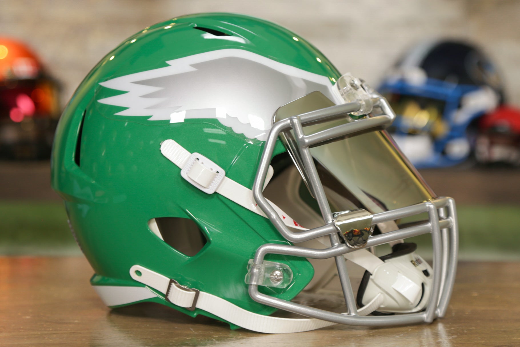
4 hours ago, Old School Fool said:
I feel like the Eagles should do a kelly green helmet with a chrome facemask. Something like the picture below but obviously update the wing.
Man, that’s gorgeous.
-
3
-
-
2 hours ago, Captain Poncho said:
The only time he ever wore them was in the preseason vs. New England in 1997. I also remember him saying at the time that he hated the monochrome outright, but I'm not sure if Nike had to scramble based on his dislike, though that's a thing that definitely could have happened given his importance to the team.
I wish players today would say they hate monochrome.
-
9
-
-
10 hours ago, burgundy said:
There was also the Vikings who wore mono purple for 3/4 of a game in 1964, but that wasn't exactly planned.
The Broncos wore mono blue twice in the 1997 preseason, beating the eagles by a few months. Weirdly, one of the games was also against the 49ers.
Didn’t John Elway himself supposedly nix wearing those in the regular season?
-
1 hour ago, PurpleHayes said:
Pretty sure someone whipped up the 'G' logo in an afternoon and after getting Vince's OK they slapped it on the helmet without further ado nor interference from the league. No 5-year design and review process like there is now!
He didn't invent the trend, though...the 49ers, Lions, and Steelers already had helmet/pants in secondary colors. If anything, he may have been trying to imitate Army.
That’s awesome. Somebody whipped it up and now it’s been used by an NFL team for over sixty years and two colleges for who knows how long.
I know Vince wasn’t the first to use proper color blocking. What I was saying was that, after the way the Packers tore through the 1960s, the monochrome looks that were occasionally seen before that disappeared. The Packers themselves had worn mono in the ‘50s. IIRC it didn’t recur for Green Bay until the advent of Color Rush.
Of course, the OG low-def color televisions had something to do with it too, I’m sure. Different colors for different parts of the uniforms kept the players from looking like Colorforms and made the action easier to keep track of.
Ironically, with today’s hi-def mega-screens, basketball (NBA and college) has gotten so far from its roots that many games are literally black against white uniforms, and it can be hard to tell, at least initially, which team is which. The NFL at least generally sticks to team colors.
-
On 2/24/2024 at 11:04 AM, Old School Fool said:
The thing about the Packers getting an alternate helmet is that it could just be making their throwback accurate. Remember the throwback was introduced in 2021 when there was no alternate helmet rule. They did wear a yellow helmet in 1950 but in 1953 they had a gold helmet.
Man the Packers sucked at having an identity Pre-Lombardi. It was all over the place.
It’s hilarious that Vince Lombardi - a coach, not a designer, and colorblind at that - had such a part in standardizing football uniform formats for so long. I have read that he associated it with winning, maybe from his time as an assistant coach in Cleveland, but he apparently preferred the helmet and pants to be the team’s secondary color, effectively ending non-white monochrome looks for more than a quarter of a century. Was he also the one who commissioned the G logo, or was that just a coincidence?
-
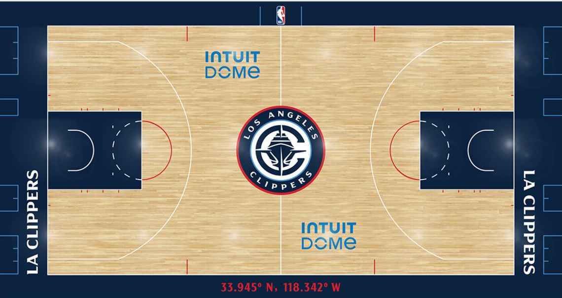
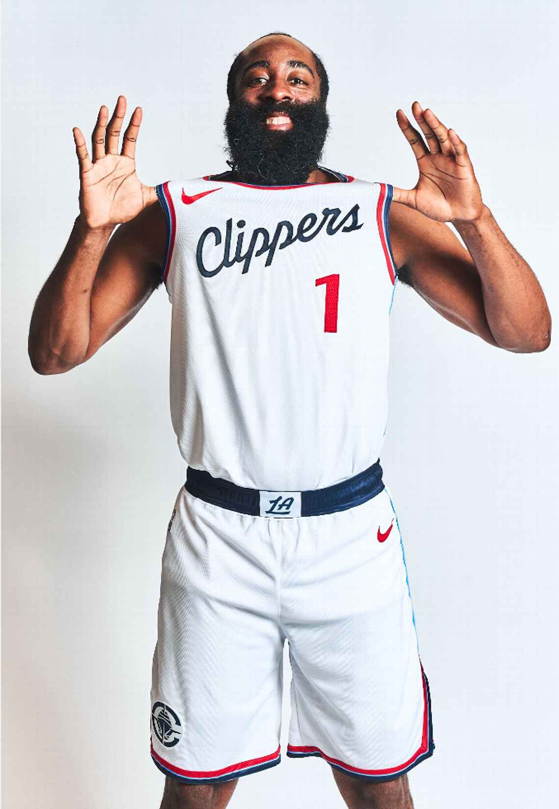
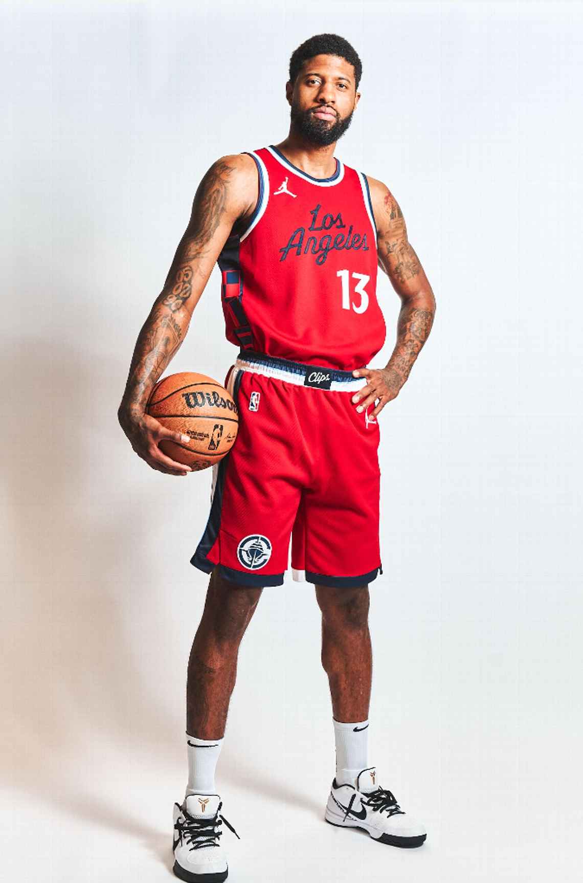
8 minutes ago, tBBP said:
One of the things I saw regarding the creative brief for this rebrand was that the Clippers wanted to emphasize "upward, forward motion". That may in part explain why the clipper ship may be rendered as if you're looking at it head-on from a perspective point somewhat below the bow.
For whatever that may be worth...
Kinda silly, perhaps, but an infinitely better explanation than the one from the LA Clip Art unveiling.
-
2
-
-
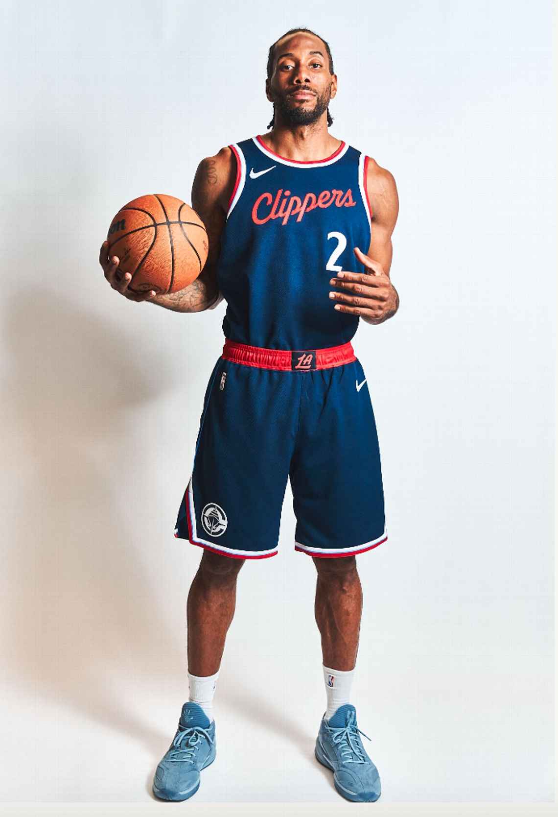
2 minutes ago, Lights Out said:
I disagree. The Wizards are primarily red, the Clippers are primarily navy, and the uniform designs are so radically different that I doubt anyone will confuse them. The current Wizards uniforms overlapped with the Hawks' navy and red era and nobody confused those either.
Right. At least they aren’t black and red! That’s like a quarter of the league right there.
-
6 minutes ago, Bmac said:
Nope, it's navy.
6 minutes ago, dont care said:There is no black on the uniforms
That’s a relief!
-
1
-
-
16 minutes ago, Lights Out said:
This is really nice. My only complaint is not bringing back the San Diego colors. I know there's a touch of powder blue here and there but it doesn't stand out enough.
The best part is finally having a real logo for the first time since... 1982. Holy crap, this was long overdue.
Random observation, but the overall look reminds me of the Twins' uniforms. Specifically the number font and how the color scheme is used.
As soon as I saw the white jersey I was reminded of the Twins’ current look. Not a bad thing.
29 minutes ago, Telemundo219 said:
So with the powder blue and grey backgrounds, is there any reason to believe either of those will eventually be the base for an alternate, or is it just to see what the navy blue script looks like on them? I know the powder blue is a trim color. Is there any grey in the new scheme?
-
2
-
-
24 minutes ago, Telemundo219 said:
Not a huge fan of the navy, but given the nautical theme it makes sense. Kinda wish they’d gotten rid of black altogether (that is the script color on white and red jerseys, right?), and scripts on blue and red jerseys could use white outlines.
All that said? This is a huge leap forward from the various colors of garbage they’ve worn for…what, close to a decade now?
-
20 hours ago, Cujo said:
Watching live action spring training -- the larger numbers/smaller names make the players look fatter.
Do any of them look like Hack Wilson or Babe Ruth or Bartolo Colon yet? If not, let’s just keep going.
-
1
-
-
7 hours ago, rfraser85 said:
Were the jerseys different colors? I thought they were the same shade of purple. But I think the throwbacks would look fine in the Vikings' current colors. Maybe they could make a white version and use those as the primaries like what the 49ers did in 2009. But only with white pants and purple socks for both jerseys.
The Vikings have actually changed their shade of purple several times in their history. For all four of their Super Bowl appearances, it was a very dark, blue-heavy shade. More recent versions have been a bit brighter and more balanced.
-
1
-
-
2 minutes ago, thisguyphelps said:
Helmets to match the throwbacks this past year that wasn't *historically accurate
I really doubt they would do that. It’s probably “HURR DURR
 ” stuff.
-
1 hour ago, MCM0313 said:
EFF soccer uniforms. Those things put the “ass” in association football, that’s for sure. They are terrible almost to a one - only World Cup looks are halfway-decent in my opinion.
For what it’s worth, I mean that mainly because of the constant uniform changes and the enormous ads, along with the tendency many teams have to wear completely different color schemes home and road. All three of those things annoy me a lot.
-
5 hours ago, MJWalker45 said:
I'm starting to think the NFL wants to copy soccer, but can't talk themselves into swapping out uniforms every 1-2 years like soccer teams do now. That's why they have the 5 year rule, with the caveat that it can be tossed out under that time if someone else buys the team.
EFF soccer uniforms. Those things put the “ass” in association football, that’s for sure. They are terrible almost to a one - only World Cup looks are halfway-decent in my opinion.
-
2
-
 2
2
-
-
On 2/19/2024 at 8:34 AM, dont care said:
It looks like they feared design too when making these
In addition to being BFBS (and one of them being for such a traditional program in Indiana!), these are lazy. They’re bland. They’re formulaic and templated. The numbers, in both cases, are too dark to contrast properly with the idiotic, unnecessary black base. These uniforms look like ass, and I have no idea why anyone thought this was a good idea. The fact that anyone is proud of this, and making social media posts to highlight it, is utterly depressing.
-
1
-
-
4 hours ago, adsarebad said:
Reminds me, who will be the first team with a Hooters ad patch??

My guess would be a college team. Temple, Rice, Florida Atlantic…probably one of those.
-
1
-
-
8 hours ago, FiddySicks said:
Oof, yeah. No. Don’t do that. (Hint: That relationship didn’t end well!)But at least it started!
-
2 hours ago, BJ Sands said:
Naked Katy Perry and a ball sack. This thread has gone off the rails in the best way possible.
Since this is a sports-related board, can I say how jealous I am that Russell Brand’s ugly ass got to score (insert Beavis and Butthead laughter) with Katy Perry for several years?
-
5
-
-
1 hour ago, rmackman said:
The irony here, to me, is that a company that spells Quick...Q-U-I-K...is going to help people read better.
They’re probably donating to the Zoolander Center.
-
1
-
-
3 minutes ago, BJ Sands said:
I forgot how much I like that Katy Perry uniform.
")
I sure wouldn’t want to see it in sports though.

-
3
-
1
-
-
11 hours ago, Rebuy said:
Fanatics and Nike are a disaster. Advertisements on the jersey are a disaster. This isn't European soccer. The uniform should be sacred and free from external commercial promotions. Fans should simply boycott the advertisers.
As a Phillies fan it's extremely disappointing that the chain stitching is gone. The cool numbers on the sleeves that was entirely unique to the Phillies are gone. We are getting a totally unnecessary city connect jersey. It's very disappointing that the organization did nothing to stand for the integrity of the jersey.
Seeing the other changes is awful too. You don't think of cool quirks like the trim on the Braves belt loop until they're gone.
What other company can take on the MLB market and save us from Fanatics and Nike? Under Armour? There is so much less competition in this space. In the 90s, you could theoretically have Champion, Wilson, Russell, Nike, Majestic, Reebok, Adidas among others compete in this space.
It’s why monopolies are bad for quality.
-
4
-


Wideright's NFL Redux 2024-- MIA/BUF Added 3/16
in Concepts
Posted
They made it lighter in like 1988 or 1989. Since then it’s been the same - at least officially.