


MCM0313
-
Posts
4,368 -
Joined
-
Last visited
Posts posted by MCM0313
-
-
On 2/8/2024 at 6:40 PM, The_Admiral said:
Inside the NBA on HGTV with Chip and Joanna Gaines, the Property Brothers, and also Charles Barkley
Turrible, turrible.
-
 1
1
-
 1
1
-
-
-
43 minutes ago, ruttep said:
That looks wayyy too traditional to fit with their main brand. I bet that's just a limited edition jersey that's going on sale soon.
To me it looks an awful lot like their Color Rush jersey. Maybe brining that back in some form? Or, yeah, just some commemorative something or other. Of course, that design was based on a combination of the ‘50s look and the ‘80s/‘90s look. So this could be commemorating whatever, pretty much.
-
16 hours ago, HOOVER said:
Not sure who the guys are behind ProLine Mockups but they're doing the Lord's work:

I still prefer Green/White/Solid Green socks and White/White/Solid Green socks.I agree with you. Normally I like sock stripes, but such a simple look is just fine with solid-color socks. Provided that color isn’t all the colors combined (white) or no color at all (black).
-
2 minutes ago, LMU said:
They’re really pushing that SpongeBob tie-in, aren’t they?
Spoken like somebody who doesn’t live in a pineapple under the sea…
-
 2
2
-
1
-
-
5 minutes ago, MJWalker45 said:
If the Broncos are actually changing, they should be going with this.
Yes, they should! Right down to the Ole Miss medium blue helmet.
-
2
-
-
6 minutes ago, MJWalker45 said:
With the new Nike design, it's easier to just go with the Sack Exchange uniforms.
I believe so, but I wouldn't be surprised if they went the 1990's route and added black trim to the sleeve stripes, or do what they did with Indianapolis and make the swoosh black.
One downside, they could make the facemasks black, which should only happen on the black uniforms, which will likely have a black helmet as well, unless they ditch it so that they can have the Namath throwbacks later down the line.
Thanks for reminding me of my nostalgia for the Orange Crush Broncos.
-
3
-
-
37 minutes ago, PurpleHayes said:
Sadly I don't think this is going away any time soon...at least until all the current players who love their 'icy whites' enter their 30s and the new batch of players in their early 20s want to disassociate themselves from the 'grandpas' on the team, and come up with some new uniform trend/atrocity.
Not all players go for the
 look. Plus, an individual’s preferred fashion can change over time. It’s a fad.
-
2 minutes ago, fouhy12 said:
Chiefs again, huh? Against…who is that, the Vikings?

-
1
-
3
-
-
59 minutes ago, HOOVER said:
Maybe the fact that they're going with the "Legacy" theme means they'll honor that a bit and not mix & match as much. We can hope.
It would be nice if they just followed the other traditional franchises in the league and quit playing Barbie with uniforms. Green/Green/White and Green/White/White. You want to mix up socks? Fine. But if you leave Green pants out of the mix, I don't see any reason they'd wear the White jerseys with Black pants, being that the Sack Exchange White jerseys have no Black on them.I don’t think they’ll mix and match too terribly much. I just hope their preferred combos aren’t monochromatic. White over white is fine, but PLEASE keep the socks green, and don’t do any ice cube or chilly emojis.
What’s good in that regard is that the set it is based on always wore green socks and white pants. I believe that, after the mess they’re leaving behind, they will mostly go for simple, traditional looks aside from the black alt.
-
1
-
-
5 minutes ago, bushy said:
so basically the Celtics.Not a damn thing wrong with looking like the Celtics! (At least their primaries….)
-
1
-
-
1 minute ago, WSU151 said:
The Colts created black helmets just from the use of black swooshes on the home/aways. Apparently any black accent can be that minimal.
Indiana nights, baby! Perfect for hitting up the local Applebee’s for some mozzarella sticks after the game.
-
4
-
7
-
-
9 minutes ago, Eszcz21 said:
That was my thought as well. I thought that was part of the reason Washington shoe horned black into the away uniforms.
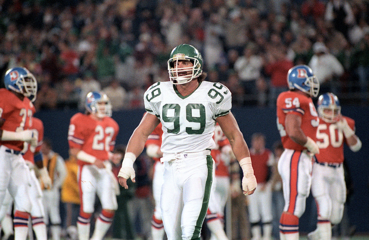
It can be done tastefully though. The Jets’ 2019-23 set shows this - black facemask, black number outline, not overwhelming at all. Since their upcoming set is just a modernization of a classic style, I don’t foresee a ton of black in the regular home and road sets. I’d say 1990-97 amounts, or even less.
-
1
-
-
30 minutes ago, HOOVER said:
And another from Jake Buff:
I love that this mockup doesn’t include white or black socks. I’m cool with it not including green pants too. But it’s just a mockup. You know they will go monochrome at least part of the time.
Still - moving to the plane silhouette full-time is a massive win.
-
Major props to Jauan Jennings. Had one heck of a game while actually wearing the proper red socks.
-
9
-
1
-
-
44 minutes ago, Germanshepherd said:
Pregame warmups show a heavy preference for white sox with the Niners. Joy.

-
1
-
 1
1
-
-
It makes me unreasonably angry that virtually every team has a black uniform in their rotation - including those whose primary color is already something dark. James Madison, Wazzu, Stanford, Middle Tennessee, Tulane. Sports are supposed to be colorful, and I am bothered that so many people seem to think they should just be black against white.
-
6
-
-
On 1/1/2024 at 9:09 PM, maxwasson said:
Happy New Year, SportsLogos.net! And to kick off the New Year, I have a redesign of Kansas City's current ABA franchise that has been active since 2018, the Kansas City Grillers who get a massive facelift in this part of the series.
BRANDING
For the logo, I asked the artist to make a basketball-shaped sirloin steak, I went with a color scheme consisting of a dark reddish brown, a super dark brown, salmon pink, and white. The font used for the wordmarks, insignias, and jersey numbers was Snappy Service.
EXTRA HOME SCRIPTS & ROAD SCRIPTS PT. I
There was a lot of wordmarks I made for this one, with the remainder of the road wordmarks being contained on the next slide
EXTRA ROAD SCRIPTS PT. II & INSIGNIAS
And here are the rest of the road wordmarks I put together, and the extra insignias.
HOME COURT
On to the home court, the current-day ABA Grillers do play their home games inside the HyVee Arena (formerly known as Kemper Arena) right near the Kansas-Missouri stateline.
UNIFORMS
I assembled together a 5-piece uniform set, with some "grill puns" for the dark brown and salmon pink alternates.
This whole concept is so clever!
-
1
-
-
8 minutes ago, MJD7 said:
I noticed this in the earlier renderings, as well:
There seems to be the ability to have different stripe sizes, which I wasn’t expecting. The Twins are another team that appear to have bigger stripes than the average. The Twins & the Rangers were two teams that had larger stripes on the previous template, as well, so it seems they were able to accommodate more than we would’ve expected, even though we can’t have stripes above the edge of the sleeve anymore.
Nike: look at our cutting-edge designs and space-age fabric!
Also Nike: we struggle to reproduce several shades of green, we can’t do metallic fabrics, stripes can go in some places but not in others, let’s muddy the waters of the NBA so much that fans can’t tell which team is which, monochrome is in, leotards are in, putting every single team in black is in, color blocking is out.
-
2
-
-
4 hours ago, spartacat_12 said:
I was thinking about pro sports in general. There are a lot of royal & red teams, but the Clippers are the only ones that have made black another one of their main colours. I guess the Marlins are the closest thing, but the shades of blue & red they use aren't quite the same, and they're a mostly black team. The closest example I can come up with for an ideal Clippers colour balance would be similar to the old Colorado Avalanche alternates, just with a bright red instead of burgundy.
The Pat Patriot-era New England Patriots are another example. And the mid-late-1990s Texas Rangers.
-
4 hours ago, projectjohn said:
The Pistons have pivoted heavily into black and gray in recent years (thankfully gray seems to have mostly passed), and also seem to be actively minimizing red to the best of their ability - refusing to bring back their old red alternate as the Statement edition, and eliminating their classic court design which was red-heavy. I keep hoping sanity will prevail at some point, but the trend just keeps getting worse.
Well, this season isn’t one they’re going to want to remember, so hopefully they pivot away from that trend.
-
1
-
-
17 hours ago, pepis21 said:
If you don't like Clippers wordmark, there are also two less known versions with Los Angeles wordmark. One with blue numbers:
and second with white numbers:
Like this?:
Precisely.
-
2 hours ago, spartacat_12 said:
I feel like the addition of black isn't a bad thing for the Clippers, but they haven't found the right way to execute it yet. It's always felt tacked on, but I'm sure there's a design that would make it feel less like BFBS. Considering how many other royal & red teams there are, the black does help them stand out.
I actually think the Pacers are one of the few royal blue teams that improved their set by switching to navy in the '90s. The Warriors have owned the royal & yellow look in the NBA for a little while now.
There aren’t that many royal and red teams, are there? Pistons come to mind and they’ve always rocked those colors wonderfully, with the exception of their absurd foray into teal. Sixers have usually looked good in those colors too. There are way more red and black: Bulls, Raptors, Blazers, Rockets, Hawks (plus yellow), Heat (plus yellow), Cavs (dishonorable mention). LAC going back to royal and red would be a breath of fresh air at this point. (So would the sky blue and burnt orange from their distant past.)
-
15 minutes ago, pelicanfan said:
If you’re someone who pays attention to the Pelicans, you may have heard fans raving about this year’s City Edition line. To a point many people are calling for the team to even rebrand around the theme. And honestly, its
for pretty good reason. I’m not one to be impulsive but I really do think the Pelicans hit the mark this year and now have a great opportunity to rebrand (and i rarely give props to this team’s marketing.)
Purple and green is a color combination rarely used in sports. Let alone purple, *lime* green, and black. Not only is this so unique, it also speaks to the VooDoo and supernatural culture of New Orleans. It’s something i never thought of before and I personally think it’s a lot better than the surface level stuff the team has done like Red White and Blue and Mardi Gras.
So with that being said here’s my take on what a Pelicans “Skelican” rebrand would look like. Credit goes to the team for the coming up with the basis of all of this. I’m just branching off it.
So for the wordmark i actually had to recreate the font myself. The font the team used was a custom made one so i had no choice but to piece together every letter i can find from promotional pieces. i tried to upscale them as much as i can, put them all together on a template, and then put it through an AI font maker. So it’s not perfect but it’s close.
For the middle logo, it’s of course the famous “Skelican” logo that many fans have been raving about. I couldn’t find any official image of it so i had to cut it and upscale it myself.
And for the third logo, i have no idea if this would be legally allowed in the real world but i combined the old New Orleans VooDoo logo with one of the secondary logos the team currently has. And then adjusted colors accordingly. This probably wouldn’t be allowed but it’s fun to imagine. And i’m sure the team can pull off something like this the right way if they wanted to.
And for the main logo, this surprisingly took a long time to make, longer than anything else here. But long story short, i managed to combine the smaller city edition logo with the bigger official logo the Pelicans have used (up until this year they decided to remove it for no reason) Also added a little drop shadow to the letters mostly so the NEW ORLEANS doesn’t just blend in with the green bones.
And for the jerseys, I actually feel like i could have done a lot more but i didn’t want to stray too far from what the City Edition jerseys look like. I have to admit I was not sold on the plainness of the actual jerseys that came out so I added some more striping all around so the colors can pop more.
For the City Edition jerseys here’s some designs of my own that take a less traditional route. The first one goes all in with the skeleton theme with a bone-like font, pinstripes made of bones, and a skull pattern all around the uniform.
For the second jersey i was inspired by the one of the retro Hawks jerseys with the big bird in front. with how much the fans love the logo i thought this would be a bold but slick way to incorporate the logo and let it do the speaking.
And as a bonus here is my third jersey concept, this actually came from an old concept I made before the Pelicans came out with their City Edition stuff. As you can see I opted for a teal color to pair with the purple. Added VooDoo doll stitching on the sides and used a haunted spooky font. Then i added the logos and recolored accordingly
And if you’ve made it this far, congrats. I now lastly present my court design. Personally this is my favorite part as it required the most thinking from me. I was mostly inspired by the current Pelicans home floor that has Louisiana nature all around the border of the court. I took that same design and took it up a notch by using dead trees and *flying Pelican Skeletons* at the top. and at the very bottom of the court is the classic “Let The Good Times Roll” motto in French.
As for inside the court, I of course used the beloved “Skelican” logo at center court and in the 3pt arch’s I added more Pelican Skeletons. Is it a *little* horrifying? yea, but one can say that perfectly fits the the vibe of New Orleans
These are sharp, fun, and unique. Could we see a neon green jersey concept?
-
 1
1
-


/cdn.vox-cdn.com/uploads/chorus_image/image/71569170/1437750496.0.jpg)


2024 NFL Changes
in Sports Logo News
Posted
You’ve been here longer than me, yes. I’m not a newcomer though. And I think “good but not great” was the most common opinion of that logo - though, if I see anyone down on one knee in these parts, I will immediately tell you.