


MCM0313
-
Posts
4,353 -
Joined
-
Last visited
Posts posted by MCM0313
-
-
2 minutes ago, Lights Out said:
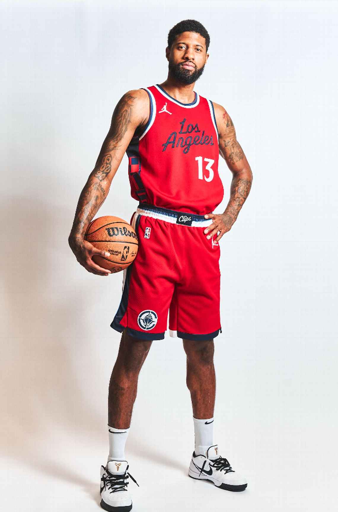
I disagree. The Wizards are primarily red, the Clippers are primarily navy, and the uniform designs are so radically different that I doubt anyone will confuse them. The current Wizards uniforms overlapped with the Hawks' navy and red era and nobody confused those either.
Right. At least they aren’t black and red! That’s like a quarter of the league right there.
-
6 minutes ago, Bmac said:
Nope, it's navy.
6 minutes ago, dont care said:There is no black on the uniforms
That’s a relief!
-
 1
1
-
-
16 minutes ago, Lights Out said:
This is really nice. My only complaint is not bringing back the San Diego colors. I know there's a touch of powder blue here and there but it doesn't stand out enough.
The best part is finally having a real logo for the first time since... 1982. Holy crap, this was long overdue.
Random observation, but the overall look reminds me of the Twins' uniforms. Specifically the number font and how the color scheme is used.
As soon as I saw the white jersey I was reminded of the Twins’ current look. Not a bad thing.
29 minutes ago, Telemundo219 said:
So with the powder blue and grey backgrounds, is there any reason to believe either of those will eventually be the base for an alternate, or is it just to see what the navy blue script looks like on them? I know the powder blue is a trim color. Is there any grey in the new scheme?
-
2
-
-
24 minutes ago, Telemundo219 said:
Not a huge fan of the navy, but given the nautical theme it makes sense. Kinda wish they’d gotten rid of black altogether (that is the script color on white and red jerseys, right?), and scripts on blue and red jerseys could use white outlines.
All that said? This is a huge leap forward from the various colors of garbage they’ve worn for…what, close to a decade now?
-
20 hours ago, Cujo said:
Watching live action spring training -- the larger numbers/smaller names make the players look fatter.
Do any of them look like Hack Wilson or Babe Ruth or Bartolo Colon yet? If not, let’s just keep going.
-
1
-
-
7 hours ago, rfraser85 said:
Were the jerseys different colors? I thought they were the same shade of purple. But I think the throwbacks would look fine in the Vikings' current colors. Maybe they could make a white version and use those as the primaries like what the 49ers did in 2009. But only with white pants and purple socks for both jerseys.
The Vikings have actually changed their shade of purple several times in their history. For all four of their Super Bowl appearances, it was a very dark, blue-heavy shade. More recent versions have been a bit brighter and more balanced.
-
1
-
-
2 minutes ago, thisguyphelps said:
Helmets to match the throwbacks this past year that wasn't *historically accurate
I really doubt they would do that. It’s probably “HURR DURR
 ” stuff.
-
1 hour ago, MCM0313 said:
EFF soccer uniforms. Those things put the “ass” in association football, that’s for sure. They are terrible almost to a one - only World Cup looks are halfway-decent in my opinion.
For what it’s worth, I mean that mainly because of the constant uniform changes and the enormous ads, along with the tendency many teams have to wear completely different color schemes home and road. All three of those things annoy me a lot.
-
5 hours ago, MJWalker45 said:
I'm starting to think the NFL wants to copy soccer, but can't talk themselves into swapping out uniforms every 1-2 years like soccer teams do now. That's why they have the 5 year rule, with the caveat that it can be tossed out under that time if someone else buys the team.
EFF soccer uniforms. Those things put the “ass” in association football, that’s for sure. They are terrible almost to a one - only World Cup looks are halfway-decent in my opinion.
-
2
-
 2
2
-
-
On 2/19/2024 at 8:34 AM, dont care said:
It looks like they feared design too when making these
In addition to being BFBS (and one of them being for such a traditional program in Indiana!), these are lazy. They’re bland. They’re formulaic and templated. The numbers, in both cases, are too dark to contrast properly with the idiotic, unnecessary black base. These uniforms look like ass, and I have no idea why anyone thought this was a good idea. The fact that anyone is proud of this, and making social media posts to highlight it, is utterly depressing.
-
1
-
-
4 hours ago, adsarebad said:
Reminds me, who will be the first team with a Hooters ad patch??

My guess would be a college team. Temple, Rice, Florida Atlantic…probably one of those.
-
1
-
-
8 hours ago, FiddySicks said:
Oof, yeah. No. Don’t do that. (Hint: That relationship didn’t end well!)But at least it started!
-
2 hours ago, BJ Sands said:
Naked Katy Perry and a ball sack. This thread has gone off the rails in the best way possible.
Since this is a sports-related board, can I say how jealous I am that Russell Brand’s ugly ass got to score (insert Beavis and Butthead laughter) with Katy Perry for several years?
-
5
-
-
1 hour ago, rmackman said:
The irony here, to me, is that a company that spells Quick...Q-U-I-K...is going to help people read better.
They’re probably donating to the Zoolander Center.
-
1
-
-
3 minutes ago, BJ Sands said:
I forgot how much I like that Katy Perry uniform.
")
I sure wouldn’t want to see it in sports though.

-
3
-
1
-
-
11 hours ago, Rebuy said:
Fanatics and Nike are a disaster. Advertisements on the jersey are a disaster. This isn't European soccer. The uniform should be sacred and free from external commercial promotions. Fans should simply boycott the advertisers.
As a Phillies fan it's extremely disappointing that the chain stitching is gone. The cool numbers on the sleeves that was entirely unique to the Phillies are gone. We are getting a totally unnecessary city connect jersey. It's very disappointing that the organization did nothing to stand for the integrity of the jersey.
Seeing the other changes is awful too. You don't think of cool quirks like the trim on the Braves belt loop until they're gone.
What other company can take on the MLB market and save us from Fanatics and Nike? Under Armour? There is so much less competition in this space. In the 90s, you could theoretically have Champion, Wilson, Russell, Nike, Majestic, Reebok, Adidas among others compete in this space.
It’s why monopolies are bad for quality.
-
4
-
-
3 hours ago, WBeltz said:
Man, Teal is gonna come back isn't he?
Any day now!
-
1
-
 1
1
-
 5
5
-
-
4 hours ago, CitizenTino said:
This is interesting. The backlash from the players over the new uniforms has gotten so loud that the union is now getting involved and demanding remedies. I doubt we are going to see wholesale changes, but I think things for MLB/Nike/Fanatics have gotten past the point of hoping this just blows over if they wait it out.
Shame that the one pictured is the Marlins’ long-awaited blue shirt. I hope the template has to change, but I also hope they don’t get rid of the blue when it does.
-
2
-
-
4 minutes ago, The Impaler said:
SMDH. No pants stripes, solid socks matching pants colors, sublimated
 everywhere, white helmets, 4 facemask colors, white logo on white helmet. Please make it stop. Just SO many bad ideas all in one uniform. FWIW though, most people over on the Broncos forums think this guy is full of :censored:, but I guess we have to give him credit now for talking to Lukas. It's possible he saw or heard about some prototypes or alternates and isn't completely full of :censored:, I guess.
Look, this time last year we were told the Cardinals would be darkening their maroon and adding burnt orange. I say we should take all this with (Milton from “Office Space” voice) biiiiiiiiiig grains of salt and just wait for the actual reveal.
-
11
-
-
1 hour ago, oldschoolvikings said:
Yup. That's why they wore the all white socks with them initially. Now, of course, teams just wear all white socks with their white uniforms because the players have really really terrible taste.
I don’t remember the Dolphins’ throwbacks ever having plain white socks. I remember them having white socks with aqua and orange stripes.
-
On 2/17/2024 at 1:18 PM, Sec19Row53 said:
Per Trucolor.net (which confirms what my eyes thought), they're not identical colors. They're close.
Nor are the uniform components identical. Number font is different, design of the stripes are different. I also don't believe that the statement was made that they don't look like each other. They are not something that I would confuse in the least.Ya both ought to just chill a little.
Bears’ navy is the same as Texans’ (which, we will see if that stays). All the other navy-dominant teams use different shades. Good eyes.
-
2
-
-
On 1/20/2023 at 5:06 PM, oldschoolvikings said:
I wasn't really thinking silver. Its a semi rip off of this old Rutgers helmet...
It does a solid job of looking old (and Vikings did live long ago, after all), but I’m not sure how well it can fit with their brand. I also feel like it would set a dangerous precedent IRL, but in this universe you’re in control, not The Swoosh.
-
On 2/10/2024 at 7:40 PM, MCM0313 said:
It makes me unreasonably angry that virtually every team has a black uniform in their rotation - including those whose primary color is already something dark. James Madison, Wazzu, Stanford, Middle Tennessee, Tulane. Sports are supposed to be colorful, and I am bothered that so many people seem to think they should just be black against white.
This has actually gotten to the point where I can’t tell from photos which team is which in most games. It seems like at least 50% of games are black against white. Yuck.
-
3 hours ago, ltjets21 said:
https://www.gridiron-uniforms.com/fields/controller/controller.php?action=main
This is a great website. A database of field art and covers most teams entire histories.
Thank you! I’ve used that site for uniform info before. Didn’t realize they also had a thorough field database.
-
3
-


 everywhere, white helmets, 4 facemask colors, white logo on white helmet. Please make it stop. Just SO many bad ideas all in one uniform. FWIW though, most people over on the Broncos forums think this guy is full of :censored:, but I guess we have to give him credit now for talking to Lukas. It's possible he saw or heard about some prototypes or alternates and isn't completely full of :censored:, I guess.

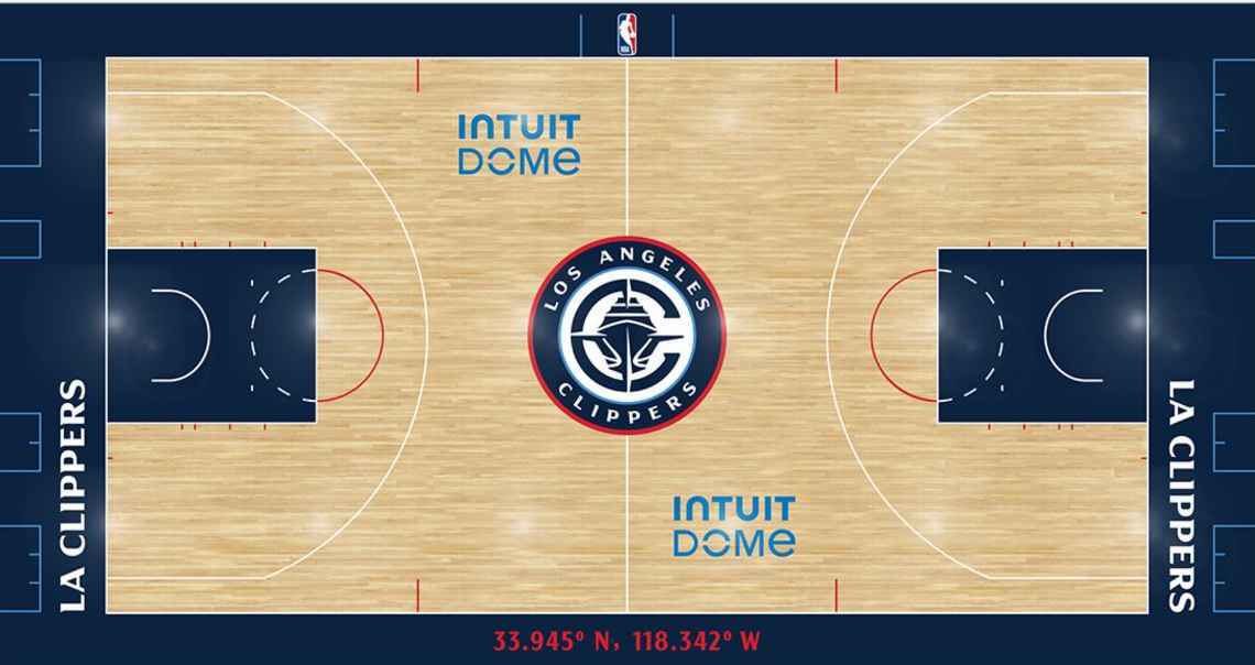
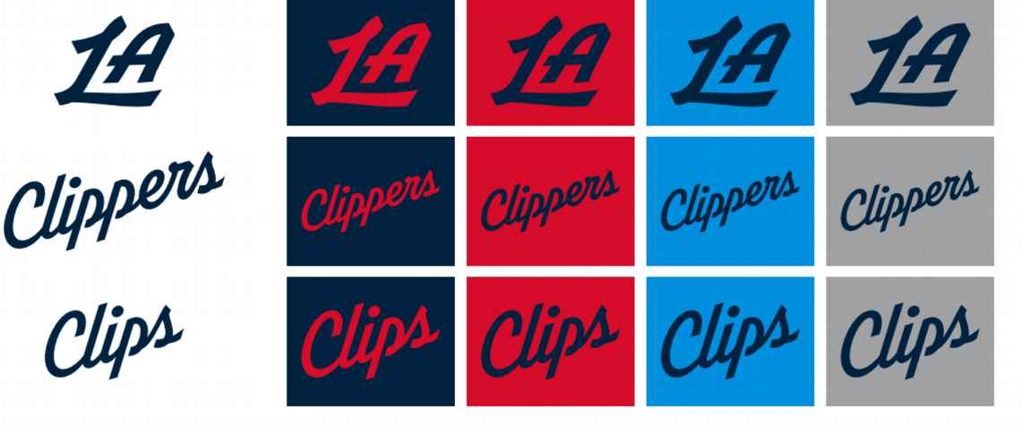
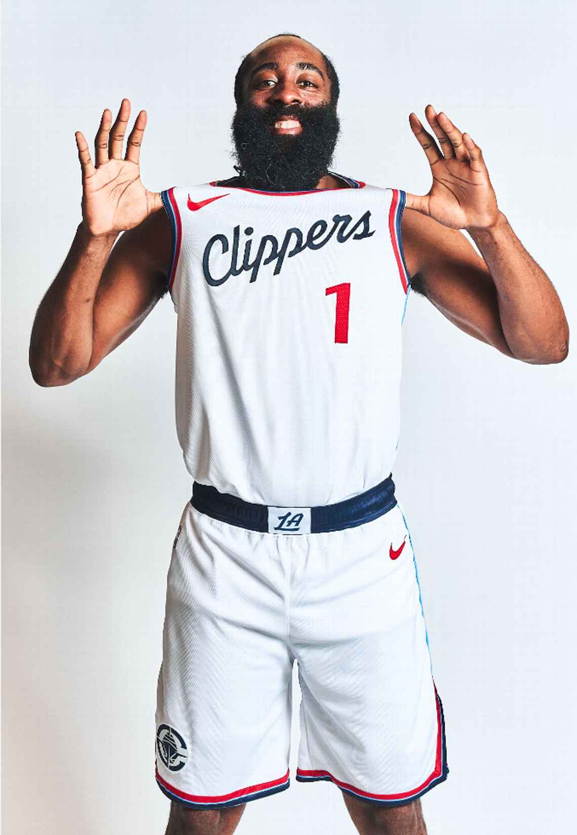
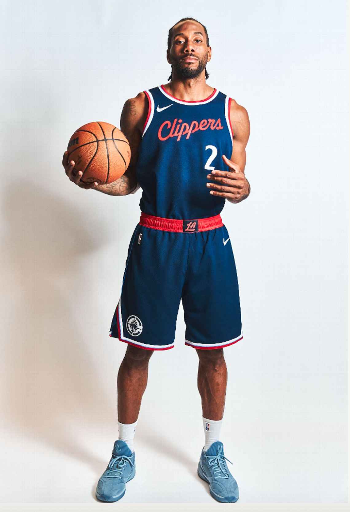
Los Angeles Clippers Rebrand
in Sports Logo News
Posted
Kinda silly, perhaps, but an infinitely better explanation than the one from the LA Clip Art unveiling.