


MCM0313
-
Posts
4,368 -
Joined
-
Last visited
Posts posted by MCM0313
-
-
1 hour ago, tBBP said:

They were that way on the original FloJo jawns, too.
(Total aside: how did we let the Pacers get away with Helvetica Bold Italic for all those many years?? )
Huh. I guess I just remembered the parts I liked.
While I do like that design, I wasn’t as crazy about the set as some. Navy blue is such a boring color and it would’ve been fun to see a yellow alt (which is kind of what the Siakam photo is).
-
1 hour ago, CaliforniaGlowin said:
They said there will be one traditional jersey, so it might not be all bad.
Eh, the jerseys they’re leaving behind are traditional, but when they wear white socks with (especially) their blue jersey, it still makes me grit my teeth.
-
 3
3
-
-
On 1/20/2024 at 11:33 AM, TheBigFiz21 said:
I know the new "sponsor" went into effect almost two weeks ago and the whole ad patch thing isn't going anywhere, but...
...having a QR code on a jersey is the unquestionably worst thing about this.
I dunno, the fact that the jersey and pant stripes don’t line up is pretty irritating.
-
2
-
-
6 minutes ago, tscuzzy said:
Paul George mentioned on his most recent podcast that the Clippers are getting new uniforms next season. Specifically they were discussing how they don’t wear red uniforms anymore and he said “something in store next season. I can probably drop that. They fire too… it’s gonna be the favorite”
Does that mean they *will* wear red uniforms after this season? That would be nice. I like LAC as a red-first team, and they’ve gotten away from that.
-
1
-
-
34 minutes ago, CaliforniaGlowin said:
I like the idea of all of the jerseys being different and they said there's something for everyone. Could be a disaster, could be good.
Split the difference: I’m calling one good, one meh, and two disasters. Which will be which I don’t know. I bet the horned helmet will be cool though.
-
3
-
-
1 hour ago, PurpleHayes said:
"Super Bowl Licks?"

They should have The Rolling Stones play the halftime show and call it just that.
-
3
-
 3
3
-
-
3 hours ago, Sec19Row53 said:
2000 World Series - Mets Yankees
Yes. Also any of several Dodgers-Yankees Series since the Dodgers moved to LA. Yankees-Padres, 1998 (although the letters on the Padres’ caps were two different colors). Dodgers and Twins…um, sometime in the sixties, although same color issue as Yankees-Padres. Um…have the Yankees and Cardinals played each other? Would that count? How about the White Sox’ script? Baseball does a lot of interlocking letters in logos.
3 hours ago, ruttep said:More footage of the photoshoots shows Nick Bosa not wearing any socks, which I doubt he'll do for the actual game (the fine for the Super Bowl is probably some ungodly amount). So maybe the photoshoots aren't 100% indicative of what we'll see on gameday?
Rather, no football socks. Black ankle socks instead. I hate wearing socks that short - I’m liable to get blisters on my heels or ankles.
-
10 hours ago, The_Admiral said:
SAY THE LINE,BART!
...we live in a culture of working the refs
You didn’t do it.
-
20 hours ago, Germanshepherd said:
Looks like all the players shown have worn white instead of red in the past.
I think we’re getting a mix, but primarily white like the Commanders game earlier this year.
Yuck. Why are players allowed to choose their own sock colors? It should be uniform just like jerseys and pants. (Also, red, not white.)
-
5
-
-
1 hour ago, PERRIN said:
'Tis both a blessing and a curse. I can't count the number of times my family has stared at me like I'm crazy after I gasp at the TV and point out a player is wearing an outdated jersey template.
I can’t count how many times my poor parents have had to hear me grumble about plain white socks, or stripeless pants, or team social media posts using the word “icy” or the stupid
 emoji.
Although, in fairness, I’ve never NOT noticed and opined on uniforms, ever since I started watching the NFL at the tail end of the 1993 season.
-
1
-
-
1 hour ago, GriffinM6 said:
This looks like something a rec-league basketball team would wear.
FTFY
-
On 1/4/2024 at 3:14 PM, nbitterman said:
With word that the Houston Texans plan on unvieling their new uniforms this April, I decided to give it a go. I actually like the Texans brand and I don't hate their current set, so I kept the changes minimal. That being said, I think minimal changes can go a long way for this team with the right approach. Also excited to hear that the light blue color will be returning in some capacity! Of course I had to incorporate it, but I left it subtle... for now. Enjoy!
Primary Home & Away
Please throw the white socks into a fire.
-
1
-
-
I’m loving this thread!
-
1
-
-
1 hour ago, GoHawks said:
Yeah but that comes at the cost of most 49ers players wearing white socks with the road uniforms
Not to beat a dead horse, but I still don’t get how the league allows that. They fined Jalen Ramsey just a couple years ago for wearing different socks from the rest of the team. How is it they let this happen over and over?
-
3 hours ago, fouhy12 said:
I would definitely be in favor of each team having to declare primary home and road uniforms, complete with pants and socks, and the league setting minimums on how often those uniforms must be worn. Those would also be the uniforms teams would wear in the playoffs.
I have no issue with rotating pairs of pants or switching things up, but part of a brand is establishing your color blocking.
YES! Color blocking is so important and teams just ignore it. I’m all in favor of your proposal.
-
6
-
-
15 hours ago, pepis21 said:
But he didn't mention CCSLC which is a humongous blunder.
By the way I don't agree with him that New York Sack Exchange uniforms is the best one for Jets. I like Brodway Joe era much better.
There’s no unanimous opinion on Jets’ best uniform. My personal favorites are the ‘90s look (New York Sack Exchange plus minimal black trim) and the first few years of the throwback look (1998-2001, I think), before the shade of green was darkened and became unpleasant. But there are plenty who agree with you; plenty who want NYSE; plenty who want 1998-era. Nobody is clamoring for the mismatched greens of the pre-2019 Nike era, and I don’t think anybody would say their current look is their best, and my love for the 1990-97 look is probably rare given how bad they were in it. But everything else is basically on the table for debate.
-
2
-
-
6 hours ago, PlayGloria said:
99 Rams have to be #1.
I lost the franchise already. Please don't take this away from me.


‘99 Rams were such an incredible story. I don’t think the Lions can overtake them there, even if they win the whole thing. With the Rams, it was an instant turnaround with a quarterback who had been unheard of, and some of the best uniforms in NFL history.
With the Lions, it’s a two-year turnaround (still very impressive!) with a former #1 overall pick at QB (still a nice career redemption) and some of…some of the uniforms in NFL history. (Actually mostly very nice designs that they refuse to wear correctly.)
-
3
-
 1
1
-
-
4 hours ago, Digby said:
The two purple jerseys they've got outside of the "standard" set are going to combine to get nearly as much run-out as the black and white ones, so I wouldn't go that far just yet. They seem pretty clearly in damage-control mode.
3 hours ago, JakeH28 said:How likely is it that the Jazz actually change soon? That jersey was an awful nightmare, and belongs in the dumpster
1 hour ago, Brave-Bird 08 said:I keep forgetting that is Utah's primary colorway, and on the off chance I am reminded (partially because they try now to show it that much), I chortle.
WHAT a mistake that rebrand was.
57 minutes ago, VikWings said:Was the Jazz the biggest flop/most tone deaf rebrand of all time?
Even the Buffaslug was at least a return to the classic colors in a way.
Everyone has their personal preference but it seems most would have lived with either: Purple/Green, update of the 90s mountain set, the red rocks, or continue using the then current colors (navy/green/yellow) and instead they release black and highlighter yellow practice uniforms for whatever reason. ("WE'RE THE BEHIVE STATE AND BEES ARE BLACK AND YELLOW!!11").
The current city jersey with a white counterpart would have nearly been a home run. And if you really wanted black jersey you could have easily had a black Third/Statement.
You know what I wish they’d do? Bring back the purple as a nod to their New Orleans origins, and the baby blue from the mid-aughts since jazz music is based on the blues, plus a nice sky blue seems appropriate for Utah. The cool color scheme complements the mountainous terrain. If they need a warm color for balance, bring back the copper from the Purple Mountains’ Majesty set. For a bit more of a New Orleans flavor, use green as a trim color, or don’t.
I still feel like their double-blue from the mid-aughts was a missed opportunity, and the dark blue should instead have been purple (which stayed in that logo anyway).
-
2
-
-
11 minutes ago, CaliforniaGlowin said:
And so it begins...
Kinda sucks for me because they were going to wear those against the Nets and the Suns.
Cool, now we have two strictly black and white teams. Don’t know why everybody is allergic to actual colors, but it sucks.
-
5
-
-
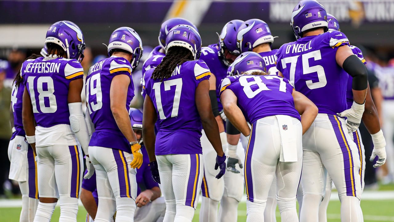
On 1/22/2024 at 7:36 PM, ruttep said:
You have a point, but I'd argue that the yellow on the shoulder and pants stripes for the Vikings is more noticeable than the gold in the Ravens' numbers and logos.
Also, I think it's clear that these are two visually different teams.
Ugh, now I’m reminded that the Vikings like to wear plain white socks.

-
2
-
 1
1
-
-
6 minutes ago, Carolingian Steamroller said:
It's not really accurate anymore to say the Namath-era because the Jets wore those uniforms for longer in the 90's and 21st Century than they did in the 60's and 70's.
That design breaks down to a contrasting sleeve cap with an added, spaced stripe. I think it's still possible to make it look good. Or at least a version of it.
I don't like the idea of trying to combine eras. I think that's how you wind up with nobody feeling satisfied.
That being said, I wouldn't complain about a straight return to the Sack Exchange. Fit the current tailoring of the jersey well. Helmet color is great, especially in a division with the Dolphins and Bills wearing white helmets. Maybe add some simple green pants (I always liked the white over green in the 00's design). Definitely use a white collar on the green jersey. People would dig it.They’d need striped socks with the green pants. And I’m pretty sure Nike loathes striped socks…and striping in general these days.
-
44 minutes ago, gothedistance said:
I wish the owners and their teams petition the league to allow alternates and throwbacks in the Super Bowl. There was a time when the host team had to wear their colors and the visitor wear white, but then that changed. It would great if the same was done for the aforementioned.
You would get the 49ers in their “icy” 1994-1950s fauxback. Be careful what you wish for.
-
2
-
1
-
-
10 minutes ago, DCarp1231 said:
Ugh I know. You’re so right. Why would a team do such an awful thing?
The Falcons had had grey/silver in their color scheme for two decades or more before switching to black helmets in 1990. They actually still list it as a team color today, although they do a crappy job of using it.
-
3
-
-
8 hours ago, WBeltz said:
Someone on the Lions staff has to be reading this page right? Aint no way the go away from mono-lulu
mono-lulu! Lol
8 hours ago, Pigskin12 said:I can't tell if they're mocking him for being wrong or confirming that he's right.
They seem like they want nothing to do with “same old Lions” so probably mocking anyone who would dare assume they’d wear their old combos. At least it isn’t mono-white.


/cdn.vox-cdn.com/uploads/chorus_image/image/72641911/1674655711.0.jpg)


2023 - 2024 NBA changes
in Sports Logo News
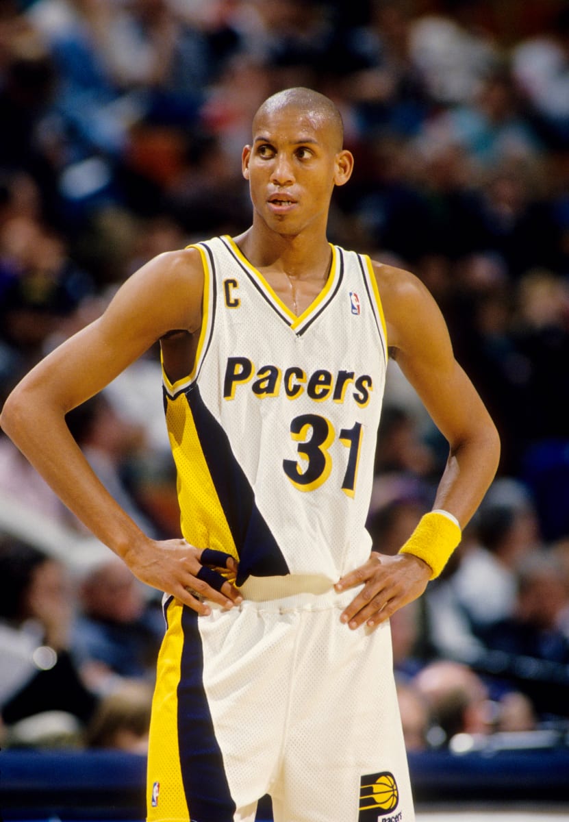
Posted
I have a soft spot for the set they wore at the beginning of Reggie Miller’s career. I think using that colorway (basically, royal blue instead of navy) would freshen up their look nicely.