


MCM0313
-
Posts
4,323 -
Joined
-
Last visited
Posts posted by MCM0313
-
-
54 minutes ago, rmackman said:
@MCM0313 I do indeed! He's 34 years old, and been with me since I was about 9. Lifelong friends!
Mine is 31, and he’s been with me since I was 18 and he was 9.
-
 1
1
-
-
8 minutes ago, Sec19Row53 said:
The old horn must have been outdated.
The new one wasn’t even more realistic, unless actual Rams have notches that lead to segments of different shades of yellow.
-
 1
1
-
-
On 3/14/2024 at 2:37 PM, rmackman said:
Absolutely. I have been collecting jerseys for years, and I have probably half of the MLB, I have an authentic '91 LA Rams, I have a Michael Jordan, Charles Barkley, and Shawn Kemp Champion jersey. Now...I don't collect nearly as much as I used to (I'm now 43 years old), but I would have to imagine there are others like me who just collect their favorite jerseys no matter what team. And yes, I have plenty of jerseys from the teams I do truly love (the logos of which are in my signature).
DUDE, sorry to change the subject, but just noticed the African Grey with you and your son in the profile pic. I have a Grey too!

-
22 minutes ago, MCM0313 said:
As far as the Texans’ new s
Haha, @jamesizzo, the page forcibly reloads itself a lot, sometimes losing the message I’m composing in the process. It reloaded as I was typing the word “set” this time. I don’t think I hit the post button, but sometimes the box does jump around the screen.
-
1
-
-
On 4/16/2024 at 11:31 AM, GrayJ12 said:
I don't see the whole point of the argument for the recent revival of the Oilers color scheme/vibe for the Texans and the Titans. Yes, both teams have valid claims, and it is part of both of their histories (to an extent). It would be easier if both teams just laid off the claims. I feel like we might be focusing too much on the past. The era of the Oilers is done and finished.
For me it’s just kind of about nobody wanting to claim Columbia blue. I would be fine with the Titans doing what they did for part of the Fisher era and going with Columbia blue for their main color and navy for their secondary.
-
As far as the Texans’ new set goes, I would gladly take the gaudy H-Town Blue set with red socks over their regular home set with white pants and white socks (both of which they have modeled, so it isn’t just a hypothetical).
-
3
-
-
As far as the Texans’ new s
-
3 hours ago, SportsFan12 said:
I can live with the numerous options having been forced to look at these two bland uniforms for most of my life:

That is one positive of the new set is that we will get more variety and they hopefully won't get as stale over time.
It will get stale very quickly, and they will modernize the Orange Crush throwbacks for full-time use in either 2029 or 2030.
-
3
-
-
9 minutes ago, MJWalker45 said:
That brown facemask was horrible and I'm happy we have the white facemasks back. Especially since the team looks closer to the days we had Brian Sipe and Bernie Kosar.
Bengals fan but wholeheartedly agree. The matchups between our teams should look really good.
-
1
-
-
52 minutes ago, ruttep said:
Disagree completely. Pant stripes at least still look like a football uniform. Stripeless pants leading into socks of the same color is what truly gives off the full legging effect, which I can't stand.Right - it's football, not yoga.
-
3
-
-
44 minutes ago, TruColor said:
285 C is a fairly common shade. I mean - the Packers, Steelers, Chargers, Chiefs, Commanders, and Cardinals all use 1235 C. Can't easily trademark particular colors (at least, not without a whole lot of legal hurdles).
1. So, with individual colors not being trademarked, could the Texans have told the Titans to screw off and used 279? Or does Tennessee have leaguewide rights to that color? Or would there be some kind of infringement based on being in the same division? Related:
2. I remember reading long ago (like, a decade or more) that the league allowed each team to have one color that was unique to them; other colors they had to share. Is that still the case? Because, honestly, it looks like most teams don’t have a unique color of their own anymore. I mean, what - Dolphins’ aqua, Panthers’ electric blue, Eagles’ teal, the respective shades of purple worn by the Ravens and Vikings? Am I missing any?
3. What is the PMS code for the Broncos’ new royal blue that is used very sparingly? Related:
4. Why have you never included the actual color(s) of the Broncos’ pre-1997 helmets? I’m guessing it would just be an approximation? How close would it be to PMS 307 (Ole Miss’ robins’ egg blue)? (And, for that matter, how about the navy helmets worn at the same time by the Giants and Rams?)
Please don’t take this onslaught of questions the wrong way - I am incredibly thankful for all that you do. Your site is wonderful.
-
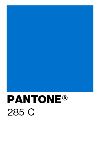
47 minutes ago, rfraser85 said:
So are they ripping off the Chargers now?
Glad I’m not the only one who immediately thought of them upon seeing that number.
-
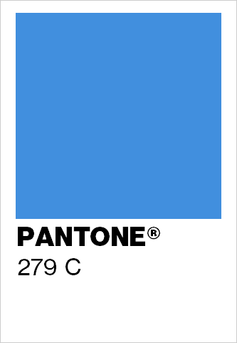
1 hour ago, TruColor said:
So - this new lighter Blue (officially designated as "H-Town Blue Light") is NOT the same shade as the old Oilers/Titans Columbia Blue/Titans Blue. Probably the reason the NFL said to go ahead with this. Original Columbia Blue on left, new H-Town Blue Light on right:
Wait…285? That’s the Chargers’ shade. Ha!
-
4 minutes ago, BadSeed84 said:
And the worst part if they stop so low, with the little Texans logo so low to accommodate that players wear their shirts out now since thats "fire"
Yeah, untucked undershirts should be an absolute non-starter, to the point that a player should be removed from the game until he tucks his shirt in. Don’t @ me.
-
1
-
-
1 hour ago, tscuzzy said:
I want more horns!
I want more non-white socks.
-
11
-
 3
3
-
-
1 minute ago, Froob said:
I think they should be. I like when the numbers are the same color as the primary jersey.
That’s the safe option, and it usually looks fine. It’s not the only choice, though, and there have been lots of good looks (current Giants, 1997-2002 Falcons, Orange Crush Broncos) that used the secondary color for the number on the white jersey.
-
2
-
-
16 minutes ago, Froob said:
Bugs me the road numbers aren’t orange.
They never have been.
-
1
-
-
1 hour ago, infrared41 said:
True, but the Eagles aren't wearing white helmets, brown jerseys with sublimated feather textures, and yellow shoes and socks because it represents the quality craftsmanship and hardworking, high flying example of the American eagle. That's the difference.
PLEASE DON’T GIVE THEM ANY IDEAS!
-
1
-
-
31 minutes ago, DCarp1231 said:
Can Houston just pull a Dallas and only ever wear these
Apparently that’s the Bruno uniform (Bruniform?), because we don’t talk about it.
-
1
-
-
3 hours ago, Cujo said:
"It'Z aGaInSt NfL RuLeZ 4 tHeM 2 UsE TiTaNs CoLoRz"
With the red socks and H-Town Blue shoes, I actually kind of like these. Without those splashes of color? Nah.
-
2
-
-
25 minutes ago, gosioux76 said:
I'd be confused. I'd also wonder why, of all uses for a time machine, this is what we've chosen.

The uniforms of the pre-1997 Broncos and Dolphins, pre-2000 Rams, 1997-2002 Falcons, pre-2004 Bengals, and pre-2005 Cardinals are absolutely worth the use of a time machine.
-
2
-
-
29 minutes ago, 8BW14 said:
Just noticed a curious thing about the Texans new home jersey, which is relatively simple and inoffensive, except for one baffling detail:
The enlarged photo from Uni Watch apparently shows the TV numbers have no outline. Ugh, why? Who thinks this
 is okay? Sometimes the simplest solution really is the best one. Just outline them.
I can’t wait to hear the contrived, convoluted reasoning for this decision.
1993 Patriots.
-
1
-
-
1 hour ago, schlim said:
This is a great picture of those front numbers! You can really see how dense the air is in Arkansas!
Yeah, but just looking at that picture, I really can’t tell what the elevation of the area is. At least the Broncos fixed that.
")
-
 1
1
-
-
18 minutes ago, FiddySicks said:
Also a good representation of where they pulled that example from.The triangles represent thin air, not the developers’ rectums.
11 minutes ago, tBBP said:Well, if anyone wants mini-reprieve from the ongoing Denver Colorados fiasco, how about a couple heaping tablespoons of steer-seasoned salt??
Wouldn't surprise me one bit to find out she was/is the reason for the "H-Town Blue" even being a thing in the first place...
Well, the Titans have always had that right legally. They are the same franchise as the Oilers. The Texans are not. I’m glad the Titans are sticking in that lady’s craw.
-
4
-
 1
1
-
 1
1
-


 is okay? Sometimes the simplest solution really is the best one. Just outline them.


CCSLC Board Technical Issues
in Forum Policies and Announcements
Posted
I had the same issue most of yesterday. I was wondering if the board itself was down. Visited in Incognito this morning and I could see the boards and I visited this one but it went blank when I tried to open this thread. Tried it again in regular mode and it was still blank. Then came back an hour or two later and it was normal again, and here I am. Didn’t do any of the steps - how could I when I couldn’t read this thread? - but the issue appears to have resolved itself, at least for now.