


MCM0313
-
Posts
4,516 -
Joined
-
Last visited
Posts posted by MCM0313
-
-
3 minutes ago, MJWalker45 said:
The players never liked the sleeves, for the most part, so I don't think we'd see them come back. Especially since Adidas made those and would probably have a conniption if Nike copies them.
Here’s hoping. Those were ugly.
-
 1
1
-
-
8 hours ago, oldschoolvikings said:
Have the Lions worn their standard blue jerseys and gray pants together yet this season?
What a bunch of morons.
I know you don’t like the Lions already because they’re a rival, but I agree with you. They look *so* good when they wear traditional combos…so they refuse to do that.
4 hours ago, GoHawks said:Only problem is half the team decided to wear all white tights instead of the proper socks.
Merton Hanks needs to come back and start issuing fines left and right. That’ll clean up the look on the field in a hurry.
5 hours ago, Rockstar Matt said:The Dolphins look outstanding. Even pairing it with the black cleats. This needs to be their full time look.
With an aqua facemask and maybe a jersey logo, I agree. The aqua color is better, the logo is…maybe not better in a technical sense, but it has way more personality…the uniform design is very cohesive (even more than their regular, which is still one of the more cohesive in the league today). Maybe they’d wear solid-colored socks in an update rather than striped, who knows…they just need a modern update to their classics so bad rather than continuing to roll with Aquafresh.
-
1
-
-
14 hours ago, JustABallCoach said:
They do the color already, clearly. The talk was of the Titans objecting to the Texans use of that color. That would cause the Texans to use a different shade of light blue.
Oh, right. Legal hurdles.
-
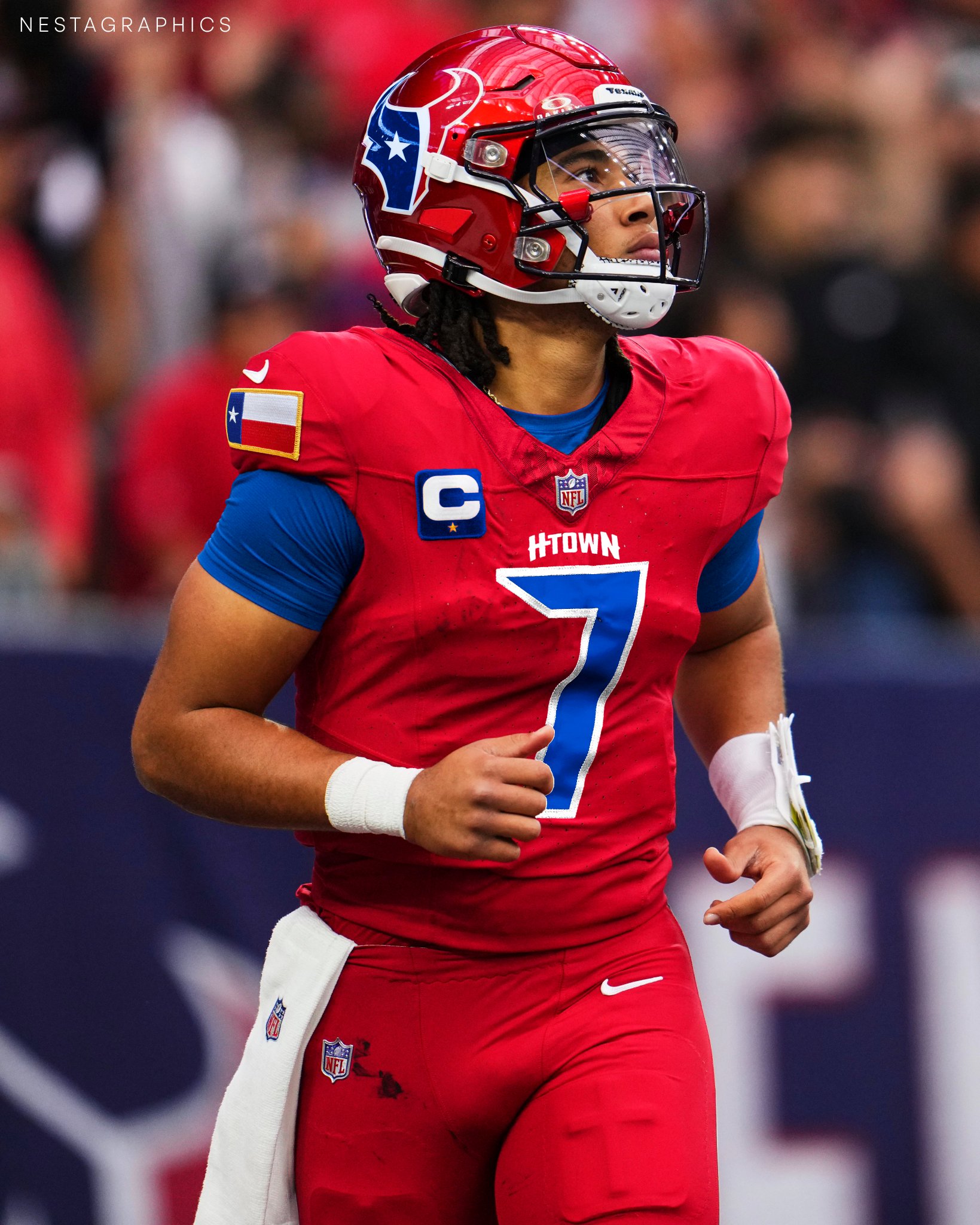
50 minutes ago, JustABallCoach said:
https://pbs.twimg.com/media/GBvcKieWUAA76tG?format=jpg&name=large
 I would guess this other H Town font they’ve been using is more likely than the Old English one.
this blue shown in the twitter mock up from @Nestagraphics might be what they go with. Some of the merch they’ve had is darker than Oiler blue and ownership has talked about some hurdles they’ve had with the shade.
High-tech Nike yet again struggling to reproduce a color? Wouldn’t surprise me.
-
2
-
-
2 hours ago, GoHawks said:
If the Eagles black jerseys are still in the rotation and didn’t get retired for the throwbacks I am guessing this would be the game it is saved for. It would be kind of funny that a green team decides not to wear green on Christmas though.
Especially with its opponent (whose primary color is nominally blue) wearing a red-heavy set. C’mon, Eagles!
-
On 11/12/2023 at 4:49 PM, fortunat1 said:
The Fort Wayne Tincaps and Great Lakes Loons use that scheme, both a bit more green-heavy though.
Nothing says red and green quite like the name “Tincaps”.
-
22 hours ago, ruttep said:
Why the average Twitter fan should never be allowed to make uniform decisions:
Is this moron trolling, or just a moron? Makes me glad I’ve never been a Twitter guy.
-
3
-
-
51 minutes ago, Pigskin12 said:
Miami is wearing aqua socks. It’s a miracle.
Right?! Now all they need to do is put the white socks into an incinerator.
-
1
-
 1
1
-
-
6 minutes ago, fouhy12 said:
I found it funny that you used this example, because this is actually one use of white socks that would fit my rule. The white socks and white helmet with blue in-between create an odd, but balanced uniform. It is certainly imperfect but better than blue from shoulder to toe IMO.
I kinda miss when Buffalo always wore red socks.
-
2
-
-
8 minutes ago, kaleb_girod said:
Panthers wearing all-white, but with contrasting black socks. The socks definitely help, even though blue socks would’ve been the better look. Not a bad looking matchup at all with the Saints throwbacks.
Contrasting socks (vs. pants) always help. Always.
4 minutes ago, Kramerica Industries said:Are the Saints wearing their current helmets with the older FdL slapped on, or did they have the same kind of color matching problem with their helmets and pants as the Giants and Rams did with their helmets and jerseys in the past?
It’s my understanding that teams are limited to two helmets by the league. The Saints have that silly black alt helmet, so these should be the regular ones with throwback logos.
-
1
-
-
Looks like the Dolphins will finally be breaking out the aqua today…for the first time all season…in week 14. The Titans are apparently wearing the light blue pants too. Navy blue socks rather than white would be nice, but it’s still a game that will have some color to it, which is nice.
-
9 minutes ago, BBTV said:
I believe the claim is that the pants would be significantly heavier due to however the metallic fabric is made, which would probably make the players seem like they were in quicksand and go 0-17.
Any team could wear metallic pants and get them from Ripon or whoever is the legacy supplier that simply sews the swoosh on jerseys (the Packers still use them... right?) They choose not to.
Yeah, the Raiders and Cowboys still wear them, right? No 0-17 seasons to be found between them.
-
2
-
-
21 hours ago, kaleb_girod said:
Considering the Saints wore the throwbacks last season (against the Rams), I wonder if this will become a once-per season trend. I definitely wouldn’t be opposed.
I want it to become a 17-times-a-year trend.
-
9
-
 1
1
-
2
-
-
On 8/12/2023 at 9:29 AM, mahnkej said:
I always thought the anthracite set was ugly AF, to each their own though. Only part of that era I really liked was the cap logo.
I liked the grey home hats. Naturally, they almost immediately stopped wearing those.
The de-emphasis on blue drove me crazy. Had it been grey hats and blue everything else, that could’ve worked. But the pointless use of black made that set suck big time.
-
1
-
-
43 minutes ago, monkeypower said:
I think the Marlins current colours are great, it's the application that stinks with only thin slivers of colour.
Also, the stitching in the logo is dumb and the placement has made me think the marlin needs to visit a urologist.
If you don’t have bloody, curved urine, then you’re not living.
-
1
-
 1
1
-
-
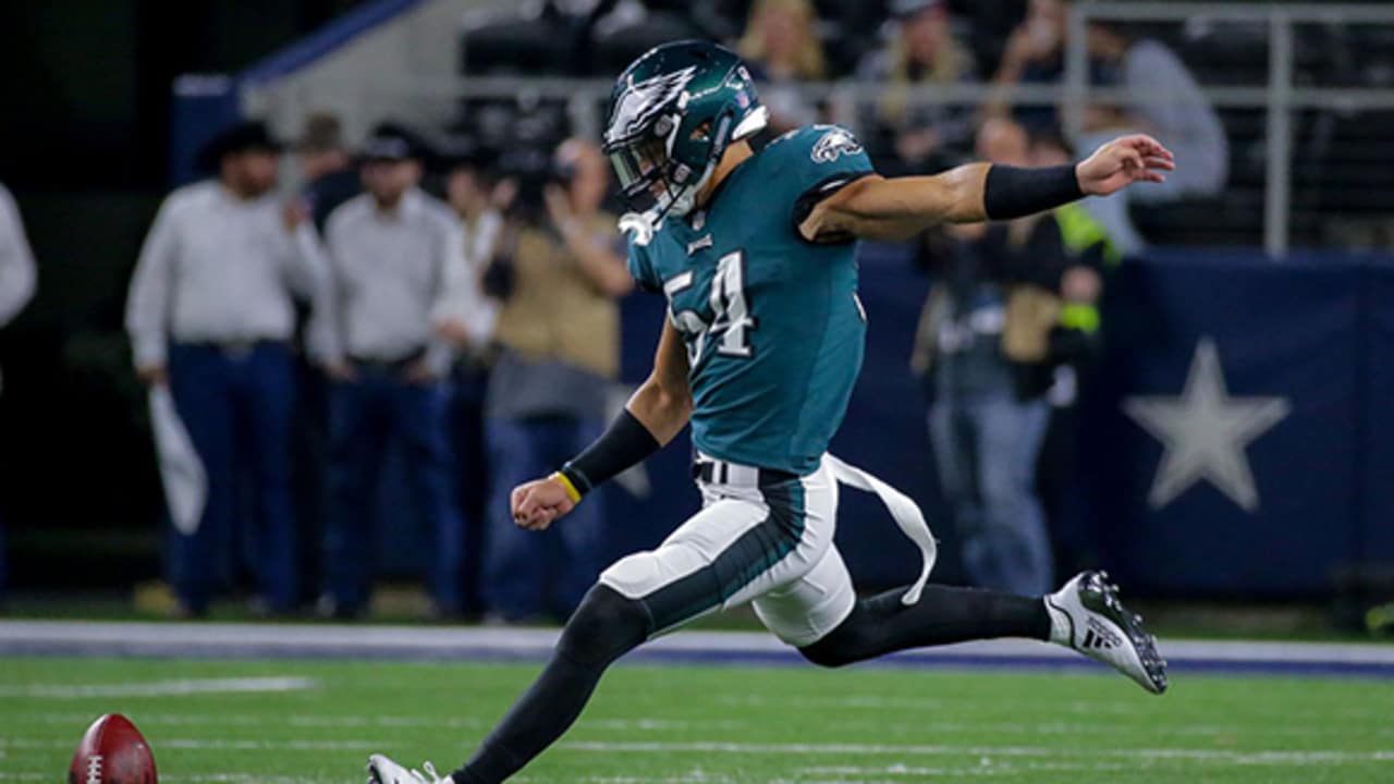
10 hours ago, BBTV said:
Eagles have had at least two position players fill in as kicker:
Not to mention a garbage collector in a Disney Channel movie back in the ‘90s.

-
2
-
4
-
-
3 hours ago, Survival79 said:
It’s nuts how cool that is.
-
3
-
-
13 hours ago, VikWings said:
Arizona should start wearing red socks on the road and then throw the red pants in the trash and it would be such an improvement.
Bingo. Throw out red pants and white socks. That’s it.
-
1
-
-
4 hours ago, BBTV said:
Honestly - I don't know if they cared much. While the Eagles helmet may have been painted to spec (I think it was different from the JJets green, but I've never seen them side by side, so it may have been a stock green from whoever painted them), I think each jersey manufacturer just used whatever kelly-ish green they had laying around, with the Russel shade being the "official" one simply because that's what they wore on field. Had they had a deal with Wilson, the "official" one would have been brighter (Wilson mesh had a slight "sheen" to it, which side by side, was very noticeable."
Basically, I'm not even sure if the original uniforms that they were trying to emulate, matched the official color specs - or that they even cared, and only really enforced the color specs for graphics and print. They changed those uniforms and colors in '96, right around the time when the retail market was starting to explode, more color-reproduction methods were in use, and when teams were having legit branding firms come up with full "systems", rather than Bill the Assistant Equipment Manager drawing a logo on a cocktail napkin and taking it down to the local sporting goods distributer and saying "put this on a green jersey with block numbers - thanks!"
So it's possible that the throwbacks are truer to the intent of the originals, even if they appear visually different.
I kinda forget what I'm talking about anymore
")
I believe, per @TruColor and his amazing website, that the Eagles, Jets, and Seahawks all used the same shade of green prior to their respective rebrandings. As in, like, the PMS shade in their media guides would have been the same. So any difference in helmet color would be due to a different manufacturer (but didn’t Riddell supply the whole league then?) or a helmet that had to be, for whatever reason, painted (or re-painted) in-house.
By the time the 1990s rolled around, I want to say they would all have been wearing PMS 349? At least 340-something. But with different jersey manufacturers, and different material for stripes (screen printing?) than for base jersey/base pants, they wouldn’t necessarily have looked the same in all applications. And, certainly, each manufacturer may have had its own approximation of kelly green, and if the team didn’t like it, their only choice was to switch manufacturers, which I’m guessing could be costly and time-consuming.
-
1
-
-
7 hours ago, Silver_Star said:
You mean the 1988-2006 Uniforms as throwbacks. The other alt next to that should be their 1974-1984 uniforms too, Those are what the royal blue alts ones are based off of.
Right, but they can only have two helmets, so one alt set would have to be a fauxback. I say, keep the royal blue fauxback with the white helmet, and dump the current navy alt for a 1988-2006 throwback with a navy helmet.
-
3 hours ago, gothedistance said:
Nah the navy is the weakest of the combos. And they keep losing in them, they're 0-5 in them now. LAC keeps picking the wrong teams to wear them against. I can take a guess that next year they'll wear them against New Orleans or Cincinnati.
They need to dump that navy alt anyway, and replace it with a 1994 throwback. It’s the only Chargers team to ever play in a Super Bowl, and almost a quarter of them are dead. They need to pay tribute to them while there are still this many left.
-
1
-
-
14 hours ago, Silver_Star said:
The best garbage ever. Grey vs Blue. If I chose that for color vs color, then the Bucs throwbacks would have been a better chose against the home blue Colts.
Tampa’s red jersey that they avoid for some reason would also have worked just fine.
-
On 11/24/2023 at 12:30 PM, Cujo said:
I would like to see the NFL go back to true throwbacks for all teams playing Thanksgiving Day.
I’d like to see the Broncos make that look no longer a throwback.
-
4
-
1
-
 1
1
-
-
On 11/18/2023 at 11:58 AM, GriffinM6 said:
Looks like Miami might have new black and throwback uniforms this year. Just came across them on Fanatics.
Wait, when did the Hurricanes wear yellow?


NFL 2023 Changes
in Sports Logo News
Posted
I don’t think they ever had a bad home uniform. I’m not sure they ever had a bad road uniform either. Hard to go wrong with baby blue and red (plus briefly silver-blue).