


wildwing64
-
Posts
4,153 -
Joined
-
Last visited
-
Days Won
4
Posts posted by wildwing64
-
-
Good stuff so far!
For the Coyotes I'd suggest swapping the colours of the shoulder patch so its closer to the existing version (sand moon and purple-red sky) - or is there any particular reason it's coloured this way?
-
On 11/11/2023 at 1:45 PM, johne9109 said:
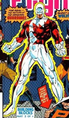
I wonder if that measn you're doing another Canadian team using Guardian (Alpha Flight's leader) He's a walking maple leaf. It probably is referecing Wolverine or Deadpool though
All three of those are planned for this project!
21 minutes ago, coco1997 said:I know you already have a couple of NYC-based teams, but I'd love to see you do something with the Ghostbusters and/or Ninja Turtles.
A Ninja Turtles team is planned! Hadn't considered the Ghostbusters but that could be interesting.
-
 3
3
-
-
Now to round off the first ten with our first Canadian team, which is also technically the first X-Men representative for this project. That's a lot of firsts. (And it won't be our only X-Men rep either!)
10. Montreal North Stars (Alpha Flight)
Name: Montreal’s NHSL expansion franchise was awarded on a night when both Polaris - the North Star itself - and an aurora borealis were visible above the city. The owners saw this as a sign of good fortune, and named their team the North Stars.
Logo: An M for Montreal in front of a four pointed star and a circle. The logo’s design resembles a compass pointing north.
Colours: Black, white and light blue.
Jerseys: A pair of traditional hockey sweaters, primarily black and white with blue accents and blue numbers. The home black jersey features a white shoulder yoke, and vice versa on the road white sweater.
Third Jersey: Amidst a wave of unusual alternate jersey designs came this one from the North Stars, with a pattern inspired by the same star that gave them their name. Blue is gone from the colour scheme and the logo has been adjusted, removing the circle and swapping the M for an N.

Compared to the US-based superheroes my options are much more limited with Canada, both in terms of numbers and how many of them could potentially work as team identities. So far I’ve narrowed it down to a few that don’t use the obvious red white and maple leaf imagery - otherwise I’d just end up with a bunch of Team Canadas (there is one exception, but I’ll get to it when I get to it). With that said: Northstar is a character I had no idea existed until I started planning this project, but his black and white colour scheme makes him somewhat unique compared to several other heroes and as we all know, the North Stars is a good name for a hockey team.
Visually, Northstar didn’t give me much to work with aside from the star motif of his suit. His colours are black and white, which despite my previous statement is a bit boring. Also he doesn’t have a logo of his own, but then he’s mostly affiliated with Alpha Flight and/or the X-Men. However he did get his own miniseries in 1994; the covers featured an 8 pointed star in the comic’s logo, so I mainly based my design around that. I also included a light blue accent as issue 1 used it as a keyline on the cover logo, but it also pairs well with black and white and seemed like a good fit for the identity.
For the logo I took that eight pointed star and - after a few attempts to fit an M for Montreal inside of it - opted to keep it simple, using a four pointed star and then overlaying the M in front of it, using that to (kind of) form the other four points. The angular shape of the M was meant to be evocative of the pattern on Northstar’s suit, but I also think a simple M is a good fit for a traditional hockey market like Montreal - despite them being an expansion team in this alternate universe. At the last minute I changed the M on the front of the third jersey to an N (you can still see the M version on the pants and helmet) as I’m sure someone would want to see what that’d look like. Curious to see if there’s any preference one way or the other.
The home and road uniforms are fairly traditional, again befitting of Montreal. The white shoulder yoke was based on Northstar’s suit, but for the stripes I mostly took inspiration from the Montreal Maroons and the last Minnesota North Stars jersey from before they moved for this look, though I admit it may come off as looking a bit generic like those lacer hoodies which all use the same striping design. On the other hand the third jersey is a more direct adaptation of Northstar’s suit, with a little influence from the Dallas Stars. I’d like to think this one stands out as being kind of wacky in spite of only using black and white.
-
4
-
 1
1
-
-
After three red teams in a row it's now time for our first green team to make for a visual change of pace... mostly.
9. Coast City Lanterns (Green Lantern)
Name: Northern California's first NHSL franchise was named in tribute to a former minor league team, which in turn was named after the Coast City Lantern; a green lighthouse that overlooks the city and is a popular local landmark.
Logo: A simple graphic representation of a lantern formed by two mirrored C’s, with two trapezoids above and below. Curiously it resembles a railroad lamp rather than the lighthouse the club shares its name with, though it’s said that the lighthouse keeper uses a lantern of this type, and it often gives off a distinct green glow from afar. The logo is a modified version of the old Lanterns crest, which was contained within a yellow circle and featured the team’s name and a pair of crossed hockey sticks.
Colours: Green, black and white.
Jerseys: The home jersey is green with black and white sleeves, and a single white stripe on the hem. Paired with a road white uniform with green and black sleeves, it’s a very understated look - perhaps appropriately so for the league’s first green team.
Third Jersey: A direct throwback to their minor league predecessors, who wore a primarily red sweater with green and gold accents.
Admittedly, Green Lantern is a series I’m not that familiar with. I always thought the logo was a bit abstract and too simple, but working on this team led me to learn how it came about and what exactly it’s meant to resemble, and as such I’ve come to appreciate it more; it’s abstract, but it works! Even so it’s just a couple of tweaks away from being suitable for hockey, so I took it in two directions; one more like a traditional crest, and the other a retro inspired old timey look. The only significant change I’ve made is splitting the ring into two mirrored C’s for Coast City.
For the most part I’ve deliberately avoided super literal hockey versions of the heroes’ suits, but the design of Hal Jordan’s suit happened to fit the mould in a similar way to the Philadelphia Flyers; a somewhat simple look putting emphasis on the primary colour. The third is a nod to the original Green Lantern, Alan Scott; ironically I chose this team to do next to make a change after three red teams in row, and yet here we are with another one. Still, interesting that his suit was mostly red (maybe it was those limited printing palettes again?)
-
6
-
-
Hey everyone. It's been a while but I'm finally back into the swing of things and the next team is done.
8. New York Spiders (Spider-man)
Name: Per team sources, the official story is that the owner was bitten by a spider when coming up with a name for New York's second NHSL franchise. But many are not convinced, believing it came from a notorious crime-fighting vigilante who was active in New York during the 1930s; the Spider - as he was known - was said to be ruthless, leaving a mark resembling an arachnid on his victims’ foreheads. The man behind the mask still has yet to be identified (I guess no one could get pictures of him?) but given the city’s history with this individual the name was initially met with controversy. Despite this, the Spiders were an instant hit particularly with the younger demographic, and their popularity would soon eclipse that of the Americans who they once shared their building with.
Logo: The silhouette of a spider, with its eight legs designed to resemble hockey sticks. Notably the logo drew ire from the Gotham Knights, but their protest was met to no avail as nobody was going to mistake a spider for a bat. Despite the controversy surrounding its origin the Spiders brand has endured as one of the most beloved in the league.
Colours: Primarily red and navy with white accents. It seems that management couldn’t agree on either black or blue and settled on a dark blue instead.
Jerseys: The home red sweater features navy sleeves; this paired with the navy pants and red helmet gives the Spiders a unique look despite using similar colours to other clubs. The road uniform swaps the red and blue on the sleeves, and the crest is also recoloured to red.
Third Jersey: Breaking from tradition but building on their ever-popular brand, the Spiders jumped onto the stealthy trend with their alternate uniform, which features a black base with bold red stripes forming a V shape.
How could one start a superhero themed project like this and not include Spider-man? Funnily enough, I almost didn’t! At first I wasn’t convinced that the Spiders would work as a pro hockey team name especially for New York City - that is, until I did some research on Spider-man’s origins and how the character was conceived; turns out he was inspired by and named after a pulp fiction hero from the 30’s and 40’s. From what I could gather when compared to Spidey, the Spider wasn’t exactly your friendly neighbourhood superhero. Basically it seemed plausible that a team might choose to name itself after a controversial historical figure like this, only to attempt to cover it up with a false alternate story (the London Rippers, for example) and so like Stan Lee & Co. did for Spider-man, I used that character as the basis for this team’s name origin.
Spider-man is usually depicted as red paired with a brighter blue like other heroes such as Superman and Captain America (and it turns out there were technical reasons behind these colours; back then comics had a limited palette for printing) but some say that he was meant to be red and black, with blue being used to highlight his muscles and give him more visual depth. Evidently the red and blue colour scheme is what stuck and has become his signature look, but for this concept I opted for navy blue, partly as a compromise between the two colours but also to set them apart from their blue and red neighbours in Brooklyn.
Much like Batman, Spider-man’s logo has seen many variations through the years, and again I did my own take but with the spider’s legs being hockey sticks. Admittedly the uniforms aren’t the most revolutionary designs ever but the main gimmick of the home jersey is the dark blue sleeves contrasting the red body, much like Spidey’s suit. For the road jersey I took cues from a version of the 2099 suit which puts more emphasis on white and red on the upper body. The third is based on one of Miles Morale’s suits with a V design on it; the simple black and red scheme fits with more recent trends of ‘stealthy’ looks in the NHL like the Oilers, Sharks and Leafs third jerseys and it feels like something a team like this might do.
-
5
-
2
-
-
3 hours ago, monkeypower said:
Still have mixed feelings on the logo choice but I like the overall look a lot.
Might have to start planning that trip now...
-
The sky also isn't red. But we see various shades of red, orange and yellow in sunsets so making that part yellow makes just as much sense.
-
5
-
-
Next team is done - I'd meant to get this up earlier today but I'm having trouble with my Imgur account, so I'm settling for elsewhere for now.
7. Missouri Racers (Flash) (AH-AH!)
Name: Apparently the result of a fan poll, the name was inspired by Central City’s ubiquitous nickname “The City That’s Always On The Run”. The team also draws fans from nearby Keystone City, Kansas, but opted to use Missouri as the geographical identifier as a nod to the Missouri River that separates these twin cities. True to their name, the Racers roster is built around speed and finesse.
Logo: A winged ‘R’ for Racers. A subtle lightning bolt can be seen between the wings.
Alternate Logo: A circle containing a lightning bolt. This striking design was introduced on their third jersey, and now adorns the shoulders of their regular uniforms.
Colours: Red, gold and white, the official colours of both Central and Keystone Cities.
Jerseys: A pair of traditional sweaters featuring red, white and gold stripes. Nothing too flashy, however there is a lightning bolt on the pants which was brought over from their alternate uniform.
Third Jersey: The team’s secondary lightning bolt emblem originated from and takes centre stage on this bold, brazen and bizarre reinvention of their classic look, which is subject to much controversy; on one hand, it was popular enough to influence the aforementioned tweaks to their regular uniforms. On the other hand, some fans have loudly expressed their distaste for this aspect of the brand, with comparisons often made to a Guardian Comics superhero: the Lightning.
Like the Steelers and Knights before, the obvious logo choice for a team based on the Flash would be that iconic lightning bolt in a circle, right? Eh, maybe for a team formed in the 90’s. But for an old timey franchise, something like that seems more plausible as an alternate mark introduced in that decade, when lightning bolts and wacky third jersey designs were all the rage. For the primary logo I instead took inspiration from the helmet wings of the original Flash, Jay Garrick, and made an R for ‘Racers’ from that. The bolt is still a secondary mark, but I made a bolt shape in the wings as a way to retain that imagery in the main logo.
As for the jerseys: have you ever wondered what the St Louis Blues would look like if they were a red team instead? No? Well, that was the basic idea here. Or maybe it’s more of a hockey version of the Kansas City Chiefs, given Central City’s approximate location in the DC Universe (and depending on which version of the DCverse). The third is pretty much the Flash costume in hockey form; even with the lightning bolt stripes around his arms and waist, Barry Allen's suit already has a similar layout to a typical hockey sweater. But like the lightning bolt logo itself I felt it better suited to an alternate uniform, or maybe the team experimenting with a rebrand.
-
4
-
 2
2
-
-
Fun thread. I especially like the Sonic Team designs!
As a Brit I'd be very surprised if James Bond or Thomas had jerseys for any of these four sports

-
2
-
-
On 8/11/2023 at 5:57 PM, Patchey13 said:
I think the shoulders for the Steelers should stay red on the away jersey. Also maybe a little cheeky idea would be a red name bar to give a really subtle nod to the cape flowing down the back.
I originally went with blue shoulders because - as I undertand it - the yoke serves as a way to put emphasis on a team's primary colour on the white jersey. In this case the Steelers are a blue team. But their main logo is mostly red, so I guess this works too.
Got a couple of different versions here, the first one with standard red lettering:
I wasn't feeling the red name bar, but then I remembered the Hurricanes road jersey from the late 2010's had sort of a cape effect going on, so I did another version based on that:
On 8/11/2023 at 6:29 PM, neo_prankster said:I wonder if the Steelers could have a blue sweater/red pants throwback.
How's this? I tweaked the logo a bit and went with a brighter blue, partly inspired by the Habs' 2016 Winter Classic jersey.
--
Now that I've made these tweaks I'll be starting on the next team soon. With any luck, it'll be done in a flash.
-
4
-
2
-
-
Looks good! The third jersey crest is a nice take on the original, and paying homage to different eras with the whole set is a neat idea.
-
1
-
-
On 8/15/2023 at 2:02 AM, Bomba Tomba said:
I'm guessing the expansion teams will include Spiderman and Hulk? (The former based on popularity, and the latter would give us a unique color scheme for the league)
Yup! And Spiderman is one of the other two I have planned for New York.
---
Speaking of New York; I brought back Captain America's helmet wings, now merged with the A. Since the primary crest fuses bits of his brand together, I figured I'd do the same with the helmet logo. So now the A is winged and much less boring.
Like with the Rangers' lightning bolt earlier this is really a minor tweak to the uniforms, so again I've hidden them below if you want to see how this looks.
Spoiler-
5
-
1
-
-
A number of you were disappointed that I left out the lightning bolt from the Angel Grove Rangers identity; one of the reasons I did so - as stated in the original post - is that I've got at least one other red and yellow team with a lightning bolt logo planned. Also, until recently the bolt has never actually been used on the Power Rangers' suits or Zords in any medium. But given that it's such an iconic part of the brand I've had a change of heart and brought it back, tweaking one of the alternate logos to accomodate it:
I've also added this to the uniforms; it's really a minor tweak (except on the third where it's now a shoulder patch) so check it out under the spoiler tag below if you like.
Spoiler@Exceed_Idiot wanted to see a white jersey more like Zenkaizer (this guy). Something more colourful like that might make for a fun alt down the line, but for now I've tweaked the existing road uniform and got it as close to his suit as I could get without straying too far from the base design.
I'm not sure if I prefer this one over the other. Thoughts?
-
2
-
-
One more for today, and the last one I've completed for now:
6. Los Angeles Ironmen (Iron Man)
Name: The owners had humble beginnings as a blacksmiths, and then an iron works before growing into the global aerospace, defence, security and advanced technologies Los Angeles-based mega corporation that it is today. They basically put their own stamp on the team, naming them the Ironmen.
Logo: The Ironmen started out with a simple IM monogram before rebranding; going for a more regal look, their modern logo depicts a knight’s helmet in the team colours.
Alternate Logo: An LA monogram, forming a triangle.
Colours: “Iron Red” and “California Gold” - a nod to their roots and to their home.
Jerseys: The home sweater is dark red, featuring bold gold and white stripes on the arms and slightly thinner stripes on the hem. The road jersey uses a red shoulder yoke. The gold stripes make use of metallic fabric, much like the third jersey of their rivals in Angel Grove.
Third Jersey: At some point the Ironmen broke out this throwback sweater, featuring the team’s classic crest and their brighter original colours.Narrowing down a name for this team was suprisingly difficult; Superman and Batman have nicknames like the Man of Steel and the Dark Knight, so I can work with those to create nicknames without the -men suffix. But Iron Man doesn't have one like that. There is "the Golden Avenger" but that's really more of a unified Marvel thing. (Ironically - no pun intended - I only learned of a real world team named the Los Angeles Avengers after finishing this concept.) Other possibilities like the Ironmongers or the Dynamos belong to his villains. I could have gone for the Irons, but that seemed a bit too simple and also reminded me of that one soccer team that's on my doorstep. Also I didn't even consider the Iron Knights because I wanted to avoid repetition with Gotham - yet I kind of have that anyway with another team named the Steelers. After much deliberation I chose the Ironmen, making them the one exception to my self-imposed rule - but mainly because it has real world precedence. On that note I'd like to thank the Seattle Kraken for their Reverse Retro jersey, the history of which helped me settle on the name.
Like his apparent lack of a nickname that I could work with, Iron Man also doesn't have any particular logo associated with him. The Arc Reactor doesn't say "Iron Man" unless you already know the context behind it - but that did at least inspire the triangular LA monogram on the shoulders. I do think this one feels a bit too corporate for a sports logo, but on the other hand that's very on-brand for Tony Stark.
The IM on the throwback third jersey was my original plan for the primary crest - it's based on a rejected design by Fede Ponce for the first Iron Man movie - but as I was designing the jersey it was really feeling like a wasted opportunity to do something cool with the Ironmen name... also it was kind of looking like a Gophers concept. So I went back to the drawing board, but kept this one as a "retro" logo as it seems plausible that a team formed in the 60's might have used something like this - or that they wouldn't have had the foresight to make their logo a literal iron man, or in other words; a knight.
From what I can gather, teams with this name use imagery like knights or spartan warriors - or some kind of android which is obviously inspired by Marvel's superhero. So a knightified version of his helmet felt like a logical way to go; some knight-like versions of his suit already exist, and I based this logo on the Iron Knight suit from the Marvel's Avengers videogame - and recoloured to his usual gold and red instead of silver and gold as seen in the game.
----
That about does it for my original six teams. I'll be making tweaks based on your feedback before I start on the next one!
-
5
-
-
"Geoffrey Guard" got a chuckle out of me
If either of your London teams are doing a Monarchs throwback then this one does makes more sense, even if the original team was blue.
The new Archers logo is excellent.
-
1
-
-
1 hour ago, Exceed_Idiot said:
The only criticism I'd have is that I wish the Away uniform for the Rangers looked something more like Zenkaiser's suit from Kikai Sentai Zenkaiger
Oddly, that thought never occured to me. Definitely an idea I'll have to toy with!
-
Now for our first Avenger... who is also The First Avenger. The name of this team might sound familiar, and I assure you that was completely on purpose.
5. Brooklyn Americans (Captain America)
Name: The Americans were simply named amidst a time of great patriotism. Originally based in Manhattan as the New York Americans, fierce competition from an expansion team in the same building led them to move out. The Amerks relocated to a new arena in Brooklyn and have proudly called it their home ever since.
Logo: An uppercase A inside a star, contained within a roundel. Inspired by the US flag.
Colours: Red, white and blue, naturally.
Jerseys: As American as the name and colours, the home and road sweaters take cues from the Star-Spangled Banner itself, with bold red and white stripes adorning the sleeves and hem, and two stars decorating the shoulders. The A from their logo is also featured on the helmet, as well as serving as the Alternate Captain's patch.
Third Jersey: With this the Amerks experimented with a modernisation of their iconic brand, replacing their traditional bright blue with navy, and featuring a stylised A in the shape of a star as the primary crest.The first of three teams I have planned for New York, this concept was partially inspired by a what-if scenario of the real world New York Americans continuing to thrive instead of folding as they did. So there's a little bit of them in there as well, particularly with the hemstripe - although it's fair to say that both the Amerks and Captain America were obviously based on the US Flag, with the Amerks leaning more into the red and Captain America the blue.
In theory either the big star on Captain America’s costume, or his shield, or even the A on his helmet would make for an adequate hockey crest, but on their own each of them are a bit too simple, so I modified the shield design by enlarging the star and adding the A, effectively merging everything except his helmet wings into the logo. The shield is also what I based the sleeve stripes on, and the hem stripes are a bit of that and the sweaters worn by the New York Americans in the 30’s.
The third jersey is a mix of a few modern versions of Captain America: the darker blue base seen in the MCU, the white shoulder yoke from Sam Wilson’s suit, and the A-star from John Walker’s helmet in The Falcon and The Winter Soldier. An A-star was my original plan for the team’s main logo before remembering the Allen Americans already did that, but since this logo exists in the Marvelverse and is used by a version of Cap (but not Steve Rogers himself), I figured I’d go with it as the third jersey crest.-
7
-
1
-
-
Time to roll out the next one, whose logo might be a better example of what I'm aiming for with this project. Also for this team in particular, I'm interested in hearing any thoughts about both the geographical identifier and the nickname. Still, I'm pretty happy with how this transformation turned out:
4. Motor City Convoy (Transformers)
Name: A reference to Detroit’s auto industry. Ownership likened a hockey team to a convoy of vehicles.
Logo: A winged C, meant to evoke a truck and a trailer. The wing is also a nod to the winged wheel symbol, long associated with the automotive industry and representing transport, speed and progress.
Colours: Red, blue and white from the Flag of Detroit, and silver in reference to the auto industry. Semi trucks with this paint scheme are often seen in the area, possibly belonging to ownership.
Jerseys: The home sweater is red, with a blue chest stripe behind the crest and silver stripes around the sleeves and hem. The sleeve stripes were once white before advancements in technology allowed them to use metallic silver fabric instead. The white jersey also has these silver stripes on the sleeves despite them not standing out too well, but has a red hem stripe to add more colour to the sweater.Third Jersey: Initially, management dismissed the third jersey program as a “deceptive con” but relented anyway, coming up with this uniform featuring a black to red gradient apparently meant to emulate a flame design. Maybe their next attempt will
flarefare better."Why not the Autobots?" you may be wondering. I did consider that, initially (complete with a plausible backstory behind the name!) but instead chose to create something original that alludes to the heroic Transformers without going the obvious route of using the Autobot insignia - I mean, you can literally buy pop culture jerseys that are just that. For the new name I had a lightbulb moment when thinking of a convoy of trucks; Optimus Prime’s Japanese name is Convoy, and also pre-Transformers the original toy released under Takara’s Diaclone line in 1982 was named Battle Convoy - the commercial even features a whole convoy of them! (video here - flashing lights warning) I’m not sure how well it will go down but I’m curious to see what people think of it as a team name.
For the logo: Optimus (usually) converts into a semi truck - but the more I thought about it the more I felt that a literal truck wouldn’t work as a hockey crest, or one that looks like it might have been designed in the 80’s, so I instead used a slanted winged C to represent a truck in motion.
The primary uniforms may bring to mind the Canadiens; while their chest stripe did influence the design, it mostly happened to end up that way as the Habs have a similar look to Optimus Prime himself. Like the logo, the red jersey is based on his classic G1 look. You could say the white jersey is a nod to Ultra Magnus, who is usually (and infamously) a white repaint of Optimus, and therefore the perfect basis for the road sweater. I originally had all the white jersey stripes in silver before remembering the Red Wings did that with their first Reverse Retro and how that didn’t stand out too well, so I limited it to the sleeves and made the hem stripe red to add more colour.
The alt may remind you of that one Vancouver Canucks third, but I figured if any team was gonna try something as wild and crazy as a gradient on an alternate uniform, it’d be this one. In the 90’s Hasbro released ‘Laser Optimus Prime’ as part of the Transformers G2 line, and this is what I based it on.
-
3
-
-
Looking sharp - and you pretty much fixed everything wrong with their current look.
Even if the alt's striping design is the same it looks very good in that scheme too.
-
3. Gotham Knights (Batman)
Name: Wanting a name equated with strength, power and nobility, the team selected the Knights, based on a legendary heroic outlaw; the “Dark Knight” was said to patrol Gotham late into the night, hunting down wanted criminals and bringing them to justice. And probably beating them up.
Logo: Allegedly a silhouette of Gotham’s folktale hero spreading out his cape. Notably it has an uncanny resemblance to a bat; apparently this was a deliberate choice by ownership meant to evoke fear in the team’s opponents. But thanks to this the Knights have earned themselves nicknames like the Bats and the Batmen, and fans of other teams are endlessly amused at the visual dissonance between the name and logo.
Colours: Primarily black, gold and white, inspired by Gotham City at night.
Jerseys: The Knights’ primary uniforms have seen many tweaks through the decades, and they currently use this simple and modern but classic design, honouring the past while looking to the future, etc.
Third Jersey: A longstanding tradition of the Knights is to project their logo into the sky (or onto nearby buildings) on game nights; the modified searchlight used for this projection was the inspiration for this alternate jersey, which features the ba - I mean, the Dark Knight silhouette, in a golden oval. This eye-catching design also introduces dark grey and navy blue into their colourway and has remained a fan favourite, especially with younger fans. Unlike the Knights’ home and road sweaters and contrary to what one might expect, the third jersey has remained untouched since its introduction.
In hockey terms, I feel that Batman is to Superman what the Bruins are to the Canadiens, and so Boston was the main influence for the primary set. But where the Boston Bruins are known for their big and bold look, I figured a team based on Batman would be more subdued given that he is a stealthy hero who usually operates at night. The yellow is often limited to his chest logo and/or utility belt. The third jersey is based on his more colourful depictions in cartoons and that show with Adam West.
Batman’s logo has seen subtle changes throughout the years (again, like the Bruins!) but rather than base the Knights’ logo on any one version I made my own instead. The primary logo features black and gold outlines, but I hated them on the jerseys so I left them off. Does this work well as a hockey crest, or is it a little too simple?
Thanks for checking this out so far! I'll get the other three teams up tomorrow.
-
7
-
4
-
1
-
-
Thanks for the suggestions so far! I'll give those a shot once I've got these first six teams up.
1 hour ago, neo_prankster said:I'm curious as to how the conferences and divisions will look like.
Admittedly I haven't planned that far ahead yet
 When I've done a few more teams maybe I'll throw some sort of map and alignment together, although that mostly depends on where the fictional cities would actually be. Angel Grove is in SoCal, and probably a suburb of LA. I believe Metropolis is in Delaware, and Gotham off the coast of New Jersey. But some of the others like Green Lantern's Coast City I haven't figured out yet.
Speaking of Gotham...
-
2. Metropolis Steelers (Superman)
Name: The Steelers were named after Clark Kent I, aka the “Man of Steel”, whose determination, willpower, and mighty steel corporation helped shape the city of Metropolis into what it is today.
Logo: A letter S for Steelers contained within a diamond shape, which originates from the Clark Kent Corporation's logo, and was probably chosen because diamond is hard as steel.
Colours: Clark I was said to be a patriot through and through despite being an immigrant, and his company used American red, white and blue, as well as gold which was said to be his favourite colour as it reminded him of the sun, believing it gave him life and energy.
Jerseys: A simple, classic and timeless pair of uniforms which set the standard for the rest of the league, if not the rest of the hockey world. And yet…
Third Jersey: Apparently envious of newer teams with eye catching identities, management came up with this jersey with an eye to the future and the twenty-first century; out with old-fashioned red, white, blue and gold, and in with a modern redesign of their classic crest featuring 24 divots referencing their many Stan Lee Cups, on an all new “Steel Sweater” that used a dark metallic silver base. On the ice, it… well, let’s just say management wisely retired it after one, maybe two games.That sure is the Superman logo on a hockey sweater. Maybe not the most interesting thing ever, but with him being the archetypal superhero for many and having one of the most famous logos in the world, I felt the best comparisons to him in hockey terms are with the Montreal Canadiens, so I mostly took inspiration from their white jersey for the primary look. I think the logo lends itself well to a hockey sweater, especially a simple and classic design similar to the Habs.
As for the third; this one is mainly a nod to Steel, a Superman-adjacent character. Also I thought it would be fun to explore what this hockey team would look like if they pursued or even went beyond the radical design trends of the 90s; even the Canadiens have had at least one gaudy sweater in their time, which they brought back for their 100th Anniversary. However this one was mostly inspired by the Dallas Mavericks and their infamous “trash bag” uniform. In hindsight I probably should have used a template that better matched the era instead of this Adizero one.
-
8
-
3
-
-
I should probably preface this thread by saying that I'm not actually much of a comic book guy. I haven't seen any of the MCU movies past Infinity War and by and large don't keep up with any of the Marvel or DC stuff. There is, however, one particular superhero franchise that's near and dear to my heart, and so I can think of no better team to start this project off:
1. Angel Grove Rangers (Power Rangers)
Name: Angel Grove selected the Rangers, named after a law enforcement agency formed in the city’s early years. The Rangers of old were symbolic of the city’s five districts coming together as a greater community.
Logo: An arched wordmark spelling the team’s name. “Angel Grove” is omitted from the jersey crest, which is also given a metallic silver treatment.
Alternate Logos: The shoulder patch is a roundel containing the team’s name, and a T-Rex. This logo pays homage to the fossilised remains of five prehistoric creatures that were excavated during the construction of Angel Grove Arena. How these five creatures - a mastodon, pterodactyl, triceratops, sabre-toothed tiger, and a tyrannosaurus - all gathered in the same place, remains a mystery. The Rangers also have a stylised AG monogram on the pants and helmet.
Colours: Primarily red with black, yellow, white and blue accents, all in reference to the city’s core five districts.
Jerseys: The home jersey is primarily red with black shoulder yokes and black dipped sleeves featuring yellow, white and blue stripes. The Rangers opted for blue socks as a means to incorporate more of it into the uniform. Unique to the Rangers is the player’s number beneath their wordmark crest. The captain’s patch is apparently a nod to the badges worn by the Rangers of old, but may also be based on a dinosaur tooth.
Third Jersey: Angel Grove welcomed a new district shortly after the team was founded, and so the Rangers introduced a “Sixth Jersey” to commemorate this historic event that forever changed the city’s status quo. This uniform features the new district’s colours of green, gold and white, with the team’s usual crest recoloured to match. The gold stripes use a metallic fabric, an innovation which would see much use throughout the league.The home red jersey was based on the Megazord; rather than base the identity around only one of the Rangers, I instead chose something symbolic of all of them coming together. I felt the robot's arm stripes would lend themselves well to a hockey sweater, and that was basically the starting point. Normally I'm not keen on wordmarks as primary crests, but I went with one here both as a nod to the Power Rangers franchise as a whole, and to serve as an approximation of the silver portion of the Megazord's chestplate - also, it seems apt for a hockey team with this name. The shoulder patch is based on the MMPR Power Coins and Morphers (the closest equivalent they have to a logo like other superheroes) and the AG monogram I based on the stylised lettering seen on parts of the Dinozords, like the Mastodon's "M" which ends up on the Megazord's shoulders. Also, I chose not to use the lightning bolt here, as inevitably there will be at least one other team that's primarily red and uses that imagery in their brand.
And then there's the third jersey, which I based on arguably the most popular character in the franchise. There’s inevitably going to be a lot of red, blue and black jerseys in this league (just like the real-world NHL!) so having one with a green alternate jersey might make for a refreshing visual change of pace.
-
5
-
3
-
-
Some of you may remember the Guardian Project; the NHL’s ill-fated attempt to cash in on the early 2010's Marvel and Batman craze and create a league of superheroes for all 30 of its member clubs, each one an anthropomorphic representation of a hockey team that incorporated their identities and locales into their costumes and abilities. Your mileage may vary on how well each hero was designed, but the way it all quietly vanished probably speaks for itself.
Admittedly I was a fan of the idea - not so much the execution - mainly because it brought me full circle and reminded me of my first exposure to the world of ice hockey; Mighty Ducks the Animated Series. The short version of my origin story is that I learned the Ducks were a real team and that’s how I became a hockey fan. So I might never have come to these boards or taken an interest in sports design if not for those humanoid superhero hockey playing anatids from outer space.
Which brings me to this idea for a concept series; the Guardian Project, but in reverse! What would beloved superheroes and comic book characters like Batman, Spider-man, and Optimus Prime look like if they were a league of hockey teams instead? What would they be called and why would they have those names? (Note that I’m not calling them the Supermen or Batmen or Spider-men, etc… with one exception.) In some cases the name choices will be obvious; for example, the Rangers makes for a good hockey name. But in other cases the identity will allude to the character without being the same.
In short: I’m not exactly making pop culture jerseys - those are perfectly fine too - but my goal is to reimagine these characters as hockey teams that exist in an alternate reality, in place of the NHL.
Each team will get a home, road, and a third jersey at most, but I may make more alts down the line if I get ideas for any. I'll also be adding some brief background info to give context for my thought process of exploring how each team might have come up with its identity. I currently have around 30 teams planned, but probably won't do more than 32 - if I can even come up with that many.
Also, here's the league logo. I'm calling it the National Hockey Super League. It's basically a blend of the NHL and Justice League shields, with an Avengers font for the acronym. Much like the teams, I'm open to feedback for this as well.
Teams:
1. Angel Grove Rangers (Power Rangers) V2
2. Metropolis Steelers (Superman) V1.5
3. Gotham Knights (Batman)
4. Motor City Convoy (Transformers)
5. Brooklyn Americans (Captain America) V2
6. Los Angeles Ironmen (Iron Man)
7. Missouri Racers (Flash)
8. New York Spiders (Spider-man) V2
9. Coast City Lanterns (Green Lantern)
10. Montreal North Stars (Alpha Flight)
11. Vancouver Canucks (Johnny Canuck / Captain Canuck)
12. Toronto Guardians (Alpha Flight)
13. Florida Falcons (Captain Falcon / F-Zero)
14. Washington Wings (Wonder Woman)
15. New Jersey Devils (Daredevil)
16. Illinois Flyers (Invincible)
17. Colorado Dragons (Goku / Dragon Ball)
EX1. Winter Classic (Rangers @ Steelers)
EX2. Stadium Series (Convoy @ Spiders)
-
3
-


Reimagining Superheroes as Hockey Teams #17 - Colorado Dragons (Dragon Ball)
in Concepts
Posted
Made some adjustments to the Spiders based on your suggestions. I've added a web-like pattern to the sleeves on the home and away sets, and made the Spider a slightly darker blue on the home sweater.
Also, I redid the third jersey - in retrospect it was a bit too simple and I wasn't satisfied with it.