


DTConcepts
-
Posts
2,806 -
Joined
-
Last visited
-
Days Won
4
Posts posted by DTConcepts
-
-
I actually like the Adidas NHL collars. Having a standardized uniform system is nice.

They look especially good on jerseys where the yoke bleeds into the collar, like these.
-
 2
2
-
-
Even as an Islanders fan, this logo isn't good.
-
4
-
-
I really hate that "In God We Trust" is even in consideration for something to put on a state flag. Separation of church and state, and all that.
This is probably my favorite design thus far. I really hope they double down on the magnolia imagery and don't do some design-by-committee BS.
-
7
-
-
On 6/25/2020 at 2:23 PM, SFGiants58 said:
The Rainfurrest convention, a place of absolute debauchery and awfulness.
Never thought I'd see an Internet Historian video on here, or anything furry related, but here we are.
-
2
-
-
Drop shadows don't look good. On anyone. Even outlines or gtfo.
-
1
-
-
10 hours ago, EddieJ1984 said:
Mad Magazine gave their magazine a facelift in 2018, and changed their logo to this (which is a more squashed version of their original logo from the 50s)
In July 2019, it was announced that beginning with issue #11 of the Mad revival, subsequent issues would include reprinted content from its previous 67 years of publication. Mad will no longer be sold on newsstands, but will remain in comic book shops.
So yea was only a year before they basically called it quits (well new material at least)
I think this is less of a failed logo and more of a last attempt at life.
-
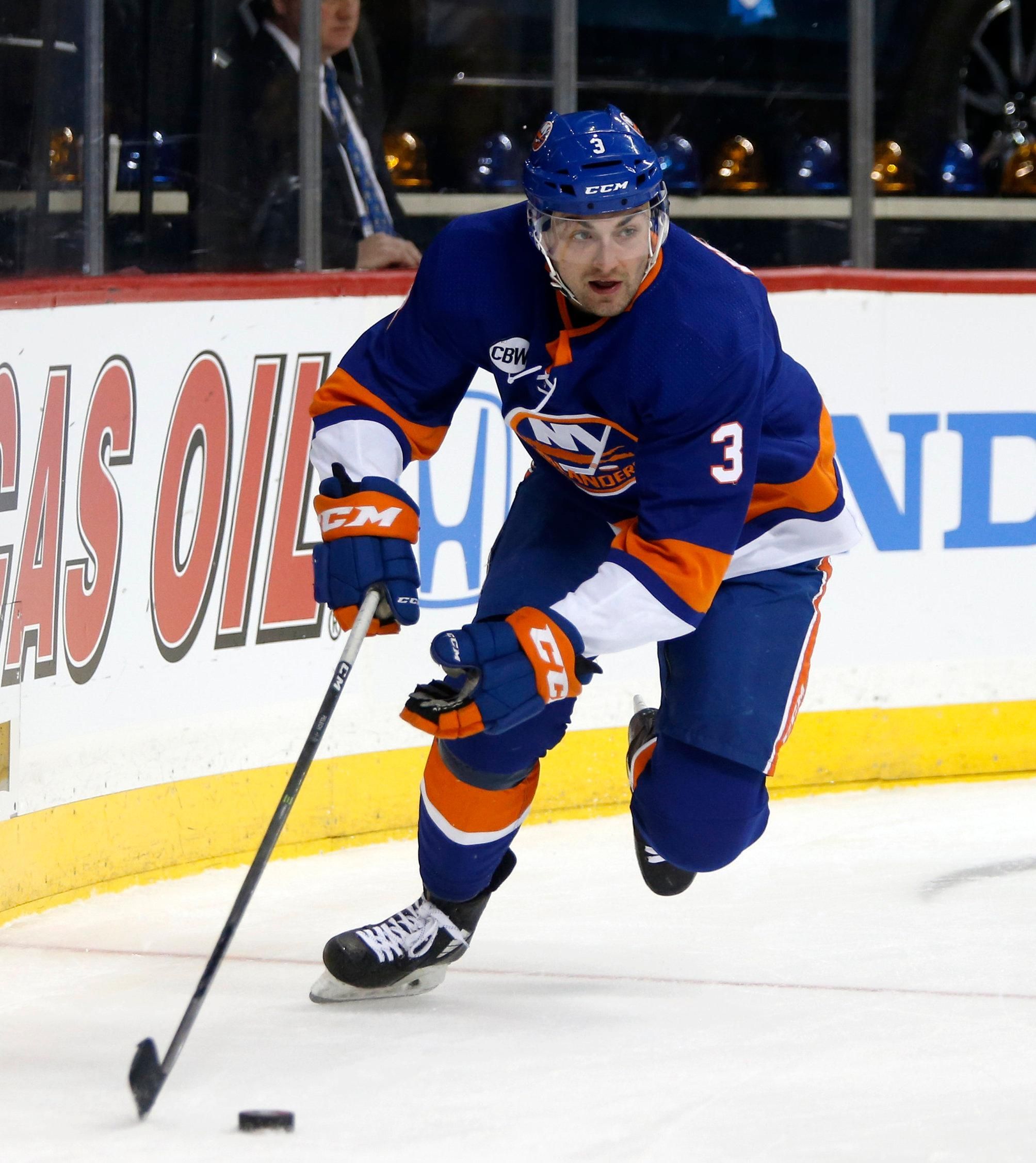
The Islanders should've stuck with this look.
The fisherman logo was bad, but putting the regular logos on those jerseys was absolutely gorgeous.
-
1
-
-
I wish the Isles' fishsticks uniforms would've stuck for a few more years. How cool would it have been to see all those 90s matchups?
-
2
-
-
Knockoffs have started popping up on Depop and other resale apps. This is getting to be REALLY annoying.
-
-
Can anybody ID the font on my dad's old t-shirt?
-
The Grateful Dead/Dead & Company have performed at the Nassau Coliseum 44 times, more than any other artist. At the show tonight, they raised a banner at the Coli.
Thoughts?
-
The alternates still feel very Oilers-y, probably because orange is the primary color, and they're totally devoid of royal blue. If it were me, I'd make the primary color navy, crank up the teal, and then go from there.
It's a solid set, but the two alternate still don't feel like the Islanders, yknow?
-
hey guys let's not let this devolve into a political $#!tshow
-
3
-
-
I think you should replace the bigger swaths of grey with black on the Cane's road jersey, if not just adding a little bit more of it. It'd really make the entire set look a bit more cohesive.
-
All are good (except number 4) but number 5 and number 10 are clearly the best.
-
1
-
-
I like it better. It'd be better if the "CITY" was the same font as before, but the new logo looks more modern and less 80's-ish.
-
I can't imagine this isn't already a thread, but I figured I may as well get this started up. This is a place you can post little things in sports uniforms that rub you the wrong way. Not major design choices, not new logos, just little things only the real jersey nuts care about.
I'll start.
Ever since the Adidas takeover, the Isles' helmet numbers haven't had the outline their jersey numbers have, and it bugs me every time I see it.
Do you guys have anything like this or am I crazy?
-
4
-
-
On 1/27/2019 at 9:01 PM, Darth Brooks said:
I am a simple man. I see the Grateful Dead, I like.
Not sure how conducive the Dead’s imagery is to good unis, though.
-
1
-
-
Not my art, but I went to the Denver Art Museum a while back and fell in love with this piece by Lawrence Weiner.
So vague, yet so meaningful. I could sit and stare at it for hours.
-
16 hours ago, OhioSportsMan61 said:
Those ASG jerseys are going to be miles better than what the NHL/Adidas reveals tomorrow
Eh. They're both pretty solid imo.
I'm not at all a fan of the Calgary Heritage Classic jersey, though. It's got such a good idea and such good potential, but the colors are just so flat, and in reality it'd look like a plain red jersey. I'd make it a red-cream color scheme, rather than double red.
-
Sadly, I've had to enable Adblocker for the site. As much as I want to let Chris and the boards be successful, this is just ridiculous.
-
1
-
-
Just got a pop up scam ad. F*** that.

-
On 8/1/2018 at 9:32 AM, sc49erfan15 said:
Every time I see an 18-wheeler with this logo, I think about how it could really work as a sports logo:
Damn. Was on a road trip and wanted to post this logo. Beat me to it.
-
1
-


Fun With Flags!!!!
in General Design
Posted
Hot take when Colorado exists.