


DTConcepts
-
Posts
2,808 -
Joined
-
Last visited
-
Days Won
4
Posts posted by DTConcepts
-
-
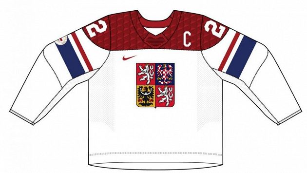
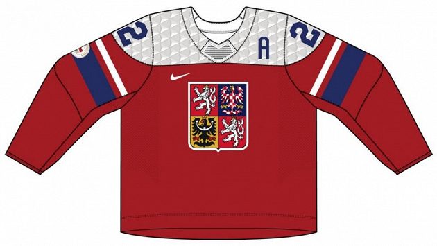
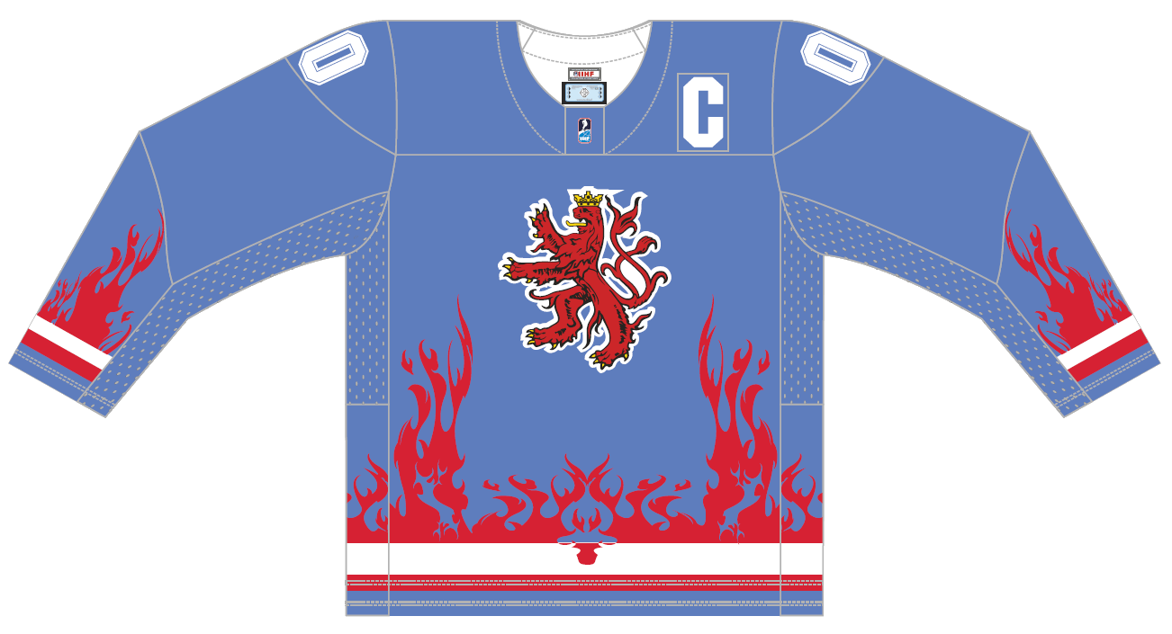
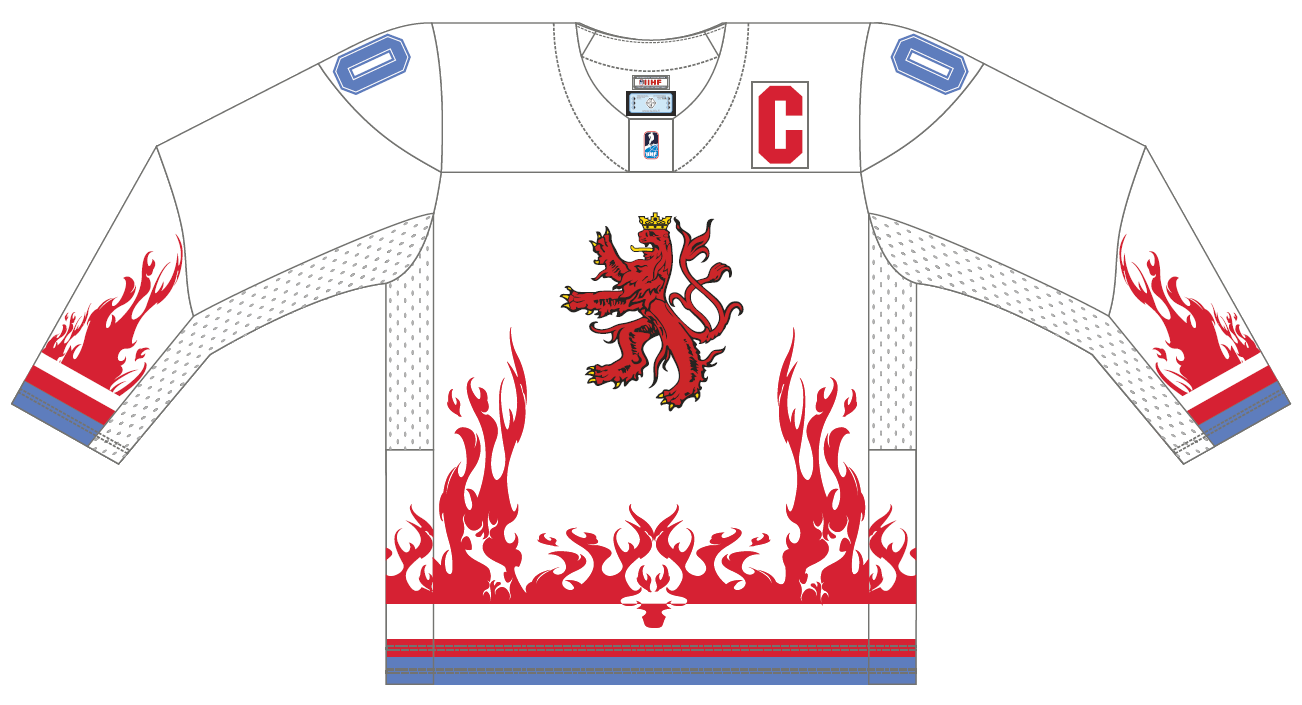
On 11/13/2021 at 10:39 PM, dannykraft said:
Don't know if this was posted or not but the Czech jerseys leaked too.

Really liking the direction this year.
waist stripes pls
-
 5
5
-
-
I bet $20 the Devils go a Sharks-type route and unveil a "Stealth" jersey that's only black and red.
-
1
-
-
As much as I love both the inaugural jerseys and the screaming eagle, both of those designs belong in the past imo.
The Caps need a refresh, and their Winter Classic jerseys or current alternates are what they should build off of.
-
3
-
-
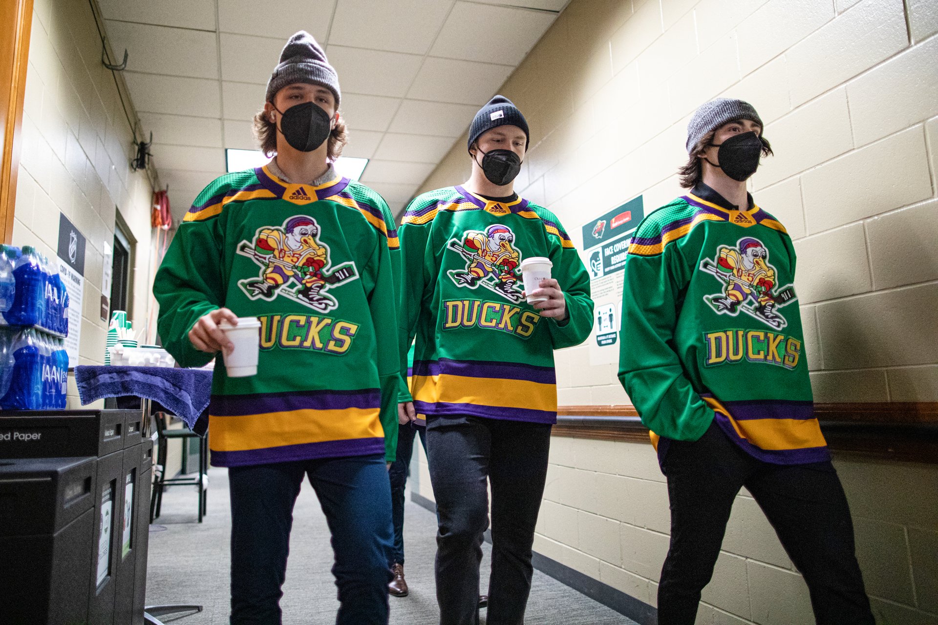
5 hours ago, flyersfan said:
Not specifically for the Ducks, but I could see it from the OG movie, there is a missing Green and Gold color scheme in the NHL right now. Before the Seattle Kraken brand was unveiled, I played around with two color schemes in NHL 19, the first being a Dark Green and Salmon (based on the Sockeyes name), and the second being Green and Gold with an "Astros" theme. The Gold and Green with some black accents really popped, and is a missing spot in the league. So is purple, but that's a Kings problem. I don't have any concepts to share, but some Ducks wore some unis on Adidas' Template to a game last year.
These need to be Anaheim's alternate jerseys. Or at least an annual one-off game, a-la Blues 90's Night.
-
3
-
-
9 minutes ago, AFirestormToPurify said:
The Mighty Ducks jerseys from 1996-97 and 2000-03 were absolutely perfect and I will die on that hill lol
Personally, I think the Mighty Ducks looked better without shoulder patches than with. This:
Looks much cleaner than this:
Plus, I think that shoulder patch is a bit too cartoony, which is saying a lot for the most cartoony brand in hockey history.
-
7
-
-
The crest on those jerseys is rough. Looks like a DHGate knockoff with all those air bubbles.
-
Yeesh. Those Nike jerseys are rough.
The Ducks got it right the first time.
-
6
-
-
I bet it's because "ASTROS" has an even number of letters, while "HOUSTON" doesn't. Because of the buttons on the jersey, they can't really align the word Astros without there being a huge gap in the middle of the word. Houston can have the 'S' comfortably in the middle, while Astros is a little misplaced.
-
6
-
-
The only issue I have with the Sharks' "Stealth" jerseys is how goddamn minimalist they are. They've got the same issue as the rest of their jerseys, where there's just nothing happening on them. I can excuse the teal-only color scheme since it is an alternate jersey, after all, and the circuit board pattern is pretty cool, but they're just so boring.
The Sharks' whole identity pisses me off. They have so many options and opportunities to be an exciting, modern, and unique brand, yet they choose the most boring designs possible.
-
7
-
-
According to CoolHockey, the Canucks will be wearing the Spaghetti Skate jerseys at some point this season.
Those jerseys look gorgeous on the Primegreen template.
-
4
-
-
Not sure how popular or unpopular this is, but I really dislike the all-white goalie pad trend. Jerseys aside, this:
Looks so much better than this:
Apologies for using DiPi as the reference, he's just the first goalie I could think of that had both maximalist and minimalist pads.
-
2
-
-
I'm tired of retuning to the deigns of the past. Between the Coyotes, Sabres, Flames, Penguins, Islanders, and Senators, we've got enough teams that replaced their identities with stuff that's borrowed from the past.
The Sharks' current logo is fine, there's no need to change it. It looks cleaner, more fierce, and more dynamic than the cartoony '90s logo does. Just brighten the teal, replace the orange with grey, redesign the jerseys, and call it a day.
-
1
-
-
Avs look like they're going ad-less for the regular season.
Good.
-
8
-
-
If the LA alt didn't have the chrome dome and white gloves, I'd really, really like it. It adds some new flavor to the Gretzky era without throwing back to it directly, which I like.
That being said, the helmet and gloves make the whole set pretty f***in' bad.
-
1
-
-
On 10/6/2021 at 11:26 AM, Sport said:
The Panthers pants stripe pants bug me.
How it's supposed to look.
How it looks now
Why'd they start cutting off the point like that?While I don't really have an opinion on the pant stripes themselves, it always bugs me when uniform elements are sublimated -- like the latter image -- instead of stitched like the first image.
-
Avs are back to the 'A' on the helmet.
They've also moved to having the manufacturer logos on the sides of the pants.
-
5
-
-
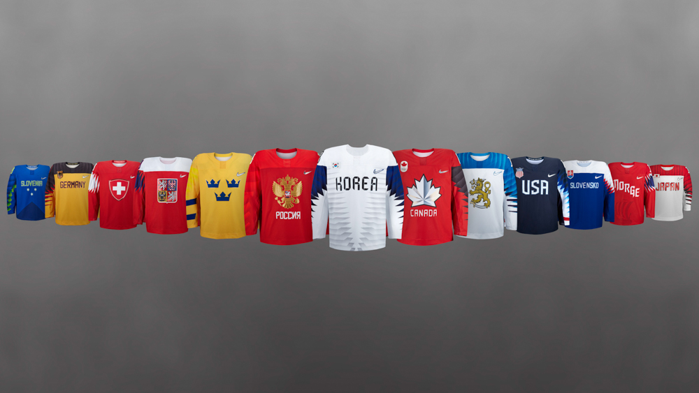
On the positive side, Australia, Ireland, Jamaica, and New Zealand all look fly as hell.
As awful as the USA and all the other countries using their stupid eagle-wing pattern look, they've got nothing on Luxembourg.
Those are just terrible.
-
4 minutes ago, M4One said:
And, as for making it inauthentic, does that mean I should stitch on ad patches when that starts happening to make sure it's as authentic as to the on ice jerseys?
I don't think an advertisement is comparable to a manufacturer's tag, but sure.
I mean, while we're at it, we may as well cut off all the CCM and Koho tags off our old Y2K jerseys. They've got the same placement as the End Plastic Waste tags, and are just as big as the ads on the front of the jerseys will be, right?
-
1
-
-
On 9/30/2021 at 9:13 PM, M4One said:
Adidas/NHL adding the black tab on the back of the hem on jerseys promoting their new recycled jerseys. If I was going to buy a new jersey, that's the first thing to go, just like how I took off the jock tag on my Reebok jersey.
Why would you remove the tag when it appears on the in-game jerseys? Doesn't that make your replica jersey that much more inauthentic?
-
1
-
-
Looks like the subtle little Primegreen "END PLASTIC WASTE" tags are on some of the in-game jerseys. Note how the Coyotes have them but the Ducks don't.
-
1
-
-
2 hours ago, Patchey13 said:
Those jerseys would be really great if they just had the modern crown logo on the front.
Nothing can save those jerseys from their god-awful arm piping.
-
5
-
-
2 hours ago, Ricky_Roby said:
That's a weird thing for an adult human male sportsfan to say, but there, I said it.
-
1
-
-
24 minutes ago, Mingjai said:
Why? Nike seems to do fine with their NCAA teams. I think they would do okay outfitting the NHL.
This is probably why people are weary of Nike doing hockey jerseys:
-
12
-
-
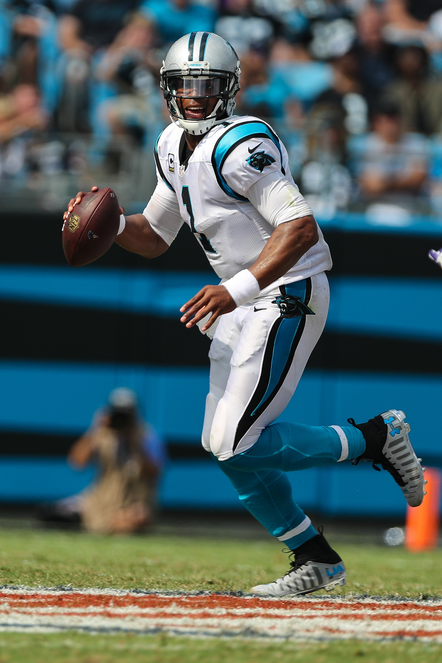
Granted, I just don't like the Rangers in general, but I also don't like the new bevel on their jersey lettering.


/cdn.vox-cdn.com/uploads/chorus_asset/file/13178915/56136552.jpg.jpg)
:no_upscale()/cdn.vox-cdn.com/uploads/chorus_asset/file/2901502/Anaheim-1.0.jpg)


/cdn.vox-cdn.com/uploads/chorus_asset/file/22810652/usa_today_16636316.jpg)


/cdn.vox-cdn.com/uploads/chorus_image/image/69937142/1235590567.0.jpg)


2021-2022 NHL Jersey Changes
in Sports Logo News
Posted