


DTConcepts
-
Posts
2,807 -
Joined
-
Last visited
-
Days Won
4
Posts posted by DTConcepts
-
-
24 minutes ago, Mingjai said:
Why? Nike seems to do fine with their NCAA teams. I think they would do okay outfitting the NHL.
This is probably why people are weary of Nike doing hockey jerseys:

-
 12
12
-
-
Granted, I just don't like the Rangers in general, but I also don't like the new bevel on their jersey lettering.
-
1 hour ago, Ridleylash said:
God, it's nice to see this look back full-time.
It's always bugged me that the patterned striping didn't carry over to the socks, if I'm being honest.
-
3
-
-
Re: Capitals jersey ads
-
6
-
-
17 minutes ago, the admiral said:
Yeah, Desert Sans, as in "the desert should be sans NHL hockey."
-
9
-
-
While we're discussing the Oilers, this should be their full-time look imo:
-
10
-
-
I don't think the RR jerseys should stick around league-wide. I mean, just look at how much the Isles, Wings, Leafs, Jets, and Stars' fanbases hate their jerseys. I do think that some teams should keep the sweaters around, though, whether as alternates or theme nights. The Ducks, Yotes, Nucks, and Pens are the first ones that come to mind.
-
1
-
-
As much as I like the kachina identity, I'm tired of teams going back to full-time throwbacks. It'd be better to evolve the identity forward using elements of the old branding rather than being unoriginal and just copy/pasting it onto the Adizero template.
-
9
-
-
2 hours ago, VDizzle12 said:
The Avs are definitely trying too hard to give blue and maroon equal weight in the brand. It's better since they removed the unnecessary black, but still could be simplified. They should never let blue and maroon touch, outline all numbers in gray and the pants/gloves should always match the color of the mountains. Sure this thinking would create a maroon-heavy white set. But honestly I don't think that's a bad thing.
This is the correct take. I'm not sure why everyone is so dead-set on only having one set of gear -- it's not an unusual or novel idea to have different home/away gear.
-
4
-
-
The Avs are trying way too hard to be a two-color team. Either brighten the burgundy or keep black in the color scheme.
-
2
-
-
51 minutes ago, AFirestormToPurify said:
Storage costs? For a cardboard box with a few socks in it? And I'm the one being ridiculous? lol
It's highly possible that they sold off those socks years ago in those pro stock and game worn equipment sales. But it's also not that farfetched to think that they would have kept a few socks around
Take off your tin-foil hat. It's just a bad aesthetic choice. There's no penny-pinching conspiracy here.
-
2
-
-
The original Wild Wing socks were knit. The Reverse Retros are modern material. It wasn't the Ducks being cheap, it was a bad aesthetic decision. This debate is stupid.
-
11 hours ago, M4One said:
Yikes. Yet, it wouldn't have surprised me one bit if a team under Reebok/Adidas whipped something like this crap out for a Stadium series.
That’d be more passable, imo. Uniforms that are this experimental are okay for a game or two, not a full-time look.-
1
-
-
Vertical striping and combined pants/jersey elements aside, I think the most intriguing part of that first Mighty Ducks concept is the helmet striping. The fact that any of that even made it into the concept phase is insane.
-
1
-
-
1 hour ago, spartacat_12 said:
This:
...is much better than this:
This:
...is better than this:
And this:
...is better than this:
I agree with all of this, but the difference between any and all of these teams and the Habs is that none of those colors clash as much as blue and red do.
Double outlines don't always look bad, and they don't always look good. In these cases, they look bad. In the Habs' case, they look good.
-
4
-
-
The Kachina logo is on the ice at Gila River Arena, and the team seems pretty proud of it.
https://www.nhl.com/coyotes/news/coyotes-new-ice-originally-classic/c-326027538
-
9 minutes ago, IceCap said:
I'm going to challenge you on two points.
How do these push any envelopes? They're just cashing in on the "team logo in a roundel"/double blue trend that started when everyone fell in love with Pittsburgh's throwbacks from the 2008 Winter Classic.
Also...how do these "fit in" with South Florida? There are a few colour schemes that fit with South Florida (the Panthers' standard colour scheme is one) but double blue and white doesn't. It's a cool colour scheme, and not one I'd associate with Florida. South or otherwise.
The jerseys pushed the envelope of the Panthers' brand, rather than overall jersey design. They took the Panthers' identity, which has always been known as bright, flashy, jagged, detailed, and 90's-esque, and simplified it. They toned down the striping, went for a reserved color palette, and simplified the logo. They pushed the envelope in the opposite direction than it usually gets pushed, making the Panthers seem more traditional than their overall branding.
And maybe it's because I've only visited South Florida a couple times for very brief periods of time, but the double blue reminds me of the ocean I saw there. The beaches are that lighter, more tropical blue that fades out into the deeper, darker ocean waters. One could even say that the white stripes represent waves or ocean foam that differentiates the two.
-
1
-
-
These jerseys are actually really solid, and fit in well with south Florida hockey. I get that people don't like them because they strayed too far from the Panthers' normal branding, but isn't that the point of alternate jerseys? To push the envelope?
Regardless, these jerseys don't deserve the crap they get. They look really slick.
-
2
-
-
7 minutes ago, Kevin W. said:
How many people do you see wearing something like that on a daily basis? That’s for a niche and not for everyday use.
I live in a college town. Believe me, this $#!t is everywhere. Young people are more loyal to their favorite brands than we are to most any religion or nationality.
-
2
-
-
On 8/18/2021 at 11:39 AM, Kevin W. said:
That's an absurd over-exaggeration and you know it.
I wear Nike shirts and shorts when I run. Do you know how many Nike logos are visible on the clothing? Two. One each.
Not to split hairs, but people are shelling out upwards of $275 for this shirt, solely because of how many Nike logos are plastered all over it. I count 14 swooshes on the front of this thing alone, and there's probably just as many on the back.
People care about brands. They're powerful. The NHL knows this, and we'll probably see some teams try to cash in on the whole phenomenon. I bet $20 that the Maple Leafs slap an OVO logo somewhere on their jerseys in the near future.
-
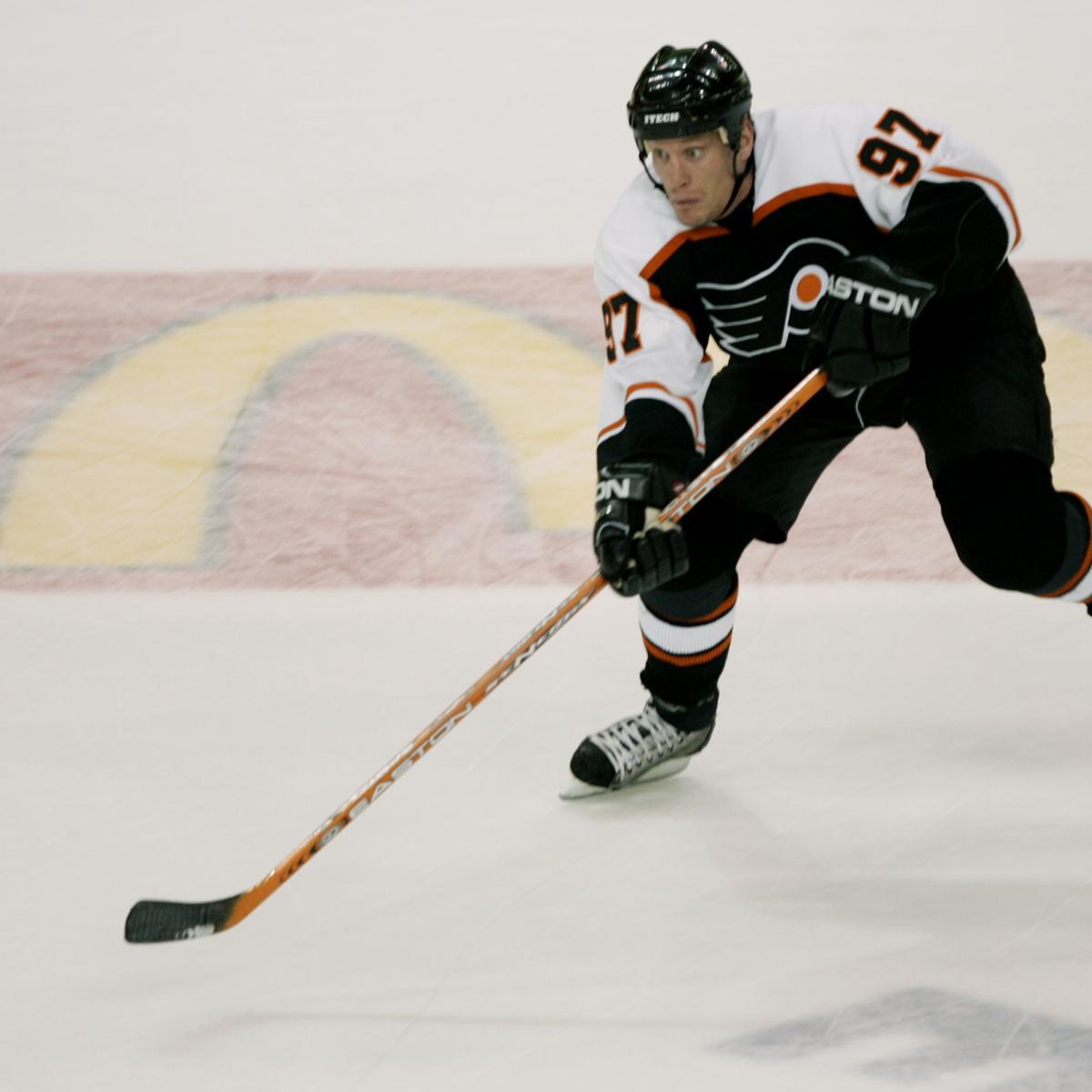
These jerseys suck. The Flyers belong in orange.
-
4
-
-
Just now, DEAD! said:
Have that 2D logo from the previous set and it would be a solid 'A' grade jersey.
Not even. Throw the effectively unused alternate logo on there and it's one of the best jerseys in league history.
-
6
-
-
I can't find any images of it, but the Coyotes and Islanders faced off during the Yotes' inaugural season, and the Isles' only season with the fisherman jerseys.
-
Found this jersey on Mia Tyler's Instagram. No idea who she is, but she had this picture of an obviously unreleased Isles jersey. The NHL crest and logo stitching look too good to be fake, and I haven't found that jersey on any of the usual fake jersey websites. Maybe an alternate/RR for next year that just got leaked by an influencer a bit too soon?
-
5
-


:no_upscale()/cdn.vox-cdn.com/uploads/chorus_asset/file/19931348/94027206.jpg.jpg)


2021-2022 NHL Jersey Changes
in Sports Logo News
Posted