


DTConcepts
-
Posts
2,808 -
Joined
-
Last visited
-
Days Won
4
Posts posted by DTConcepts
-
-
On 12/17/2021 at 3:29 PM, Rj0498 said:

I think these are a solid set of uniforms.
Solid? Yes. Better than the Kachina jerseys? No.
-
 8
8
-
-
16 hours ago, JerseyJimmy said:
repeating my prior hot take that this was the best the Isles ever looked
hotter take: these are the isles' best jerseys of all time
-
53 minutes ago, ManillaToad said:
This is straight up minor league. It's embarrassing to look at and doesn't belong in the NHL. Comparing it to the kachinas or the screaming eagle is crazy.
The screaming eagle put weirdly placed angles and wordmarks in the striping. The Kachina jerseys used abstract art for a logo and tribal patterns for the stripes. The fisherman jerseys just used the warp tool on Photoshop. They all did weird, new things and they all did it well, imo.
5 minutes ago, monkeypower said:Speaking of Fisherman, the Isles are selling these at UBS.
I think this is a neat jersey to put back into circulation.
Truth be told, I think this white post-fisherman wave jersey is my favorite Isles sweater of all time.
-
The only negative of moving the Coyotes is that we'd be losing the Kachina jerseys.
-
5
-
-
1 hour ago, ManillaToad said:
The logo is terrible and the jerseys are sterotypically 90s in the worst way possible lol. What's the point in giving something credit for doing something new if that new sucks?
$20 says that in an alternate universe where the Islanders didn't have the most dominant dynasty in hockey history, the fisherman jerseys would be looked back at just as fondly as the Caps' screaming eagle jerseys, the Mighty Ducks' inaugural jerseys, or the Coyotes' Kachina jerseys. Each of those designs are recognized as some of the best in NHL history, and they each do something outlandish and/or entirely new in the confines of jersey design.
-
3
-
-
The cross on the thumbs is a pretty neat touch.
Why is Nike so good at putting in little touches that add nothing to the design, but so bad at creating designs as a whole?
-
1
-
-
4 hours ago, ManillaToad said:
Fisherman is still worse
Strongly disagree.
The fisherman jerseys were gaudy, but they at least tried something new, and did a pretty coherent job at doing it. In a vacuum, the logos were good and the jerseys were stereotypically 90s. The main reason they get so much flack is because they replaced the classic Isles identity.
The new New Jersey "Jersey" jerseys, however, swing and miss on each and every front. Scripts on hockey jerseys will pretty much never look good, the sans-red color scheme doesn't suit the Devils' brand at all, they were "inspired" by a minor-pro team 100 years ago that no one cares about, the jerseys themselves are basically copies of the Blackhawks' Winter Classic jerseys, and even the team's half-assed attempt to pass them as both classically-inspired and memeworthy aren't working.
At least the fisherman jerseys had the balls to do something new and do so coherently. The Devils' alternates don't do a single thing right.
-
7
-
-
16 hours ago, tigers said:
New England Revolution's palm tree logo
Once you see it.
When you isolate this part of the logo, yeah. In the confines of the overall design, it doesn't look like a palm tree at all. You can isolate an element of most any logo design and make it look like something it isn't.
-
3
-
-
9 minutes ago, Ridleylash said:
So the Jets are doing NFTs now. How lovely.
Hey, the Islanders did it first!
Speaking of the Isles...
THE STREAK IS OVER!!
-
Not sure how popular or unpopular this is, but the Islanders look better with double outlines on their jerseys.
-
5
-
-
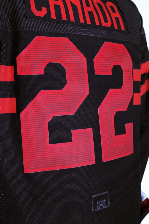
I do have to say, I appreciate the subtle shading and striping on Canada's numbers.
-
1
-
-
I mean, I think the Smashville jersey is worse than the Jersey jersey, solely because the Jersey jersey still looks classy and relatively good, albeit boring and derivative of the Blackhawks.
3 minutes ago, chcarlson23 said:And aesthetically, nothing has been as bad as the Thrashers red alternate…
This is the correct take. There are some jerseys that have come close, (Dallas Edge jerseys and Islanders first black alts come to mind) but none of them have been quite as ugly as those Thrashers alts.
-
1
-
-
1 minute ago, AFirestormToPurify said:
Which one, Jersey or Smashville? lmao. Either way, not exactly a good year for new jerseys. Other than the Blues and Coyotes maybe? Definitely more bad than good, just as I thought the league as a whole hadn't looked that good in decades, the crappy new jerseys keep on coming and coming and coming
Neither the Blues or Coyotes jerseys are really new, so
-
1
-
-
Just now, IceCap said:
You're not wrong.
But it just got released alongside the single worst sweater in NHL history. So it looks passable by comparison.
That's probably clouding my judgement a bit, to be sure.
But I also tend to like the more out there and experimental jerseys. The Avs 'Bib' Stadium Series jerseys, the Space Coyote alt, the Isles' fishsticks jerseys, and the Red Wings' Stadium Series jerseys are all designs I genuinely enjoy.
-
1
-
-
I guess I'm in the minority, but I really like the Lightning sweater. It's new and futuristic without being unbearably gaudy. I'm not a fan of the BOLTS script, but I do like the striping a lot.
Stadium Series are meant to push the envelope of jersey design. The Lightning do it fantastically. The Preds? Not so much.
-
6
-
-
How did the Lightning get it so right and the Predators get it so wrong?
-
5
-
-
Why even contemplate about whether Houston is worth it or not? Just move the Coyotes to Quebec, where we know damn well hockey works, and works well.
-
3
-
-
Not sure if anybody's posted it yet, but Travis Zajac in the Adidas Devils jerseys never did look quite right.
-
2
-
-
I've seen a lot of bad counterfeit jerseys, but goddamn, that one takes the cake as the worst I've ever seen.
-
I mean, even the stupid, ugly-as-:censored: Reebok fashion jerseys would look better than the New Jersey Blackhawks jerseys.
-
3
-
-
The white jersey is the only one that’s even semi-okay, and even it gets ruined by the black gear.
-
2
-
-
I wish NHL teams would follow the NBA's lead and wear their special edition uniforms for an entire game. It'd make the events feel much more meaningful, and it'd make the league a lot more colorful.
-
The Blues look better now than they ever have. Elevating the Winter Classic jerseys to a full-time look would be a mistake.
-
5
-
-
In other, less disappointingly bland news...
The Isles are gonna be wearing these patches for the rest of the season after their home opener tonight. I don't like the way the design makes it look like it's the Isles' inaugural season instead of the arena's, but the design itself is pretty solid.
-
5
-
:no_upscale()/cdn.vox-cdn.com/uploads/chorus_image/image/64773019/940470010.jpg.0.jpg)


2021-2022 NHL Jersey Changes
in Sports Logo News
Posted
This year’s all-star jerseys have leaked.