


DTConcepts
-
Posts
2,808 -
Joined
-
Last visited
-
Days Won
4
Posts posted by DTConcepts
-
-
This is what Adidas should've done with the Devils. Modernizing the look without totally screwing it over. The 'Jersey' jersey looks especially sharp, nice job!
-
 3
3
-
-
21 hours ago, Blindsay said:
Will there be Logo Redesigns too?
Yes and no. Some teams will have tweaked primaries, some teams will have new secondary logos, and some teams will have recolored logos. I didn't want to completely rebuild each team's brand, so most of the logos are more or less the same from the originals. The next team is a good example of that:

There may be some hometown bias here, but after digging into the various identities of IHL teams, the Denver Grizzlies easily became my favorite. They may have been named after a bear that's been extinct in Colorado since the '50s and had an admittedly ugly logo taboot, but I fell in love with their jerseys. The strange, sublimated claw mark on the waist, the same claw marks on the numbers, and the unique color scheme all drew me in. With these jerseys, I tried to maintain the somewhat classically styled look the team had, while updating it and truly making it unique. The original jerseys used a weird teal color rather than a true forest green, which was rectified here. I also introduced a touch of brown to the striping, in order to round out the look. The claw marks remain on the waist and numbers, and a new secondary mark is introduced to the shoulders. The alternate is just a more all-out take on the clawmark striping, and I think it looks pretty sharp.
How about you? What do you think of these sweaters?
-
4
-
-
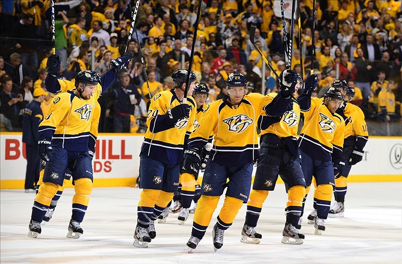
I think the Predators' switch from a navy/silver to yellow counts here.
-
9
-
-
9 hours ago, Old School Fool said:
I'm not much of a Hockey fan so I don't carry the tradionalist type viewpoints on uniforms and with that being said, I always thought most of the 90's NHL uniforms were awesome. Having wavy numbers to go with the water waves is pretty creative.
I understand why people didn't like the Islanders Fisherman logo but I personally thought it looked pretty good if you just forget that it's suppose to belong to a traditional type team.
These logos are nice.
The bulk of the disdain for the fisherman jerseys comes from the fact that they replaced a classic hockey identity that had won four straight Stanley Cups. I've said forever that if the Islanders were an expansion team in the '90s that came out with those jerseys, they'd be as well-loved as the Coyotes' Kachina or the Capitals' Screagle jerseys.
-
8
-
 1
1
-
-
A couple weeks ago, I went down a bit of a rabbit hole. I was browsing through hockey jerseys on Depop, and I stumbled upon the most '90s hockey jersey I've ever seen — an old Detroit Vipers jersey. I'd never heard of the Vipers or the IHL that the team was a part of, so I did some digital digging on the history of the International Hockey League and the teams that played in it. Succinctly stated, it was a longstanding and historical hockey league that experienced a boom in the '90s, and produced some of the gaudiest, 1990s-est looks hockey has ever seen, and I absolutely love all of it. I've attached some of my personal favorite jerseys from the IHL in the spoiler below, if you want to see what I'm talking about.
SpoilerIf it wasn't already clear, I absolutely adore '90s-era hockey design. The crazy colors, far-out designs, and willingness to experiment with the boundaries of traditional sports design are all wonderful, and are things I wanted to revive in a modern context. Which gave me the idea to do exactly that and modernize a handful of those '90s IHL identities for the current day.
Enough talk. Here's the team that inspired this series, the Detroit Vipers!
The design of these jerseys is simple, and is more out-there than the actual jerseys worn by the Vipers. The curved striping is inspired by the curved tail of a snake, and the red stripe on the light and dark jerseys is filled in with a sublimated snakeskin pattern. The alternate jersey was designed with the intention of including yellow more prominently than the primary jerseys do, while also maintaining an experimental 90s-esque striping pattern.
What do you think of the first team? Is the design '90s enough for you?
-
11
-
-
As an Isles fan living in Colorado, it's pretty damn beautiful seeing the Tampa "dynasty" come to an end.
-
2
-
-
How it started:
How it's going:
-
 1
1
-
-
47 minutes ago, adsarebad said:
is this a fan jersey? it says made in Canada.
I found the image on r/HockeyJerseys. It’s not team issued, but it is an MiC.
-
1
-
-
On 6/7/2022 at 10:59 AM, DTConcepts said:
Looks like the SCF patches will be more subtle than years past, and will be the same plastic-y material as the NHL shield.
I stand corrected. The SCF patches are still stitched like normal, at least on retail jerseys.
-
 1
1
-
-
Lateral move. I just don't understand what prompted the change. What about a shift towards electric cars prompts a very minor rebrand?
-
6
-
-
Reebok-era MacKinnon just feels so wrong in retrospect. The blueberry jerseys in particular don’t feel right.
-
4
-
-
Looks like the SCF patches will be more subtle than years past, and will be the same plastic-y material as the NHL shield.
-
7
-
-
On 5/24/2022 at 10:09 AM, JTernup said:
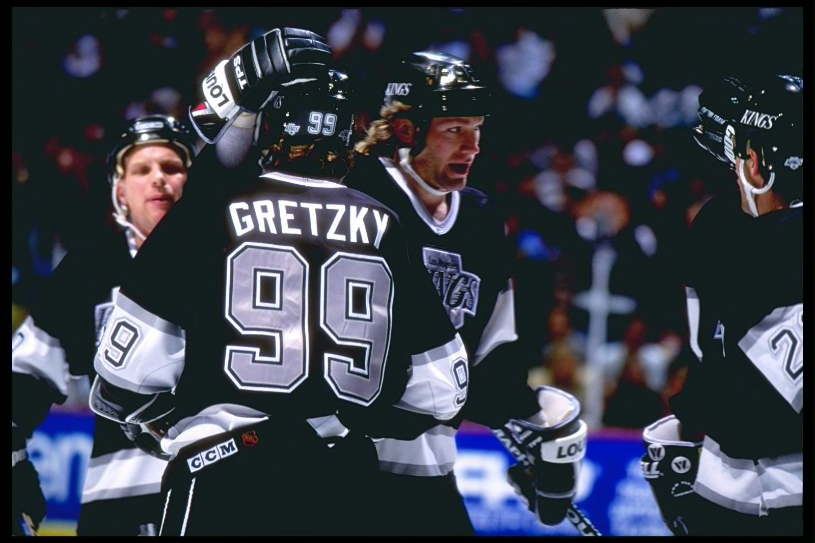
See, I totally disagree. Whether we like it or not there are a lot of unconscious perceptions tied to the color black. Seeing Sakic race down the ice in a black helmet and brawls with Red Wings definitely contributes to that gritty/tough perception that I associated with those Avs teams. Something about the blue just doesn't hold that same visual weight. I just can't imagine the photo below with that goofy blue helmet. You can say that's because I'm used to black but I think it's more than that.
Is that stupid? Yeah, probably. But color theory is very real.
I agree that if we flip it though it would've felt like an unjustified bizarre BFBS.
I don’t know about you, but this photo still looks pretty gritty and tough to me.
-
10
-
-
Not sure how popular this is or isn't, but I want to see floating outlines return on hockey numbers. Something about them just looks so good and nostalgic.
-
9
-
-
I think the Avs' move to blue is a lateral move. It definitely matches the identity much better, but I agree that the black had become so normal that it does feel a bit off.
On 5/22/2022 at 7:32 AM, adsarebad said:Avs need the black, and bigfoot back on the shoulders.
I will never understand peoples' affinity for the foot, though. The logo only existed because of the Avs' former mascot Howler the Yeti, who has since been replaced by Bernie the St. Bernard. It doesn't make sense to have a logo based off a mascot who hasn't seen daylight in 20 years after reportedly getting into a fight with a fan after a game.
The Colorado flag C just makes so much more sense from a branding perspective. It's an actual symbol of the state the team plays in, instead of a weird mark that stands to please foot fetishist hockey fans.
-
4
-
-
On 5/11/2022 at 4:45 PM, Germanshepherd said:
As a very intermittent hockey watcher who typically only watches highlights on SportsCenter, I have been unable to tell who is who throughout the entire Tampa Bay/Toronto series.
As a very frequent hockey watcher who has been a fan of the sport most of my life, I have also been unable to tell who is who throughout the entire Tampa Bay/Toronto series.
-
2
-
-
On 5/5/2022 at 1:34 PM, Discrim said:
That Stars jersey is a bit of an oddity, I'm pretty sure the sleeve stripes always had the number gap when that style was in use. Maybe a goof or something.
I looked back at it when I was clocked in the other day, and I'm 90% sure it's just a beer league jersey with the North Stars' color scheme and logo. The striping widths, the number outlines, and the collar were all off. Plus, the name on the back didn't match anybody who wore #11 for the North Stars or the Dallas Stars.
-
Bring back goalies using #1!
-
3
-
-
If you ask me, the Oilers need to dump navy and embrace orange as the main color.
This would easily be one of the best jersey sets in the league. Just tweak the home jersey to match the three-stripe pattern we've gotten used to over the years and it's perfect.
-
11
-
2
-
-
Another box of jerseys floated its way into my thrift store the other day. I restrained myself from buying much, but here were the highlights:
While the Blues jersey is the only one I ended up buying, the Stanley Cup Championship jersey was an oddity. Giant, screenprinted crest, an NHL logo on the waist, a screenprinted Molson logo on the sleeve, and a stitched '94' on the back. All on a Kings template.
In non-thrift-store related news, I bought a Mighty Ducks CCM jersey for $30 and an Adidas Ilya Sorokin jersey for $35 off Depop.
Sorry for spamming so much in this thread, I just don't know any other community that would appreciate these pickups as much as I do!
-
5
-
1
-
 2
2
-
-
On 4/27/2022 at 2:40 PM, VikWings said:
While I'm all for this, this will be the second time they've done this now lol.
You mean to tell me that the Ducks franchise has -- on two occasions -- acknowledged the sentiments of the fanbase and upgraded their jerseys to match? How corny, lol.
Obvious /s
-
Hot take, I know, but I think the Bruins look better with black socks than gold socks.
The color scheme makes much more sense with black socks, and the striping pattern actually matches the jerseys. I know there's a historical basis for the yellow socks, but in retrospect, they stick out like a sore thumb imo.
-
2
-
1
-
-
I'm honestly down for the Golden Knights to wear golden jerseys full time. If there's any sports team that can ostensibly pull that off, it's the expansion team from Vegas. I just hope they nix the chrome helmets.
Also, at least the sponsor patch isn't as ugly and out of place as the Penguins.
-
On 4/22/2022 at 11:03 AM, DG_ThenNowForever said:
The Coyotes want those prices for a minor league arena? I just don't get it.
Minor league arena? C'mon now. All but two AHL teams have more capacity than the Coyotes do.
-
1
-


:format(webp)/cdn.vox-cdn.com/imported_assets/1092139/1389279.jpg.6732_crop_650x440.jpg)


/cdn.vox-cdn.com/uploads/chorus_image/image/70798255/1393898885.0.jpg)

International Hockey League Rebuilt
in Concepts
Posted
Up next is the Houston Aeros! They're one of my favorite IHL brands due to how solid the team's identity was despite being so far out of the box by traditional hockey standards. As a result, I tried to modernize their jerseys more than redesign them, which resulted in a few significant tweaks. Here's what I did with the Aeros:
First and foremost, the logo is a little tweaked from the way it appeared at first. The wordmark is straightened out and cleaned up, and the eye on the plane is redesigned to give a fiercer, more intimidating look. In addition, red is introduced to the color palette, rather than looking out of place on the shoulders and logo. The jersey striping is sharper and more angular, too, to match the cleaned up and modernized vibe. The alternate jersey is a direct throwback to the 1974 Houston Aeros, who were the World Hockey Association's second ever Avco Cup Champions.