


DTConcepts
-
Posts
2,808 -
Joined
-
Last visited
-
Days Won
4
Posts posted by DTConcepts
-
-

So we get the Sabres playing in their away jerseys vs. the Leafs playing in their practice jerseys.
Awesome.
-
 2
2
-
-
23 hours ago, insert name said:
I've never seen a league so obsessed with saving a franchise in a market that's clearly not working. This is an embarrassment to the franchise and to the league. They should not be this proud moving into a community center.
I feel awful for the poor social media intern who's being forced to spin this as a good thing.
-
1
-
 1
1
-
 1
1
-
-
Scooped a 90s 'Russian Penguins' era CSKA Moscow jersey from my job, too!
I'm looking into getting it customized with Khabibulin on the back, but I'm not sure if it's an on-ice jersey or a fan replica.
-
Adding blue to the Pens’ gradient jersey would be cool and all, but…
-
 1
1
-
-
The fact that the Pens’ Gin & Juice jerseys have a black stroke on the lettering but not the numbers has always bugged me.
-
5
-
-
oitgdnhl.
-
2
-
1
-
-
Last night's Coyotes-Kraken matchup was a sight to behold. Two modern classics.
-
4
-
 4
4
-
-
Man, the diamond pattern on the shoulders is brutal. Look at how bad Czechia looks here:
-
41 minutes ago, Frylock said:
So here’s a dreadful thought. What if Lou signs off on the RR using the fisherman template, but throwing back to the stop-gap set with the traditional Islanders crest?
Even if it's just the wave jersey instead of the full fisherman, it'll still be a top 5 RR.
-
1
-
-
On 2/5/2022 at 8:28 AM, nash61 said:
Not my concept, but this is really the only way to make the Fisherman work as a RR
Another shameless plug, but I'm partial to having a teal base rather than an orange one.
On 7/2/2021 at 7:06 PM, DTConcepts said:
If you're gonna throw back to the fisherman, go all-in on the 90s vibe. Pure teal.
-
11
-
2
-
-
1 hour ago, LMU said:
Other than the silly 90s ribbon stripe this is about the absolute maximum amount of black that the Flames could get away with, and even then it's too much. Pants and home helmet should be red and the thick black patches at the cuffs on the home should be white.
Another shameless plug, but...
On 12/13/2021 at 2:01 PM, DTConcepts said:Thanks for the kind words! Next up is an era mash for the Flames. As good as the Flames' "new" throwback jerseys look, I don't like the tendency for teams to directly throwback to old designs instead of creating something original. Here's my attempt to balance old and new for Calgary:
In my perfect world, these would be the Flames' home jerseys.
-
3
-
-
It's all a forum! Why you heff to be mad?
-
7
-
1
-
-
If you ask me, the Avs using the Nordiques' identity and the Devils using the Rockies' identity both make about as much sense as this hoodie:
-
3
-
-
We're really doing this, huh? We're really gonna let a professional hockey team playing in the world's highest-caliber league play third fiddle to a college hockey team and youth gymnastics tournaments?
Make it make sense.
-
4
-
-
Jesus Christ, just move the team to Quebec. If nothing else, the Centre Videotron can be a temporary home until they find a buyer in Houston.
I don't know why anyone is even marginally considering the move to ASU as a legitimate option. Like, it's so bats#!t crazy I can't find proper words for it.
-
7
-
-
4 hours ago, Survival79 said:
Slightly tweaked logo...
-
1
-
-
Ugh. I'm tired of teams just doing direct throwbacks, even as alternates.
Move the brand forward. Give us something new. Don't just be lazy and slap an old design on an Adidas template.
-
4
-
-
1998 was the first year of the Islanders' navy rebrand, and the last for the Lightning's storm jerseys. Without looking at the schedule from that year, I imagine this matchup only could've happened a small handful of times at most.
-
3
-
-
21 minutes ago, tohasbo said:
The logos go off of the official vector files and colours...
It's a bit different with the colour differences thereThe actual design of the logo's teeth and moustache are distinctly different from the actual jersey to the mothership's logo.
-
1
-
-
The teeth and mustache on the mothership's "Burger King" logo are different than what was worn on the ice.
-
On 1/2/2022 at 7:48 PM, DTConcepts said:
I work at a boutique-y type thrift store. Earlier today, we got a big shipment of hockey jerseys, and it had the grail to end all grails in it:
Needless to say, I bought it. It was only $45 after my employee discount. There were also a bunch of 90s and Y2K jerseys in there that I didn't snag, but really, really wanted to.
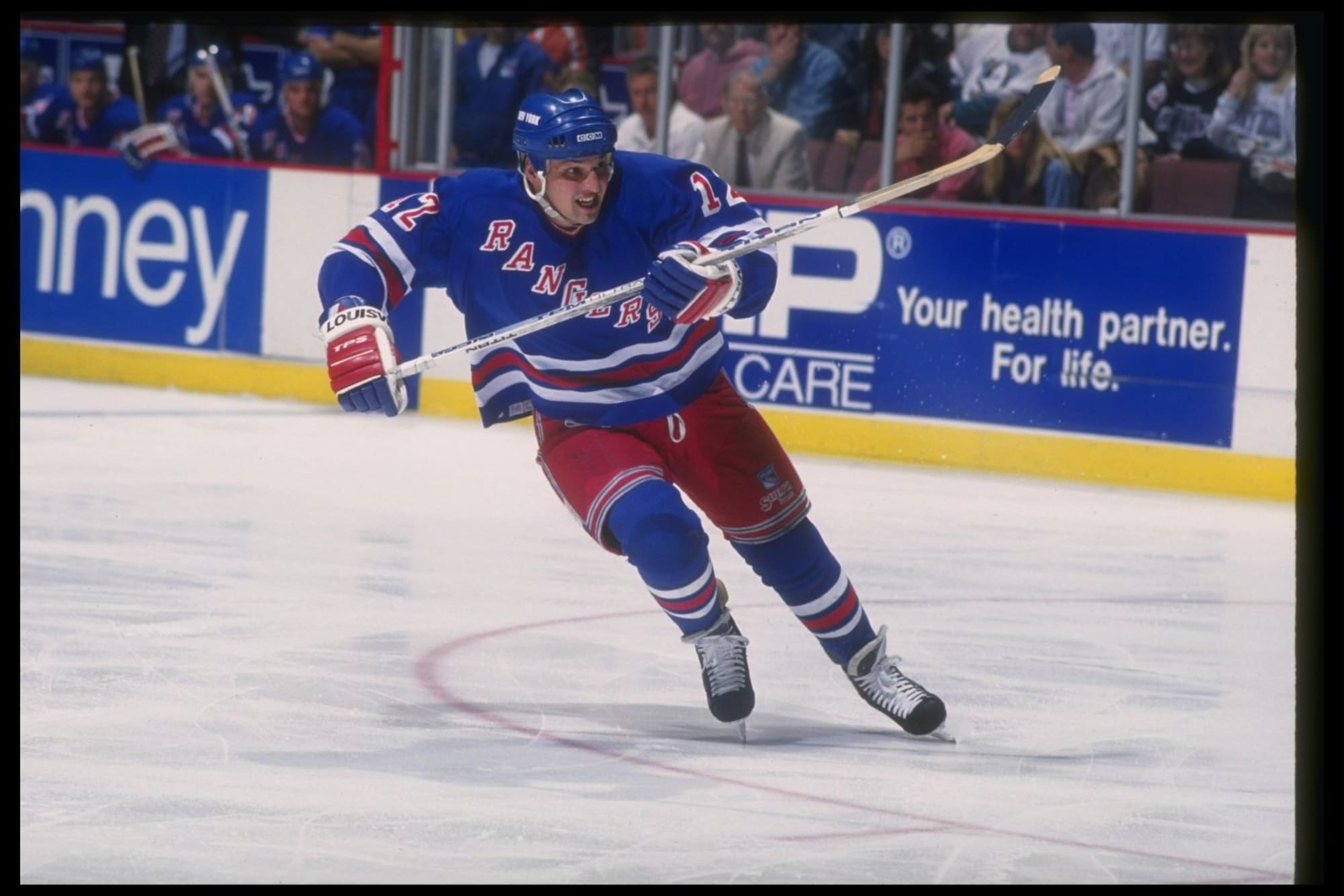
I was like a kid in a candy store going through that box. There were a bunch of other 90s jerseys (Mainly Blackhawks, Rangers, and Habs) and fake Edge jerseys in the shipment too, but those didn't feel as special as these bad boys.
Update: I bought the Stars jersey too. I also found this in another box and, of course, got it for myself:
It's been a good week for 90s NHL jerseys, but a bad week for my wallet!
-
9
-
-
Idk if this is popular or unpopular, but this:
Looks better than this:
I can't quite place why, but I like the subtle blue stripes and lack of a white cuff.
-
6
-
-
I work at a boutique-y type thrift store. Earlier today, we got a big shipment of hockey jerseys, and it had the grail to end all grails in it:
Needless to say, I bought it. It was only $45 after my employee discount. There were also a bunch of 90s and Y2K jerseys in there that I didn't snag, but really, really wanted to.
I was like a kid in a candy store going through that box. There were a bunch of other 90s jerseys (Mainly Blackhawks, Rangers, and Habs) and fake Edge jerseys in the shipment too, but those didn't feel as special as these bad boys.
-
16
-
-
A supposed Rangers Reverse Retro prototype has popped up on eBay.
-
4
-


/cdn.vox-cdn.com/uploads/chorus_image/image/67797713/53132684.jpg.0.jpg)


2021-2022 NHL Jersey Changes
in Sports Logo News
Posted
it's all a forum! why you heff to be mad?