

edjb93
-
Posts
992 -
Joined
-
Last visited
-
Days Won
8
Posts posted by edjb93
-
-
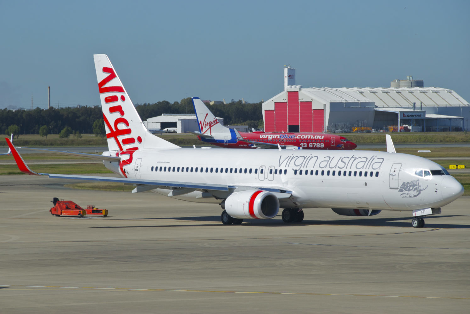
VIRGIN AUSTRALIA
While its counterpart from the United Kingdom focuses on the red, Virgin Australia puts more emphasis on white, as evidenced by its current livery. That's the reason why there's no regular red pants for the home and road jerseys. Though I applied the same design from my Virgin Atlantic concept, there are some noticeable differences other than the white helmet, such as the replacement of purple with silver and VA's own version of the Flying Lady on the sleeves.
The retro alternate is also the same as the one for Virgin Atlantic, but in blue, since the airline was originally known as Virgin Blue. I'm unable to find a clearer copy of the Flying Lady from that era, so I just used the current Flying Lady on the pants.

-
 1
1
-
-
VIRGIN ATLANTIC
The flagship airline of Virgin Group looks simplistic nowadays, so I also went with a simplistic design for the uniforms. Red and white dominate the home and road uniforms, with purple being added for accents. The sleeves feature one of the Flying Icons, a red-haired lady named Ray, holding the Union Jack. I chose Ray on the grounds that, since the Flying Icons replaced the iconic Flying Lady illustration, she is the one that closely represents the former Flying Lady.
Speaking of the Flying Lady, she's still represented on the retro alternate, where the illustration is placed on the top portion of the pants' side panels. The shoulder yoke on the alternate jersey is attributed to the shape that encloses the Virgin logo, which is also found on the airline's livery in the 2000's.
-
 1
1
-
-
Maybe it's just me, but I think cream would fit well as the primary road uniform color for the Bucks. If the Padres made sand an acceptable road uniform color, perhaps the Bucks can do the same.
-
2
-
-
On 4/28/2024 at 11:59 AM, Bomba Tomba said:
3 very different looks? We entering soccer territory now boys
Yup! For an airline that's famous for being infamous, it's just fitting to get wacky and unconventional at the uniform designations.
23 hours ago, Bomba Tomba said:PANK
Such a fine scheme, shame the merger means that these colors will soon be gone from the skies
Well, the Alaska-Hawaiian deal implied that the two airlines will still operate as separate brands, much like how Air France-KLM works ever since they merged.
17 hours ago, TheGiantsFan said:Wow, that Hawaiian Airlines set is absolutely GORGEOUS!
 My favorite part is the gradient use on the numbers for the modern white jersey
As a frequent Southwest flier, you did an amazing job with that one as well!
")
Thank you very much! I initially thought of using a single color on the front and back numbers of the white jersey, but then I realized that a purple-to-pink gradient would make things better. I didn't apply this on the purple jersey due to legibility issues, especially when viewed from, let's say, a stadium's nosebleed section.
I'd think the design of Southwest's blue socks is possible, with the rise of unusual sock designs (commonly made by Stance) for MLB City Connect uniforms.
-
HAWAIIAN AIRLINES
Hawaiian owns one of the most beautiful liveries—if not THE most beautiful one—among the world's airlines. Pualani surely is an eye-catcher and it's just fitting that she adorns the primary helmet. I'm unable to replicate the sublimated lei from the current livery, so I just picked out (no pun intended) the flower from Pualani and made a sublimated pattern. When applied on a white background, the flower pattern is in light grey, while when on a dark background, it's in a gradient. The latter is also applied to the road jersey numbers for color balance.
I went with the very first Pualani livery as my reference for the airline's throwback uniform. Note the lack of TV numbers on the jersey, as the dual curved stripes extend to the portion of the shoulder a la Houston Texans' brand new white and red jerseys. This color combo might be familiar with those who followed or witnessed the defunct World Football League, as I indeed drew inspirations from one of its teams, Southern California Sun—even if there's another team that's simply called The Hawaiians.
Since the merger of Alaska Airlines and Hawaiian Airlines will now come into fruition, I added the Oneworld logo onto the uniforms (please take note that Alaska Airlines is a Oneworld member).
-
2
-
 4
4
-
-
Hey there! First of all, these concepts looked great, especially that Nordiques set, which looks similar to what I did.
For the Skipjacks, have you tried using the old RWB scheme of the Capitals? That's what the old AHL team of the same name used in its final years. It would be a challenge, though, since there are the actual Capitals and the Rangers within the same division.
-
ETHIOPIAN AIRLINES
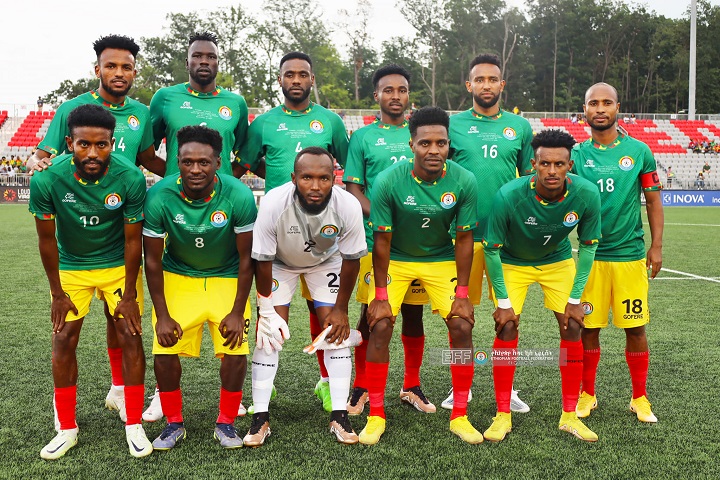
Okay, back to another full-service carrier, and this time, it's Africa's largest airline! Ethiopian's livery is yet another simple one, as it only consists of several wordmarks and the logo—a big thanks to the firm responsible for simplifying Ethiopian's logo into what it is today. Since that's the case, I resorted to the cloth pattern found on the airline's Economy Class seats, applying it on the sleeves and the pants' side panels. Speaking of the latter, Ethiopian's name in Amharic is also applied there.
Now, you might have noticed the usage of green on the dark jersey and red on the socks. Well, that's because it's the home color combo of Ethiopia's football team. I could've used yellow on the pants, but I thought it would be too much. Let me know if you want yellow pants on the home combo, though!
As for the retro design, I can't help but to describe the airline's old livery as really ancient-looking. With that said, when applied to a uniform, it's not that too old, due to the number font.
-
1
-
-
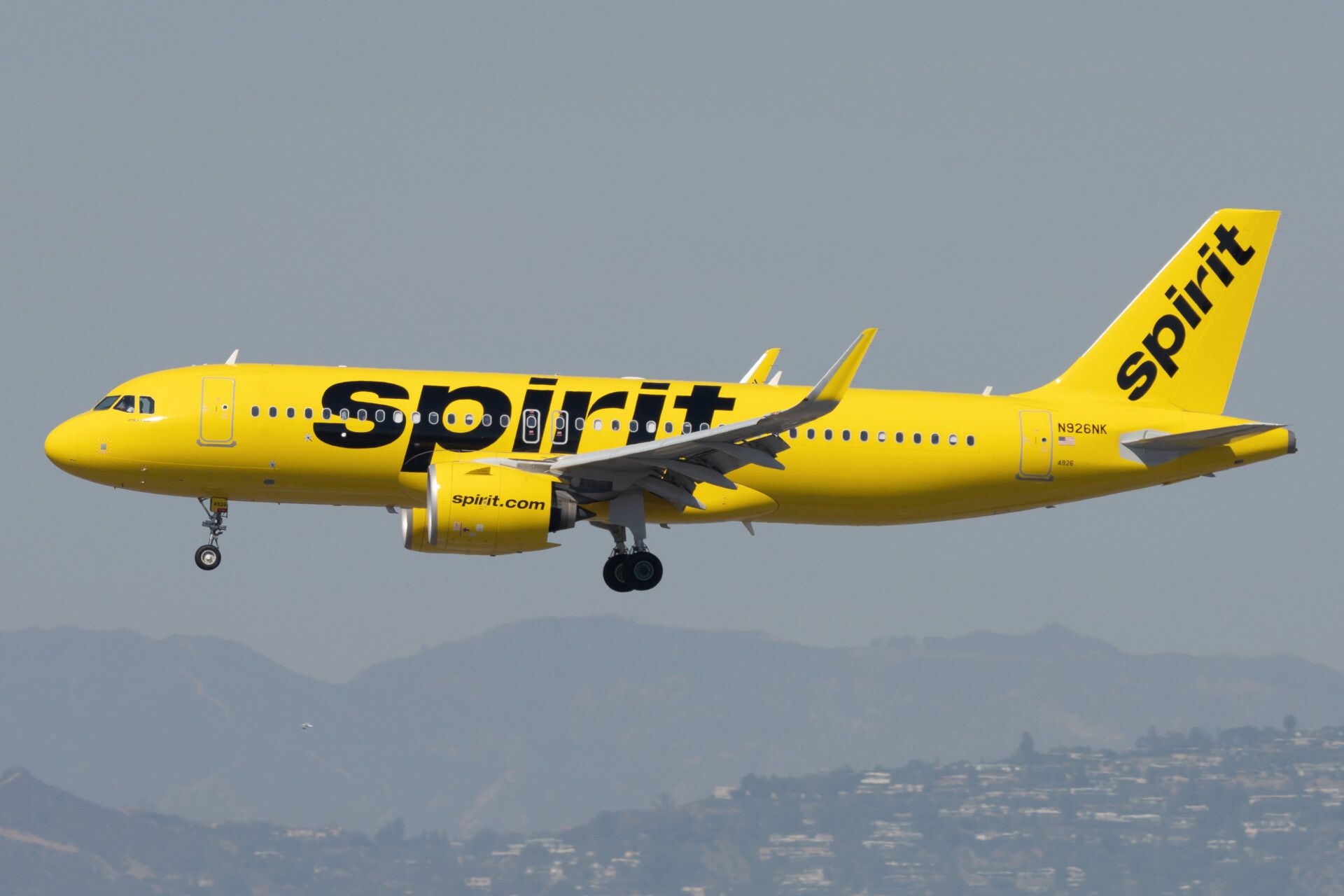
SPIRIT AIRLINES
The "school bus of a plane" really knows how to get attention, and my uniform concepts for Spirit Airlines do the same thing, perhaps. When I implied at the beginning that there will be some airlines which will get the primary-clash-alternate designation, I was not thinking then about three SEPARATE designs from the helmet all the way to the socks (well, I actually thought about that for my Thai Airways concept, but I then abandoned that idea). However, for a distinct airline like Spirit, this is the full exhaustion of the unofficial rule I just mentioned.
Starting off, we have the all-yellow uniform with touches of black. Actually, I just learned recently that Spirit tweaked its current livery where all logos no longer have the scratch pattern. By the way, that same scratch pattern is applied on the sleeves and the pant striping, so that this won't be just another all-yellow uniform.
The clash uniform tackles the much "tamer" livery—Eurowhite with significant usage of blue. I specifically applied the livery's empennage design to the shoulders, and I went with blue pants and white socks this time, to add more color to what's essentially a road uniform.
Finally, we have the livery that I mostly like, the grayscale pixel livery. I also recently realized that this is a later variant of the original pixel livery, which uses blue. The former is the basis of my alternate uniform for Spirit, as it looks more professional.
-
1
-
1
-
-
PERFECTION. Honestly, stripes are what the non-silver pants need. I also don't mind about the wordmark above the number on the front of the white and black jerseys, though.
-
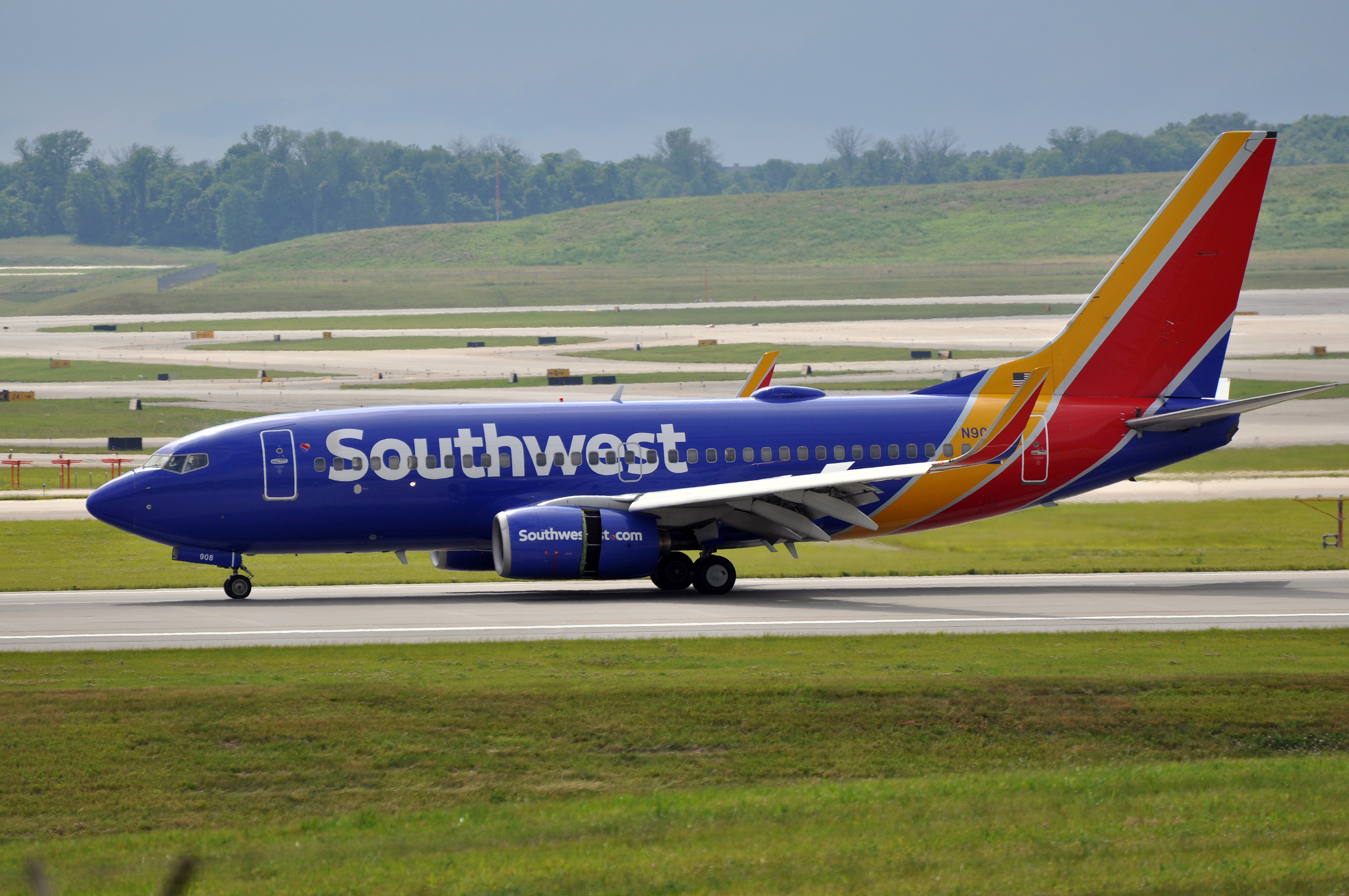
SOUTHWEST AIRLINES
Ever since looking upon Southwest Airlines, I've been quite fascinated by its unique livery history. Fast forward to the current livery, Southwest's look never disappoints. Because of that, I applied the tricolor pattern from the "Heart" logo on the helmet, the sleeves, and the socks. While both jersey and pants colors are interchangeable, all-blue is the primary home uniform combination and all-white is the primary road combo.
Since the first two uniforms are already in "Canyon Blue" (which has been in use since 2001), it's just natural that the retro uniform pays tribute to Southwest's original "Desert Gold" livery. The helmet features the iconic diagonal orientation of the wordmark and its respective striping. Numbers all over the jersey receive the vintage shadow treatment, and red is what I chose for the color of the pants, due to the red belly on the airline's first-ever livery.
-
2
-
3
-
-
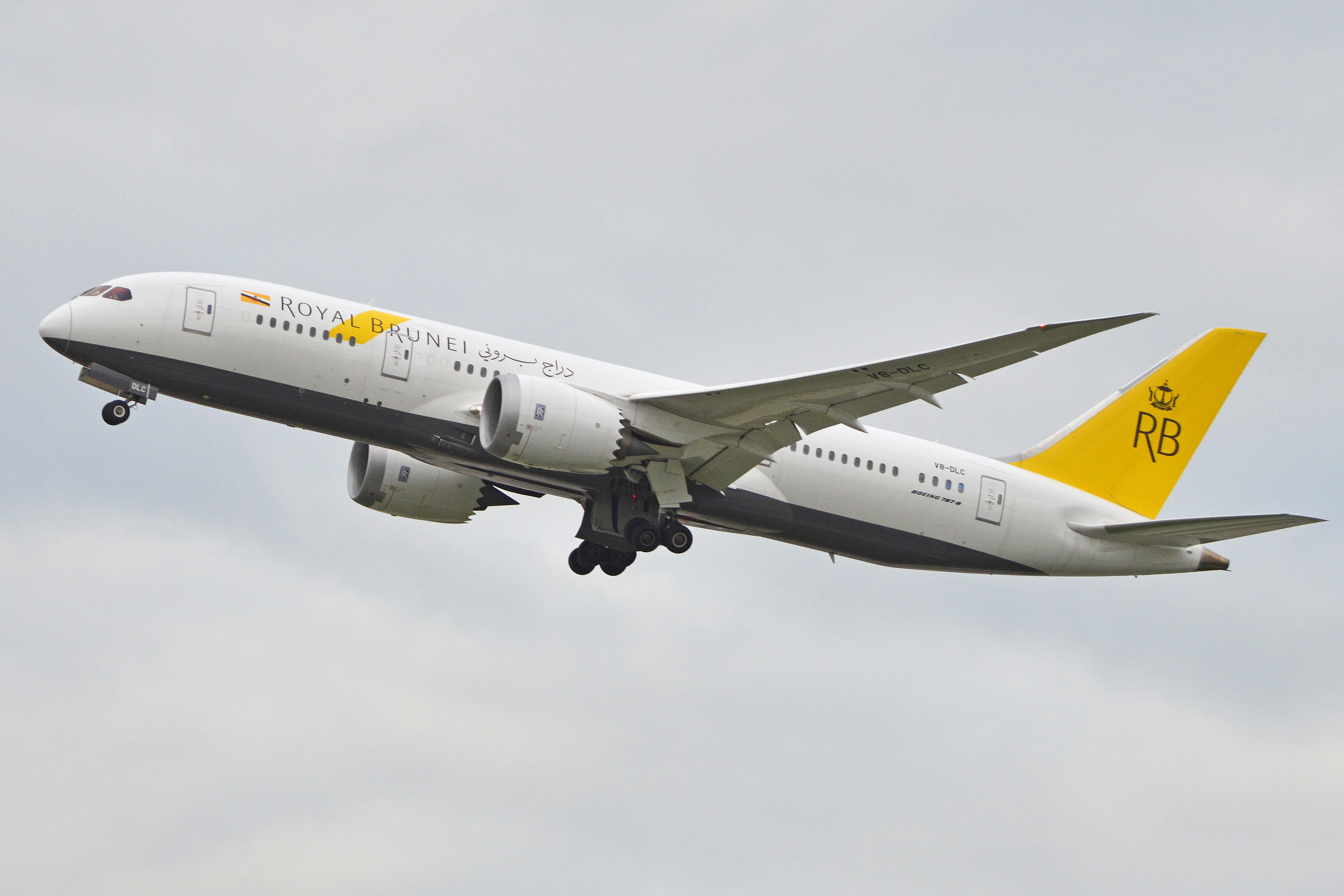
ROYAL BRUNEI AIRLINES
While I know the airline has done it for modernization purposes, I don't consider myself a fan of Royal Brunei's current look, considering how it looked like immediately before. But yeah, that wasn't a hurdle for me when I created the home and road uniform concepts for the airline.
The overall design revolves around the yellow parallelogram on the logo. From afar, it seems that both home and road uniforms look plain, but that's what I aimed for, especially with the simplistic overall look of Royal Brunei—white stripe on a yellow background, black stripe on a dark brown background (maybe anthracite or dark grey—you name it). The yellow jersey is designated as the primary (since it has been the traditional color choice of Brunei's national football team kits), while the dark brown/anthracite/dark grey one becomes the clash jersey.
Of course, with what I said earlier, I've shown some love on the previous livery, so I made it as my retro alternate uniform for the airline.
-
1
-
-
AIR CHINA
Honestly, I had some difficulty in designing a set for Air China, despite its simplistic livery that was inherited from its predecessor CAAC Airlines. Thus, I went with a straightforward approach by using the exact livery design from top to bottom.
White is my color choice for the primary uniform, with the blue one being designated as the clash jersey. Both are paired with grey pants to mimic the belly color of Air China's fleet. There's a specific reason why I chose red to be the number color, and that is to simulate what's on the empennage, where the airline logo is the only red element on the livery, aside from the Chinese flag.
Since the airline is China's flag carrier, I had to make an alternate uniform that really speaks of the Chinese culture. With that, the alternate uniform draws inspiration from the Red Phoenix livery, which relies heavily on red and gold. Except for the white helmet, this uniform is all-red from top to bottom. And if you look closer, the shade of red that's used on the helmet decals is darker in contrast to the usual red from the regular uniforms.
-
4
-
-
On 4/11/2024 at 9:18 AM, edjb93 said:
Thanks for the appreciation, @TheGiantsFan! I'll look onto your suggestions later on and think about those.
I have decided to retain what I have for Emirates, Delta, and JAL, after testing out larger helmet decals. I don't even wanna make the decals outrageously large like what's done for MOST college football teams nowadays...

Regardless though, thanks for all the comments in this series so far. I fully appreciate it.
-
1
-
-
SHANGHAI AIRLINES
Even if it's under China Eastern, Shanghai Airlines still maintains it distinct look. The curves found on the livery are inspired by the crane that has been the airline's identifier from the beginning. This design pattern extends from the sleeves to the front of the jersey, while on the pants, it extends all the way to the back. Since the belly of the airline's current paint job is in grey, it's just right to have only one option for the pants.
It's quite difficult to find high-quality images of the airline's earliest livery, and the one I found is one of the best I can find. This retro livery doesn't get any simpler than that, so I decided to give the throwback uniform a Penn State treatment. The striping on the pants and the helmet are slightly wider compared to the one used by the Nittany Lions, then I colored the collar and the sleeve cuffs white, just like how Penn State football looked like in the 2000s.
-
4
-
-
SCANDINAVIAN AIRLINES
SAS has looked even more simpler with its current livery—an evolution of the 1998 look. With that in mind, I also gave the home and road uniforms a simple look. To add a little bit of color, the minimalist banner made from the flags of Norway, Sweden, and Denmark is applied on the front of the jersey and the pants' side panels.
Instead of white, I instead used an extra-light shade of silver to be the road uniform color, with the SAS wordmark colored in a darker tone to mimic its application on the fuselage. On a blue background, however, the wordmark is colored in white. Both home and road jerseys feature blue sleeves to make it reminiscent of the paint job on the aircraft's empennage. On the back of the jersey, the airline's original emblem is added.
As a tribute to its founding membership in the Star Alliance, I went with the airline's livery from much of the 80s until 1998. During my childhood, this looks is what reminds me more about SAS. I initially wanted to apply the stripes on the helmet, below the SAS logo, but I thought it would be overkill, so I limited the stripes to the rest of the uniform except the helmet.
-
2
-
2
-
-
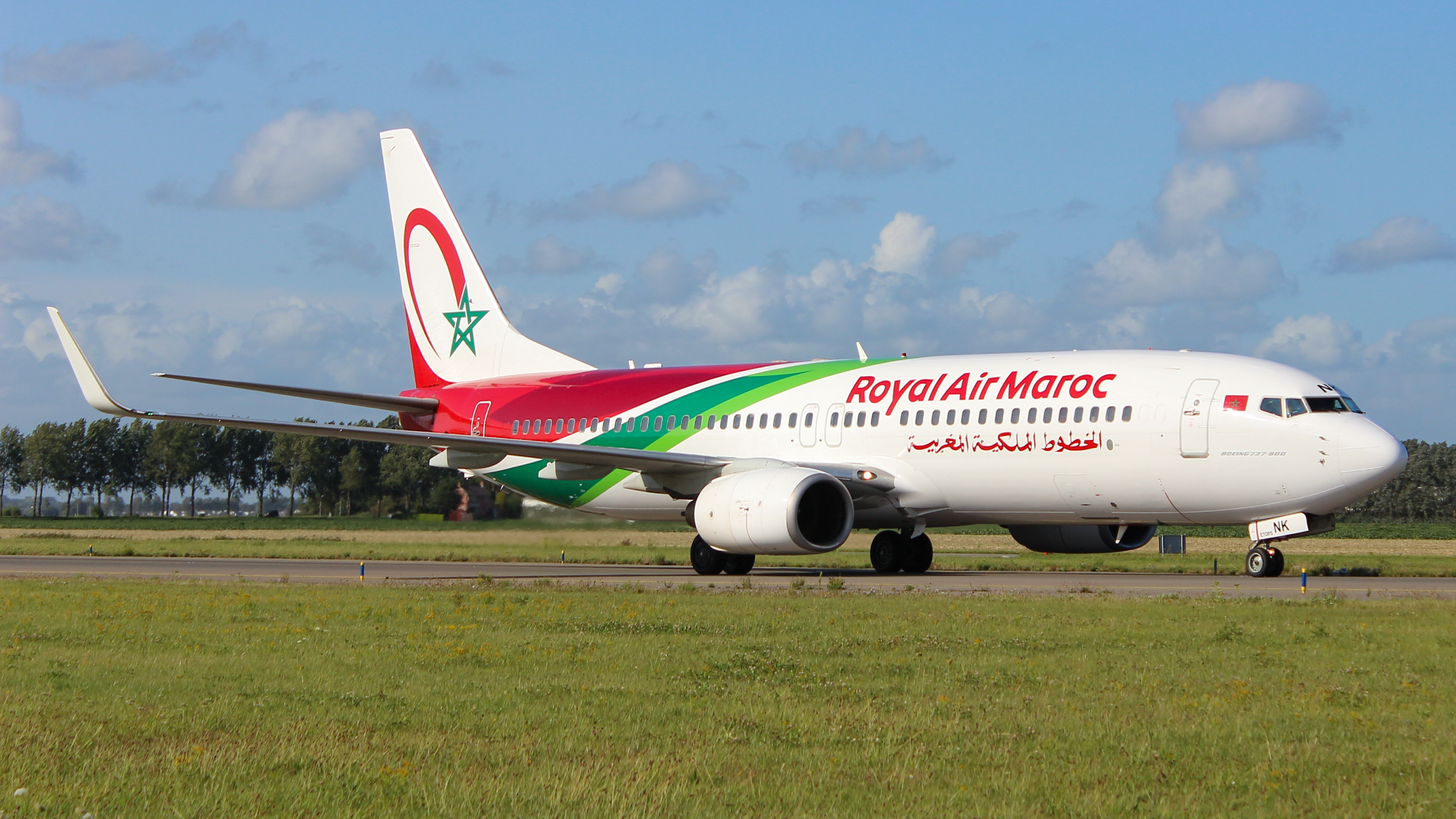
ROYAL AIR MAROC
Here we have the first entry from Africa in this series, and its current livery looks visually striking, compared to the ones that preceded it. I applied that very same theme, specifically on the shoulders and the ends of the pants.
The throwback uniform is very straightforward, but the "RAM" tail logo applied on the helmet is the star (no pun intended) of the show.
-
Thanks for the appreciation, @TheGiantsFan! I'll look onto your suggestions later on and think about those.
-
2
-
-
OMAN AIR
Oneworld's newest member airline is doing its best to become one of the Middle East's best, just by looking at its current livery. Though the design features lots of curves, I went with a traditional straight line striping for the home and road uniforms, as it provided a great opportunity for me to take advantage of the striping pattern being translated onto a football uniform.
Talking about the airline's old livery, I immediately thought that a New York Jets-esque uniform will suit. And so I did just that, making a white-on-white retro uniform with red helmet and socks.
-
1
-
1
-
-
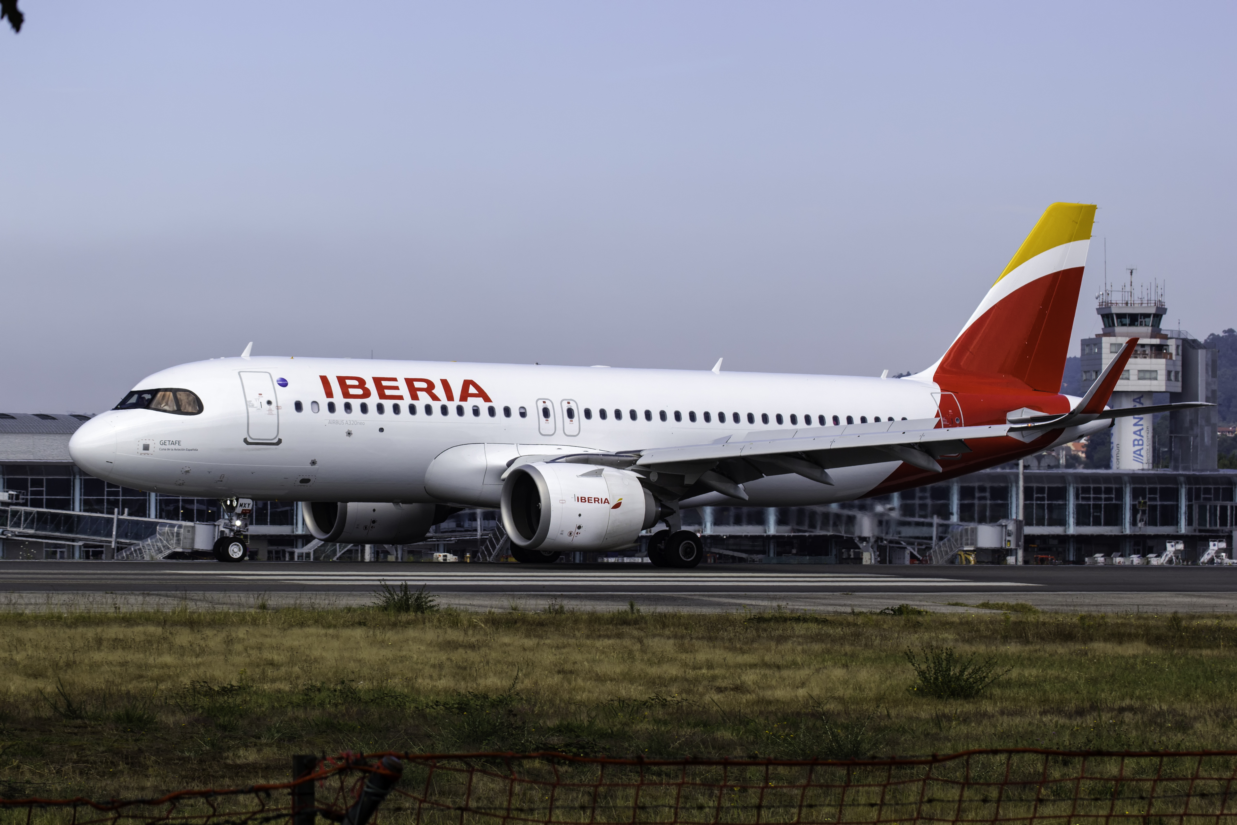
IBERIA
From one Spanish-speaking country to another, we proceed to Iberia, in which the logo design itself is used as the striping all over the home and road uniforms. It's another straightforward concept since the livery that comes with the current logo is also such. I chose mono-color combos as the primary uniform combinations, but these can be interchanged as they please.
However, the current livery's predecessor is anything but, as I can compare it to the Saul Bass-designed United Airlines livery. It's unbelievable that Iberia's old livery lasted until 2013. Anyway, the striping extends all the way to the front of the jersey, with the iconic curvature being applied as well, instead of just having straight lines. On the pants, "Lineas Aereas de España" is located inside the red portion of the striping.
-
1
-
1
-
-
14 hours ago, Bomba Tomba said:
Flying Elvis' Mexican cousin?
More like an ancestor, since Flying Elvis came into existence in 1994, while the Aztec head logo, which has multiple iterations, was unveiled earlier.
-
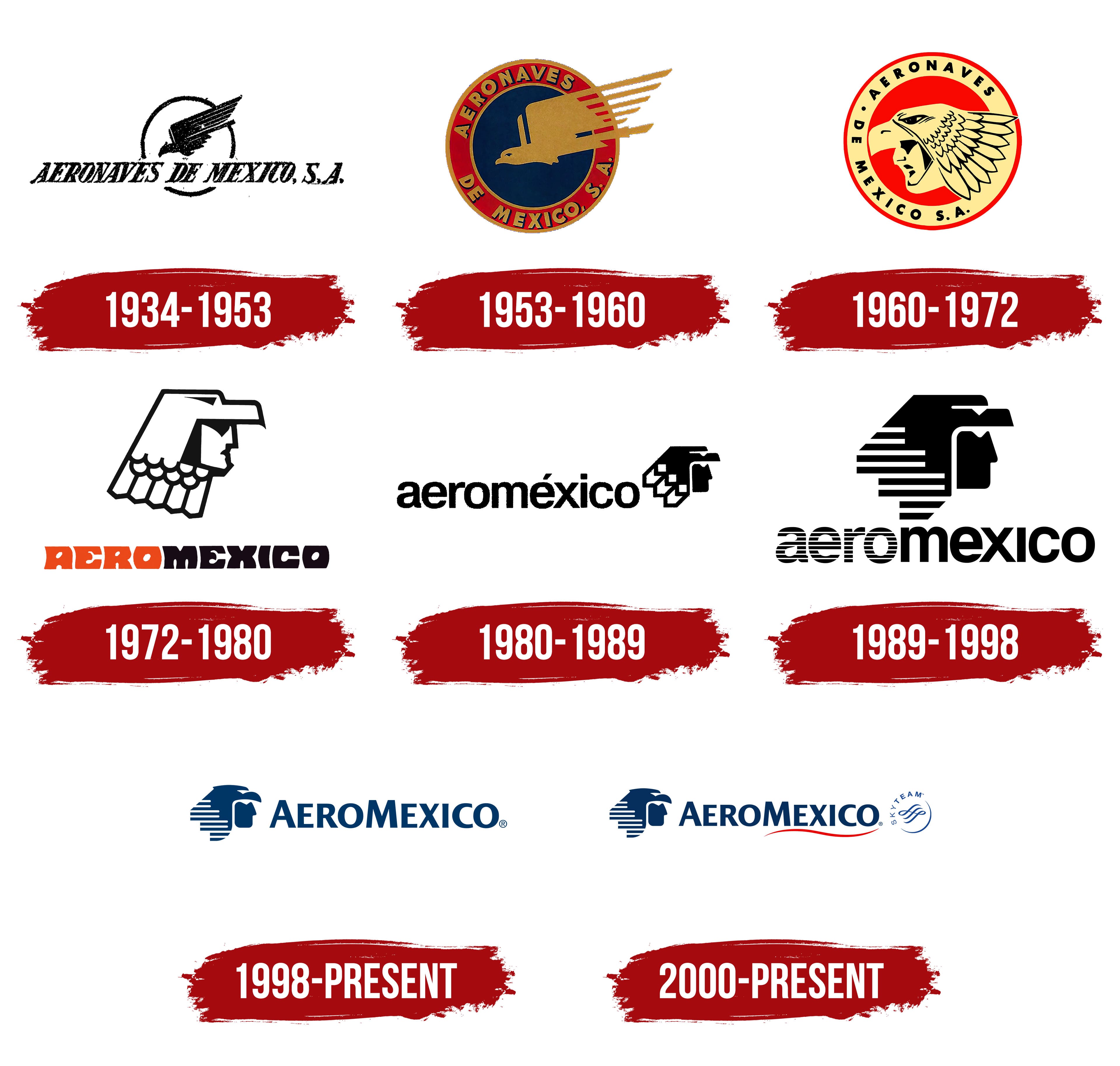
AEROMÉXICO
The home and road uniforms here are based from the current livery, which features a touch of light blue that's prominent on the airline's regional brand. Both the shoulder yoke and the hem on the pants are in a contrasting color for each uniform variant to mimic the color separation between the tail and the entire fuselage.
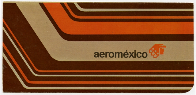
Before navy blue and red, orange was the main color of Aeroméxico, and the color choice really screams the vibrancy of the 70s. For the retro alternate, I merged the two livery designs during the orange era: the one with a detailed Aztec logo and thinner cheatlines, and the other with thicker cheatlines. The striping on the pants and the sleeves were taken from a particular ticket jacket from the same era. On top of all of these, both the jersey and the pants are colored grey to mimic the bare metal fuselage utilized by the airline for a long time.
-
4
-
-
TURKISH AIRLINES
Despite having a new logo (not really new because the font for wordmark is the only significant change) since 2018, Turkish Airlines still uses the 2010 livery. In this series, though, I used both of them for the uniforms. Logos aside, the tulip alone is a nice touch. Both white and grey pants can be used on either red or white jerseys, similar to what I did with my United Airlines concept. For the sake of color balance, I used black for the numbers, NOB, and the airline's script logo.
The "pyjama" livery takes flight through the retro alternate uniform. For this one, the Turkish translation of the airline's name is featured on the front of the jersey, with the English version being used at the back bumper of the helmet.
-
1
-
-
3 hours ago, FCMacbeth said:
Yup, I predicted that it would come eventually as soon as you reached the low-budget airline section.
Though, I might ask just how different is it from AirAsia MY to AirAsia Phillippines.
I think that there's nothing different when it comes to service. So far, I had only one round-trip experience with PH AirAsia, and it's quite good.
I'll most likely go back to doing concepts for full-service carriers after this pair of LCCs, then it will take a while to tackle more of them. I haven't even covered any airline from Africa or South America, so stay tuned for the next ones!

-
AIRASIA
This is a request by @FCMacbeth, along with Malaysia Airlines—which I already made. Before the whole AirAsia X deal is fully implemented, this is the perfect time to do an AirAsia concept, and since the airline has many subsidiaries across Asia—my home country Philippines included—I'll focus on the main brand from Malaysia.
For the home and road uniforms, I went with a New York Jets-styled design but "in steroids", because I based it from the airline's livery since 2012. You might wonder why I implied "in steroids". That's because the shoulder striping is enlarged, and the same jersey design can be found on the hem of the pants.
The alternate uniform takes us back to the 1990s, when AirAsia was a full-service airline owned by the Malaysian government. Before red took over, blue was the primary color used by the airline, and its corresponding livery back then did not scream "low-cost airline".
-
1
-


_Boeing_737-7FE_at_Melbourne_Airport.jpg)
NBA X MLB Uniforms 18/30 Timberwolves Full Set Added
in Concepts
Posted
Oh yeah, I forgot to mention that if ever cream becomes the primary road uniform color, then you might have to consider any of the Bucks' blue uniforms as the "City" alternate.
But I gotta say, what an awesome job you're doing on all these concepts.