

edjb93
-
Posts
991 -
Joined
-
Last visited
-
Days Won
8
Posts posted by edjb93
-
-
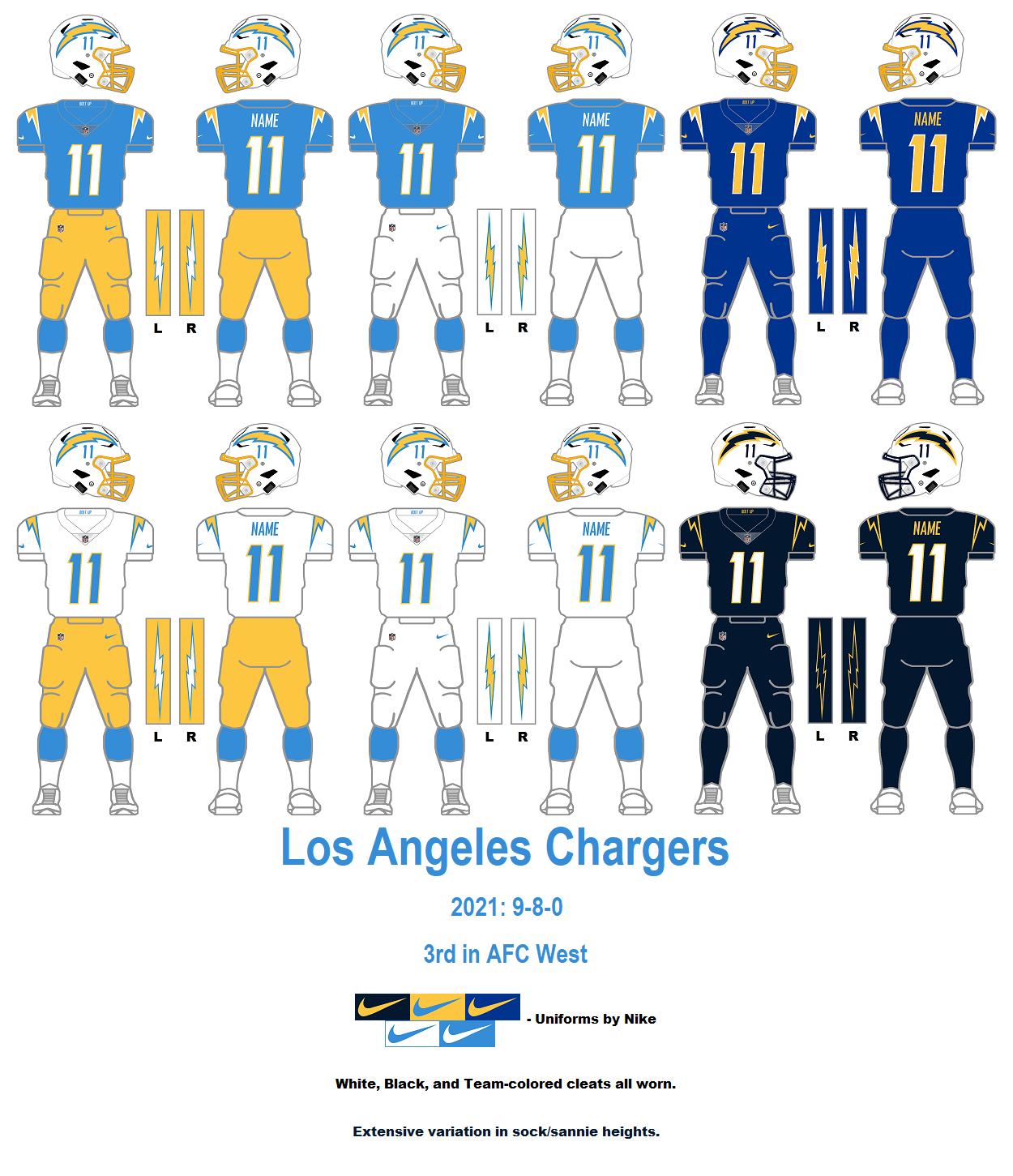
CEBU PACIFIC
The first low-cost carrier in this series, Cebu Pacific stands out for its vibrant livery, as well as the one that preceded it. I can still recall my not-so-great experience with this airline, but I'll leave it up to that.
Anyway, yellow is the primary color for both home and road uniforms, with lots of streaks and curves applied from top to bottom. I planned to have yellow and white socks, but for the sake of color balance, I went with blue socks. Think of it in the same situation as the Los Angeles Chargers.
For the throwback, I decided against an all-white uniform as a tribute to Cebu Pacific's original livery, since the first two uniforms already have a fair share of white. I went with blue jerseys and blue socks instead, to complement the white helmet and white pants. This is, in part, due to a former special livery with a Manila vibe.

-
 2
2
-
-
SWISS INTERNATIONAL AIR LINES
Swiss has one of the most straightforward liveries among the world's airlines, as its primary design element is the cross from Switzerland's flag. That alone is sufficient enough for Swiss' home and road uniform concepts. Imagine a football version of the Detroit Red Wings' uniforms, but with white pants.
For the alternate uniform, it's just right to pay tribute to Swissair, and I went with the defunct carrier's second-to-last livery due to the black cheatlines that separated the white and bare-metal halves of the fuselage's paint job.
-
2
-
-
STARLUX AIRLINES
Taiwan's newest airline looked ultra elegant from the get-go, due to the colors that were chosen. I tried my best to give it justice with the uniform concepts I made.
Since Starlux is brand-spanking new—founded in 2018 and started operations in the worst time possible when COVID-19 was in its hard launch in 2020—there will be no throwback alternate and instead, I made a TRUE alternate uniform. All three colorways—white, anthracite, and gold—feature the same wavy design from the airline's livery, which is applied on the helmet and the sleeves.
-
4
-
 1
1
-
-
CHINA EASTERN AIRLINES
While China Eastern's current livery has left nothing to be desired—joining the likes of Japan Airlines for having a plain all-white livery—it at least paid its dividends with an even distribution of red and blue all throughout the logos placed on the aircraft. That's the same theme I applied onto my home and road uniform concepts for the airline.
Yes, I know that the current livery doesn't have cheatlines, but I went with a red-and-blue striping applied on the jersey, the pants, and the socks. The white uniform will be worn primarily at home, with the blue uniform on the road. Now, why blue? Just like some of my concepts in this particular series, I based it from the airline's female flight attendant uniforms, which is also the reason behind the red belt on both home and road uniforms.
The alternate uniform in this concept set is taken from the airline's retro livery, which for some reason, includes gold striping. I chose red as the jersey color since it seemed to be the dominant color.
-
2
-
-
1 hour ago, Bomba Tomba said:
Hold up, they aren't called "Air Jordan"?
I see what you did there...

Seriously speaking, the airline was formed by a royal decree, thus the "royal" moniker.

-
ROYAL JORDANIAN AIRLINES
Royal Jordanian surely has a bold livery, and I'm even more amazed that the overall design has been used all the way back in the mid-80s! Honestly, I thought it was unveiled in the 90s or the 2000s. So much for that, I basically translated that livery into a football uniform for the home version, while in the corresponding white jersey, I left the sleeves as is, as a homage to the airline's Oneworld livery.
The "Alia" branding of Royal Jordanian is preserved with a retro livery painted on one of the airline's A321 aircraft. While the uniform I designed is pretty straightforward, I spiced it up a bit by pairing the white jersey with red pants instead of grey pants. The helmet features different decals on each side: the left side features the "Alia" name in Arabic, while the right side features the same name but in English.
-
2
-
1
-
 1
1
-
-
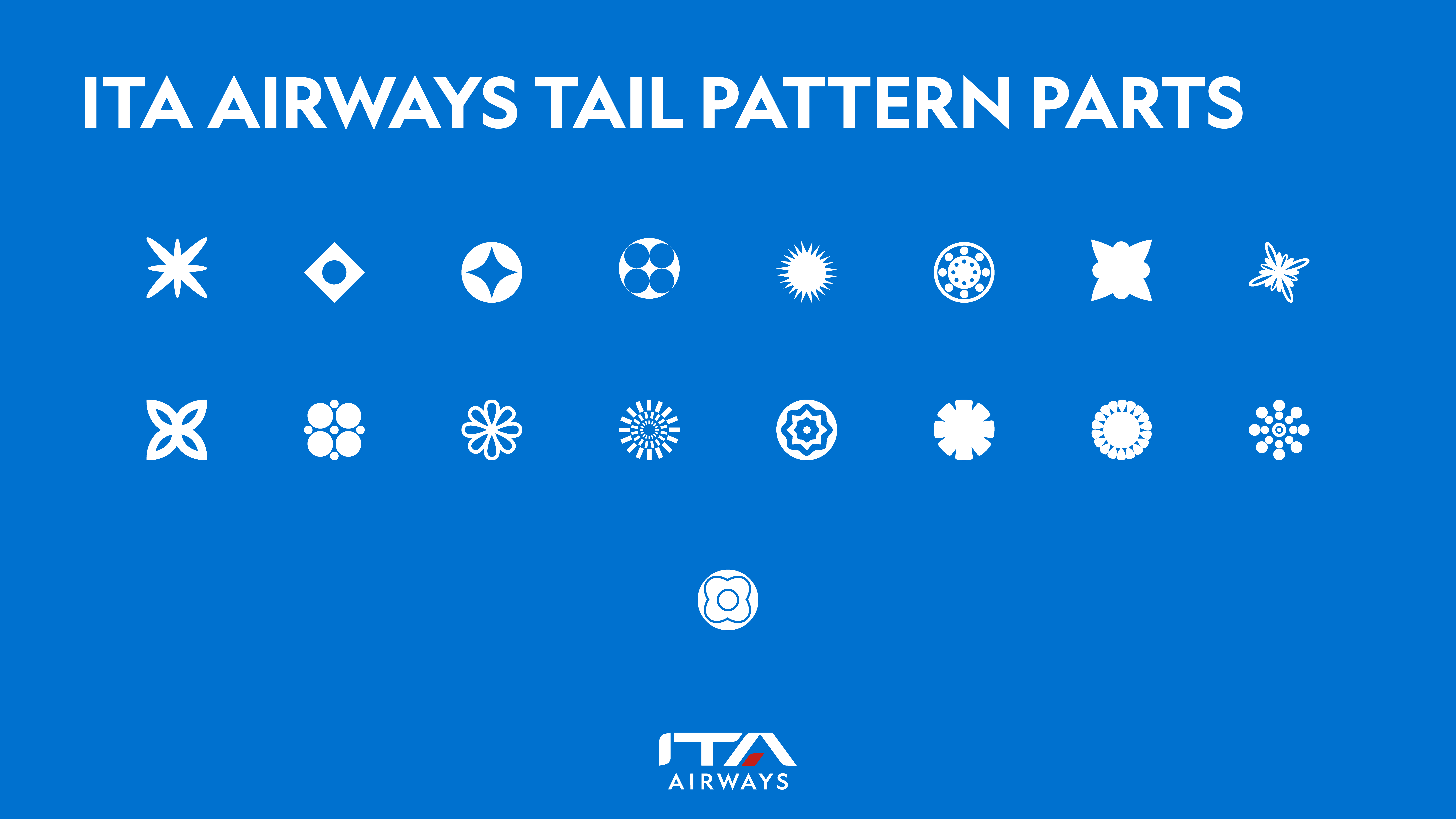
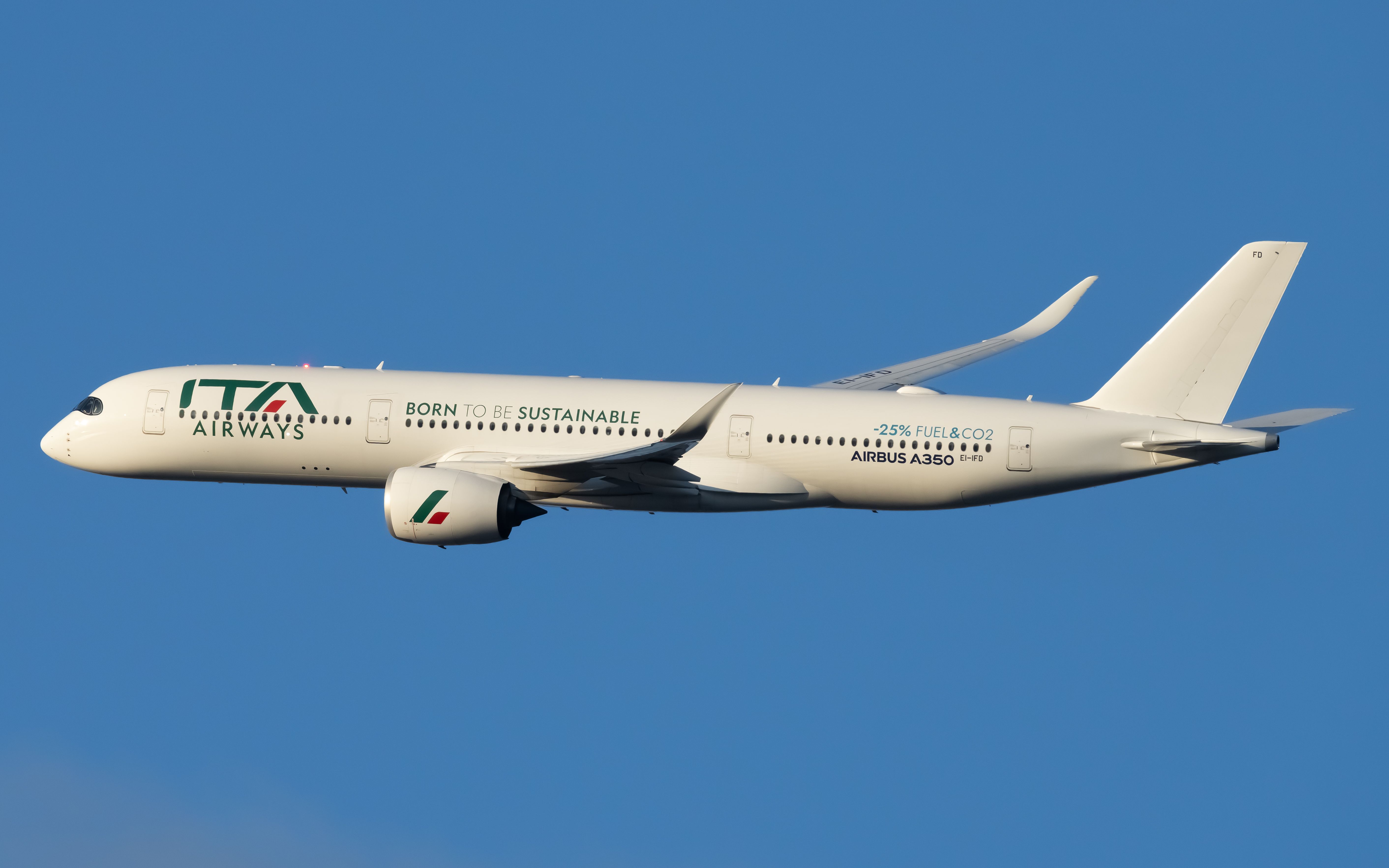
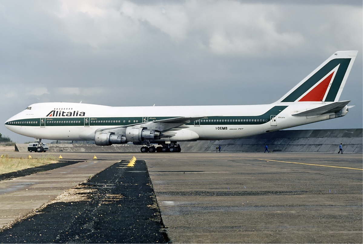
ITA AIRWAYS
When I first saw the livery of Italy's new flag carrier, I thought it took a page from the country's national football team. This is necessary since the European Commission barred Italy from recycling the Alitalia brand, even if it's owned by the people behind ITA Airways.
So much for that, I went with a primary-clash-alternate designation for my 3 concept uniforms for the airline, starting with an all-blue uniform—an obvious homage to the Italian football team—but I did not make it blue from head to toe, due to the white engine nacelles. Both the helmet and the jersey feature a pattern of various shapes found on the tail. Next is an all-white uniform—even the helmet is also white—with the same theme as the blue uniform. This was done as a tribute to the airline's white liveries: the "Born in 2021", the "Born to be Sustainable", and the special half-blue, half-white livery.
While the Alitalia brand could not be used for now, the iconic brand remains alive in my alternate uniform. I specifically picked the 1969 version of the former Italian flag carrier's iconic livery, since it was the first iteration of what would become one of the signature looks in the skies. The cheatline design is placed in front of the jersey and on the pants' side panels, while a large version of Alitalia's tail logo adorns both sides of the helmet.
-
3
-
-
@TrueYankee26, thanks for indirectly suggesting ITA Airways!

I'm actually targeting either a SkyTeam member airline or a non-alliance member as my next concept.
-
1
-
-
SRILANKAN AIRLINES
I got fascinated with SriLankan Airlines because it formerly served flights to Manila, but this route has since been terminated. Recently, I watched a latest flight review of the airline—you can check the reviews on YouTube by yourselves.
Anyway, about the current livery, it truly reflected its 10-year partnership with Emirates, just by looking at the similar typography, the predominantly white paint job, and the way the logo is designed especially when placed on the tail. I went with blue as the primary color for the uniforms since it's heavily used on the airline's website, as well as the new belly design promoting Sri Lanka's tourism. The main design element that's found throughout the uniform is the current peacock logo, with its curves being a perfect fit. Since I don't want the home and road uniforms to be just two blues and white, I added the colors from the logo as an accent.
Before the rebrand in 1998, the airline was known as Air Lanka, and it was known for its peacock logo called "Dandu Monara". The livery that came with the airline's establishment following the demise of the country's former flag carrier Air Ceylon was quite simple, utilizing red and white. My retro uniform concept is pretty straightforward, using the curves on the empennage leading to the tail as striping on the sleeves and the pants.
-
1
-
1
-
-
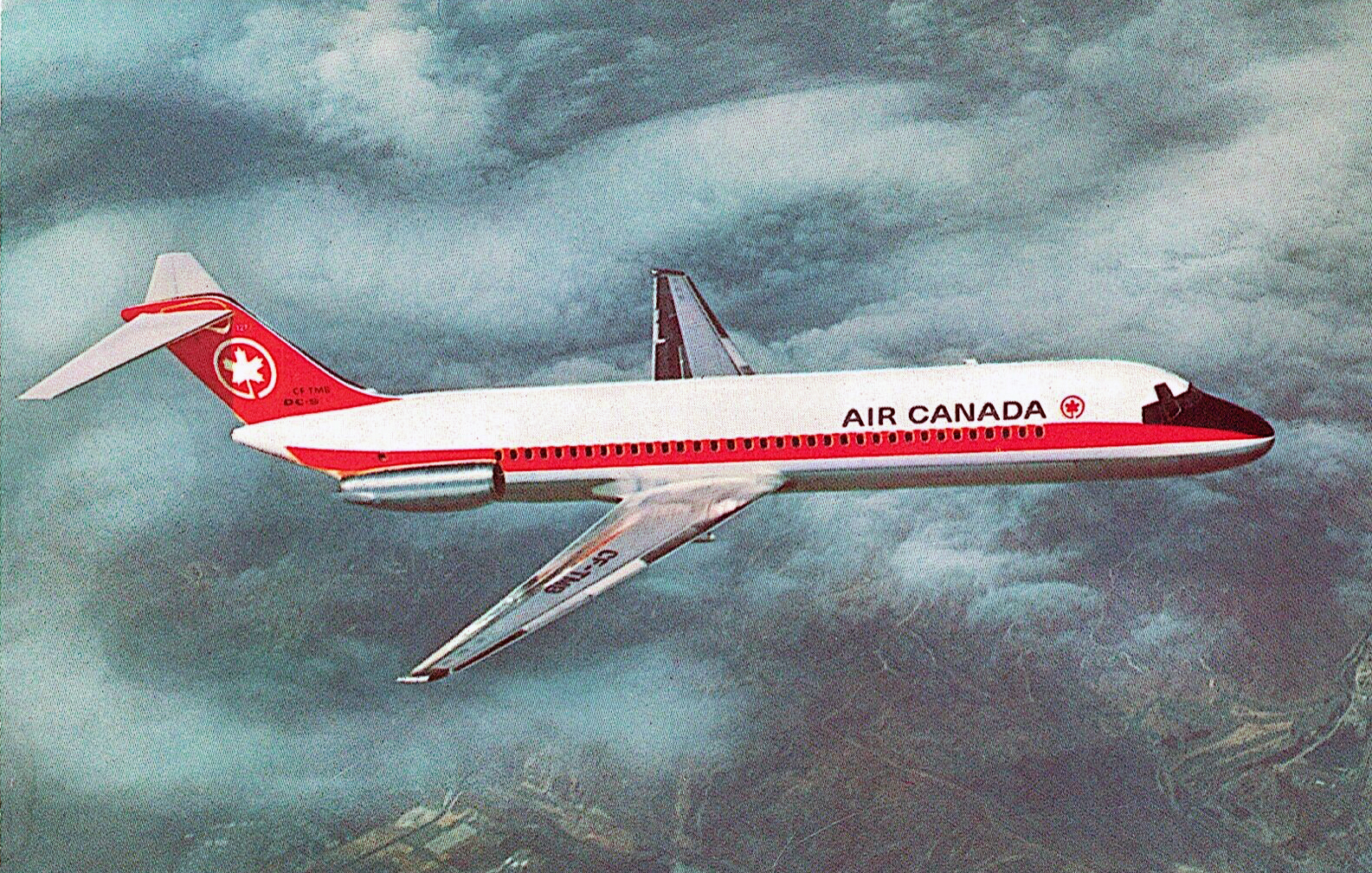
AIR CANADA
I'm actually a fan of Air Canada's black-tailed livery, may it be the previous version (some images imply it's dark green but it's still black to me) or the current one with the "mask" painted on the cockpit windows.
The addition of the "mask" is a cool feature of the current regular paint scheme for the flag carrier of Canada, and therefore that's my focus on designing the home and road uniforms. Instead of making it pop out by using red on a black background or black on white, I went with sublimated colors, so that the simplicity of both uniforms is highlighted.
My choice for the throwback alternate would be the livery which featured a black notch on the aircraft's nose, which explains why I colored the helmet facemask black. And since it's Canada, I got to make the jersey red. In the thinking stages, I pondered on making a red version of the home/road jersey, but I eventually settled on using that color for the throwback.
-
6
-
1
-
-
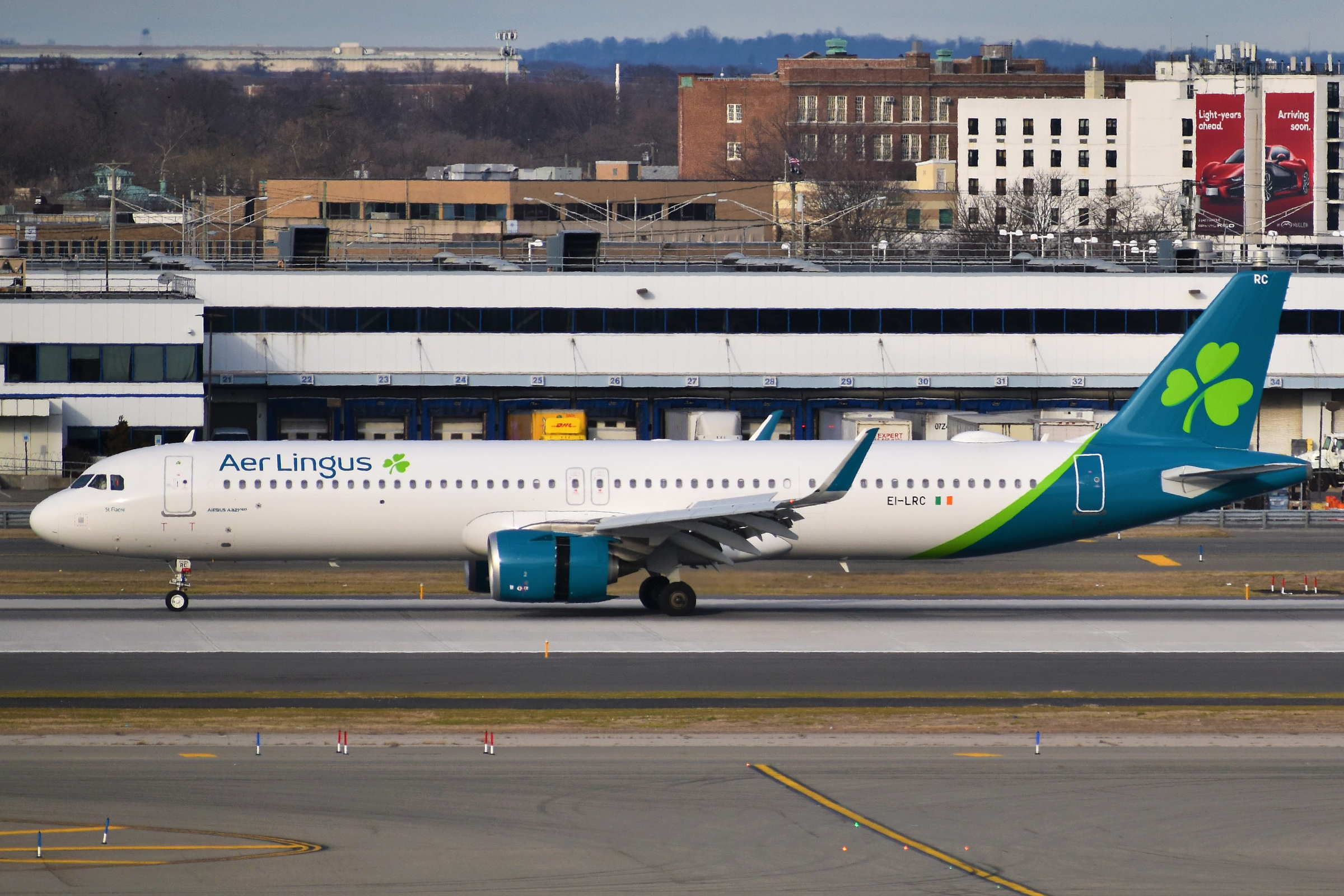
AER LINGUS
Ireland's flag carrier unveiled its current livery in 2019, and I gotta say, it looks like a green version of Qantas' current livery due to the same design treatment on its empennage. While it looks clean, it might have lost it's Irish-ness aside from the shamrocks found on the aircraft. With this livery in mind, I went with a random curvy design inspired by the design on the empennage.
While I mentioned that the current livery looks like Qantas, the airline's older livery is essentially a green version of KLM's older livery. The cheatlines from that particular livery become the main design for my retro alternate, with the side panel striping on the pants having the horizontal orientation instead of vertical, to match every other application of the cheatlines throughout the entire uniform.
-
3
-
-
GULF AIR
There's no shortage of gold—the color, that is—on the liveries of Gulf Air, especially the one that preceded the current livery. I wanted the home and road uniforms to have the similar color treatment as Georgia Tech's uniforms, but I later realized that designing with the current livery in mind will be challenging. This resulted to a gold jersey-tan pants home combo and an all-white road combo, in which both feature tan-colored shoulder yokes.
During the airline's 70th anniversary, Gulf Air unveiled an inaccurate version of its retro livery, where gold replaced all applications of the eggplant color—or is it brown? This time, I specifically picked the later version of the airline's tricolor livery, with the correct colors.
-
2
-
2
-
-
On 2/17/2024 at 6:10 PM, Coiler said:
Weird request: You've done famous airlines, now for an infamous one:
Aerosucre, a Colombian cargo line that has lost two-thirds of every plane it has ever owned to crashes.
I didn't even know this airline until you said it. Now, I'm sorry in advance if I won't cover it since I'm not doing cargo airlines in this topic. Good suggestion, though.
-
1
-
-
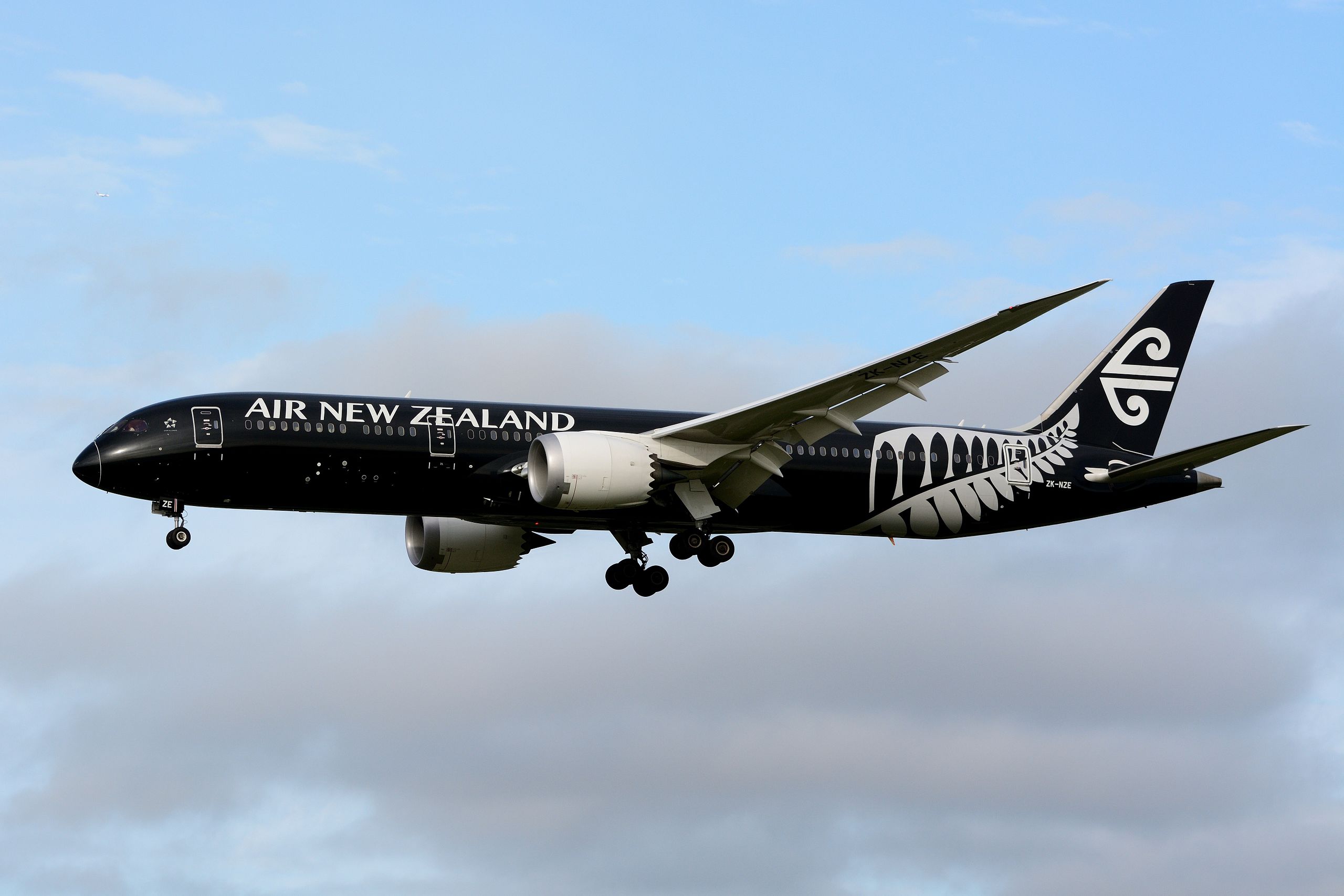
AIR NEW ZEALAND
Nothing can be simpler than using just two colors on an airline livery—let alone, if those two colors are black and white. But Air New Zealand's current liveries proved that a black-and-white look doesn't have to be boring, and it's all because of the fern, which is featured on the sleeves of my home and road uniform concepts for the airline.
The throwback livery I chose for the alternate is the Pacific Wave livery. I went with something I've never done before in this series: a gradient jersey. Instead of applying that gradient on the helmet, I thought it would be better if it's applied on a jersey. On top of that, the Pacific Wave is heavily featured on both the sleeves and the pants.
-
1
-
1
-
-
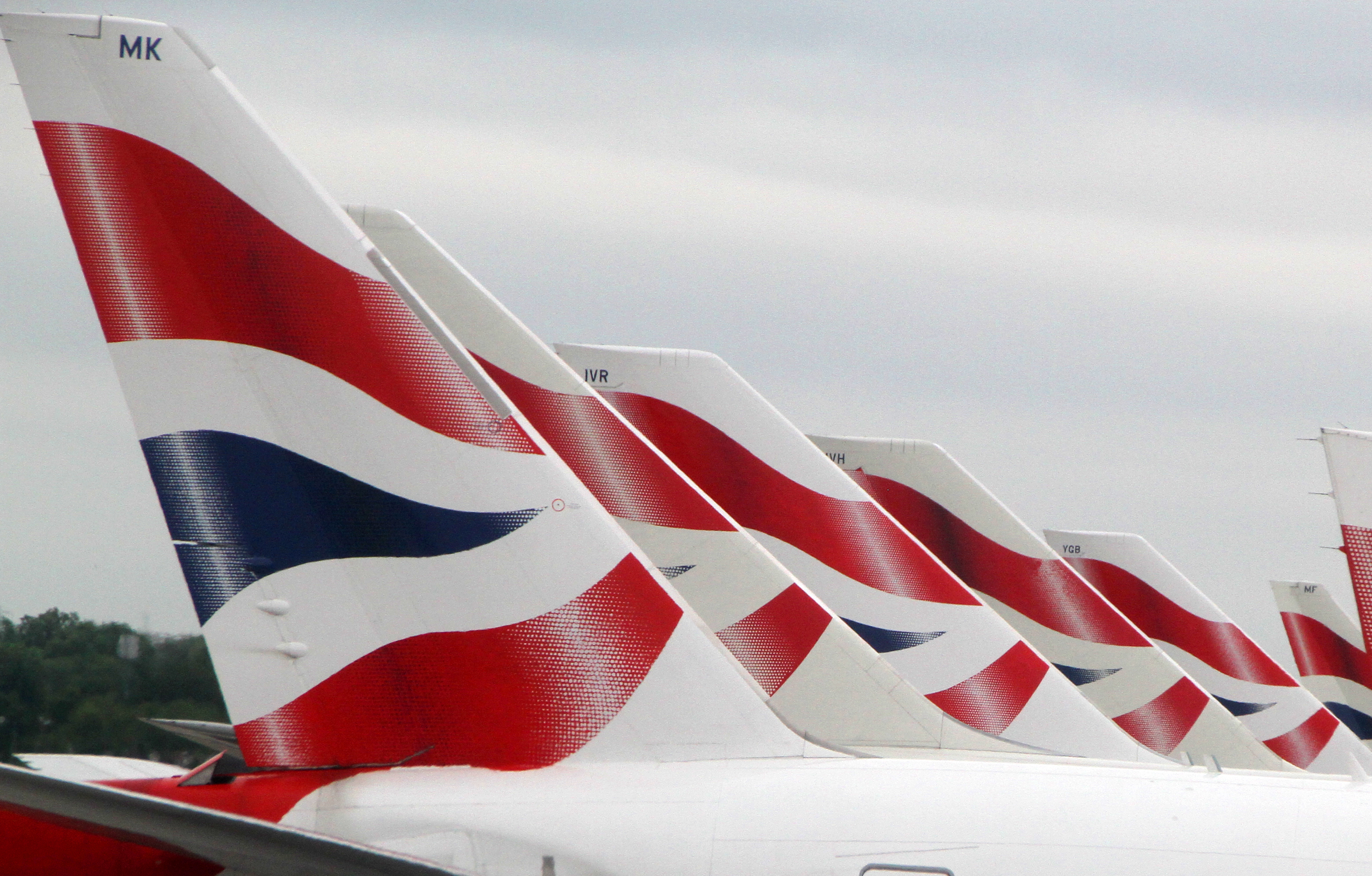
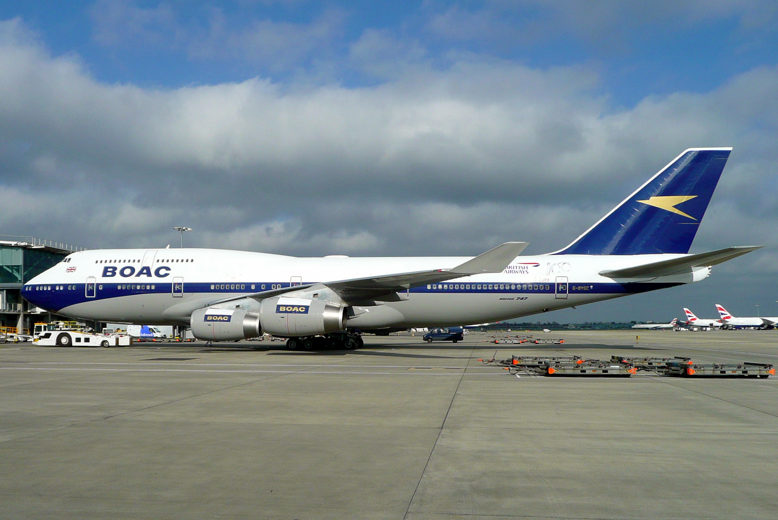
BRITISH AIRWAYS
My home and road concepts for BA center on one theme: the Chatham Dockyard Union flag on the airline's current livery—from the collar to the socks and all the way to the pants' side panels. The sleeves also follow the theme, thus the blue sleeves regardless of the jersey's main color. Those same sleeves feature BA's coat of arms, which can also be found on the pants. By the way, both the home and road uniforms are inspired by @tBBP's work in 2006.
With all the options for the throwback uniform, I eventually settled on the BOAC livery, since it's the only retro livery that doesn't feature red. I didn't add TV numbers on the shoulders to evoke the retro feels of this particular uniform.
-
1
-
-
On 3/2/2024 at 3:22 AM, FrutigerAero said:
I'll be flying Vietnam this spring, maybe I'll show this to the flight attendants and tell them they need to play for my team.
Wow, how thoughtful! I mean, it would be an honor to showcase that to the FAs of Vietnam Airlines. I'll be delighted to know their reactions to the concept I made, if ever you'll show these to them.

-
3 hours ago, Bomba Tomba said:
Jaguars if they ditched the black!
Yes, exactly.

-
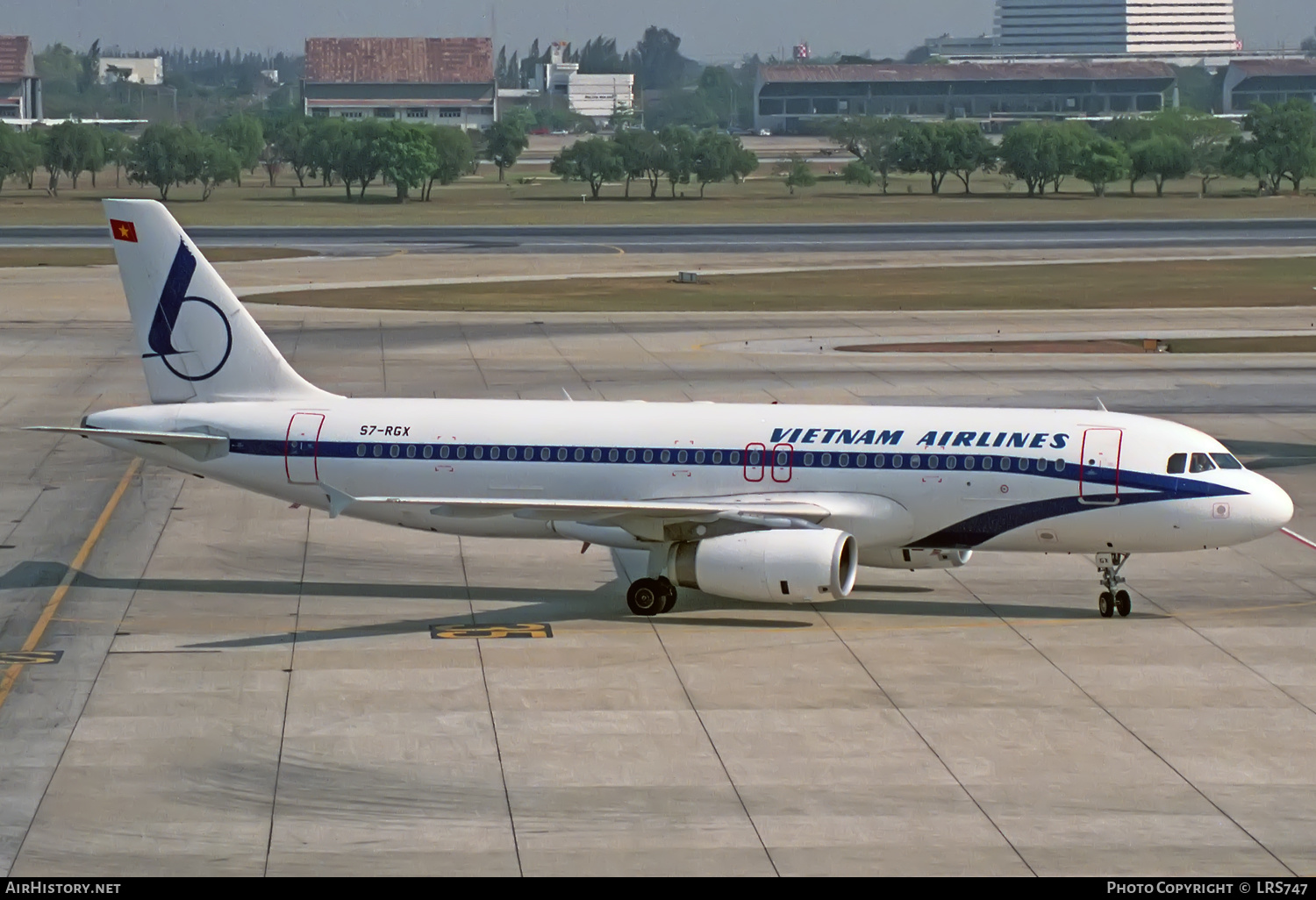
VIETNAM AIRLINES
In my opinion, Vietnam Airlines upgraded big time ever since adopting the lotus as its logo. From its initial look in the early 2000's up to its current iteration, VN's lotus livery looks great—although I prefer the latter since the former looked darker for my taste. Truth be told, this is one of the first airlines that I looked upon as a possibility to have a football uniform set based on the livery.
The curved design on the belly is the focal point on the primary uniforms, being placed on the sleeve cuffs and the hems of the pants. Just like the real thing, the lotus logo on the helmet is enlarged and slanted.
Before the lotus logo was unveiled, Vietnam Airlines looked really vintage, regardless of the overall livery. While there are two that instantly come to mind, there is one obscure livery that caught my eye. I don't know if it resembles a bird's beak, but that particular livery's cheatlines are so unique. Thus, I added that on the sleeves, while the rest of the uniform is pretty basic.
-
1
-
1
-
-
15 minutes ago, udubfan19 said:
Akron (zips officially but reference kangaroos in their logos) is the only American team off the top of my head
Correction, there are two prominent teams, Akron and UMKC, although TruColor.net also lists two more colleges/universities.
-
QANTAS
The addition of silver to Qantas' current livery is indeed a nice touch, thus making the airline look sleeker. With that, I applied the same principle onto the home and road uniform concepts. Few tidbits that I want to highlight are the shiny silver outlines on the front and back numbers, and the metallic finish of the helmet facemasks.
For the alternate, I turned to the airline's regional arm QantasLink, which unveiled a very special livery for its very first Airbus A220. Known as "Minyma Kutjara Tjukurpa", that green-heavy livery is the latest addition to the numerous Indigenous Australian art liveries throughout Qantas' history. A portion of the artwork can be found on the shoulders and the sleeves of the jersey.
-
3
-
-
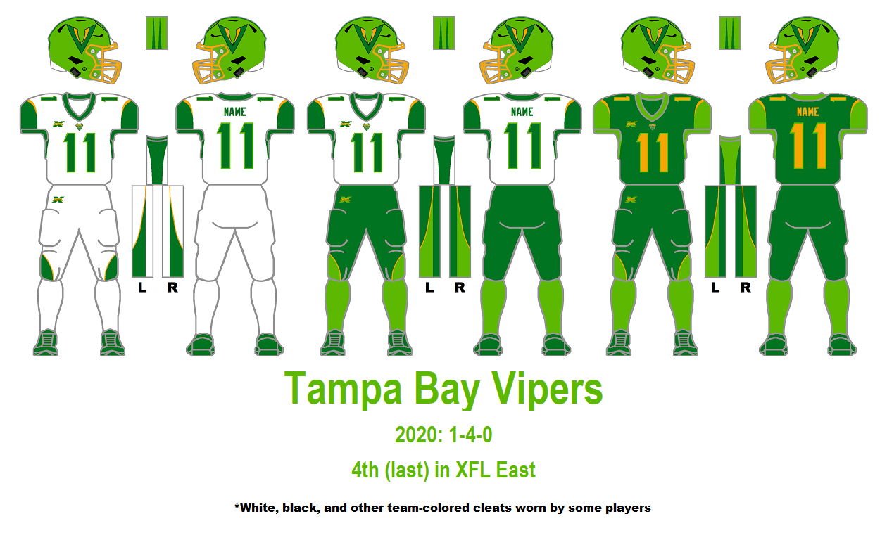
EVA AIR
EVA Air unveiled its current livery in 2015, in which I thought the belly color was black, but upon a closer look, it's actually dark green. I don't know if it's me or not, but the curvature on the belly reminds me of United Airlines, a fellow Star Alliance member. Comparisons aside, I made that curvature the overall theme on my home and road uniform concepts for this Taiwanese carrier.
First off, why did I choose dark green as the primary color for these two uniforms? Well, that's the color of the airline's flight attendant uniforms. However, in spite of all this, there's still a huge chunk of the regular green color to maintain balance, which reminds me of the Tampa Bay Vipers uniforms.
While the home and road uniforms evoke the modern design, the throwback uniform expresses EVA Air's humble beginnings. Good thing that the airline's inaugural livery has an additional stripe so that it won't be just another Eurowhite paint scheme. This time, though, I went with the regular green for the jersey color.
One more tidbit that I'll add is that I used the full globe logo instead of the one used in the airline logo where the globe is trimmed off at the top-left portion to fit it within the tail.
-
3
-
-
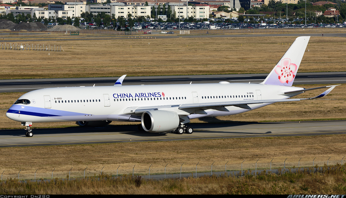
CHINA AIRLINES
Ever since it adopted the plum blossom as its main identity, the flag carrier of Taiwan has set itself apart from the usual blue-and-red looks of most airlines. The livery that came with it is distinguishable enough, it's already an art piece by itself.
As for the uniforms, both the jerseys and the pants capitalized on the striping found at the front of the fuselage, near the nose. Meanwhile, the helmet features the plum blossom, as well as the white-to-lavender gradient background, just like how it appears on the tail of its aircraft. White is my choice for the airline's home jersey.
The throwback uniform harkens back when the airline heavily relied on the flag color theme. Though the blue-white-red striping looked similar to those of Philippine Airlines and American Airlines, among others, the way it appeared on the tail made it unique from the rest of the pack. Looking at other pictures of the older livery, it seems that the vintage CAL logo is not visible anywhere on the paint scheme, so I decided to make it obvious on the uniform, as a reminder that China Airlines used to have a logo like that.
-
1
-
1
-
-
ALL NIPPON AIRWAYS
Ever since its brand refresh in the 80's that's still carried to today, ANA has one of the most straightforward brandings among the world's airlines. Its double blue-adorned livery stands the test of time, in contrast to the numerous changes of Japan Airlines.
With that, the home and road uniforms speak high volumes about ANA's iconic look. I decided to make the sleeves colored differently compared with the rest of the jersey, inspired by the tail logo. This is also the reason why I went with the ANA script and a tapered light blue stripe on the blue helmet. On the front of the jersey, right above the number, is the old full name script found on the airline's original version of its livery. And on the back of the pants, there's one of the Nihongo translations of the airline name.
Before 1982, ANA had the aerial screw logo, and with it came the "Mohican" livery. Even if the output I made looks similar to my Korean Air concept, the grey pants made this retro alternate uniform unique.
-
2
-
1
-
-
CHINA SOUTHERN AIRLINES
For the first China-based airline in this series, I went with its iconic cheatlines which have been there since the beginning, and designated the white uniform as the home uniform, with the dark blue uniform being worn on the road.
Since China Southern's livery has been the same since 1988, there won't be a throwback uniform. However, the airline sports a different livery for its Boeing 787s, so I went with that design, where wings adorn both the jersey and the pants.
-
2
-


-Cebu-Pacific.jpg)
-HB-JND.jpg)
Airline Football Uniform Concepts - Virgin Group's Two Airlines
in Concepts
Posted
You just read my mind! I'll be handling AirAsia next, even before the result of the AirAsia X reorganization comes. I just realized that today.
I understand your sentiment and I agree that yellow should be a "road" color for American football if there's no white jersey, but I'm basing the colors primarily from an airline's current livery. It just so happened that Cebu Pacific's paint job heavily uses yellow and white. Also, I considered the fact that the airline's flight attendants wear yellow polo shirts.