

edjb93
-
Posts
992 -
Joined
-
Last visited
-
Days Won
8
Posts posted by edjb93
-
-
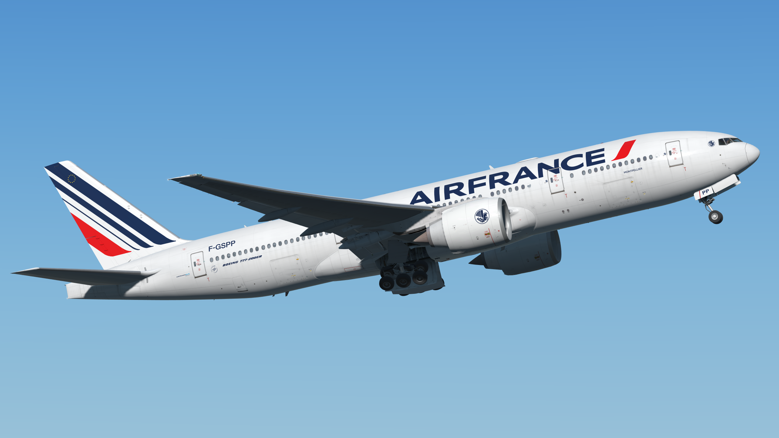
AIR FRANCE
The home and road uniforms for Air France are centered around one thing: the airline's iconic tail stripes on its Eurowhite livery. I'm unable to find the actual font for the airline's logo, so I went with the Gill Sans MT font family for the numbers and the NOB. While the stripes are the front-and-center in these uniforms, I made sure that the "hippocampe ailé" (winged seahorse logo) is also prominent.
It looks like Air France has only one livery design prior to the unveiling of the tail stripes we know now, so that was the basis of my throwback alternate for the French flag carrier. I went with blue jersey and white pants, since the white jersey-grey pants combo is already redundant.
And yes, "Airfrans" is indeed the callsign for the airline, you can look that up online.

-
 1
1
-
-
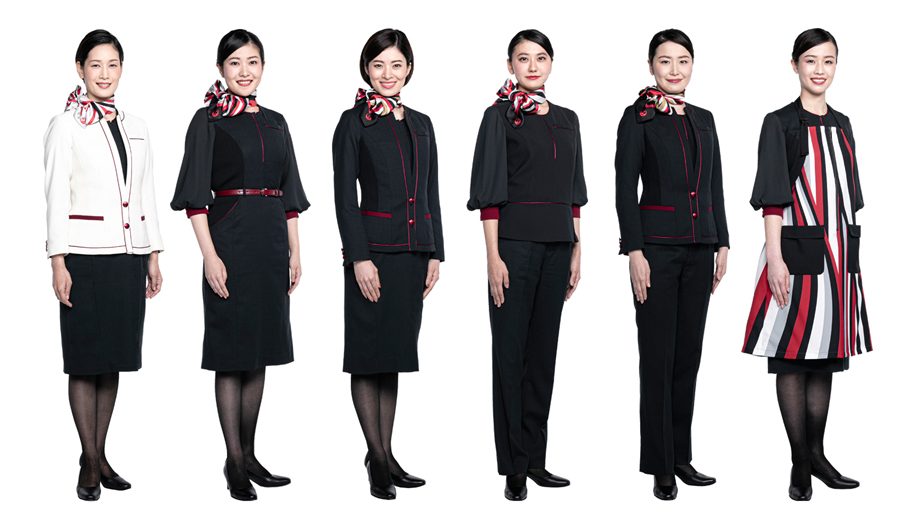
JAPAN AIRLINES
JAL's current livery is both clean and underwhelming. Like, the livery could've had a grey underbelly such as the airline's previous liveries, but it settled with something simple. With that I mind, I went on to search for the airline's flight attendant uniforms and, while most variations are simple, at least all of them have red embellishments. I applied that idea on my home and road concepts for JAL, while maintaining the uncomplicated look and feel from the livery. The white jersey is designated as the home uniform, while the black can be either the road or clash uniform. Why black? That's the color of the aforementioned flight attendant uniforms.
For my throwback choice, the 1989-2002 livery is the one that instantly reminds me of JAL. Since the "tsurumaru" is already used on the primary helmet, I went with the JAL logo from that era, and just like the actual application on the plane where the grey striping extends to the nose of the aircraft, I extended the grey striping all the way to the back of the helmet. And instead of placing it on the sleeves, the same striping is treated as a shoulder yoke.
-
2
-
-
GARUDA INDONESIA
I love Garuda's blue-and-teal look, from its first iteration up to the "nature's wing" era, with the latter being a brand evolution of the former. And so, I made it the overall theme of my home and road uniform concepts for "The Airline of Indonesia". While the jerseys and the pants have the nature's wing pattern, this is not that obvious compared to the helmet.
I went back to red for my retro alternate. Specifically, I went with the airlines' final livery featuring red and orange cheatlines which extend all the way to the aircraft's tail.
-
2
-
-
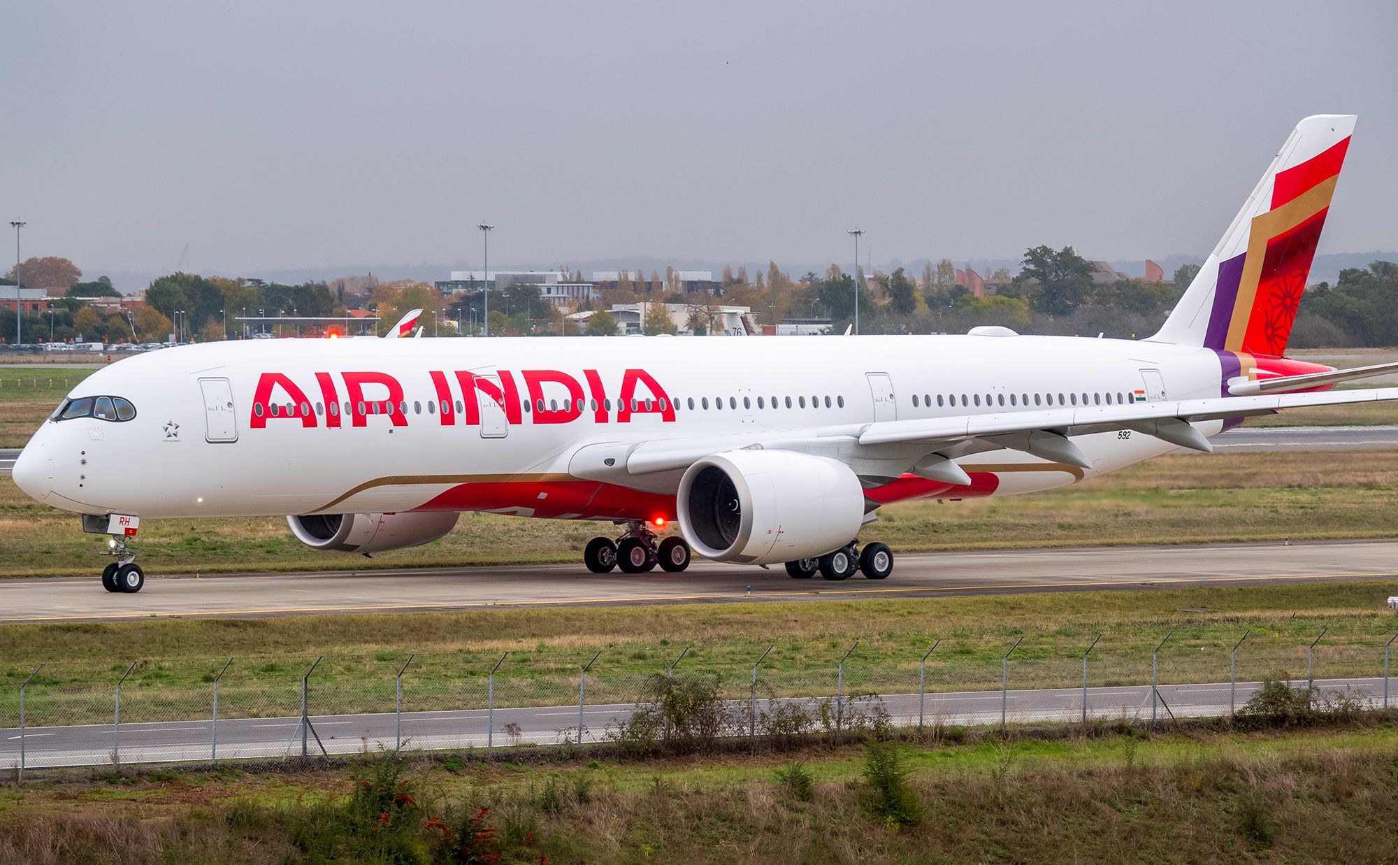
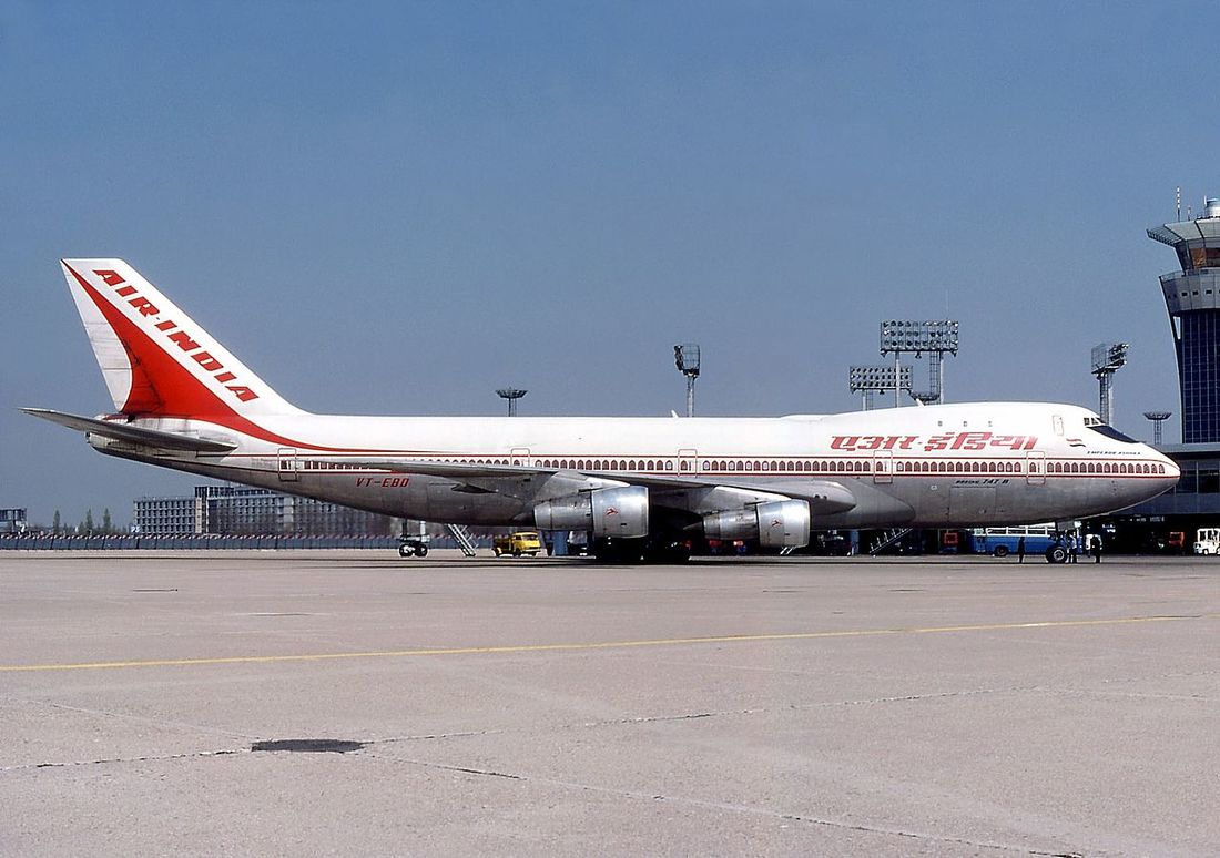
AIR INDIA
I'm slowly getting used to Air India's new overall design as of now, but back then, I thought it was a huge departure from what the airline used to look like. But the one thought that's common between those is, the complete overhaul of Air India's identity looked extravagant. Given how the airline is slowly transforming itself both inside and out after the Tata Group takeover, I think it wants to place itself among the best, and I wish greater things to come for the airline.
With that being said, the home and road uniforms are based from the airline's new look, focusing on gold and the chakra pattern, which is sublimated on the sleeves and the pants' side panels. The helmet features the new tail logo, where the only application of aubergine (purple) is used (after all, we need some sort of a Vistara tribute). In case you're wondering about the golden gradient on the helmet face mask, that's because it should imply that it is metallic chrome gold.
The throwback uniform I chose for Air India is the "Flying Palace" livery. The overall striping on the jersey and the pants are taken from the window frame design that was carried over to the post-merger livery. Just like what's found on the aircraft, one side features the brand name in English, and on the other side is its corresponding Hindi translation.
-
2
-
 1
1
-
-
On 2/9/2024 at 11:59 AM, udubfan19 said:
Is it just me or am I seeing two same uniforms in between the mono-orange and the white-orange combo?
-
THAI AIRWAYS INTERNATIONAL
The "wai" has been one of the recognizable symbols in airports around the world, and I can consider Thai's livery as one of the most beautiful-looking liveries among the world's airlines. On that note, the distinct striping on Thai's livery is the main focus of my home and road uniforms for the airline, and I applied it a la Seattle Seahawks' soon-to-be former uniforms (rumors suggest that the Seahawks will have new uniforms starting in the 2024 season). The white jersey gains a differently colored yoke so as to maintain the striping, similar to the actual livery.
Initially, I went with 3 different designs: the home uniform is based from the current livery, the road uniform from the 1975-2005 livery, and the alternate from the pre-1975 livery. However, it would be best to stick with the same theme (but not necessarily the same design) for the home and road uniforms. So for the throwback, I ultimately decided to go for the pre-1975 one, since the 1975-2005 livery was the original bearer of the wai logo, with the current livery being an evolution from the previous one.
-
4
-
1
-
-
QATAR AIRWAYS
Throughout its recent history, one of Qatar Airways' signatures has been its grey livery. And with that, I chose grey as the home jersey color, with maroon becoming the road jersey color. True to the livery, I paired the grey jersey with white pants, while grey pants come hand-in-hand with the maroon jersey. I put the enlarged oryx logo on both the helmet and the sleeves.
The alternate uniform pays tribute to the airline's early years, in which the livery that came with it was brought back in 2022 to celebrate the airline's 25th anniversary.
-
4
-
1
-
-
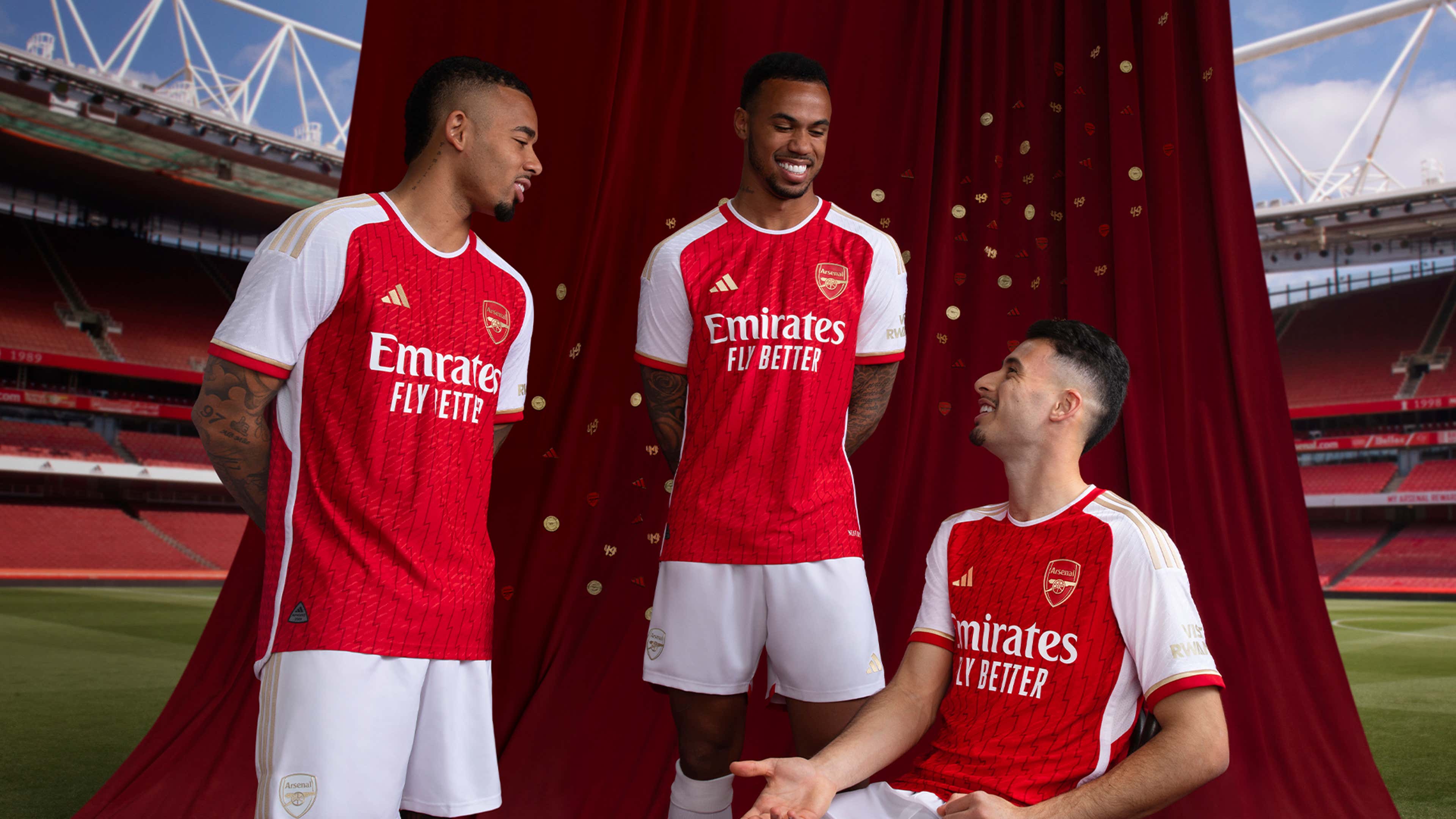
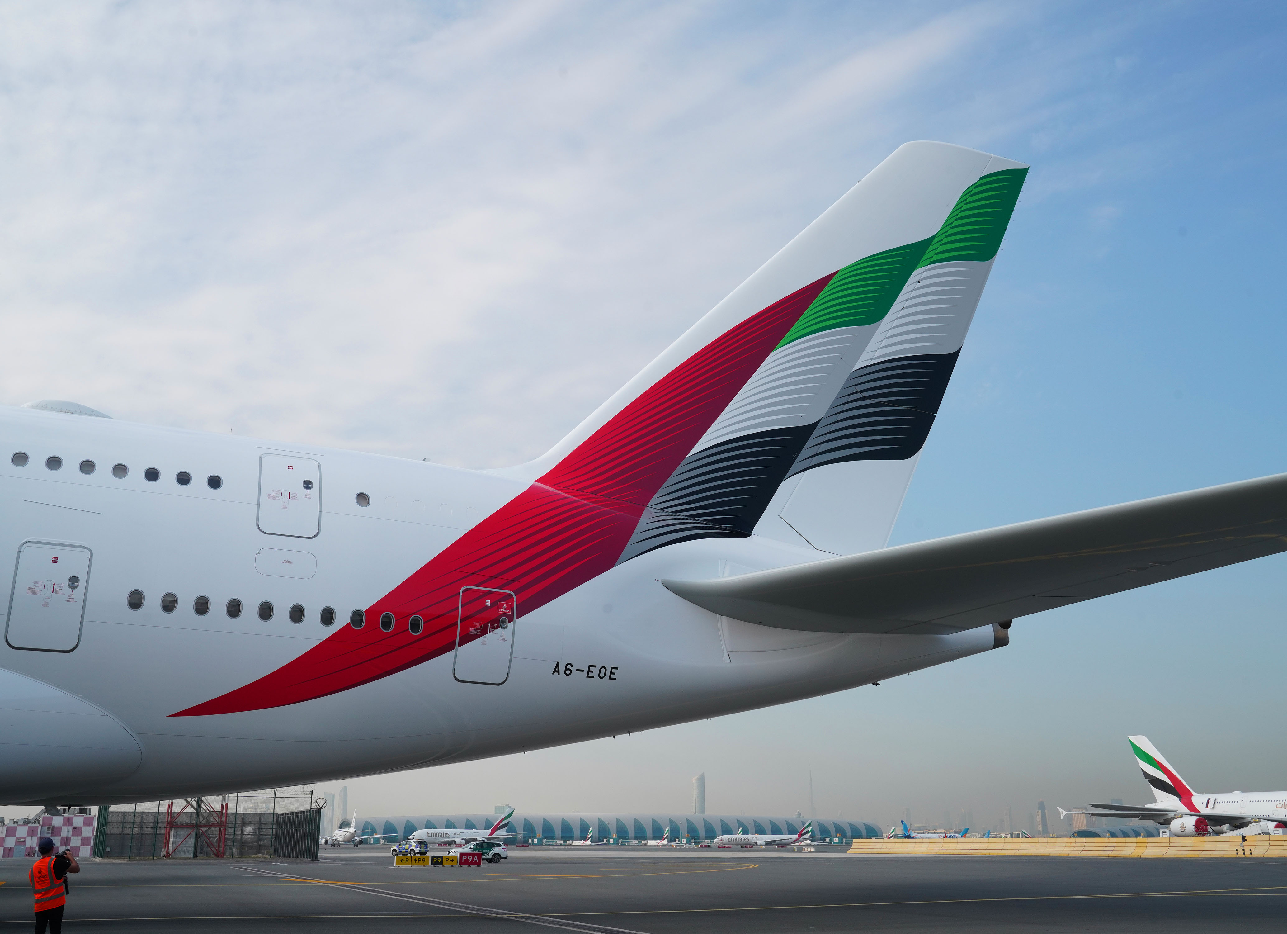
EMIRATES
From its early years up to present, Emirates' livery has remained consistent: UAE flag, gold script, white fuselage. Since that's the case, I had to resort to the prominent football/soccer clubs around the world which proudly wear the airline on their shirts.
The home set is an obvious homage to Arsenal, but the color choice can also be linked to Benfica or ES Sahel. The road set, meanwhile, is a mix of design elements from Real Madrid, Olympique Lyonnais, and AC Milan.
For my alternate, I chose the airline's mostly blue livery for the Dubai Expo, which is, by far, the only special livery that doesn't feature the design elements from the main livery.
-
45 minutes ago, udubfan19 said:
this is a funny idea. whats next? fast food football uniform concepts?
Who knows, maybe I'll touch on that. But I'm just really fascinated with airline liveries.

SPOILER ALERT: I'm in the process of doing an Emirates concept. It would have been an easy call, if not for the latest rendition of the UAE flag on the tail.

-
DELTA AIR LINES
The widget has been Delta's signature for a long time, and it's been heavily used in the airline's pubmats especially since the 2007 redesign. That's the overall theme I captured in my home and road uniforms for Delta. The pants feature an elongated version of the widget, which appears more like a spire or an obelisk. Just like in my Philippine Airlines concept, I gave these the pre-2006 Houston Texans treatment for the pants-socks combination, although I chose the traditional socks instead of the single-color ones that are prominent in NFL right now.
For the throwback, there are numerous choices, which include the Ron Allen livery and the Colors in Motion. However, most of you might have thought about the livery that preceded the Ron Allen scheme, and therefore, I went with that one. It's quite challenging to apply its overall design into a football uniform, but I did the best that I could. I instead chose white pants instead of silver, since my Korean Air throwback features a similar design, and I don't want to have redundancy as much as possible, especially that both airlines belong to SkyTeam. The widgets on the helmet and the sleeves are slanted, just like in real life, with the helmet decal version being larger than usual. I originally planned to have the enlarged widget decal to be placed at the back of the helmet, spanning to the sides, but the final output might have stayed true to the original.
-
5
-
1
-
-
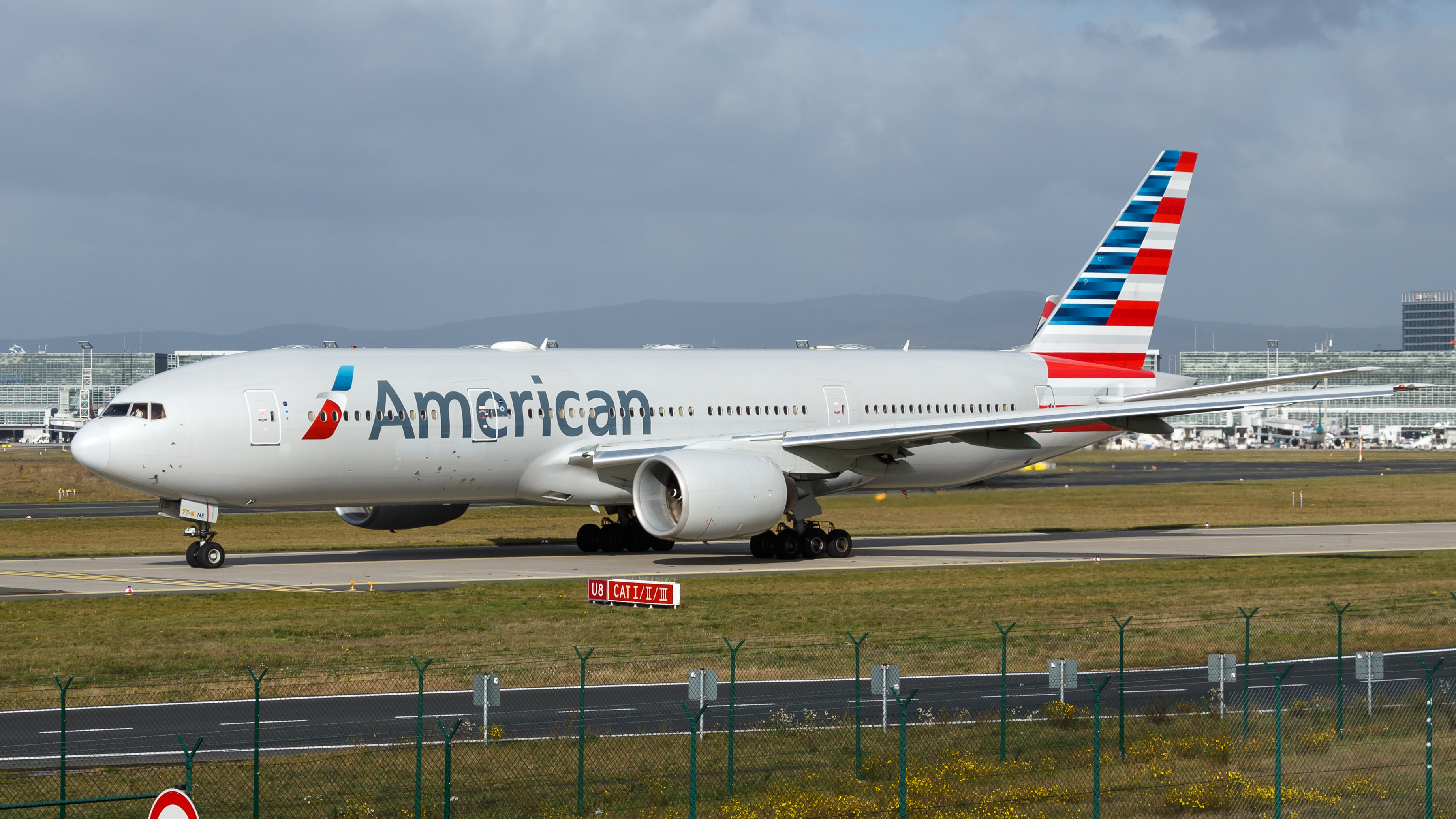
AMERICAN AIRLINES
While its bare-metal livery is still the one that reminds me much about American, I can fully understand why the airline needs to change its livery, simply because of the main materials used to create the fuselage of most modern aircraft.
With that being said, I made the stylized stars-and-stripes from the tail as the primary design element in both home and road uniforms (sublimated on the sleeves) and especially on the helmet, since it defines the "new" American Airlines. I went with a red NOB for both home and road jerseys to create an illusion of not having the player name on the dark-colored jersey but having it in reverse on the light-colored jersey. Speaking of which, I chose light silver as my choice for the light-colored jersey and pants to conform with the current livery. Finally, even if the airline is known for using serif fonts, I went with a block font for the numbers and the NOB to highlight its originating nation.
The bare-metal livery is the main theme for my throwback alternate, and this also serves as a tribute to @tBBP's concept uniforms for AA. The differences between tBBP's and mine are: shoulder stripes a la Indianapolis Colts, block numbers, sock design, and the chrome helmet (mimicking the reflectiveness of the bare-metal fuselage). I tried my best to do the chrome application, alright. I originally intended this to be an all-silver uniform, but the white socks with the blue-white-red striping might make it out of place, so I went with a white jersey, which is somewhat a tribute to the old American Eagle livery.
The helmet back bumper features the slogan from each uniform's era: the current says "#GoingForGreat" (really?) while the throwback has the iconic "Doing what we do best" slogan.
-
4
-
2
-
-
FINNAIR
Since @Coiler brought up a hockey team from Helsinki, the timing is just perfect to go through the flag carrier of Finland.
In this set, I made the home uniform white and the road uniform blue, because white is the main color that's being used on both the national flag of Finland and the current livery of Finnair. The sleeves feature a slanted version of the Nordic cross, the key feature of the Finnish flag. It just also happened that the cross was used on older liveries of Finnair. If you look closer on the pants, the logo resembles the 1968 version, but it's actually a modern take: I enclosed the current tail logo in a circle. Finally, instead of placing it on the front, above the jersey number, I put the Finnair logo on both sleeves, much like what was done to Detroit Lions' current uniforms.
Speaking of Detroit Lions, I see the resemblance in colors comparing it to Finnair's retro livery called "Silver Bird". The tail striping becomes the primary striping of the helmet and the pants, while the cheatlines are featured on the sleeves.
-
6
-
-
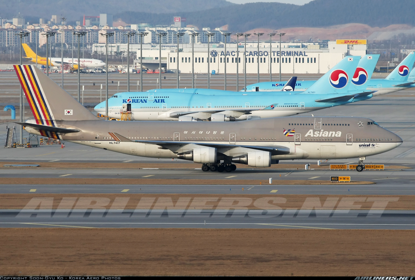
ASIANA AIRLINES
South Korea's other major national airline has really gotten all-in with its color choices: there's the color palette of red, yellow, and indigo, and then there's warm grey. While the Korean Air-Asiana merger is not yet in its 100%, let's fully appreciate what we have now while it lasts.
That being said, I made the design from the tail of the current livery the primary element of the helmet and the jersey's sleeves. It also makes its appearance on the pants' side panels, even though its application there is small. With the smorgasbord of colors for Asiana, I had difficulties in choosing the color for the dark uniform. That's until I realized that Asiana's flight attendants and pilots wear dark grey uniforms (might be close to anthracite), and so I went with that color. Though the home and road combos you're seeing are the primary combos, both the jerseys and pants can be paired with other colors.
I don't know if it's just me or not, but Asiana's original livery is like a grayscale version of Korean Air's sky blue livery, judging by the white underbelly on both airlines. I went with traditional striping on my Asiana throwback alternate, which heavily uses the original warm grey.
-
3
-
1
-
-
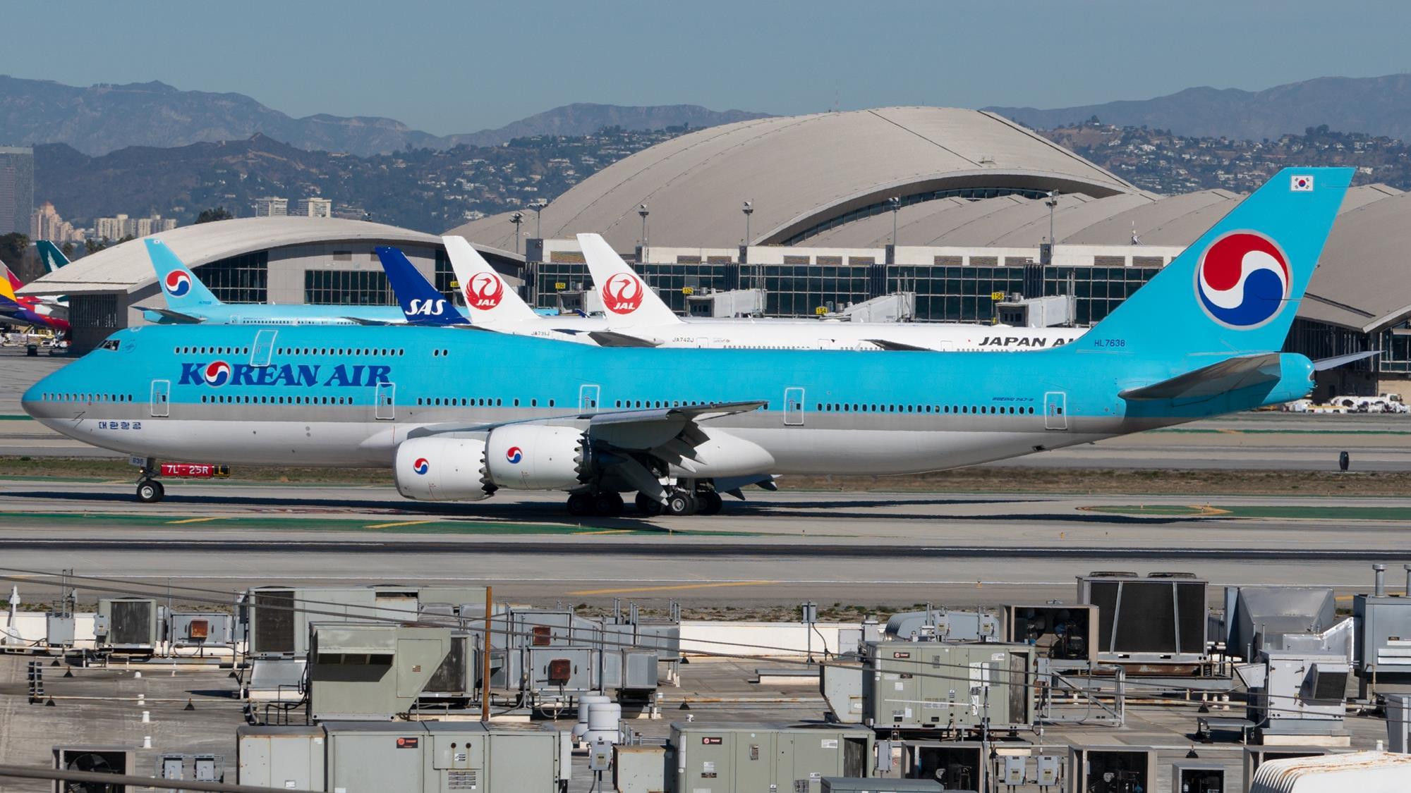
KOREAN AIR
With its sky blue livery, Korean Air has one of the most iconic looks above the clouds. To differentiate this with my KLM set, I went with a shoulder yoke that extends to the sleeves a la Tennessee Titans' old uniforms. Aside from that, I colored the NOB and numbers blue, similar to the color of the airline name's lettering on the fuselage. From the looks of it, the home and road uniforms are kind of inspired from the female flight attendant uniforms since 2005.
The throwback uniform harkens to the time back when the airline was still known as Korean Air Lines. The livery that came with it before the rebranding in 1984 really evokes the design trend among airlines from East Asia, specifically China, Japan, and the two Koreas. Breaking away from what I'm used to do, the helmet number is placed at the front.
And yes, I chose this specific number due to the exact date when Hanjin Group acquired the airline.
-
2
-
-
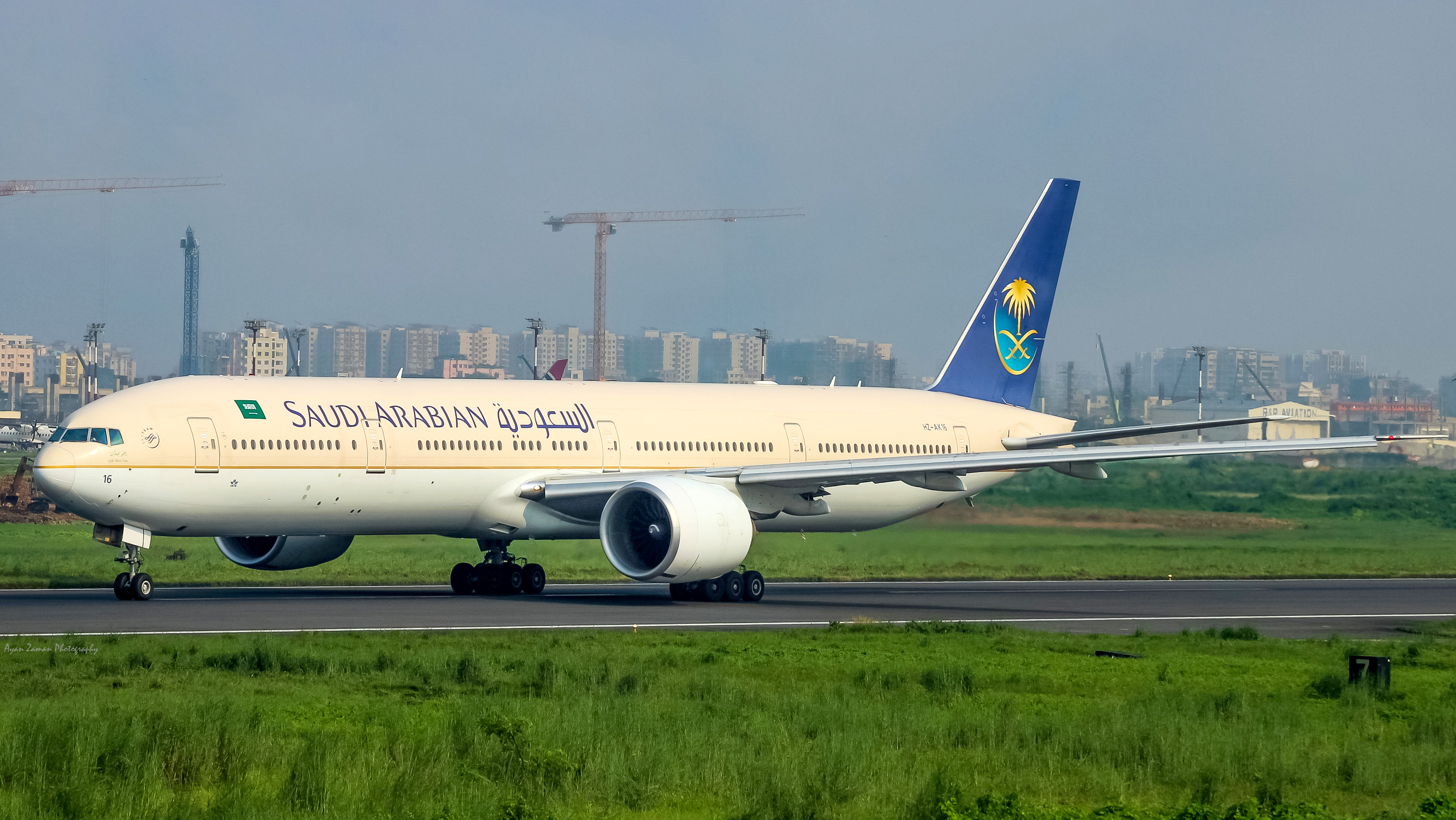
SAUDIA
One of the reasons why I came up with this series is because of this exact airline. In 2023, Saudia went through a redesign, which eventually resulted in a retro-inspired look. I thought that the retro striping would be a perfect fit for a football uniform, and so, I finally brought it to life.
Whether on a green or white background, the stripes remain the same. The final home and road outputs kinda evokes the Jets' uniforms during the height of the New York Sack Exchange—of course, without the blues and the lighter green. One quirk can be found at the top of the number on the front of the jerseys, as the green jersey contains Saudia's name in Arabic, while the white jersey has the English version.
The alternate uniform is taken from the 1996 redesign, where green was out and blue and gold came in. I went with the original 1996 version over the 2012 refresh (even though I used its simplified name that came with it over the full name from 1996), since its tail logo is much colorful. And yes, I even used the overall theme of the livery on the choice of colors for the jersey (sand) and the pants (white).
-
2
-
1
-
-
CATHAY PACIFIC
I've been a fan of Cathay's overall branding since 1994, as that looks first-class (no pun intended) and chic, and I still prefer it over the 2015 redesign, which doesn't include red. Oh well, times really change, and brands around the world get simpler to accommodate technology. Rants aside...
The primary uniform is basically the fuselage design translated onto a football uniform. Eagle-eyed observers would see that the background of the brushwing logo on the tail is actually a halftone gradient, although in general, it's just a solid midnight green. I went with cyan-esque, light grey pants to symbolize the striping in between the white parts of the fuselage.
The clash uniform, on the other hand, is a tribute to its old "Asia's World City" livery, which is by far, one of Cathay's most beautiful liveries ever.
We travel all the way past 1994 with my throwback uniform, which is just the "green lettuce" livery turned into a football uniform. Honestly speaking, that livery evokes old-school East Asia, so I'm glad Cathay went with the brushwing. But who knows? Maybe we'll get a green lettuce comeback someday. Adding to the old-school feel of the uniform are the numbers on both sides of the helmet. I was originally planning to leave the sides blank, though.
All jerseys feature the logo of Cathay's majority owner, Swire, while the helmets feature both flags of China and Hong Kong, as the latter is a special administrative region of the former.
-
5
-
-
On 1/19/2024 at 10:34 AM, Ted Cunningham said:On 1/19/2024 at 11:28 AM, tBBP said:
Man say whuuuttt??? Check this out! @edjb93, a concepter after my own kind!
Just so you know what @Ted Cunningham is talking about, my very first concept series ever on this board was the Airline Football League, way back in like 2006 or something. Nice to see this come back around dang near two decades (!) later! I'm actually half-curious now to go back and look at those early designs of mine.
Anyway, you've got some great work going here thus far. So far you seem to be focusing more on international airlines, which I most certainly did not. (Then again, back then, we actually had a lot more domestic airlines to pick from before they all cannibalized each other into the big 3+1 we have now, plus a random offshoot of others.)
I'll be watching this here...this is some good stuff!
Whoa, I never even thought of that! I truly appreciate your comments regarding my series. Make no mistake, I'll honor and respect the legacy of the Airline Football League through my concepts.
-
38 minutes ago, Walk-Off said:
So far in this thread, I have noticed that if an airline belongs to Star Alliance, SkyTeam, or Oneworld, the logo for that alliance can be usually found on the same parts of the uniform as the league logo on a typical professional gridiron football team's uniform or the conference logo on a typical US college football team's uniform.
Personally, I find that small touch to be a very nice flourish of detail.
I actually placed the alliance logo on the collar, similar to what's done in the NFL and with LSU and Florida, instead of the usual place for conference logos in college football. Anyway, thanks for appreciating that detail!
-
1
-
-
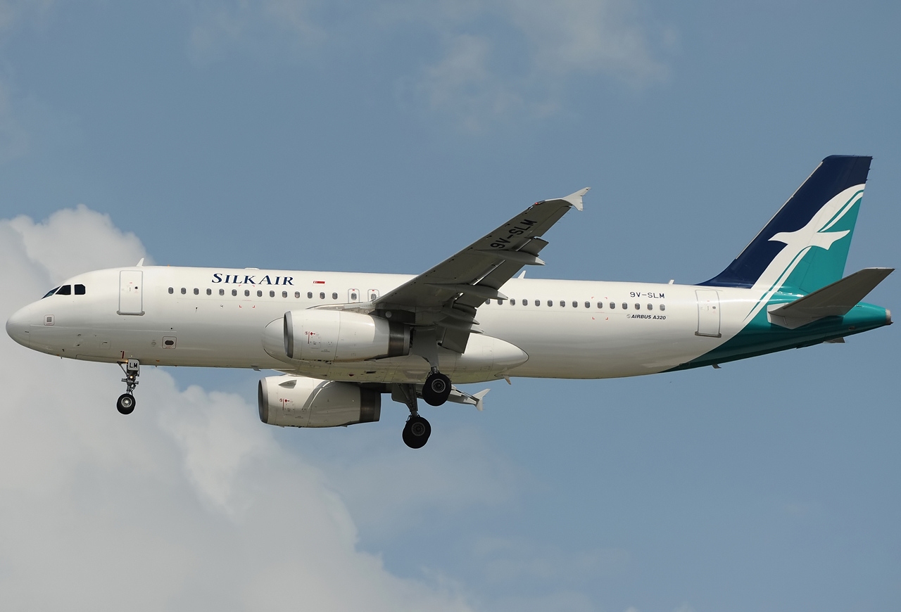
SINGAPORE AIRLINES
When it comes to designing concept uniforms, I'd say SIA is an easy call, since it has a recognizable livery and with it comes a recognizable cheatline design. Thus, I applied that on the entire uniform except for the helmet, which features the tail design. The airline name script on the front is much larger than usual, paying homage to the first aircraft to don the tweaked livery, the Airbus A380.
I'd been thinking about which throwback design should I do for SIA, before finally settling on an airline that's no longer with us: SilkAir. Singapore Airlines' regional wing was absorbed into the main airline in 2021, so it's just fitting to pay tribute to a brand that recently bid farewell from the skies. Unlike its parent, SilkAir has only one design element: the tail logo. That proved to be quite challenging for me, until I decided with the striping pattern from the wings of the bird logo. I went with dark pants as an homage to the final uniform design of the airline's flight attendants.
-
3
-
-
LUFTHANSA
Germany's flag carrier has gone to a simpler look nowadays, and so, my concept might epitomize the "less is more" mantra. Starting off with the home and road uniforms, there are no additional design elements other than the small yellow strip on the sleeve cuffs and the yellow collar tag on the back (similar to the feature on Los Angeles Rams' uniforms). The Lufthansa script is placed on the top-right portion of the front of the jersey, to pay tribute to the hanky found on the flight attendants' uniform. That same script can also be found at the back of the pants but in a larger size.
The throwback uniform illustrates the airline's retro livery from the 70's, which is applied on a Boeing 747-8 Intercontinental. It also features the same collar tag from the previous two uniforms.
Overall, I would say, when you want a definition of something done in Paint, then this could be it.
-
1
-
-
On 1/16/2024 at 7:12 AM, Bomba Tomba said:
A second RWB team? I dunno man
Maybe this could be the red heavy one while the Philippine Airlines one is the blue heavy one?
Sorry, that's really the way the airlines are right now, and they're heavily influenced by their respective countries' national flags. We still got the likes of Air France, American Airlines, British Airways, and Delta coming.
-
1
-
-
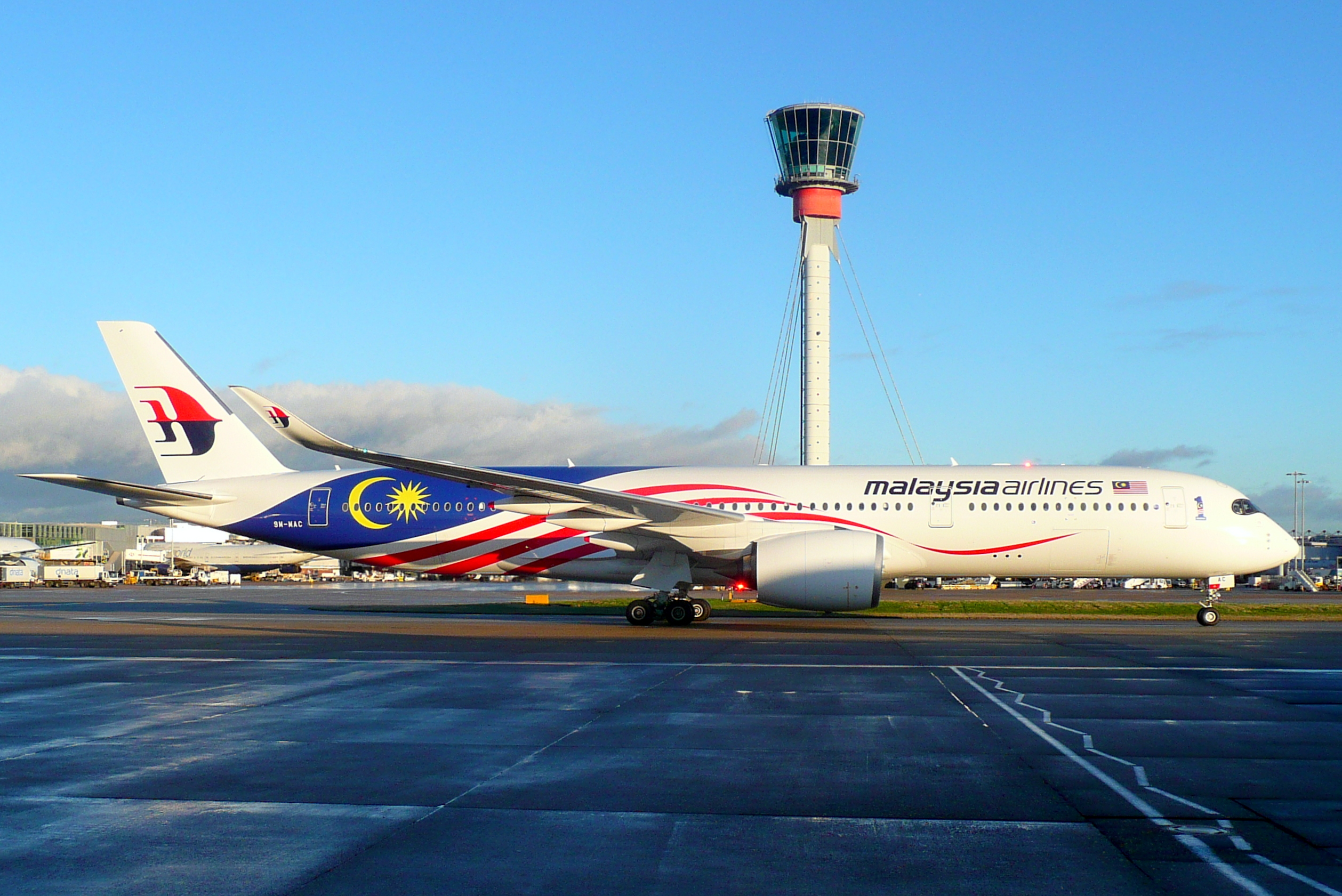
MALAYSIA AIRLINES
Malaysia Airlines has recently put an emphasis on Malaysia's national flag with its Negaraku livery, which was initially a special livery but eventually made its way to become the primary livery for the entire fleet. And since it would be difficult to put up a great dark uniform design while integrating the national flag, I decided to make this set the second ever to possess the primary-clash-alternate designation.
The primary uniform features an abstract version of the country's national flag on the sleeves. I chose an all-white combo for the primary as an homage to the new livery, but it won't be a "stormtrooper" look due to the socks with a design inspired from the stars-and-stripes of the flag.
The clash uniform, meanwhile, features the songket pattern found on the airline's promo materials and the tail logo on its Boeing 737 MAX 8 fleet. Both the primary and clash uniforms are partnered with a white helmet containing an oversized logo, done to mimic the way it is designed on the tail.
When it comes to the alternate, it's back to MAS. Back then, Malaysian Airlines System (as it was called during those days) used red as its primary color, and I applied a similar motif from its livery to the uniform. Since the full name won't fit on the jersey, I just reduced the front script to read simply "Malaysian", while the full name is relegated to the helmet's back bumper. I went with silver pants since the aircraft belly at the time was bare metal.
-
1
-
-
KLM ROYAL DUTCH AIRLINES
The world's oldest airline still in operation has one of the most recognizable brands in the air: its iconic blue fuselage. Throughout the years since the 70s, it saw various changes but the overall theme remained the same—which brings me to the concept I made for "The Flying Dutchman". If you're curious, I specifically took the 2002 redesign as an inspiration—although the 2014 version is a modified one.
With a white tail, blue fuselage, and white belly, I thought that the helmet should be white as well, and there should be a differently-colored shoulder yoke to signify the overall separation of colors on the fuselage. I went with traditional football socks instead of mono-colored ones to conform with the theme. The KLM logo on the sleeves is enclosed in a circle, paying homage to the old logos.
For the alternate, I went with the airline's Orange Pride livery, but instead of making it half-orange, half-blue, I made the uniform orange-themed all throughout. While the wavy design on the sleeves look similar to my United Airlines concept, the Orange Pride was unveiled after 2014, and so I had to conform to that. The Dutch tricolor is featured as an accent, just the actual livery, and the KLM logo remained blue on a white background.
-
3
-
1
-
-
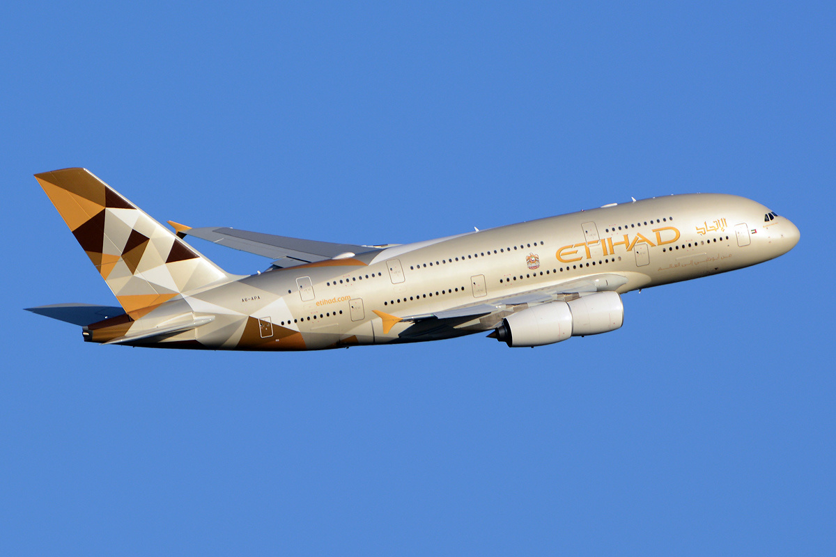
ETIHAD AIRWAYS
Ever since unveiling its "Facets of Abu Dhabi" livery in 2014—then solely for its A380s but eventually applied to its entire fleet—Etihad, for me, is one of the elegant-looking airlines in the world. The colors blend well and speak very highly of its origin.
This will be the first set where the primary-clash-alternate designation is applied, as I think that the main color of the airline's livery should be worn as the primary uniform. The clash uniform, on the other hand, will have a brown jersey and gold pants. Both these two feature UAE's emblem on the sleeves and on the pants.
For the alternate, I decided to use Manchester City's colors as the airline is a primary sponsor of that football club. The nine stripes on the front of the jersey symbolize the nine Premier League championships that MCFC won throughout its history. So, you could also say that this might be how Manchester City would look like if they were an American football team.
As to why I did not go with Etihad's old livery—which contains the colors of the UAE flag—those colors shall be reserved for my Emirates concept.
-
4
-
1
-


Airline Football Uniform Concepts - Virgin Group's Two Airlines
in Concepts
Posted
CHINA SOUTHERN AIRLINES
For the first China-based airline in this series, I went with its iconic cheatlines which have been there since the beginning, and designated the white uniform as the home uniform, with the dark blue uniform being worn on the road.
Since China Southern's livery has been the same since 1988, there won't be a throwback uniform. However, the airline sports a different livery for its Boeing 787s, so I went with that design, where wings adorn both the jersey and the pants.