


Old School Fool
-
Posts
4,539 -
Joined
-
Last visited
-
Days Won
14
Posts posted by Old School Fool
-
-
7 hours ago, Crow23 said:
These got upgraded from Spring Training jerseys to Road alts

I never expected them to wear Psycho Mr. Red on their jerseys in the regular season. I love it.
-
 4
4
-
 1
1
-
-
48 minutes ago, flyersfan said:
to be fair, the eagles green is so dark it wont be ALL that different
I think it will be pretty noticeable when they take the field in a black helmet. The Eagles have only worn green or white helmets as a main identity since the invention of the non leather helmet. It will be weird and stupid.
-
2
-
-
All this talk about 2023 being when we will see these throwbacks sucks but at least I can have the teams wear them in Madden whenever I want.
-
2
-
-
10 hours ago, the admiral said:
Yeah, it's really terrible. Might be the worst in the league unless you can tell me what else is. I hate this name, identity, and team.
-
5
-
 1
1
-
 4
4
-
-
The only alternate helmet the Raiders could and should wear is a 1960 throwback from their first season. Other than that they should never ever mess with the helmet.
-
8
-
-
GUD digs really deep for evidence before putting it on their site. Here's the confirmation of the Cowboys 1995 Preseason games with actual pictures sourced from newspapers.
http://gud-updates.blogspot.com/2015/06/1995-dallas-cowboys.html
-
1
-
-
Cowboys didn't wear their road uniform in the 1995 Preseason and instead wore the white Double Star jersey for the final time but with solid socks.
-
5
-
-
The idea of the Jazz rebrand is stupid but it could somehow end up working. I doubt it works out but we'll see.
-
5
-
-
19 hours ago, Sport said:
I've seen this movie so many times and I could have sworn the pants had two red stripes. Looking it up they removed the black in 1996 which is one year after this movie.
Honestly, the Cardinals are such a boring team that I hardly ever notice anything about them or notice when they even play and realizing this about Jerry Maguire is just one of those examples. No offense to any Cardinals fans on this board, but they have never once had anything stand out to me aside from their current stadium. It's weird, it's almost like they should probably just do something ridiculous and off the wall with their uniforms but the problem is that it probably wouldn't work.
I feel like the team is cursed is just cursed man. They gotta get outta that curse.
-
7 hours ago, oldschoolvikings said:
I have no real reason to think this, but if I had to bet, I'd go with navy and white for the Rams'new alt. Not a true throwback, but one of those Nike-speak "inspired by" uniforms.
They were really leaning into this look when they were in the Coliseum. I would be surprised if this isn't it.
-
1
-
-
20 hours ago, UnclearInitial said:
Good G-d, they somehow :censored:ed it up even more (though TBF it might look better, if it wasn’t THE LAKERS)
Purple is my favorite color, Lakers are my favorite NBA team, I always loved the purple jersey...
Now, this is a nice design and I like it way better than the previous Statement uniform but...
THE LAKERS NEED A NORMAL PURPLE JERSEY IN THEIR NORMAL UNIFORM ROTATION. WHAT IS SO HARD TO UNDERSTAND ABOUT THIS. THIS IS THE LOS ANGELES LAKERS, NOT SOME RANDOM ASS NBA TEAM ESTABLISHED WITHIN THE LAST 15 YEARS.
Between the front office drama, the lack of good play on the court, and questionable uniform decisions, the Lakers are just morphing into a joke. I hate it.
-
6
-
-
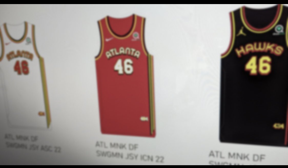
17 minutes ago, Krz said:
from the same account, don’t know why the hawks would be rebranding though.
Conrad said awhile back this isn't real.
-
6
-
-
This was as good as the Cardinals got but even then it's still not enough for me.
-
8
-
1
-
-
47 minutes ago, KittSmith_95 said:
Once again, heavy usage of Black & Yellow.
We’re getting new Jazz stuff next year, aren’t we?
It was mostly confirmed and heavily discussed on here that the Jazz are changing everything next season. The colors will most likely be black, white and highlighter yellow.
-
Playing the beta of MLB The Show 22 and I see that the Cleveland Guardians number font is not standard block and is the stylized font from the wordmark. It looks great and adds character to the uniforms while keeping it simple.
Here's a player shirt to give an idea.
I think we all expected this, but I was just not sure how good it could look until I saw it for myself in an actual Baseball setting.
-
The Commanders are the first NFL team to have a front helmet logo since the 1963 San Diego Chargers, although they were in the AFL at the time so this makes the Commanders the first actual NFL team to do it.
-
1
-
-
2 hours ago, RyanMcD29 said:
and to think, that was the first time NBC had an always on scorebug (not counting the Turner partnered NASCAR telecasts)
IN THE YEAR 2003!
It's weird realizing the NBA On NBC didn't have a scorebug in it's final year. I didn't notice it back when when I was younger but now in retrospect I realize how ridiculous it was they broadcasted the 2003 Finals like that. Every network had one by then.
-
1
-
-
17 hours ago, PERRIN said:
I hate all the stupid shadows and gradient textures. That was the only thing I disliked about the previous NBC scorebug, but this just looks goofy. Looks worse than every scorebug NBC has had since I started watching football in 2009. The previous one was dynamic, unique, and modern, though some of the shadows and textures didn't work. This is just awful. Not a single graphic looks good to me. Can't wait for 3 years from now when they change again.
You say you started watching football in 2009, well let me show you what NBC was using in 2003 for it's Notre Dame games. Thankfully we were spared of seeing this often because NBC didn't have the rights to the NFL at the time.
-
3
-
1
-
 1
1
-
-
I was playing NBA 2K22 and noticed they added the Rising Stars uniforms and they are WAY better than the All-Star uniforms. There are actually 4 different uniforms, I picked the ones that matched Cleveland for this picture. The other uniforms were Navy and Teal. No idea what they will actually wear in the game.
-
1
-
-
You want another NFL change for 2022? Here's another bad one.
-
5
-
 1
1
-
-
The thing about black jerseys is that you can make it work even if it's totally unnecessary if you just stick to what the people know of the brand. Take the Detroit Lions or LA Lakers for example, they shouldn't be good but they manage to work out and it's because the black is applied in a normal manner and not some dumb in your face nightmare like the Commanders. I know it's not everyones cup of tea but to me these were "done right" and inoffensive to me.
Even the Arizona Cardinals usage of black is better than the Commanders.
-
11
-
1
-
1
-
-
4 hours ago, Dilbert said:
Snyder and the NFL cant be happy that everyone is calling the team the Commies. Like its not too late for them to change it back to Football Team. If they can dump the (Commanders) as quick as they did, they can dump the Commanders.
It will be fine. The jokes will stop soon because they aren't funny. It's like making a poop joke about the Cleveland Browns or making a... very bad reference about the Green Bay Packers. Every team has some sort of stupid joke and it doesn't hold up as much as you would think. It's just the lowest form of humor and eventually people will get over it.
-
7
-
-
The only way to salvage the home and away looks are going to be in the uniform combinations. Burgundy over White, White over Burgundy, etc. You can make it tolerable. The problem is you shouldn't have to find ways to make something tolerable, you should have gotten it right the first time!
I really love the burgundy helmet though.
-
6
-
-
12 minutes ago, FinsUp1214 said:
Honestly, if a 90-year old franchise is going this far off the rails with the removal of the one-helmet rule, there’s a part of me that’s worried for any future rebrand from any team at all. I don’t think I can trust teams to not look at this and get wild ideas they shouldn’t be running with.
Give it five years and we’ll have a game with Arizona in a copper helmet vs Minnesota in a black helmet. That of course isn’t anything I’m rooting for, but I think that could be where we’re headed. The NFL unlocked the door, and Washington just kicked it down.
These uniforms would not have happened if the team name didn't change. If they were still [REDACTED] then they probably would have brought out the Lombardi Era throwback again.
Most importantly, this stuff is only happening because Dan Snyder is a piece of trash. I'm glad they changed their name but any other team would've done this sensibly.
-
8
-


/cdn.vox-cdn.com/uploads/chorus_image/image/70359774/usa_today_17443535.0.jpg)


MLB 2022 Uniform/Logo Changes
in Sports Logo News
Posted
I'm late on this but the White Sox Spring Training look this year was stupid. I like the jersey by itself but you have 3 eras of White Sox logos going on and if that wasn't ridiculous enough, they also have red on the jersey logo which is a color that is nowhere else in the teams main identity. I feel like this team is suffering from the same issue the Brewers had over the last decade.