


dont care
-
Posts
8,992 -
Joined
-
Last visited
-
Days Won
18
Posts posted by dont care
-
-
1 hour ago, Scrumptious Ham said:
Not doing it at all. I can't think of a better way to execute this look. They should have just left this pandering idea on the shelf. They should just change their name to the Oregon TryHards.
So it’s nothing with the design you don’t like but instead the “pandering” to a significant part of their players history
-
 3
3
-
-
9 minutes ago, selgy said:
Was Oregon going for the Oregon Trail ms dos look?
No, it’s the “ohana” uniform for their history of Polynesian players. It’s suppose to be tribal patterns.
-
2 hours ago, CaliforniaGlowin said:
No it's just kind of generic and old fashioned, doesn't reflect the city.
Does Ontario really have anything about it that would make for a non generic name?
-
2
-
-
I really didn’t like the white helmets today for florida, maybe if they weren’t chrome and widened the stripes to better match the others I’d have liked them more.
-
16 hours ago, CaliforniaGlowin said:
I get a team close by and it has to have a dumb name like that.

What makes it dumb? Would you rather they be called the “Silly nannies” or something?
-
10 minutes ago, Magic Dynasty said:
The mobile ads that take over the entire border of the screen are back.
I had it looping this morning, and couldn’t do anything without closing the ad
-
Anyone else getting a ridiculous amount of pop ups that are making the site almost completely in usable?
-
3
-
-
Anyone else getting a notification where it’s asking you if you would like to download an “ids” file only on this site.
-
2 hours ago, gosioux76 said:
One of my biggest complaints when my alma mater, University of North Dakota, rebranded to Fighting Hawks several years ago was that they failed to introduce any secondary logos or even any variants on the primary -- which shows a Hawk facing to the right overlaid on an "ND." As a result, the football team used the logo on only one side and put the player's jersey number on the other side of the helmet.

It appears the may have rectified that situation, though I'm not sure I love the solution. The football team, which is playing a reduced spring schedule this year, has recently released some clips of its initial practices that show the logo now on both sides of the helmet. They didn't update the logo to have the hawk facing two ways, like the Ravens have done. On the left side of the helmet, the bird is looking backwards.
I suppose it's possible that this is temporary, and they'll shift back to numbers on the helmets once the games start. While I don't like that the logo hasn't been modified, the helmet overall looks much better without the numbers on the side.
I don’t think there is any way of changing that logo to have the hawk facing the other way and still fit the letters. Also using the ravens as your example isn’t a good example since it’s probably the worse there is and shows there is no need for the “R” in their logo. What they could do is just isolate the hawk head for the helmet without using the letters at all.
-
Cool to get, but it also looks like it came from a cereal box
-
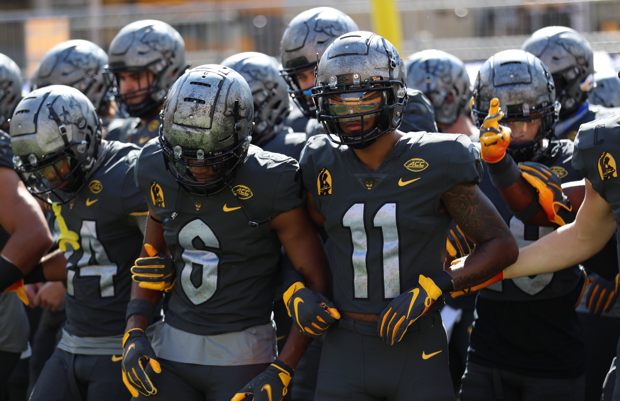
5 hours ago, DNAsports said:
I thought Pitt’s alternate looked great yesterday. The natural sunlight helped a lot. That helmet is a thing of beauty in my eyes
Is the helmet suppose to look like they took a blow torch like that or did the paint get rubbed off during the game?
-
12 hours ago, 4_tattoos said:
Today with was the first time I noticed players wearing zero. Looks better with certain number fonts than others. So far I've only seen skill position players wearing it. Waiting to see a big 300 plus lb defensive tackle where zero lol
I can accept single zero being a jersey number, but I can never accept double zero when I see it in sports. I see no point in the number zero being represented with two digits. At the end of the day, 0+0=0. Double zero is a mascot jersey number to me

SN: When did Louisiana-Lafayette start going by just "Louisiana"?
I agree, the same reason 01-09 aren’t used and shouldn’t be used
-
Probably couldn’t get proper fitting and alterations due to covid
-
18 minutes ago, BroncoBuff said:
Of course, please don't take me too seriously.
Darth Brooks posted did post some very interesting, in-depth topics on the first couple pages ... but now it's been FOUR years since I first posted in here. I'm not ENTITLED to any one-on-one lessons, I know that. But there are some very talented people here ... hell, I'd be happy with a quick drive-by and a sentence or two from them.
It's not just this site, I posted some of these same images on another site's "Photoshop help" thread ... in 6 months all I got was ONE post, with just ONE word: "Rasterize." I looked up its meaning, it had something to do with bitmap images. But I'm still not sure what it meant.
Why respond to a post from 2 years ago. At this point we don’t even know what you want anymore
-
I thought Virginia got rid of the squiggle in the sword handles because it represented a wall on campus that was used to hide the slaves that were working on campus.
-
3 hours ago, tron1013 said:
Comparing them to these solid BC throwbacks really reinforces how badly Under Armour phoned in the South Carolina faux backs/updated 2020 jerseys.
These look nothing like the flutie uniforms. If anything they mailed these in. Atleast Carolinas look accurate
-
2 hours ago, tron1013 said:
Not a fan of mismatched striping and use of “CAROLINA” unlike the black faux backs.
It’s not mismatched striping, it’s just different colors because of the base they are on. Over consistency is just as bad, look at UF.
-
5
-
-
7 minutes ago, Brave-Bird 08 said:
Right, but when ordering from a catalog, why would Nike give the option for sleeve logos to be set so low? That's still on the manufacturer, unless the school said "can you please make the logos tuck into the pads so you can't see them."
The manufacturer wouldn’t add the patches, same way with numbers, it’s all done by tailorers during alterations and fitment.
-
37 minutes ago, Brave-Bird 08 said:
The sleeve logos on the Marshall jerseys are getting tucked under the pads in the photo shoot. Not sure if they are just modeling the wrong size or if Nike made a boo boo
More the school making a boo boo, Nike doesn’t design the smaller schools uniforms. They just order from a catalog
-
1
-
-
2 hours ago, WSU151 said:
Yeah that 17 looks terrible..just awful work by adidas. Who stitched the 7 an inch higher than the 1?
And it's weird how in some pictures the wordmark looks arched while in others it's straight across.
And for the fonts..."Texas A&M" has a bunch of serifs...the numbers have some serifs...and the NOB is sans-serif.
Needs improvement.
The 7 isn’t stitched higher, the top of the 1 is just pulled down, look at the material up and to the right of the 1 you see where the knit pattern changes from being pulled.
-
1
-
-
2 hours ago, Tracy MidGrady said:
The players don't seem that enthused
Yea they failed in even making their target audience excited. They all are like “it’s a little plain, but it’s cool” because they know they are on camera and can’t say “yea these are :censored: and our old uniforms were better”
-
1
-
-
42 minutes ago, Lucas718 said:
Been wondering this myself. If the ACC & SEC keep their plans to play fall ball, are the winners (let's say Clemson and Alabama) supposed to sit idle until June waiting for the other conferences to finish their seasons so they can then begin the playoffs?
I’m assuming no playoffs, no bowl games even and instead a national champion will be voted on by coaches poll at the end.
-
2
-
-
FIFO is that suppose to mean first in first out? I would think they would want FILO first ones into the gym, last ones out or last ones out of the tournament.
-
11 minutes ago, CaliforniaGlowin said:
CCU still doesn't have a consistent number font.
What are you talking about?


College athletics identity changes
in Sports Logo News
Posted
It’s no longer the 90’s