


dont care
-
Posts
8,992 -
Joined
-
Last visited
-
Days Won
18
Posts posted by dont care
-
-
1 hour ago, CaliforniaGlowin said:
Agreed. It's one little logo, people! You'll get used to it.
This isn’t the board for that. We care that 2 materials don’t match perfectly, you expect up to ignore a makers mark when we have noticed them for the past 2+ decades that makers marks have been a thing on uniforms.
-
 1
1
-
-
Links didn’t work
-
On 11/7/2019 at 5:11 PM, SFGiants58 said:
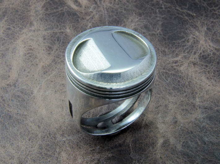
I've always thought that Detroit Pistons’ primary mark was supposed to look like a stylized top of a piston head, not a basketball.

Upon further inspection, that isn’t even a piston, but a ring.
-
3
-
-
15 minutes ago, Gobbi said:
Anyone else having an issue on mobile (I use Chrome for iPhone) where you have to click everything twice for it to actually bring you to the desired page? Example below: I click on “Sports Logo News”, the text turns red letting me know that I did in fact click it but it doesn’t open that page... I then have to tap it again for it to actually go to the new page. It’s been like this for about a week for me.
I think it’s the new iPhone update. Mine started doing that ever since I updated my phone. You now got to press things harder for them to work on here to make them work. Otherwise they just highlight as you show on there. I don’t have the problem with other websites though.
-
41 minutes ago, SFGiants58 said:
I've always thought that Detroit Pistons’ primary mark was supposed to look like a stylized top of a piston head, not a basketball.
I don’t think that’s the case when most piston heads don’t look like that. And that barely looks similar to the logo makes me think that isn’t the case.
-
1
-
-
11 minutes ago, BringBackTheVet said:
I think it makes for consistency. In years you don't win the title, you put up the conference banners. Unless you're doing one banner per year and lining them up in a row, it would look like some conference championship banners are missing.
The Phillies do this - only hang one pennant per year, just in different colors depending on what they won, but each color is on its own pole, so they only have NL Championship banners for 50, 83, 93, and 09. To me, that pole should also have 80 and 08. The division banner only has 07, 10, and 11, but IMO it should also have 08 and 09.
Unless you're the Yankees or Celtics, where you have so many banners you don't know what to do with them, I don't see anything wrong with hanging one for each legitimate title... meaning NO WILD CARD BANNER BECAUSE IT LITERALLY MEANS YOU LOST.
Especially in leagues like nba, and nhl because there are 10 wild cards each year
-
1
-
-
Well that is just because it’s easier to create 1 set of numbers, rather than 3 different sets for left, right, and single numbers
-
5
-
-
I hate the Toronto Raptors title banner. The gold looks like it was made out of trash bags.
-
1
-
-
4 hours ago, spartacat_12 said:
The Raptors made all the right choices here. They didn't include any unnecessary gold in the banner other than the trophy itself, and they also were able to avoid the temptation of throwing the NORTH chevron on it like they did with the rings. The player names around the outside is a nice touch too.
The execution of the trophy is pretty bad though. The gold leaf or what ever material they used looks really bad.
-
2
-
-
5 hours ago, Ice_Cap said:
Stan Kroenke is building a football palace in Los Angeles on his own dime. If he can do that then whoever owns the A's should be able to build a decent ballpark in Oakland.
Stan Kroenke is worth over 8 billion, the A’s owner is worth less than 2. That’s a huge difference
-
3
-
-
1 minute ago, Brandon9485 said:
That has been used before; the Cavs ring comes to mind. I’m with you, it looks bad.They atleast changed the “0” To the nba logo rather than the 1
-
It makes them look
like 2009 champions rather than 2019 with how the replaced the 1 with the nba logo
-
1
-
-
On 10/19/2019 at 11:33 PM, McGlinchey23 said:
I feel the same way about a lot of Uni Watch ticker posts.
”Jaguars caught still using last years logo on sideline!”
Like Jesus, give them a break
Fun fact someone created a Facebook post about Brady wearing a jersey last night with the regular NFL shield to try to get him fined by the league for wearing the wrong jersey. When in reality it’s the equipment managers fault not his.
-
15 hours ago, anythinglogos said:
The shot clock above the free throw line TNT is using seems very unnecessary when there already is a shot clock on the scorebug and another behind the basket. Just creates visual clutter
EDIT: added picture
There’s actually 2 behind the basket, one facing the floor above the basket, and another facing the camera on the beam
-
8 minutes ago, Bucfan56 said:
This is the age old line they always use. I wonder if it's true that they really can't pay for it themselves (In which case, they shouldn't be allowed to own a Major League Baseball team) or they're just trying to cry poor and make it look to the public like they can't pay for it themselves (In which case they REALLY shouldn't be allowed to own a Major League Baseball team).
I've never really understood why the A's have always seemingly had such impoverished ownership groups. You would think with all the money in the Bay Area that you'd be able to find at least ONE extremely rich billionaire
 who could buy the team and foot this whole thing themselves (or at least have the tangible ability to). , just look at Lacob and Gruber. They added BILLIONS to the value of the Warriors and just got them a new arena right in the middle of San Francisco, which is a damn near impossible task. You're really telling me they (or someone with similar financial clout) couldn't do the same thing with the A's? I don't believe it.
When stadiums cost billions even billionaires can’t afford it and keep their other businesses afloat.
-
1 hour ago, McCarthy said:
Other than "they don't want to pay for it themselves" why can't the A's just build the new stadium in the parking lot while they play the next two years at the Coliseum?
Because they can’t pay for it themselves
-
1
-
-
2 hours ago, Camden Crazy said:
Your life seems like a dark void where fun goes to die. Sorry you lost a bunch of money your first time in Vegas playing blackjack like a tourist and have decided to use that as an excuse to harbor grudges against not only an entire city, but people who enjoy said city. Maybe stick to Settlers of Catan.You say that like the gambling industry isn’t the main focus of LV and all other entertainment is just there to filter people to the casinos.
-
3
-
-
So yea they are all button down
-
On 10/13/2019 at 8:30 AM, insert name said:
Just downloaded MLB 19 because it was free on PS+ and noticed they got the Mets 1985 uniforms wrong. The same applies for the 85 away uniform.
This could’ve passed for their 1991 uniforms since those where button downs but they kept the blue collar. Now it’s just a mixup of a set that didn’t exist.
I’ve worn that uniform in the show that I own. I haven’t noticed that and will need to look. Might just be a deal with file size with it not being on a disk had to cut a corner.
after playing it again it is clearly a button down, and so is the away so now it’s making have to look at all other pullovers to see if it is a game wide issue.
-
1
-
-
5 minutes ago, FlyingBuckeye7 said:
The Cincinnati Bengals tiger stripe helmet is fantastic, iconic, and should never be changed!
See this
On 10/10/2019 at 6:40 PM, dont care said:This isn’t the popular opinions thread lol
-
4
-
-
8 hours ago, Murg said:
Chrome has never looked good on a single helmet or facemask. It's tacky and never compliments the rest of the uniform well
This isn’t the popular opinions thread lol
-
1
-
-
Sacramento wouldn’t create an anti A’s sentiment like moving the chargers to LA?
-
1
-
-
9 minutes ago, the admiral said:
Why is it "midnight green," anyway? Midnight blue makes sense, it's the color of a midnight sky. It's like calling lavender "creamsicle purple."
Because it’s a green with some midnight navy mixed with it.
-
1
-
-
6 hours ago, dmmdoublem said:
The Philadelphia Eagles look much better in Kelly than what they have now, but I think it's overrated in regards to the Oakland Athletics and New York Jets. Darker shades of green work much better for those two.
Well that’s because any color looks better than midnight green


 who could buy the team and foot this whole thing themselves (or at least have the tangible ability to).
CCSLC Board Technical Issues
in Forum Policies and Announcements
Posted
Yea this just happened to me for some reason?