


dont care
-
Posts
8,976 -
Joined
-
Last visited
-
Days Won
18
Posts posted by dont care
-
-
9 minutes ago, The Six said:
The Marlins should move to Montreal and the Rays should move to Miami.
Rather than just move the rays?
-
 2
2
-
-
3 hours ago, prof said:
Scottie Pippen in a 2007 Bulls uniform


What's different about that uniform?
-
3
-
-
1 hour ago, SabresRule7361 said:
Surprisingiy rare:

These Lions and Vikings uniforms only coincided 3 years and only 6 such games
Not only was that rare, but also their 2003 meeting here was the last time the Metrodome had astroturf as well.
I wouldn't consider 6 games with it being the equivalent of almost half of a regular season worth of games as being rare
-
2
-
-
It's almost as if they were designed by the same people,
-
On 7/4/2017 at 11:18 AM, dfwabel said:
After the content change, foxsports.com had 60% less traffic.
http://dealbreaker.com/2017/06/jesse-spector-sports-media/?utm_source=dlvr.it&utm_medium=twitter
Considering that none of the video play for me on my phone I can see why.
-
1 hour ago, MCM0313 said:
Not being that much of a hockey guy, I don't recognize any of those faces. I stand by my previous misstatement, whoever they may be - the Stars' current set may be wrong historically for these guys, but aesthetically they are SO right.
You don't recognize mike modano?
-
4 hours ago, joey joe joe jr. shabadoo said:
How can anybody look at this and not think "team chevrolet" GO CHEVYS
Whatever this team is, the ad completely overpowers, this is totally bush league. Once you do this any prestige and magic and dignity you had or once had is gone.
Ok you can be the team that doesn't take the close to a billion dollars to put their logo on their shirt
-
4
-
-
24 minutes ago, Lights Out said:

Still a better logo than the Vegas Knights'.
Not true. I would take vegas' logo over that any day.
-
2
-
-
7 hours ago, chcarlson23 said:

Who?
-
3 hours ago, whitedawg22 said:
Which jersey is the "right" one for Brook Lopez then? I know he's been with the Nyets his whole career, but they haven't exactly had a consistent identity.
Any of those jerseys that aren't alternates are right uniforms for him.
-
9 minutes ago, TrueYankee26 said:
Reminded of him after Boston retired his jersey on Friday.

He started on the mariners

-
3 hours ago, jmac11281 said:
But I could see Nike doing that for the Patriots. We all know Nike loves to mismatch TV numbers with numbers on the front and back (Seahawks, Jaguars).
They just take away unnecessary outlines and patterns away that don't show up well regardless on such small applications. They don't make them completely different colors
-
54 minutes ago, Lights Out said:
I honestly don't think it's anywhere near as bad as people made it out to be. The problem is that there were better concepts that the team and/or designer(s) passed over that probably would have been better received. For instance, the roundels on the very bottom right:

Those rounders look even worse, it's like they tried to get a 5 year old to draw the old logo and called it a day. The sabers are so small and dainty they might as well not even be there, and the Buffalo look like incomplete blobs.
-
1 hour ago, RichO said:
This makes me want a team- any level- to roll out a romper uniform just to see it happen, and for my brain to break a little.
Do you like watching the world burn?
-
3
-
-
1 hour ago, msubulldog said:
Why don't the teams that wear powder blue tops pair them with powder blue pants?
Once upon a time they did, they then realized how bad they looked and trashed them.
-
3
-
-
4 hours ago, KittSmith_95 said:
Iggy is fine in a Sixers uniform. Peja's time as a Raptor is one I'll never forget given we trade away Jarrett Jack of all people for him. He then got waived, signed with the Mavs... and got a ring.
These are their true wrong jerseys:

And here's a Bonus one that I bet people forgot about:

Figured it fits in nicely, with how Peja & Artest were traded for one another (I refuse to call him by MWP).
He's now Pandas friend
-
21 minutes ago, Brandon9485 said:

I like that they used the falcons custom font.
-
2 hours ago, fouhy12 said:
283 diamonds. That is absolutely absurd, and a hilarious dig at the Falcons by Kraft.
I don't get the connection
-
12 hours ago, Championship Sports Rings said:

It reminds me a lot of their 3rd ring, I don't know the size comparison that will be interesting to see
-
11 hours ago, KRZYBDGRZ said:
This will probably grow more and more wrong as his career goes on (especially since it's a terrible jersey)

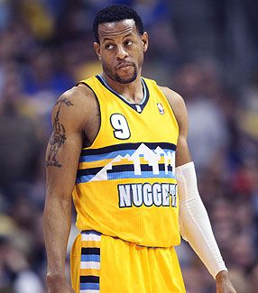
This is the Right team wrong uniform thread. He's a Rocket now that his career really took off after the switch
-
-
35 minutes ago, rhiser@cox.net said:
Can anyone tell me what year the rams wore this uniform?
They didn't
-
10 hours ago, joey joe joe jr. shabadoo said:
It's neither here nor there.
I understand there is a purpose and a meaning to the various parts of the logo, but so much of this is first glance and what immediately comes to mind. I just see the word Steelers and three randomly colored astroids. It doesn't make me think of football, the franchise that it represents, the steel industry, or the blue collar city.
It's not ugly but of all the iconic franchises in sports it's probably the most middling logo that any of them have
Yea has nothing to do with the steel industry...

-
6
-
-
I personally am not a fan when rings have diamonds and other jewels on the shanks. That can't be comfortable to wear. Probably constantly scratches people's fingers


Full list of teams with neon colors?
in Sports Logo General Discussion
Posted
Columbus blue jackets used a volt color their first couple of years