


sky1324
-
Posts
2,428 -
Joined
-
Last visited
-
Days Won
4
Posts posted by sky1324
-
-
The mint jerseys are fine, solid even, but the Hornets aren't known for those colors and to be honest? The whole "mint" thing wasn't a thing until around 2019/2020 when it got huge for some reason. I don't think a gold jersey would look good on the court anyway so I'd rather have a purple jersey.
-
 3
3
-
-
That should be part of the cost of having a league-wide manufacturing deal. If you're taking up exclusivity and responsibility for supplying all 32 teams, you should be able to match what the teams have, not the other way around. I understand not supplying every color for high school or college teams or for off-field gear and whatnot but there's no reason Nike be able to meet the teams' demands.
-
10
-
-
Why don't the Hornets have a purple jersey?
-
1
-
-
Not to necessarily defend the Gen 7 car, which needs improvements on safety, yes, but it's not like the old cars were perfect - Dale Jr's career was ruined by concussions, but he never raced in a Gen 7 car. Jeff Gordon and Ryan Newman suffered great injury in previous models of car, even the incredibly safe COT. NASCAR is just a dangerous sport - barreling around at nearly 200 MPH for hours will do that.
-
Never understood the focus people have on this. What's most important is franchise continuity right? The NFL didn't even Hornets the situation and retroactively assign the old Browns' history to the new Browns, they've always been the Browns franchise. A "franchise" is nothing more than the license to operate a team in a certain city and when Art Modell decided to leave Cleveland, he did not take his franchise with him. According to the NFL, Modell was granted a new franchise to operate in Baltimore that was filled with the staff and players of the Cleveland Browns organization. However, the Browns franchise was deactivated for three years before it returned in 1999. Still the same franchise, but with a different organization. So yes, the current Browns are the same franchise as the old Browns.
-
10
-
 2
2
-
-
All these jersey reveals have such colored, extreme lighting and while it looks cool I can't see what the damn uniform actually looks like.
-
14
-
-
Philadelphia vs. Houston
Indianapolis vs. New England
Green Bay vs. Detroit
LA Chargers vs. Atlanta
Buffalo vs. NY Jets
Minnesota vs. Washington
Carolina vs. Cincinnati
Las Vegas vs. Jacksonville
Miami vs. Chicago
Seattle vs. Arizona
LA Rams vs. Tampa Bay
Tennessee vs. Kansas City
Baltimore vs. New Orleans
-
4 hours ago, Sport said:
Can someone explain to me like I'm 5 why that move worked and what exactly happened? I don't follow Nascar that closely and I haven't been able to find a good summarization.
He needed to make up two positions to advance to the championship race so he shifted into 5th gear (not normally done at Martinsville because of a lack of handling) and just floored it, letting the wall guide him. Because nobody was up there he was able to take the two positions he needed and then some. He sacrificed his car for speed and in the process set a new Martinsville track record for a Cup car.
-
1
-
-
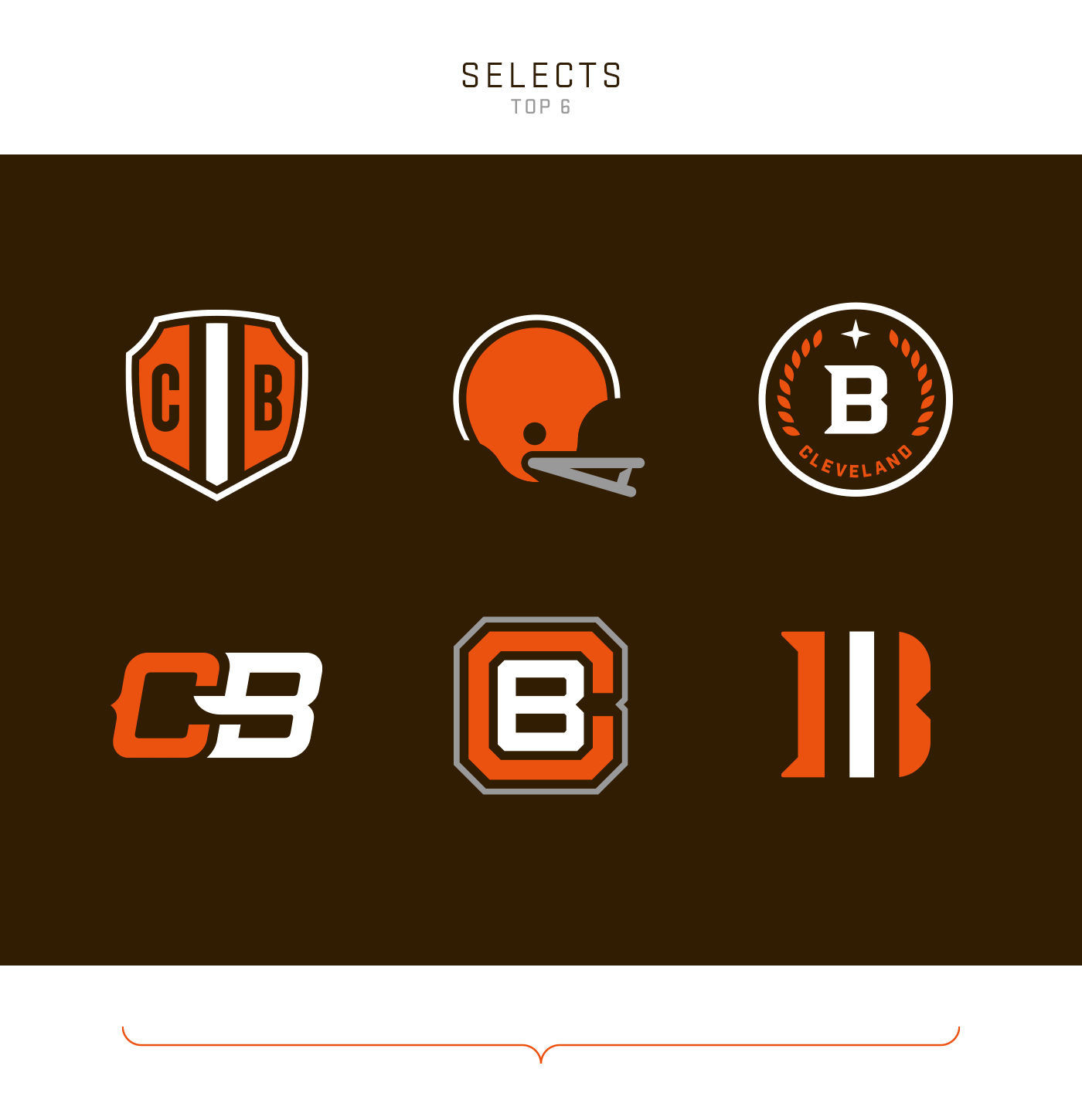
I don't like the elf at midfield and I've never cared for the bulldog branding either - I've always felt the blank helmet was strong enough to serve as the logo. What I don't like about what they use now is that it's a generic NFL template and not a unique logo built specifically for them. A return to the 60s-style one- or two-bar helmet with an emphasis on the iconic stripe is a good way to go in my opinion. Since I saw specifically the top middle from this selection from Gridiron Labs I've been of the opinion that that's the way to go.

-
8
-
 1
1
-
-
That blue jersey is a thing of beauty. Not as big on the black caps for the home and road (nor the de-emphasis on gold) but overall I'm pretty happy. Logos are a downgrade from what we had but the new shade of blue is so nice I'm happy about the change overall.
-
3
-
-
1 minute ago, McCall said:
Is it wearing a facemask?
Real medieval helmets had that connecting piece:
It's just given an outline to define it in the logo.
-
The Charlotte Knights add blue to their color scheme to tie into the city's other professional sports teams:
New logos to go with the change:
Not super big on the new helmet design (what's going on at the bottom?) but I am a huge fan of adding blue to the scheme. Light blue feels right for any Charlotte team and now all that's left is for the Checkers to return to blue and orange.
-
2
-
-
If I see one more Panthers concept with "cat scratch" or "whisker" stripes I'm gonna lose it.
-
12
-
1
-
 4
4
-
-
Replacing the numbers on the Steelers' uniforms wouldn't make it a good uniform by itself because the Steelers uniforms aren't good to begin with.
-
1
-
3
-
-
3 hours ago, seasaltvanilla said:
The Twins have been wearing RWB since 1901 and three World Series. Go pick on the Rangers (1961, 0 WS) or the Nationals (1969, 1 WS) or the Angels (1961, 1 WS) to change their colors.
I want all three to change their colors.
-
1
-
2
-
-
1 hour ago, Brave-Bird 08 said:
I don’t understand what prompted the Panthers to start wearing black socks with their road set, but it’s disappointing.
I desperately miss the blue socks, but I'd rather have black than white.
-
8
-
-
Just now, Ridleylash said:
Maybe it'll even have an arrow on it in some form?

Sure! The North Stars aren't using it anymore. Twins are free to take inspiration from a great, classic design.
-
1
-
-
6 hours ago, tBBP said:
If any of this is indeed true, then it may confirm a sneaking suspicion I've had about the Twins' new branding ever since I first heard about it: they're going for more of a "cosmic" theme, specifically Gemini (aka The--wait for it--Twins), despite the fact that their across-the-ricef brethren in green have already incorporated elements of that into their identity.
You know what? I actually like that idea. The Twins brand is so incredibly dull that a pivot to Gemini theming is a welcome move. If they're going to do that, though, navy, red, and gold is not the color scheme to use. I'm especially interested by the idea of a M + star logo. I bet it'll be leagues better than the TC is.
-
2
-
-
I feel bad for Tom that his marriage is blowing up very publicly, but I'd be lying if I said his football failures weren't bringing me lots of happiness. I miss when the Bucs were in the dumpster. No matter how bad the Panthers were, we could always count on two wins from them. I'd love to see them return to that for like 5-8 years. You don't get the best QB ever for free and not have to pay for it later.
-
2
-
-
56 minutes ago, LA Fakers+ LA Snippers said:
How about something like this? Tapers the stripe, drops the logo but makes room for the TV numbers and the maker's mark.
I've been looking for this image ever since I saw it - this is exactly what I want. Maybe even move it closer to the shoulder and drop the numbers completely.
12 minutes ago, PERRIN said:I'd be perfectly fine with this, it does the tapered stripe look way better than the Jets do without looking too cluttered. This striping with a slightly more modern block font would be perfect.
A modern block would be great, as long as it's block and not some god-awful "cat scratch" or italicized nonsense. Just a small cut would be enough to set it apart while sticking with the team's aesthetic tradition.
-
3
-
-
The Tuskers looks is very close to what I want to do - Panthers blue helmet (it's not Carolina Blue, that's what UNC wears) with tapered shoulder hoops and pant stripes, blue socks only, white/black pants. My ideal primary set is Blue/Blue/White/Blue but if they want to stick with black primaries then I'm ok with that as well. There's actually a version of the logo with a full black stroke that you can see on the blue and white jerseys - the mothership doesn't have it for whatever reason and it's not on the fan jerseys but it is on the real one. It needs a rework anyway but for now it can stay, the important part is refining the jerseys. The elimination of silver would also eliminate the Lions comparisons, so do that as well.
-
The Washington Senators and Los Angeles Angels entered the American League in 1961 with a red, white, and blue color scheme. Not an expansion of course but the former Senators became the Twins and kept their old RWB scheme as well.
-
6
-
-
Just now, PERRIN said:
Wouldn't mind it, but I feel like the Panthers could use a more drastic redesign. They should definitely keep some form of shoulder stripe and perhaps emphasize their electric blue over black, but I think moving on to something more modern would be the right way to go with them
I keep seeing this suggestion brought up - the Panthers are a rare example of an expansion team that hasn't changed much since their first season and they should stick with that. Agreed to emphasizing Panthers blue over black but no thanks to something "more modern". The team is already ruining its look with all-black/all-white/that awful black helmet, any modern redesign would look more like the Falcons than the Panthers.
-
11
-
-
29 minutes ago, LA Fakers+ LA Snippers said:
Since we
are(were) on the subject of eliminating TV numbers, what if the Panthers "UCLA-ed" thier stripes to something like this:
No thanks. Try and keep the loop, use the Chargers-style hoop space (cut it off if you have to, but make it a point like the pants), drop the shoulder numbers. Just clean it up, don't change it too much.
-
6
-


NFL 2022 Changes
in Sports Logo News
Posted
Any team with metallic pants.