


ManillaToad
-
Posts
1,837 -
Joined
-
Last visited
-
Days Won
4
Posts posted by ManillaToad
-
-
13 hours ago, Chromatic said:
The "Kraken" name is goofy, and the jury is still out on how well it will age, but its nowhere near as bad as "Wild".
In terms of bad names, the Wild is in a league of its own in the big four sports leagues. The only thing that comes close were the leaked Professional Women's Hockey League names that were so bad they decided to scrap them entirely and go strictly with the city names and generic templates until they could come up with something else.
Magic is as bad or worse than Wild
-
 1
1
-
 1
1
-
-
2 hours ago, mmejia said:

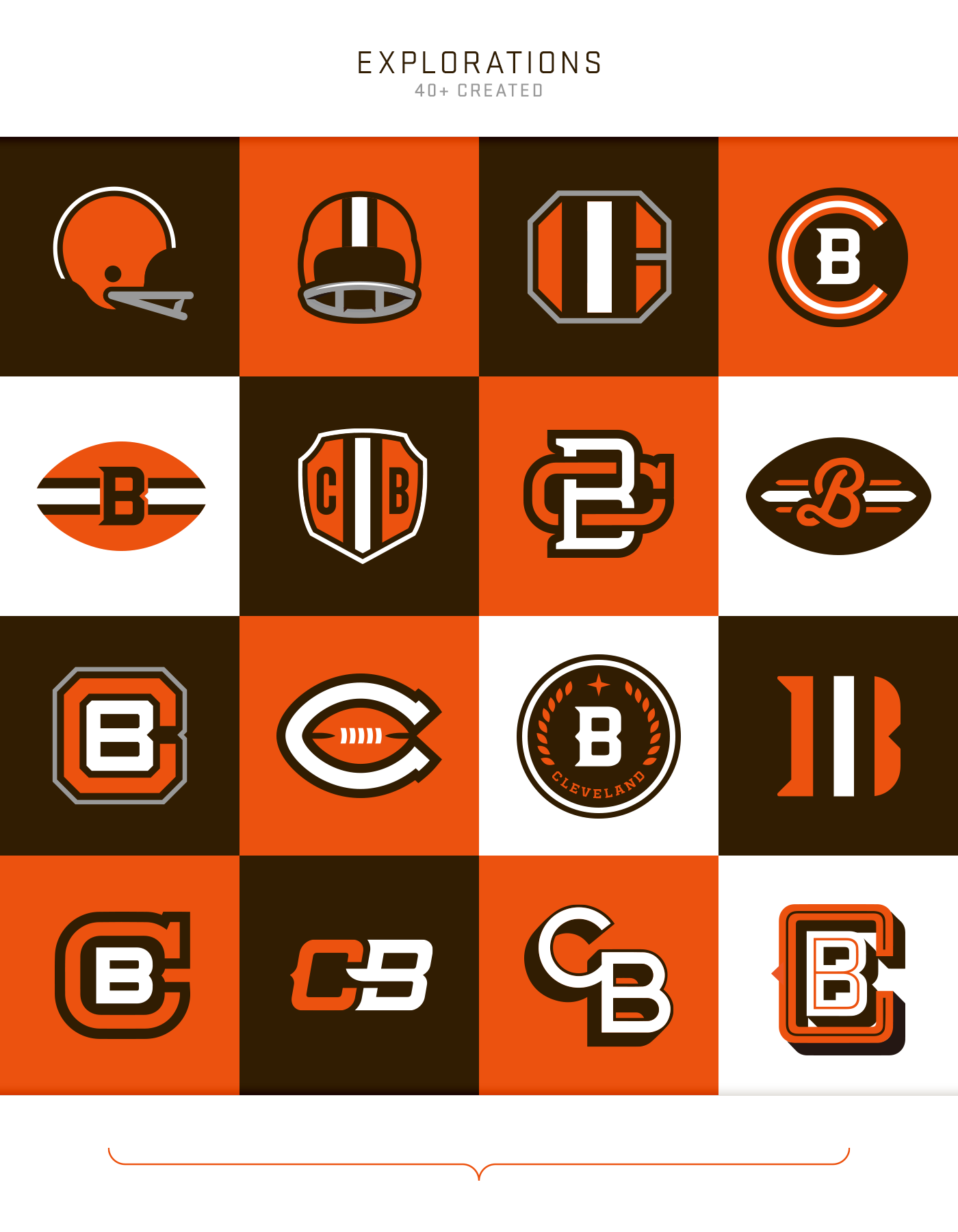
WTF happened to football aesthetics
-
3
-
 2
2
-
-
These are all fantastic
-
What is the thinking behind using "Mammoth" as a collective noun instead of just using "Mammoths"?
-
2 hours ago, AgentColon2 said:
In case you missed the logo on our helmet, check the sleeve.
I thought this kind of assery was in the past.
I will never understand why more NFL teams don't make use of secondary logos like MLB teams do
-
2
-
-
11 minutes ago, GrayJ12 said:
Any reason why there are two national championship rings?
The CFP has an official ring they give to the champions, and then the team makes a set of their own later on
-
2
-
-
These are gonna age like milk, especially when the team wears monochrome in almost every single game
-
4
-
-
Pioneers isn't a good hockey name. That's pure baseball, and maybe a little bit of football.
-
2
-
 1
1
-
-
-
You know we live in dire times when the most popular suggestions for a team name are either WNBA-tier or just not having one at all.
-
2
-
-
This trend of non-name names is getting out of hand. It was stupid for Washington and Edmonton but at least it was understandable because they had to drop their old names like they were on fire. Now teams are willing to have a lame-duck year just because the owner doesn't feel like picking something. It really blows my mind how such a stupid trend can even become one in the first place
-
4
-
-
Oh God they're going to subject us to a year of "Lol the Stars are playing Hockey Team
 " before we even get to whatever terrible collective noun they choose as a name
-
1
-
-
44 minutes ago, DCarp1231 said:
ANY of these would work
As an icon for a phone app, sure
-
6
-
1
-
1
-
-
It took 60 years but the Jets finally figured out how to put a plane and a football in their logo at the same time
-
20
-
3
-
-
It looks like the E has an underbite
-
5
-
-
I understand why the circumstances change things but Arizona getting to keep the history for the move to Utah while Winnipeg didn't for the move to Arizona is such a Bettman-era thing to happen
-
4
-
-
2 hours ago, DCarp1231 said:
It’s kinda also like how the Chiefs should get rid of their Lamar Hunt/AFL patch
Not only should they keep the patch, they should put the AFL logo in their endzones
-
2
-
1
-
 1
1
-
-
8 hours ago, clonewars2008 said:
We need to be careful about reunifying Winnipeg’s history, that’s a Pandora’s box in if itself, especially with another Canadian team that would suddenly be tied 3rd all time in Stanley Cups.
That would be a good thing
-
1
-
-
Man I hope SLC doesn't go with some goofy crap akin to Kraken. There's potential for a solid identity here
-
1 hour ago, The Impaler said:
I don't think monochrome is bad, in fact the only monochrome I really don't care for is white, just think it's boring. However, I think monochrome is just poorly executed too often. Saints and Ravens are the first to come to mind. Put striping on the pants and opposite socks and all the sudden those two looks are much more palatable. I'm not saying every team should have a monochrome look by any means, and I think for teams such as the Patriots silver pants should be standard home (actually white, scrap the silver, but that's another story).
It's not monochrome if the socks contrast the pants & jersey
-
2
-
1
-
-
4 hours ago, tigerslionspistonshabs said:
I think Owls would be cool.
Owls are dangerously underrepresented in sports branding
-
3
-
1
-
-
24 minutes ago, Silver_Star said:
No, with the Rams, keep the horns. If the Rams gotten a logo, it would not fare well with fans as they are used to the horns on the helmets. I find the horns on the helmet to be awesome. I like it. Downsizing the Rams helmet where they are just like every NFL team is just not unique. The Rams and Bengals have a unique helmet and not to be touched because it is creative for 1948 and 1981 respectfully.
No I'm saying their logo should be your profile pic
-
4
-
-
The Browns and Rams should both have helmets for a logo
-
2
-
 4
4
-
-
Guy who worked for nike says nothing is nike's fault
-
1
-
2
-
2
-
 2
2
-
 1
1
-


2024-25 NHL Changes
in Sports Logo News
Posted
Does Salt Lake have sockeyes in it?