

johne9109
-
Posts
1,580 -
Joined
-
Last visited
-
Days Won
6
Posts posted by johne9109
-
-
San Francisco 49ers
The 49ers also throw it back to a 60's uniforms; particularly this pre gold uniform. So to make it more in line with their current branding I sawp the silver out for their current gold

-
 1
1
-
-
2 hours ago, MJD7 said:
What if... the Astros relocated to Virginia (and changed their name)?
The 'Stros had a "handshake" deal in the 90's to move to the DC area and become the "Virginia Fury," but it was rejected by the owners. The tequila sunrise is used to convey the "firey-ness" the name provokes.
This set is great. I'd love to see one full on Tequila sunrise uniform in this color scheme
-
1
-
-
Pittsburgh Steelers
The Steelers were another team that hasn't changed their uniforms in quite a number of years. The easy choice then is to go with the stripped look of the '30s, but the Steelers have thrownback to this quite a few times in the past few decades so instead I went with this unique look from the 60's
-
3
-
-
-
4
-
-
New York Jets
The Jets throw back tot heir 1968 Super Bowl winning year. To reverse it I took the black that the team has adopted in recent years and injected it into their throwback uniform giving us these slick yet retro look
-
2
-
-
New York Giants
For the Giants I went all the way back to 1934 as I felt it was the uniform that contrasted the most with the Giants modern uniforms and their recently reinstated throwback. The jersey is swapped to blur to fit the Giants current theming
-
2
-
-
Love the elephant with the sun rays behind it
-
1
-
-
6 hours ago, MJD7 said:
I considered doing "the 'Burgh," but I couldn't get over how cheesy it felt:
I agree about abbreviations though: even the ones you listed I'm not too big on, other than LA.
Here's a look:
Personally, I think sleeveless jerseys have become a thing of the past, but I agree that if any team could pull it off, it'd be the Pirates. We'll see if sleeveless jerseys make a comeback in maybe 10-15 years.
I agree it does feel kinda cheesy, but I think for a program like City Connect it really works
-
1
-
-
14 minutes ago, MJD7 said:
Pittsburgh Pirates City Connect
I mostly like the Pirates' take on the City program, I'm just not big on the 3-letter abbreviations, so I went with the full "Pittsburgh."
Steel City, the 'Burgh, or like you did here full on Pittsburgh, anything is better than the abbreviation. I feel for a team to use the abbreviation it has to be a well known one like NYC, BOS, LA, TX. PGH???? Yeah we can figure it out, but it's not one of the well known abbreviations. It's like the Hornets using CLT. Good call here
-
1
-
-
-
4
-
-
New England Patriots
So this one was a little tricky for me. The most prolific era in Pats history is clearly the Brady era, but that's not really retro is it? I tried flipping the teams original uniforms, but that essentialy just gives us our current uniforms; so that was a no. I then looked to the Bledsoe era uniforms (They did go to a superbowl wearing them) but they just didn't look good in red. So I looked back to the Brady era and to give it a retro feel I swapped the dull navy blue and silver for the teams original blue and white. Ultimately I'm proud of the result.
-
3
-
-
I would 100% be behind this change. Even if they stayed Miami and just changed the F to an M and Florida to Miami on their uniforms
-
 1
1
-
-
Minnesota Vikings
In 1998 the Vikings had mismatching uniforms. Their dark jerseys had striping on the sleeves while the white jersey had striping on the shoulders. So I took the white jersey and swapped it to purple
-
5
-
-
Miami Dolphins
The Dolphins are of course based on the perfect season. Now some may look at this and think I just changed the color of the pants and helmet, but in the 72 season the aqua jersey didn't have stripes. So I took the white jersey and not only swapped the main color to aqua, but then made the numbers orange and swapped the striping around. This added with the aqua helmet and orange pants create a very color forward look
-
2
-
 1
1
-
-
Los Angeles Rams
The Rams take their 2001 St louis look and reverse it into their current colors. The sides of the jersey were difficult to replicate on a template of a newer style NFL jersey but I did my best.
-
3
-
1
-
-
Los Angeles Chargers
For the Chargers I took their 2007 uniforms and made a yellow jersey with a dark blue equipment set
-
2
-
1
-
-
I think this is a great start. I think it needs more red however. Maybe a red helmet with some added strokes around the logo, red or grey pants with the white uniform, and I think the orange jersey should be red with maybe an orange throwback/alternate.
-
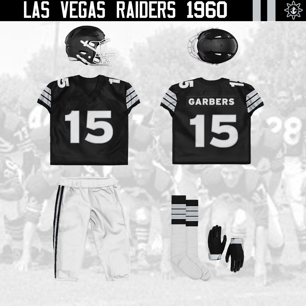
Las Vegas Raiders
For the Raiders I went with their 1960 uniforms for something visually different. I then swapped out the gold in the uniform for their current silver color. Pretty straightforward
-
4
-
1
-
-
Kansas City Chiefs
The Chiefs were a hard one for me as most of their uniforms have had very little variety in them. So what I did was go with their 1966 uniform, as it was one of the more visually different uniforms, and then instead of going with yellow as the main color I swapped in black as it is techincally one of the team colors and is something that fans have been asking for awhile.
-
1
-
1
-
 1
1
-
-
Jacksonville Jaguars
Sorry I haven't posted for awhile I have been busy for a bit. but here is Jacksonville. For the Jags I went with their 1999 uniforms and swapped their gold color to the main color. I think it works pretty well
-
4
-
-
Everything looks really good except for the R logo, but I wouldn't abandon it completely. I think with some retooling it could work. It's mainly the shape of the R you went with. It feels very outdated; like it's straight out of the 70's or 80's. If anything hold onto it for a feauxback uniform? Look forward to the rest
-
2
-
-
21 hours ago, MJD7 said:
Thanks! I thought about removing the elephant since, as @SFGiants58 acutely pointed out, a lot of New Orleans fans would also be LSU fans, and the elephant is the mascot of LSU's rival school, Alabama. I eventually decided against removing it, as I don't think it would be too big of an issue.
I don't think it would be either. There's a lot more overlap with team identities than people think.
-
1
-
-
That A's set works really well and the Elephant on the ball feels oddly on brand for Mardi Gras
-
2
-
-
Indianapolis Colts
So the Colts kind of get the Toronto Maple Leafs treatment in the sense that grey is used as a color that they've used before, but barely. I took the Colts 1955 look from their days in Baltimore mainly because it's one of the few looks they've had that looks destinctly different from their uniforms that they've essentially had for decades. I swap the main jersey color with aforementioned grey and blue pants are added.
-
2
-


NFL Reverse Retro 32/32 (Titans and Commanders added)
in Concepts
Posted
Seattle Seahawks
For the Seahawks we had to throw it back to the 1983 uniform. This time they are in green instead of the blue we were used to.